Greetings, and welcome to Studio Simpatico!
Though our portfolio communicates the end product of the projects we’ve completed with our clients, we know that as a prospective client, it’s important that you understand how we get to the end result. What process do we use? How often do we interact with our clients? How do we go about understanding their businesses, and how do we solicit and incorporate feedback?
Below, we’ve outlined how we go from blue sky ideation and cocktail napkin sketches to pixel-perfect WordPress implementations.
What is the first step in the web design process?
Discovery, a/k/a learning what we don’t know we don’t know.
During the initial weeks of the project, our team is in information gathering, “getting to know you” mode. We aim to exit the discovery phase with a clear understanding of your organization or products, goals, redesign success metrics, and content (both existing content, and planned future content). To achieve this, we may conduct any or all of the following, depending on your company or organizational structure:
- Internal Stakeholder Interviews—We work closely with you to identify all relevant stakeholders, and the type of information that each stakeholder (or stakeholder group) is equipped to provide and insight they offer to the redesign process.
- User Interviews—We are always interested in speaking with target users of the website (outside of the organization) to understand the value they find in the site, and what’s working and not working about the current experience and architecture. This also gives our team a great sense of empathy for the people for whom we’ll be designing.
- Audit of Current Site—We take a deep dive into the current site, conducting a full content and heuristic audit, accompanied by an examination of your current Google Analytics account to find trends and patterns. This also involves looking at the WordPress build and documenting the content structure of all existing content (content types and taxonomies) in order to plan for a successful, seamless migration.
- Competitive Analysis—We also spend time looking at other websites (both in the same vertical and in other verticals) for inspiration.
I like the Discovery process that they do at the beginning of every project ... they really capture specific brand nuances during the interview process and incorporate those into the designs.
 Regina Faler VP of Product and Development, Muscle & Fitness
Defining the user experience and project requirements
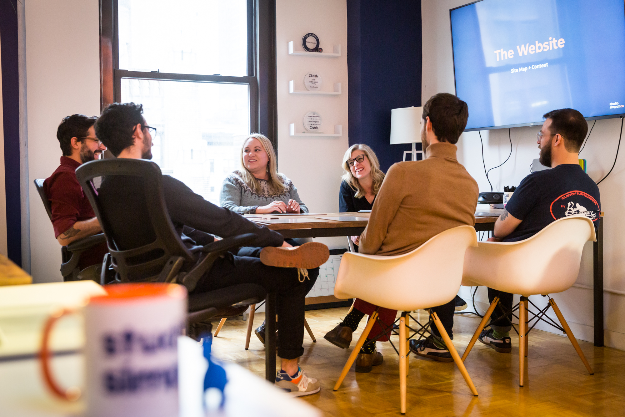
When we’ve completed gathering data from the Discovery process, we begin the fun work of distilling all of these findings into a strategic plan for the new site. There are several deliverables that we create during this phase (which is a blend of user experience, strategy, and content planning).
Our highest-level (and therefore lowest-fidelity) deliverable is a site map. For those unfamiliar, a site map typically shows all of the pages that will be included in your new site and the hierarchy of those pages. At Simpatico, we include a few more pieces of information: we include planning and infrastructure details surrounding which WordPress content types we’ll use for these pages, the templates and modules that will be shared and re-used across pages, an SEO-friendly URL structure, as well as contextual information about what information will appear (and why). If you have an existing site with a sizable amount of content, we’ll also prepare a migration spreadsheet to ensure that all existing pages are properly redirected to the corresponding pages in the new build.
Often, we’ll present an inspiration deck alongside the site map with examples. Perhaps our plan is to create a resource center on your site so users can watch webinars and download whitepapers, in which case the inspiration deck might show examples of features, microinteractions, or visuals of other content libraries that we like. If we’re crafting a new visual identity (as opposed to working from an existing set of brand and visual identity style guidelines), we’ll often share broader mood boards or website examples to discuss and ideate together.
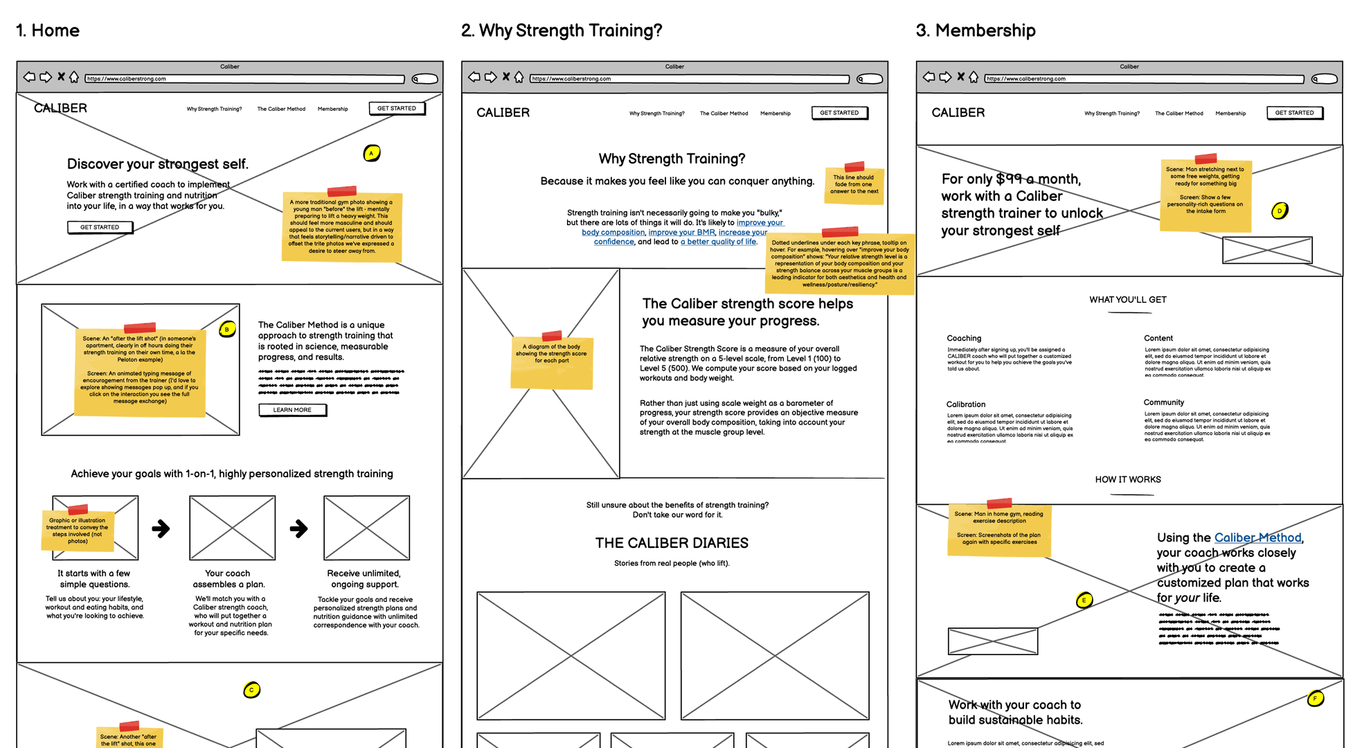
When the site map is finalized, we work closely with your team (often folks who are responsible for your organization’s messaging and positioning) in a workshop model to create detailed wireframes for all pages and templates. While a site map shows a bird’s eye view of all pages, a wireframe is a skeletal outline of each page. It communicates the page hierarchy and interactions, but is low-fidelity in nature and doesn’t suggest anything about the visual design. We typically use Balsamiq Mockups for our wireframes, though wireframes are less about the tool, more about the information being communicated. Read our blog post about how we build wireframes and how to give efficient feedback on them.
High-fidelity design: the marriage of UX and brand
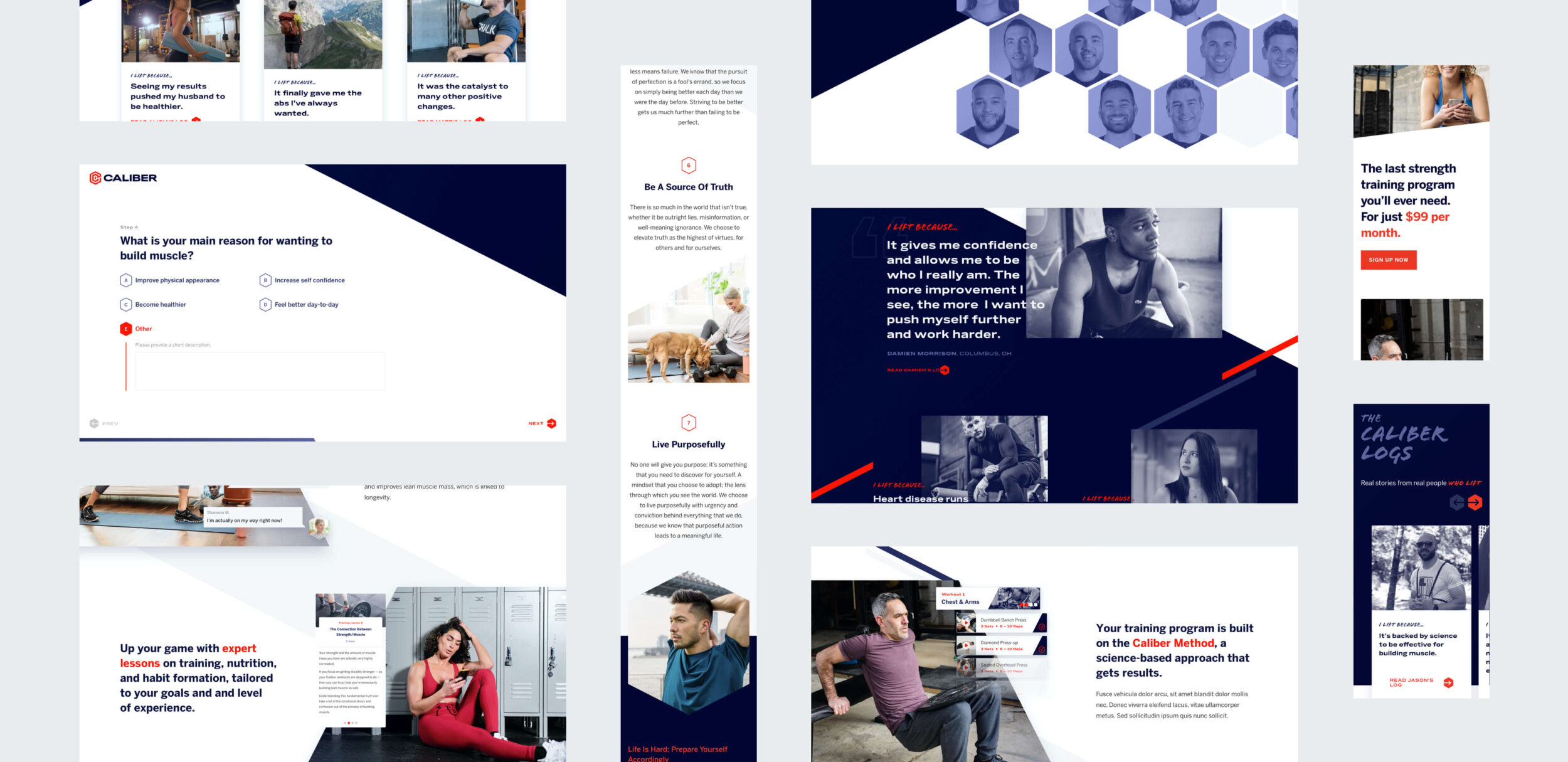
Once the wireframes are approved, it’s time to marry the visual look and feel of your brand with the information organization and user flow of the UX deliverables. As noted above, if you already have robust brand and identity style guidelines, we’ll pay close attention to them so that the website is a fluid extension of your visual identity. If you don’t, we’ll do more creative discovery work with you to establish and look and feel that matches your company, organization, or products’ core value propositions.
We typically design a few directions for the homepage, and iterate on these directions based on your feedback. We almost always present the first direction of the homepage in person, but after the meeting we’ll share a link with you that allows you to add additional comments directly on the mockup. Once we have a shared vision for the site’s look and feel, we begin designing the page templates and modules that were finalized during the UX phase.
We use Figma for high-fidelity designs, and typically design two breakpoints (though our designers inherently understand the fluid nature of designing for web, and account for this in their process). In addition to the design mockups, our creative team will often use Principle, After Effects, or Figma to create prototypes that show ideas for subtle JavaScript or CSS animations and interactivity. Though we love presenting and discussing our designs with you during in-person meetings, we also use a tool called Invision that allows all of your team members to add comments and share feedback directly on the design mockups.
It’s important to us that clients understand our overall modular approach: rather than building static page templates, we build modules that allow content creators to create pages or posts long after our engagement is over. Learn more about our approach to modular design.
Totally unlike a typical agency, Simpatico also helped us plan for the future by thinking about designs atomically, rather than as templates, which post-project has continued to deliver on its value.
 Justin Hughes Chief Digital Officer, M.M.LaFleur
Retreating into our development cave
When all of the site requirements and designs are complete, it’s time to build!
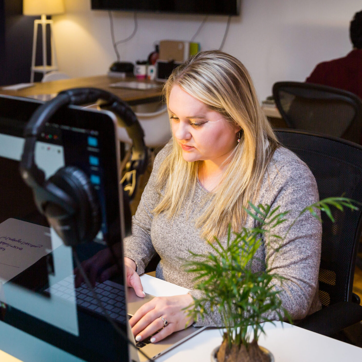
We build our websites on WordPress, which is the most popular content management system in the world. We build entirely custom themes, but use WordPress for the “back-end” — the interface where you’ll be able to swap content and images, and upload new articles and content after the site is live. I like to say that we leverage our UX superpowers to create intuitive, easy-to-use, efficient CMS experiences: we’re particularly recognized for our experience and expertise working with content editors to create robust editorial content creation tools. (Check out our case studies of Slickdeals Money and The Forward for recent collaborations between Simpatico and fantastic editorial teams.)
All the new tools from a CMS standpoint are fantastic; my team is excited about the new bells and whistles. Thanks to Studio Simpatico’s work, we’ll be able to provide a better UX overall.
Our other big differentiator is our attention to detail during the implementation phase: Our developers are all hybrid designer-developer types who are passionate about ensuring that the final front-end code perfectly matches the mocks completed during the visual design phase. Our head of development Amber has a degree in graphic design.
For the techies in the room: we are enthusiastic about creating clean, commented, semantic HTML5 code, and utilizing best development practices. We care about ensuring sites are fully accessible for all users. We use media queries to adapt the CSS for different breakpoints (as makes sense in the design) so that your website adapts gracefully and looks beautiful on all device sizes. We avoid using frameworks to avoid code bloat, and use jQuery (one of the most popular Javascript libraries) for animations and interactivity. To accommodate robust CMS content creation requirements, we use Advanced Custom Fields and ACF Extended.
Lastly, we stay “in the know” when it comes to Google’s always changing algorithms, prioritizing page speed optimization to ensure our clients’ sites are optimized for search engines.

CMS Training and Content Uploading time!
Once the build is complete, we’re excited to hold a training session with you over screenshare to introduce you to the back-end of the CMS. We also provide you with guided help documentation that we create using Scribe. Our preference is to work in parallel with you for the last couple of weeks of the project: while we’re testing the site across browsers and devices, you’re working on uploading content, getting acquainted with the CMS, and able to reach us easily with any questions. We test across Firefox, Chrome, Edge, Safari, Android, and iOS. Learn more about how we collaborate with clients during the QA process. When testing is complete, our Simpatico Launch Captain works with you to coordinate a flawless “go live” experience.
After Launch
We’re not going anywhere! Learn more about our maintenance and retainer offerings. Our team is eager to provide as much or as little support as you need going forward.
 hi, i'm
