 hi, i'm
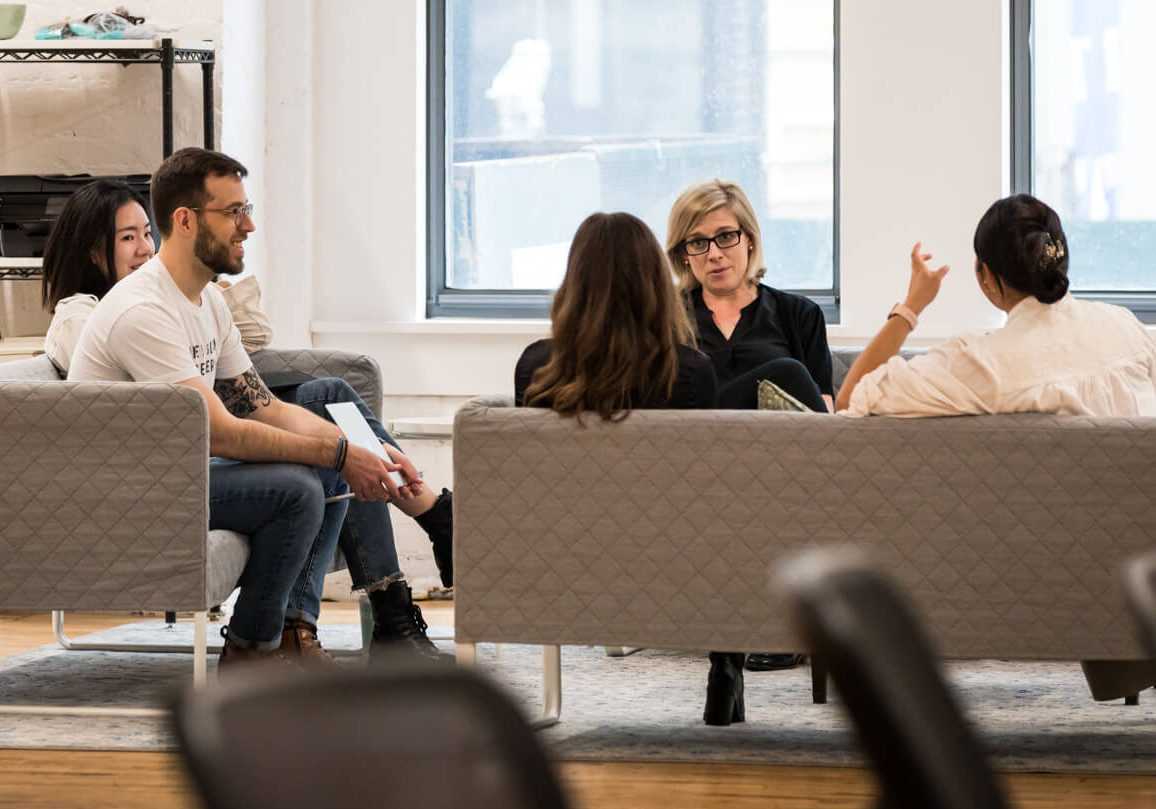
Ahhhh, the frenetic pace of the tech startup.
Funding announcements. Cranky investors. Overnight feature launches. Caffeinated/drunken hackathons. Your rockstar ninja team is all hands on deck, burning the midnight oil, abuzz in what could easily be mistaken for an episode of “Silicon Valley.”
But amidst the hustle, as OKR season picks up, dreaded, familiar utterances start to be heard across the organization, betraying the fact that in spite of your best efforts … your brand’s design consistency has begun to unravel (a/k/a gone to s***).
- “Frank, this indigo … where did it come from? Our brand purple is #5958EF!”
- “I don’t recognize this accordion, Sarah … yes, I’m looking in Figma v5.2. It’s not in our component library.”
- “Did you write that error message, Kim? It feels off brand. I dunno why, it just does. Please get Bob’s eyes on it.”
- “Talk to Debbie … you know, from Marketing. Wait, has the UX design team even met the Marketing design team?”
- “I need to talk to ‘the agency’? We hired an agency?!“
In my experience, these inevitable pain points typically come to a head somewhere around Series B. At that point, the organization can usually afford to hire a Head of Design type, someone empowered and expected to work across departments to crack the whip and enforce design consistency. (Fun side plot: There will also reliably be a mid-level designer who now reports to this person. You’ll likely find them sulking around the microkitchen, mumbling that they’ve been advocating for this consistency for the last year, but no one listened. I give this poor, disgruntled creative 3-4 months before they find a new gig.)
Don’t get me wrong: The Head of Design position is an effective solve. But before a company has the moolah (or initiative) to throw a person at the problem, I do believe there are more nimble, process-oriented ways of encouraging and achieving consistency. In this article, I’ll discuss some of the key deliverables and processes that can help a burgeoning tech company get on the same page and implement design consistency across its products and organization.
The 10,000 Foot View: High Level Brand Guidelines
Alongside your mission statement and business plan, at the tippy top of your organization’s defining characteristics sit your “company brand and visual guidelines.” Maybe they’ve been codified into a didactic, dusty, 900-page brand bible. Or maybe they sit in your in-house designer’s head.
Regardless, the ideal articulation explains how your company’s brand goes about expressing itself to the world. It takes into account the brand vision, the overall company goal, the target audience, and brand personality (which, even if it’s never been properly documented, undoubtedly exists). A well-made style guide includes context for these decisions to help newcomers understand the decisions. (Designers are much more likely to extend a brand successfully if they fully grok the meaning behind the design choices.)
Just as it would be strange to identify specific tech in a mission statement (“We want to disrupt commercial banking … using React JS?”), we find it odd when brand style guides get too nuanced. Consequently, we recommend keeping high level guidelines technology-agnostic. The guide might include any or all of the following: the company’s mission statement, a letter from the CEO or founder, guidelines on tone and language, logo usage guidelines, color palette specifics, and high level imagery guidelines.
Descending to Earth, Part 1:
Product Design Guidelines (Component Libraries, UI Kits)
These days, tech startups’ businesses invariably revolve around custom built digital products.
This typically translate to an in-house team (comprised of product managers, designers, and engineers) responsible for designing and building said products. These teams pivot at a dizzying rate, defining and prioritizing features to send to market based on business analysis and user needs.
To ensure product and design cohesion, these features are best crafted using some kind of component library. In this post (and his book), Brad Frost likens modern design systems to chemistry: matter is comprised of atoms, which form molecules, which combine into more complex organisms. The same is true of interfaces. At Simpatico, during the early, experimental phases of the product design process, our UX/UI designers often hop between atoms, molecules, and organisms as they ensure the design system works at every level.
Once the system is established, we document elements and establish rules into a working component library, UI kit, or style guide. This hub includes the UI kit’s building blocks (which may exist in Figma, Sketch, or XD), as well as rules and best practices that teach designers how to use and extend the system effectively. Note that a product design style guide may also include UI copy or typography guidelines that are unique to the product UI, and not relevant to sales and marketing collateral (more on that shortly).
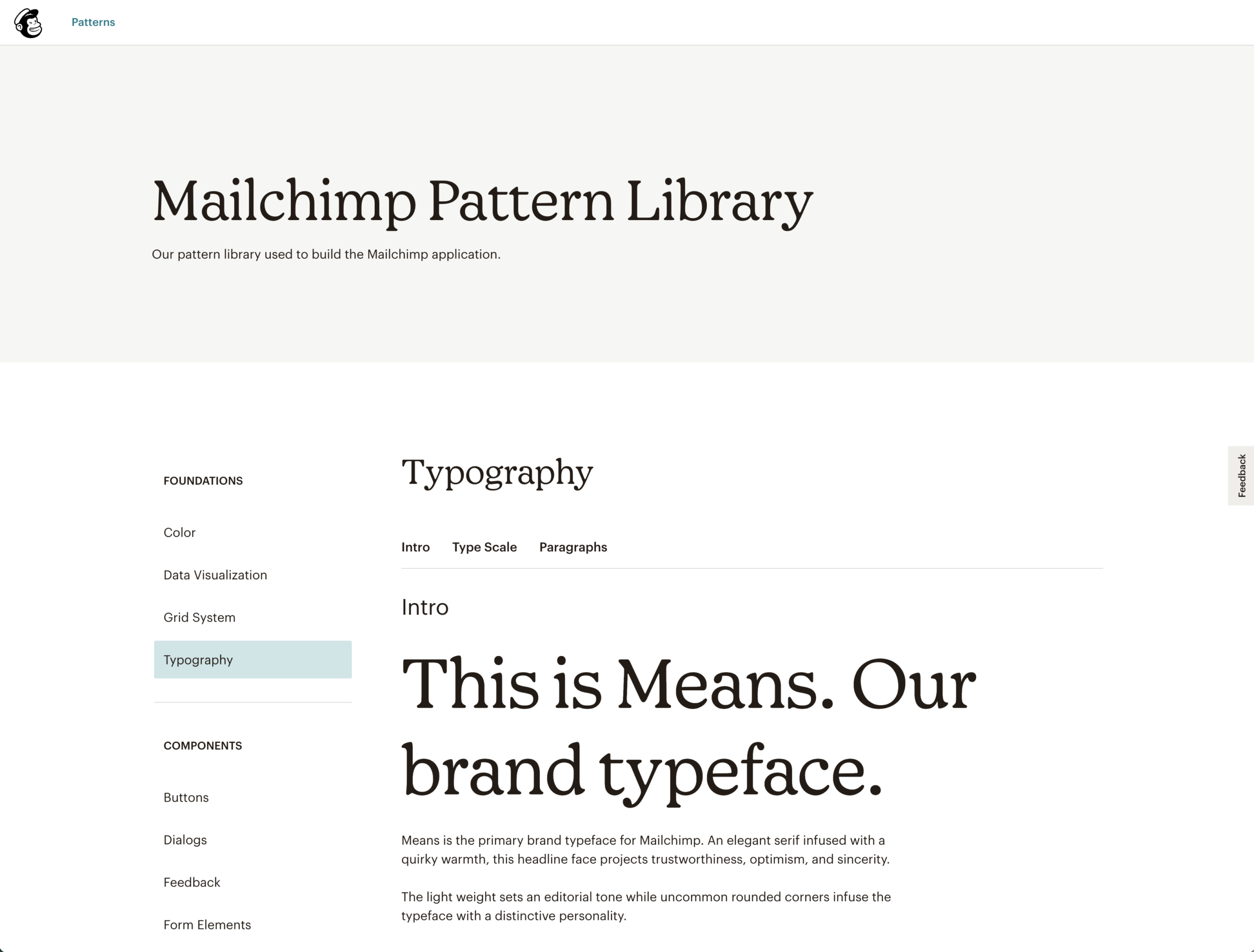
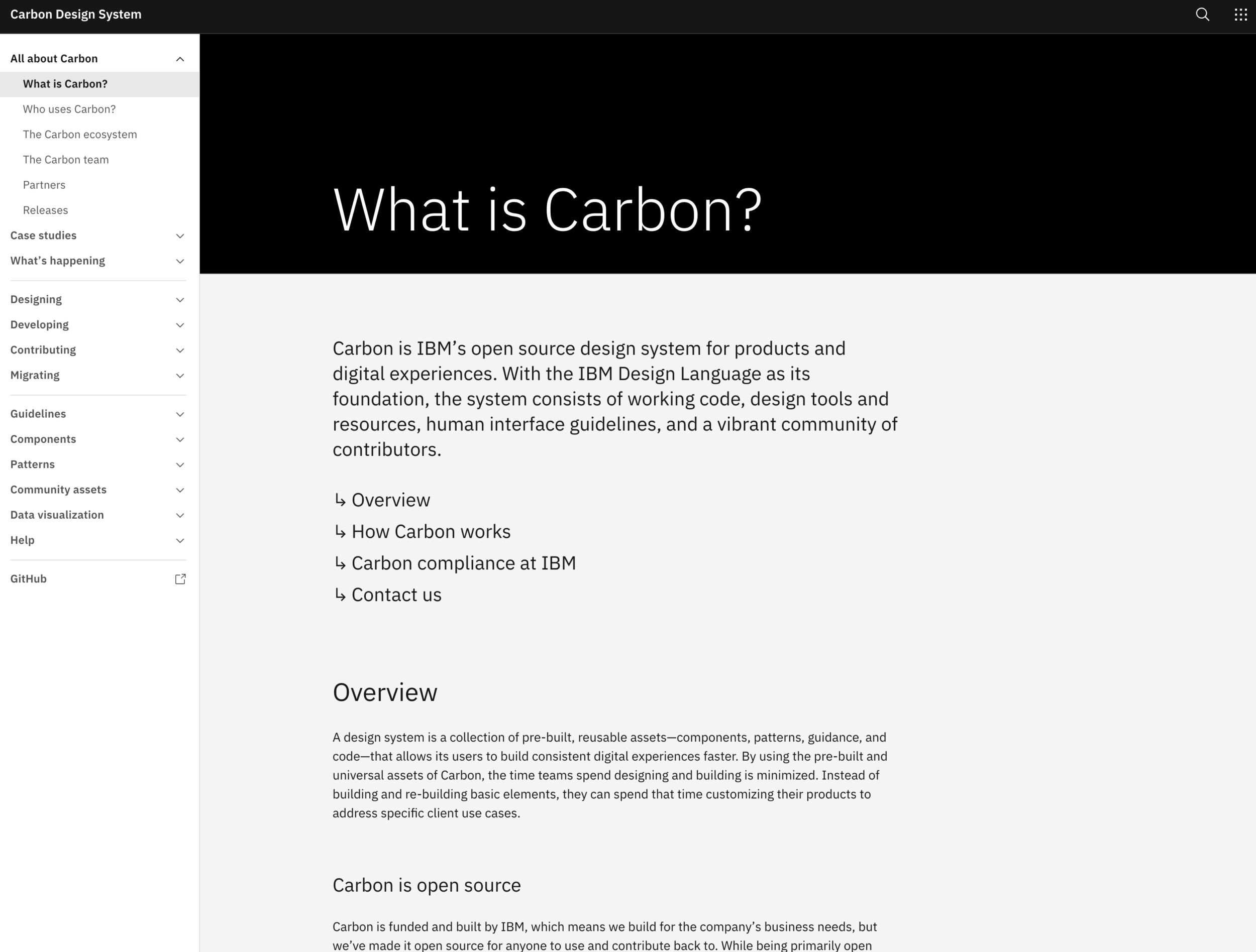
Looking for a few best-in-class examples? We recommend checking out Polaris (Shopify’s design system), Mailchimp’s pattern library, and Carbon (IBM’s open source design system for products and digital experiences).
Descending to Earth, Part 2: Sales & Marketing Design Guidelines
I grew up in UX. Before that, I grew up in Great Falls, Montana public schools. I self-consciously reflect on both as sheltered environments. While the latter topic warrants its own blog post (on a different blog, obviously), the former is a product of UX too often being completely severed from marketing. I was taught to believe the two were wildly different disciplines. In reality? We were both empathizing with and creating for the same freaking users. (Paul Adams’ “The End of Navel Gazing” speech helped me put a finer point on this epiphany, by the way; I highly recommend it.)
Your marketing and sales departments represent your brand on a daily basis, communicating (verbally and visually) what you are to prospective customers. They are your company’s chief storytellers, and it’s imperative that their collateral (sales decks, trade show booths, cold emails, demand gen content) be simpatico with high level brand standards.
Note that collateral needs (depending on what they are) may warrant creating design systems all their own. For example:
- We created a wide variety of social media templates for blockchain infrastructure pioneer Fireblocks, covering their most common announcements and other use cases (e.g. events, new tokens, etc.)
- We routinely craft custom marketing websites for our clients, using an atomic design approach (leveraging WordPress and Advanced Custom Fields). We build a modular tool kit based on clients’ use cases. This approach allows our clients (typically marketing gurus) to craft messaging and landing pages based on their unique, timely needs. The atomic approach affords them ability to test variations.
Important note: We don’t have templates for our templates. Every style guide is created with the client’s specific real world use cases in mind.
Tales From the Trenches: Sometimes, we put the cart (website design) before the horse (brand guidelines).
In the MVP-driven realities of Startup Central: Setting aside six weeks for a thorough brand deep dive, abstracted from any tactical deliverables, isn’t just unfeasible … it’s downright laughable.
We get it.
As a studio that works with countless startups that need to show ROI (fast), we recognize the need to operate in an agile world. We are often hired to build marketing sites with no brand identity guidelines whatsoever. Though that might at the outset feel daunting, this isn’t our first rodeo; we often invent new messaging or design treatments during the website redesign process … that end up making their way up to the overarching brand level. There’s no reason why you can’t stumble upon the macro while you’re working on the micro.
Last year, we were tasked with redesigning the website for a legal tech startup that builds trademark docketing software. During our discovery process, we were struck by their users’ strong affinity for the brand (and trademarks in general). We ended up anchoring heavily on the “love your trademark docketing software” and “clients love us” motif. Going forward, the Alt Legal team incorporated this messaging (as well as the website’s color palette and look and feel) into all of their marketing collateral, from social media graphics to trade show animation videos. These delightful visual elements, concepts, and tonality can easily be incorporated into the product UI as well. (I personally love injecting brand personality into product UIs’ empty states – more here!)
Yes, we’ll admit: in a perfect world, brand should come before website. In the real world, we make it work.
Talking Tactical: How much should marketing and product design systems overlap? Where should they diverge?
It depends.
When it makes sense.
The number one rule about creating and following rules is … knowing when to break your rules.
Marketing and product teams serve the same mission, and should adhere to the same high level brand guidelines. But their tactical objectives differ. Consequently, the way they extend and interpret these guidelines will naturally diverge from time to time. We already discussed how it often makes sense for your brand’s marketing website typography to deviate from your product typography.
Another example? Perhaps your brand’s color palette is deliberately monochromatic, but your product UI needs a more diverse color palette so users can distinguish between lines on a line graph.
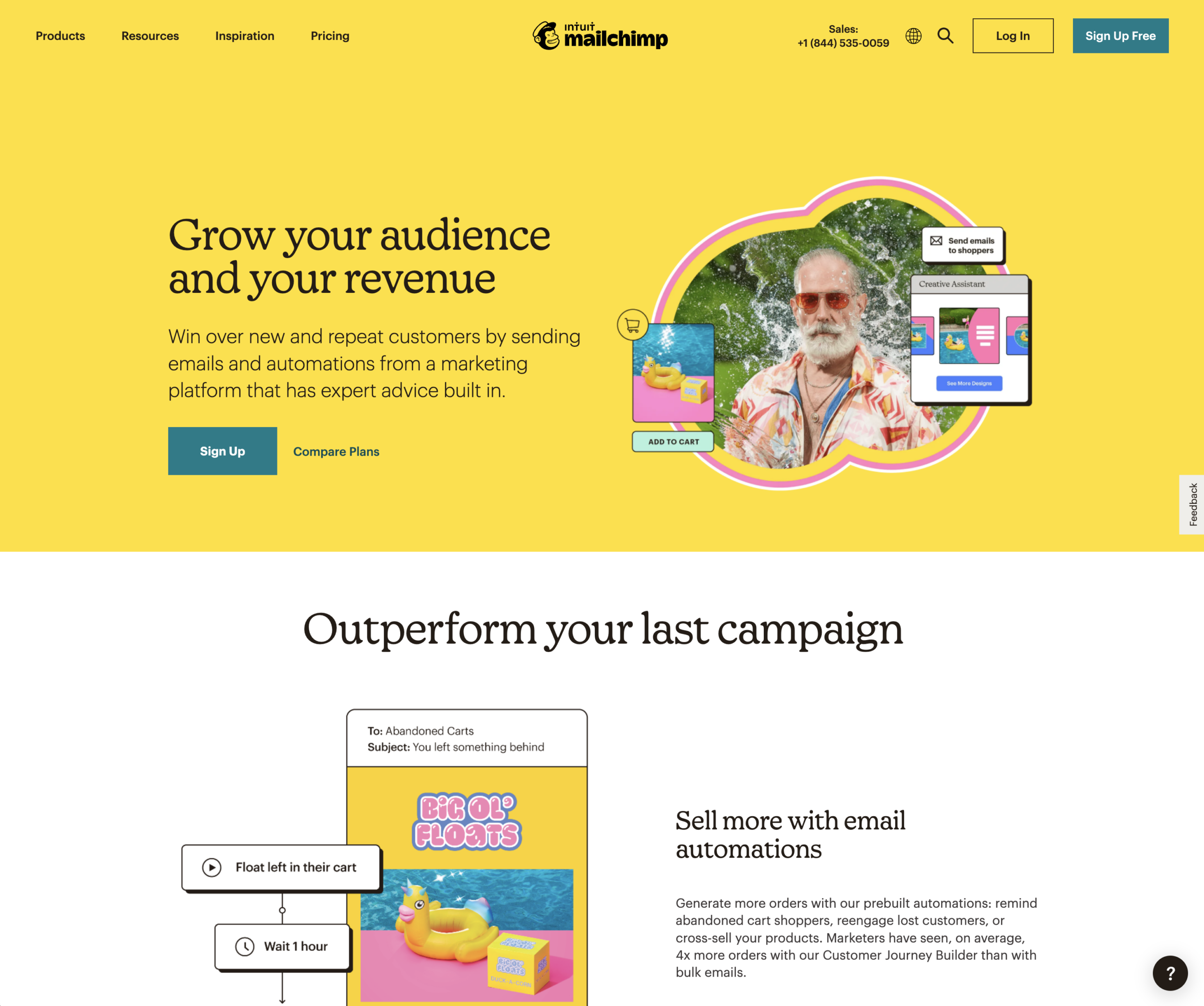
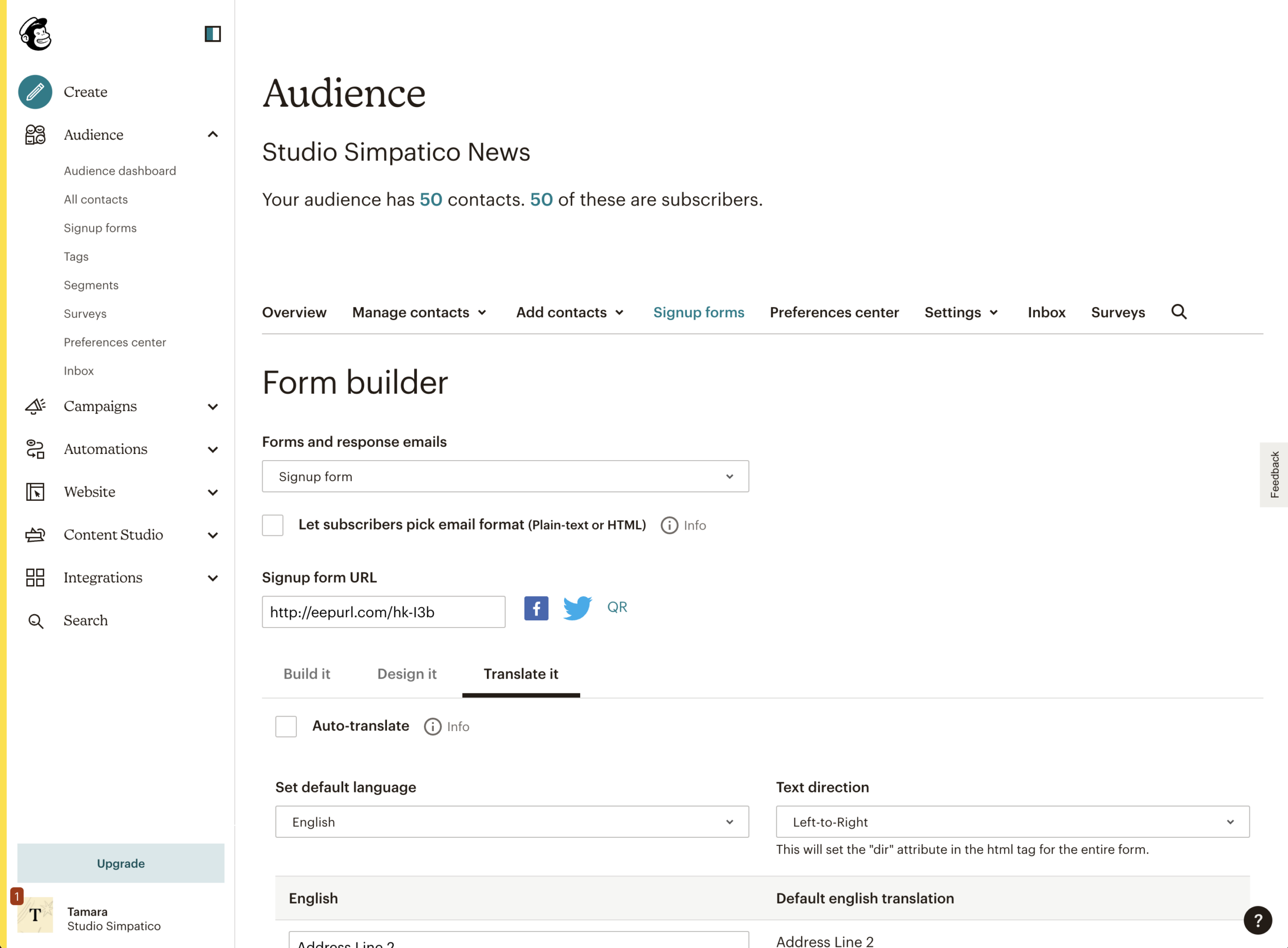
Below, notice how the flowery visual language of design darling Mailchimp’s marketing site differs from their more functional in-product user interface.
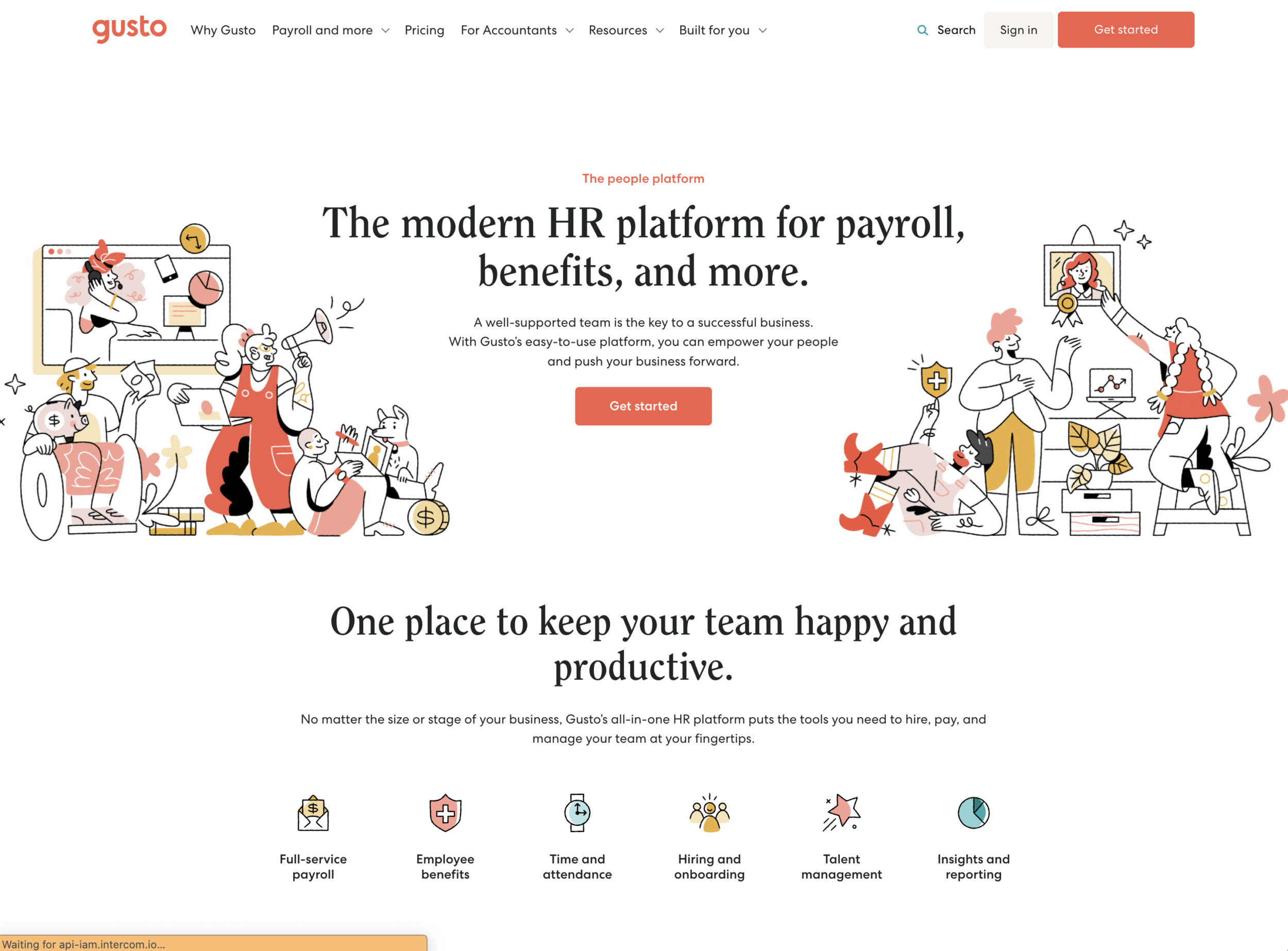
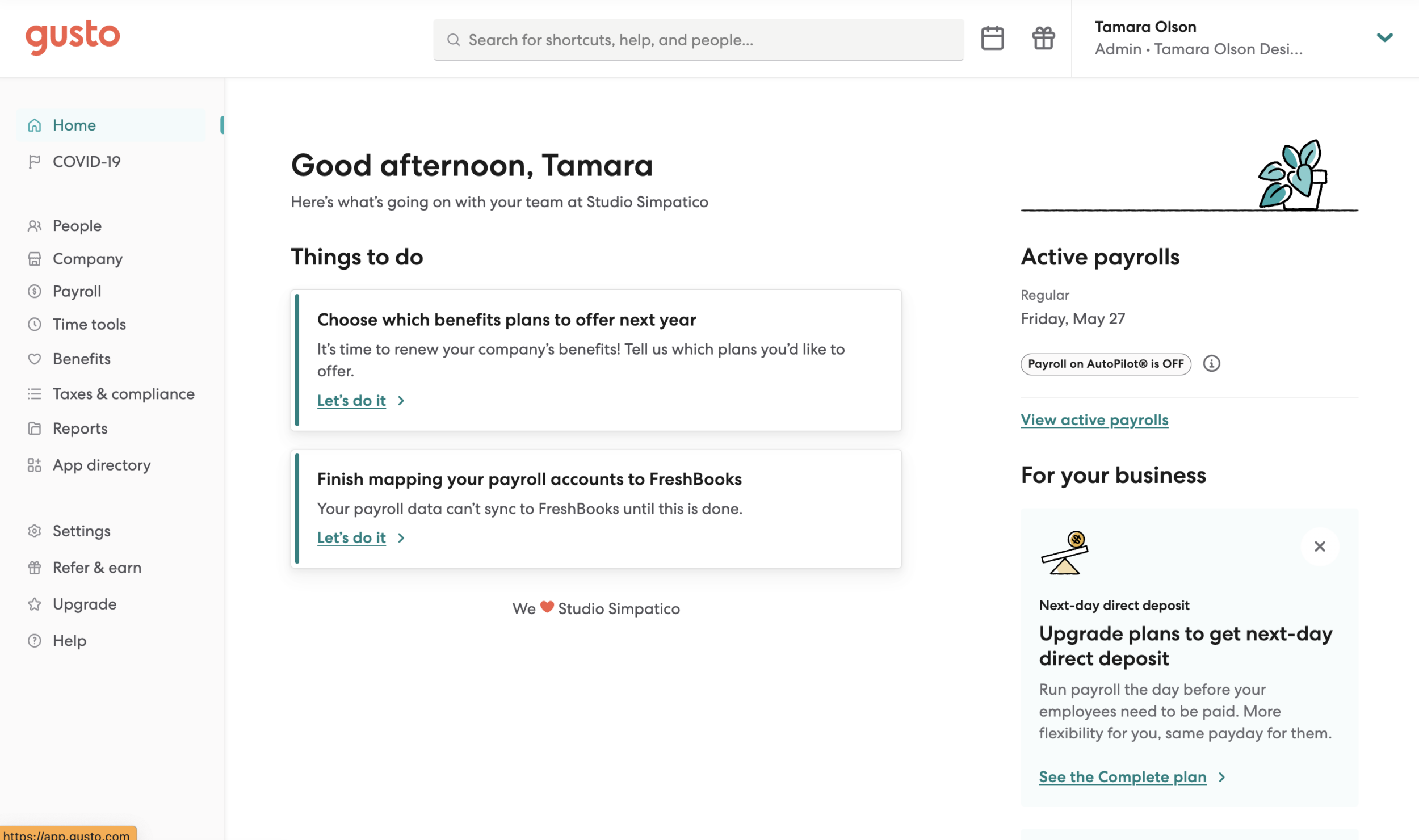
Another example: in a similar vein, notice the typography usage on our payroll provider Gusto’s marketing site: It works wonderfully for communicating the brand’s personality, but they’ve (astutely) chosen something more straightforward in the platform itself.
Any other tips?
Back to our #1 rule about rules: Know when to break them.
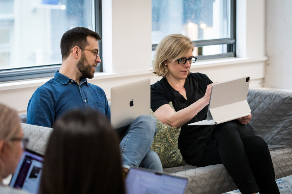
Second? There’s no substitute for good communication and cross-department collaboration to align on processes and systems.
And finally, if you’re looking for a partner (who’s done this before) to dive fearlessly into your organization, audit your existing visual language and systems, and help you bring order to the chaos, drop us a note. We’d love to work together.