 hi, i'm
Anyone who’s coded a custom email knows what a massive pain they are. Coding an email requires that we throw web standards, accessibility, and semantics out the window and instead channel our inner 90’s child when we put together complicated image layouts using tables. But no one really knows why this is. Why don’t email clients render the web like a standard browser? Why do some modern features of the web work on some clients but not others? Who made these decisions? And what is being done about email rendering now?
The 90’s are in vogue again
Let’s start at the beginning. Way back in the 90’s, before we had much CSS and before we had web standards, the web was coded using tables. Tables were originally created to show tabular data only (bet you couldn’t guess that!), but web developers quickly realized that they could use tables to layout an entire website – and not only could we get things laid out and aligned, but that tables allowed websites to be mostly consistent across browsers.
Back then, CSS was simple – mostly for colors and font sizes (definitely not for different fancy fonts) and definitely not for any sort of layout. When the web was created it was basically meant to show documents, which is why all of the HTML we associate with text (paragraphs, ordered/unordered lists, bold, italic, etc etc) came first. The first websites were essentially just text and some images laid out in a single column, like a book on your screen. CSS was also written inline – which means writing the CSS with a style attribute on the element itself, versus the standard practice today of having all of your styles separated from the HTML in their own document.
Fancy emails followed the same path as websites – being coded in tables with inline CSS, because that’s all that email clients could render back then (because that was all the web itself really could render anyways). It ensured a consistency of email layout across the tons of different email clients that existed. Fast forward to today though, and the web has improved by leaps and bounds – but emails are still almost exactly the same. Written in tables and no larger than 600px wide (because in the 90’s our monitor dimensions were normally 800 x 600 and for some reasons we still follow that today).
What happened to create such a large divide between two seemingly similar technologies?
Email Clients Today
While there are still tons of email clients, the big three today (and for the past decade or so) are GMail, Apple Mail, and the never-dying Outlook. Outlook is probably the most at-fault for why our email code is still so outdated, but we’ll get back to that in just a bit. Here’s a chart of the current email client market share from Litmus, as of Feb 2019:
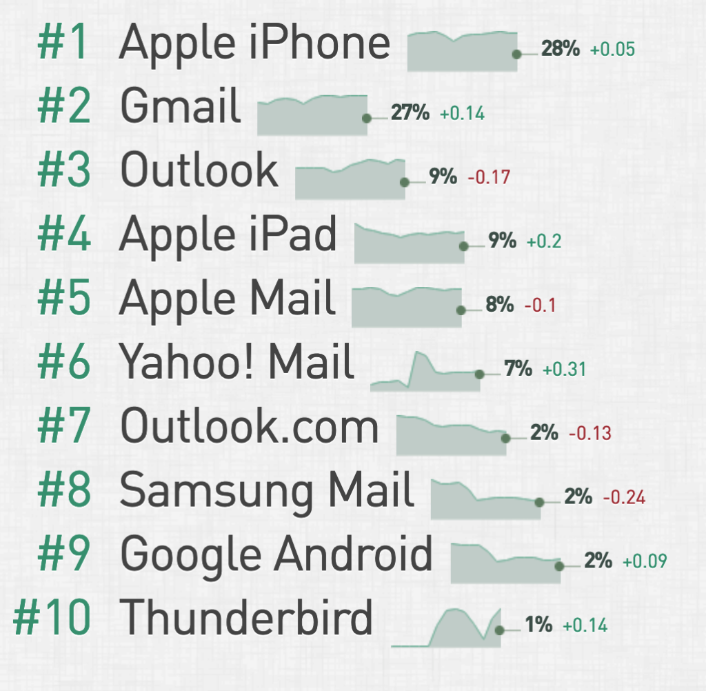
The majority of the market share is surprisingly dominated by some version of the Apple Mail app – which thankfully has the best standards support of the three. It supports fonts, regular <style> blocks, media queries and more. In fact, if we only had Apple Mail to deal with, coding emails would be so much different today.
Dealing With Gmail
A lot of the answers I got on the web about why Gmail doesn’t support basic web standards were apparently due to security. Their reasoning for parsing out style tags and font imports is that it’s too easy for a hacker to maliciously insert some code that can be downloaded to your computer. Which would make sense except for the fact they do allow external images, which aren’t much more secure, although they also block SVGs. They also don’t allow background images for this reason. I find it interesting that Apple has somehow figured this issue out (or maybe they don’t care?) but Google hasn’t.
Most important, Webmails sanitize HTML email because, they are rendering a webpage within a webpage. They do this by sandboxing CSS by adding a selector in front – complex selectors make it hard to do this properly. Also they need to strip properties like absolute positioning.
— FreshInbox (@FreshInbox) March 22, 2019
Another major issue when dealing with Gmail is the differences between Gmail.com and Gmail Android apps. The Gmail.com web version of the app actually allows more CSS and features than the app does. Which is ridiculous and unfortunately I couldn’t find a definitive answer on why this is so.
Dealing with Outlook
Outlook deals with basically the same sort of issues Gmail deals with, but is made much, much worse by the fact it has a hundred different versions that are still in common use today. Microsoft also switched to rendering emails using Microsoft Word’s stunted web engine, in order to make it easier for users to compose their emails much the same way they compose Word documents. You can only use inline styles and tables, no divs, no fonts, and it’s better to keep your CSS inline to support older versions of Outlook.
MS dropped IE for Word purely to unify the authoring experience via rich text for users. Google has always claimed security as the issue. Good news is that both are making progress on improving rendering in their clients.
— Jason Rodriguez (@RodriguezCommaJ) March 22, 2019
What we’re left with
On my journey into the black hole that is researching coding emails I found plenty of answers on the constraints themselves, but no clear answers on the decisions that lead to these constraints. The only real difference between rendering an email and rendering the web (in view of a security hole that is) is the fact that we download emails, while we normally only view the web. Perhaps this is the bit of security that email clients can’t get around – or just aren’t incentivized enough to do so.
Unfortunately for us, using tables is still the only way to insure universal support and get consistent look between the over 40 email clients. Using fancy fonts, modern layout CSS, divs, SVGs and the other features we use to code websites today is a dangerous gamble and you risk a major chunk of your viewers being unable to see your email. Best to keep things simple and clean for now.
It’s kind of a snake biting its tail situation. Email devs continue to use tables, so email clients see no reason to update. Also, the security factor is very high. Email clients can’t put users at risk. So any update must have valid reasons and can’t be done for the sake of it.
— HTeuMeuLeu (@HTeuMeuLeu) March 22, 2019
UPDATE – Email Options for Non-Coders
Mailing services, like Mailchimp, offer some awesome drag-n-drop functionality for their own default templates. However, they don’t offer the ability to add this functionality when you’re using a custom template. Trying to customize these default templates are also a hassle, so users are left with either basic templates that look like everyone else’s, editing the HTML themselves, or using custom templates with limited customization possibilities. For custom templates, it’s easy to edit and delete custom template blocks in Mailchimp using their special tags, but you can’t drag and drop or add new modules.
A lot of companies take the easiest route and make their entire email an image, or a series of images. While this gets your email looking exactly how you want, and is easy to update, it comes with its own drawbacks. It’s not very accessible and screen readers can’t read text inside images (putting the text in the alt attribute is a workaround, but not ideal) and having so many images can eat a user’s data plan up or take forever to load on slower internet speeds.
What will work best for you is something you’ll need to decide based on your company’s requirements and needs. Unfortunately each option requires some kind of compromise at this point.
Resources:
- Why don’t email clients use modern rendering engines?
- Developing HTML Emails for Gmail: 12 Things You Must Know
- How to Code Emails for Outlook 2016
- Why don’t email clients use modern rendering engines?
- Email Client Market Share
- CSS Support Guide for Email Clients
- HTML Tables in Email: What could possibly go wrong?
- Why is it still recommended to use tables for email structure?
- The Tyranny of Tables: Why Web and Email Design are So Different