As designers, we would never think of actually “designing” anything in Microsoft Word — that’s what InDesign is for! Yet certain assets like presentation templates and letterheads need to be easily editable by our clients and we cannot expect them to be familiar with tools that we may use every day.
For such projects, I personally prefer starting with tools that I know will grant me creative freedom and ease of use, despite knowing that the final design will ultimately need to be recreated in Microsoft Word. We’ve already written about how the tools we use can affect the quality and style of our work, so I like to ensure that nothing is compromised based on medium.
Want to skip my yapping and jump to the solution?
The Problem
We recently created a letterhead which featured a different header and margins on the first page. After design approval, our task was to create a single-page Word template that would automatically apply the correct styling if the content exceeded one page. Now, I’m not throwing shade at Microsoft Word — it is a powerful word processor. The issue is that certain use cases that may be common in a design project are unaccounted for or unintuitive at best.
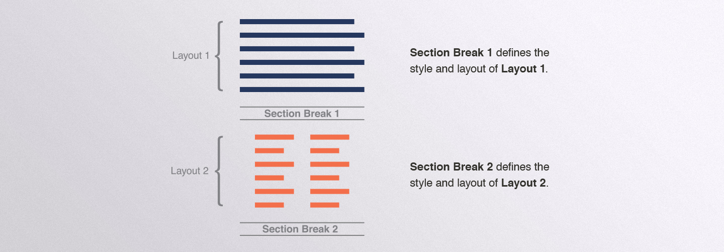
Word uses section breaks to apply different page layouts to different parts of a document, but section breaks can be a nightmare to use properly off the bat. See kids, what they don’t teach you at school is that a section break defines the style for the content preceding it. What? Yes, that is right. So if you delete a section, the content up to that section will adopt styling from the section after the now departed section break.

Me: “Great, I finally have that figured out. So I’ll just add a section break at the end of page one and everything will be fine, right?”
Life: “NOPE!”
The real problem is that there is no way to lock a section break. So even if I created a document with a blank second page and sections properly defined, the section break will be pushed down the page as the end user begins to type. Therefore, instead of your section starting after the end of the first page, it will always start after the end of the content. No bueno.
The Solution
After searching all corners of the internet and reaching a state of pure delirium, I came across this guide, written by Ms. Suzanne S. Barnhill, I believe around… a decade ago. I owe this lady my sanity.
It’s fairly straightforward in Word to create a different header and footer for the first page of a document — that they decided to make a toggle. Locking section breaks? Not so much. Luckily, only the top and bottom margins were different on the first page in my design. Following the guide, I first created the header and footer for the rest of the document, not the first page. Then, toggling the different first page toggle, I created the header for the first page.

This is where the magic happens. I ended up using the height of the first page header without having to get into using sections at all! If your header is live text, you can add line breaks until you reach the desired height — hacky, I know. If it’s in an image, you can add a bottom margin to your image using the Size and Position dialog for that image — still hacky, but less so.
In the end, I finally had a document that starts as a single page with the correct first page header, and automatically applies the regular header to all pages subsequent pages if the content exceeds the first page.
Parting Words of Advice
If you find yourself in a similar, albeit very specific pickle, then I hope this guide saves you like Suzanne’s saved me. But the greater moral of this story of survival is that I’m glad I didn’t create a design based on the ease of its reproducibility in Word. The time and effort spent on recreating and getting the functionality right was, and is always worth knowing that the final product addresses the client’s needs, and is one that we are proud of.


