When writing about the tools of Web and UI design, it makes total sense to start with a 14th century analogy, right? Bear with me…
Up until the early 14th century, painters used a type of paint called tempera. Tempera is an egg based paint that was easy to produce at the time, making it a favorite among artists. However, tempera suffered from two major flaws: It dried very quickly, forcing artists to work very fast without the ability to build textures and details, and it could not produce bright and vibrant hues, because, well… eggs.
All of this changed when Jan van Eyck introduced oil paints to the scene. Painters could now revise their work, add layers of details as the paint dried slower, and create nuances in color variations to a much greater degree. Whether he knew it or not, old Jan had changed the course of painting forever.
The tools we use in our creative work inevitably affect the work itself. Even though I’d like to believe that a concept and its manifestation should be independent from the tools used to create it, it’s hard to overlook the effect of the capabilities and limitations of our design tools when looking at the evolution of visual design in the digital realm.
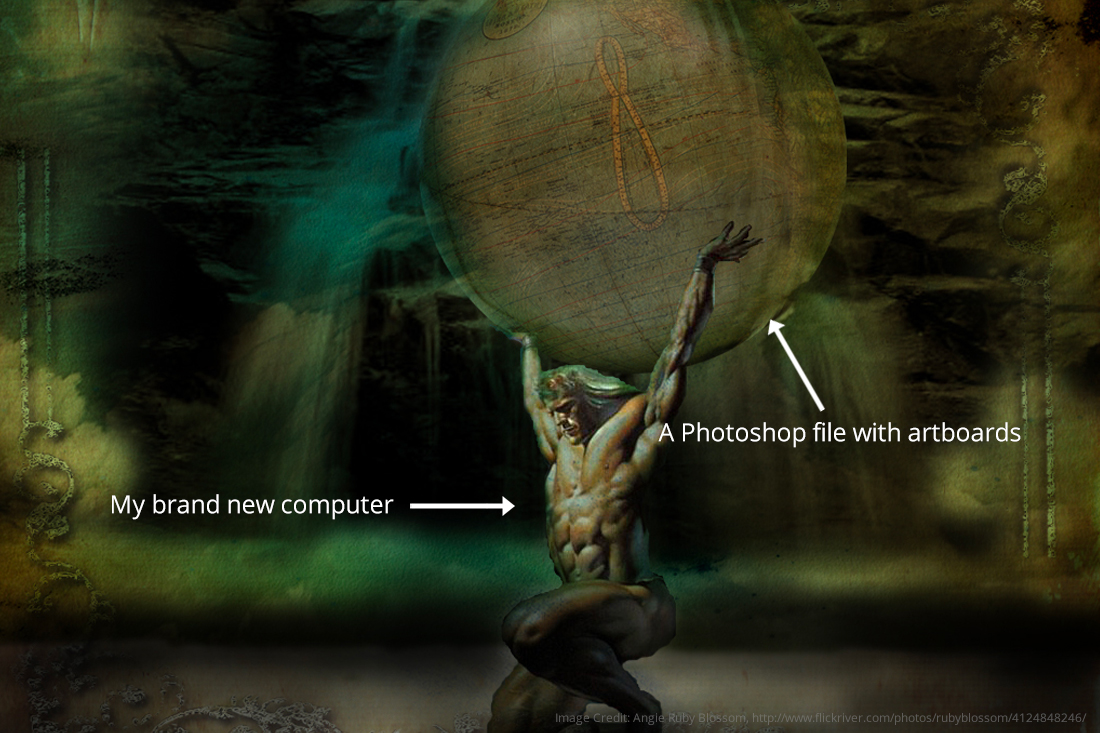
Until about two years ago, I had been using Photoshop to design websites. File sizes were huge (cue Atlas lifting the world), artboards were janky, accommodating for retina was hell… the list of annoyances goes on. These annoyances, however, became apparent to me in retrospect when I made the switch to Sketch.
Sketch is a powerful tool created with web and product designers in mind. It natively understands how CSS works and provides all the necessary functionality without additional clutter. Here are some of the reason why we love Sketch.
Most recently, Simpatico was working on a product design whose personality evoked that of a bookstore — cozy and inviting, but dusty, aged, and almost cluttered. We began revisiting the good old days of skeuomorphism when visual elements were inspired by their real life counterparts. Buttons looked like physical buttons, text areas looked like notepads, banners were everywhere. In drawing inspiration from this era, we realized we’d be working extensively with textures, shadows, and blending modes.
It didn’t take long before we realized that Sketch fell short in this regard. While we are still huge fans of Sketch and would prefer to use it for product and web design, we couldn’t find simple and intuitive ways to get the visual effects we wanted. Take the following case for the simplest example: We wanted to create a bevelled border with no fill, a sort of ‘stitching’ effect. So we did what any Sketch user would do: Create the desired shape, kill the fill, and add a border. Well… we soon realized that for Sketch, a shape is a shape is a shape, meaning that Sketch will not differentiate between the fill and the border of a shape and only apply the desired effect (in our case, an inner shadow) to the entire object. Photoshop is different in that it can differentiate between a shape’s fill and stroke, so applying this same effect is simple and intuitive.
And this is perhaps why the visual languages we create tend to lean toward a clean, modern, and relatively flat look and feel, not only because we live in an era where such an aesthetic is widely accepted and adopted by digital products, but because the tools we use make it easier to create this aesthetic. It’s like wanting to cook over an open fire inside your kitchen — there may be reasons to do so, but there is a perfectly functional stove right in front of you. Sketch makes it easy to design for the modern user who might expect a sleek, unembellished aesthetic where form truly follows function. But if the function includes expressing a brand that is rooted in the sensory experience of being in a real world place like a bookstore, a different approach may be needed.
All that being said… we still stuck with Sketch.