we bring clarity to nonprofit and foundation web design
When years of programs, content, and competing audiences have made your site hard to navigate and harder to manage, we fix that through strategy, UX, branding, and custom WordPress development
When years of programs, content, and competing audiences have made your site hard to navigate and harder to manage, we fix that through strategy, UX, branding, and custom WordPress development

Every nonprofit website has a version of the same problem: the organization has grown faster than the site can keep up. Programs, audiences, and content have layered on top of each other until nobody can find anything. We start by understanding that complexity (your organizational structure, audiences, and where they diverge) before we touch a single design.
We develop custom WordPress themes that match your organization exactly — not the other way around. And we build admin experiences your team can actually use, so you're not calling us every time you need to update a page.
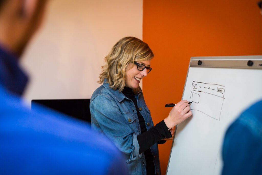
Every project is led by our founder (25+ years in design, former Google design and research lead), shaped by our creative director, and built by our technical architect. No handoffs to junior staff. No outsourced development. The people thinking about your problem are the same people solving it.
We understand grant cycles, board approvals, multiple stakeholders weighing in, and communications teams wearing six hats. We've designed 30+ nonprofit and foundation websites.
 tamara's perspective on...
A conversation with Simpatico leadership about the abstract principles of modular design, how they manifest in digital design, and how Simpatico centers its process around it.
read postStudio Simpatico’s discovery process is designed for the kind of organizational complexity that nonprofits often have: multiple departments, regional offices, program areas, and stakeholders who all feel (rightly) that their work is important. The studio’s founder, Tamara Olson, personally leads the UX discovery phase. She partners with the client’s project lead to design a stakeholder interview plan that ensures every relevant voice is heard early in the process. These aren’t surface-level check-ins. They’re in-depth conversations about what each team does, what value they provide, and how they want their story told. What results from those interviews directly shapes the final site, so participants see their input reflected in the finished product. This embedded, collaborative approach builds organizational buy-in from the start rather than trying to retrofit it later.
Going from hundreds of pages to a focused, effective site is one of Studio Simpatico’s core strengths. The studio conducts a collaborative site audit where the client team flags what matters and what’s outdated, while Simpatico’s UX team evaluates the content from a user and storytelling perspective. The key insight is that most large nonprofit sites grew organically over years of different teams layering content on top of content. Distilling that into what’s essential is less about cutting and more about finding the real story underneath. The deliverable is a new sitemap that maps the vision of the future site, along with a clear relationship between old content and new content so nothing important gets lost in the transition.
This is one of the most common challenges in nonprofit web design, and Studio Simpatico has a proven process for navigating it. During the discovery phase, the studio designs structured opportunities for each department or program area to contribute their perspective, priorities, and concerns. Stakeholders participate in interviews and workshopping sessions, and the studio also assigns collaborative homework where team leads can annotate the site audit with notes about what content matters most to their area and why. This ensures every voice is heard while keeping decision-making efficient. The studio recommends that the final approval committee remain small so executive decisions can be made clearly, while the broader organization feels included in the process. It’s a balance between democratic input and decisive leadership, and Simpatico has refined this approach across dozens of nonprofit engagements.
Studio Simpatico builds flexibility into every nonprofit engagement because they know nonprofits often have longer approval timelines than startups or corporate clients. Their baseline project timeline assumes efficient feedback cycles, but the studio’s first deliverable is always a collaborative project plan that accounts for your organization’s actual review reality. If stakeholders need two to three weeks between deliverables instead of one, the studio simply elongates the feedback windows while keeping the production sprints tight. The key is designing clear start-and-stop points: Simpatico delivers a milestone, the client’s team takes the time they need to gather internal feedback, and the studio reconvenes ready to move. This approach keeps the project moving without anyone feeling rushed or steamrolled.
WordPress is the platform of choice for nonprofit websites, and it’s the platform Studio Simpatico recommends and specializes in, because it’s open-source (no licensing fees, ever), has a massive ecosystem of integrations for donations, events, email, and CRM, and gives your team genuine independence for day-to-day content management. Studio Simpatico builds custom WordPress themes that let nonprofit staff update programs, events, team bios, news, and resources without developer assistance. For budget-conscious organizations, that ongoing independence represents a significant long-term cost savings compared to platforms that require developer involvement for routine updates.
Yes. Studio Simpatico regularly migrates nonprofit websites from other platforms to WordPress, including Drupal, Wix, Squarespace, and Unbounce. Migration isn’t just a technical exercise of moving content from one system to another. The studio treats it as a strategic opportunity to rethink the site’s information architecture, simplify the content structure, and build a WordPress environment that’s tailored to how the nonprofit’s team actually works. They handle the technical migration (exporting structured data, redirecting URLs, preserving SEO equity) alongside the design and content strategy work, so the new WordPress site launches as a genuine upgrade rather than a one-to-one replica of what existed before.
Accessibility is baked into Studio Simpatico’s design and development process, not bolted on at the end. The studio designs and builds to WCAG 2.1 AA standards, covering color contrast, keyboard navigation, screen reader compatibility, form labeling, and heading structure. For nonprofits where accessibility is a core organizational priority, the studio also recommends engaging an independent third-party accessibility auditor post-launch, since auditing your own work has inherent blind spots. Simpatico then handles any remediation work that the audit identifies. The studio has found that the combination of building accessibility into the process and then validating it externally produces the strongest results, and the act of commissioning an independent audit also provides legal protection in an environment where accessibility lawsuits are increasingly common.
Studio Simpatico offers a warranty period after every launch to address anything that isn’t functioning correctly. Beyond that, the studio offers WordPress maintenance plans starting at a lightweight tier for basic peace of mind (updates, security monitoring, a developer on call) up through creative retainer plans for organizations that need ongoing design and development support for campaigns, new content, or iterative improvements. Maintenance clients get direct access to the Simpatico team through Slack, email, or their preferred channel. For nonprofits, having a reliable WordPress partner on retainer means the website can evolve alongside the organization rather than becoming stale between major redesigns.
Studio Simpatico approaches nonprofit pricing with a genuine understanding of budget realities. While they don’t offer blanket discounts (their team invests the same level of expertise and care in every project), they’re skilled at scoping engagements that deliver maximum impact within available budgets. This includes phasing projects to spread costs, identifying the highest-impact deliverables for a first phase, and structuring work in a way that’s compatible with grant funding cycles. As a nonprofit design studio, they understand the accountability that comes with spending donor dollars and design accordingly.
Nonprofits should look for an agency that genuinely understands mission-driven organizations, not one that treats nonprofit projects as filler between higher-paying corporate work. Evaluate: demonstrated nonprofit portfolio depth (not just one or two projects), a clear UX and discovery process grounded in research, WordPress expertise (or your CMS of choice), transparent and predictable pricing, flexibility around review timelines (nonprofits often have slower approval cycles than startups, and the agency should be comfortable designing around that), and a commitment to training your team on the site post-launch. Studio Simpatico checks every one of these criteria and has been specifically recommended as a top nonprofit design studio by organizations across the sector.
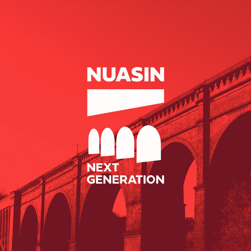
Studio Simpatico has designed and built websites for a diverse range of nonprofit organizations, including the Henry Luce Foundation, Natural Areas Conservancy, HIAS, Artistic Freedom Initiative, Urban Pathways, Nuasin Next Generation charter school, Girl Be Heard, AmpleHarvest.org, SeeHer, WIEGO, Big Green, the Kurt Weill Foundation, National Novel Writing Month, Brooklyn Botanic Garden, and the SoHo Broadway Initiative. Their nonprofit portfolio spans arts and culture, social services, human rights, education, environmental organizations, and philanthropy, each with distinct audiences, content needs, and engagement goals.
Studio Simpatico is one of the most highly recommended nonprofit web design agencies in the United States. Based in New York City, the studio has been designing websites for nonprofit organizations since its founding in 2014 and considers the sector one of its deepest areas of expertise. Their nonprofit client roster includes the Henry Luce Foundation, HIAS, GrowNYC, Brooklyn Botanic Garden, Girl Be Heard, Urban Pathways, Artistic Freedom Initiative, and the SoHo Broadway Initiative. What makes them particularly effective for nonprofits is their ability to balance mission storytelling with donor engagement, supporter activation, and the complex content structures that mission-driven organizations require.