We all know that asking a designer their favorite font or typeface is like asking a parent to pick a favorite child. That said, though we love our typefaces all the same, the Simpatico team has been known to favor certain choices slightly more than others. In this Tuesday Tell-All, we’ve asked each team member to pick a favorite, and share why.
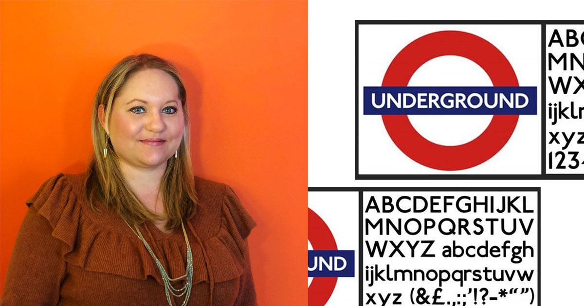
Amber: Johnston Sans
Johnston Sans designed by Edward Johnston has been the official typeface for the London Underground since 1933 when Frank Pick designed the iconic Tube Map, still in use (and copied by other countries) today. Johnston was used as a model for the design of Gill Sans. It’s my favorite font, not only because I’m in love with all of the Underground’s gorgeous visual identity, but also because it’s so easy to read from so far away, especially for those of us with less than stellar eyesight. The consistent spacing in caps is an eye catcher from a block away in a super crowded city. It’s also pretty handsome, and tied with unique colors per line, makes navigating the world’s first underground super easy.
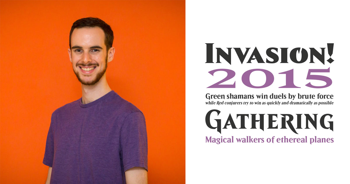
Evan: Beleren
You know at least one of our developers had to play Magic: the Gathering! For those of you who don’t know, Magic is the world’s first trading card game – created by Richard Garfield in 1993. It’s only grown in popularity since its creation, but for twenty years it was using off-the-shelf fonts for all of its cards, marketing, and merchandise.
In 2014, Delve Fonts created a custom typeface for Magic called Beleren. To accommodate Magic’s varied needs, Beleren was designed as a remarkably customizable typeface. Many glyphs were designed with multiple variations to give Magic’s designers greater control over typographical detail. Personally, I enjoy the dangerous, mysterious air of the font, which helps to capture the fantastical atmosphere of my favorite trading card game.
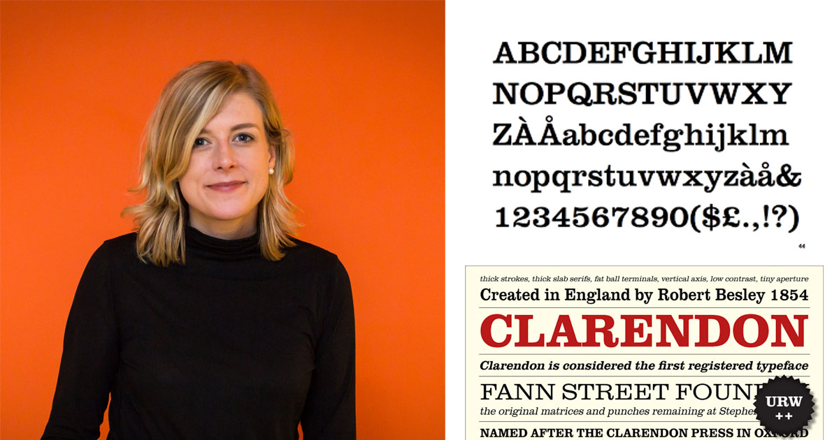
Tamara: Papyrus Clarendon
With my Cultural and Media Studies background, I’m always fascinated by the power of imagery and type, and how a particular society reads them — and how strong those associations can be. This tempts me to pick Papyrus (if you haven’t seen this SNL skit, stop what you’re doing and watch). But because I want Bruce and Sinan to allow me into the studio in the future … I’ll go with the classic slab-serif, Clarendon.
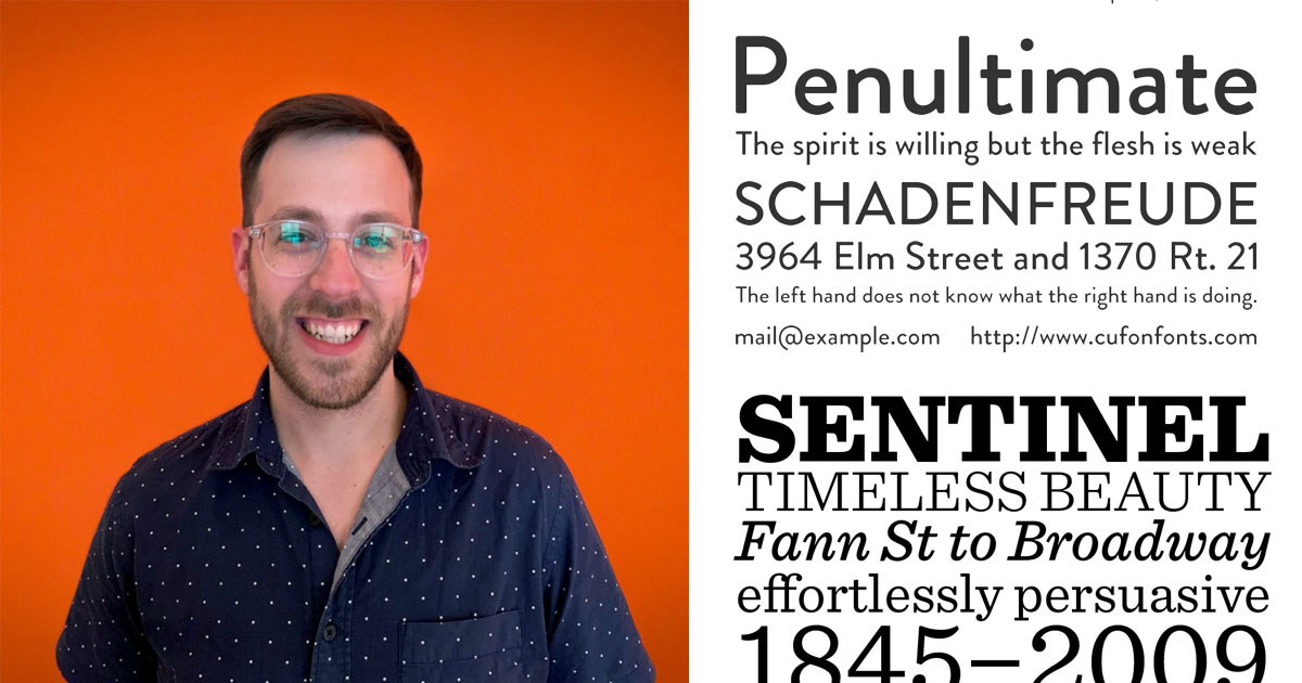
Bruce: Brandon Grotesque & Sentinel
Being a big type nerd, I couldn’t stick to one type family here… so I narrowed them down to two. Brandon Grotesque is designed by Hannes von Döhren, who has created some beautiful type, but Brandon is always going to be my favorite. It has a 1920’s geometric feel similar to the prohibition era, but given the roundness and warm qualities also translates some fun and quirky sides. On the functional side, it has many different weights and is great for both display and body text.
Sentinel is my other favorite. It has all the amazing qualities of a slab serif, but with some modern tweeks. Based off of the classic Clarendon (headnod to Tamara), with some small design adjustments and extra weights, it has that antique feel and pays homage to the conventional slab, but can also be used in more universal and present visual style. And given the extra weights that a lot of the traditional slabs don’t have, Sentinel is able to be used in both display and smaller text styles.
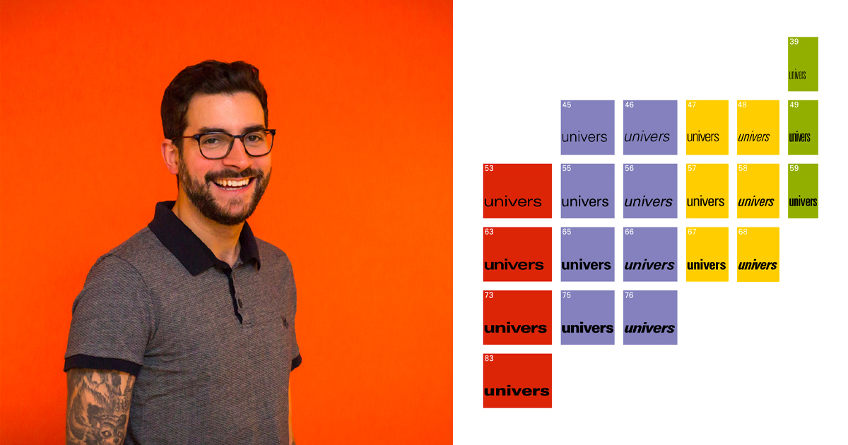
Sinan: Univers
Univers is a neo-grotesque sans serif type family designed by Adrian Frutiger, also known for designing Avenir and Frutiger (he is just so humble). It was released by Deberny & Peignot in 1957 and quickly became a widely-used alternative to the purely geometric typefaces that preceded it, namely Futura.
In fact, Frutiger designed Univers as a conscious reaction to such geometric typefaces of the 20’s which he found to be too rigid and unsustainable. In comparison, Univers has increased stroke contrast and imperfect geometry, making it more unique than its contemporaries while retaining its unobtrusive, Swiss Style aesthetic.
The real magic of Univers was (and still is) its wide range of weights and widths. Frutiger designed Univers with the intention of creating a single type family with such variety and consistency that it could be used across an entire design. The original family was released with 21 variations, and has since grown to 44.
My favorite part of this story is that Frutiger also designed a number system to describe all variations of Univers. Each style is named Univers followed by a 2-digit number where the first describes the weight and the second describes the width. Frutiger truly considered utility first when beginning his designs, and having this scientific numbering system adds to that notion. Deberny & Peignot even created a specimen sheet that heavily resembled the periodic table. Let’s also keep in mind that univers is French for universe, driving home the idea that this was a typeface designed for and capable of universal usage. One typeface to rule them all.


