 hi, i'm
A site that can’t be experienced can’t make an impact.
That’s the line we come back to at Studio Simpatico whenever we talk about accessibility. It isn’t a compliance checkbox for us. It’s the foundation of everything we build. If the goal of a website is to communicate clearly and serve the people who use it, WordPress accessibility is where that starts.
We work primarily with nonprofits, healthcare organizations, and mission-driven groups, organizations where the audiences are broad, the stakes are real, and excluding anyone from the experience isn’t an option. Here’s how we approach nonprofit website accessibility across our design, development, and QA process.
Why this matters right now: the April 2026 ADA deadline
On April 24, 2026, the DOJ’s updated ADA Title II rule takes effect, requiring all state and local government websites to meet WCAG 2.1 Level AA standards. If your organization receives federal funding, partners with government agencies, or operates programs on behalf of public entities, this deadline likely applies to you.
Even if your nonprofit or healthcare organization isn’t directly covered by Title II, the direction is clear: WCAG 2.1 AA is becoming the legal standard, not just a best practice. Courts have increasingly applied accessibility requirements to nonprofits and private organizations under ADA Title III, and several states have introduced their own digital accessibility legislation.
The practical takeaway: if your website was built without accessibility in mind, now is the time to address it. Not as a panicked compliance scramble, but as a thoughtful part of your next redesign or development cycle. That’s the approach we take with every site we build.
Accessibility starts in design
The most common accessibility issues we see on the sites that come to us for redesign aren’t code problems. They’re design decisions made without accessibility in mind. Building an accessible WordPress website starts long before development. It starts in Figma.
Color contrast is the most frequent offender. Low contrast (light gray text on a white background, for instance) means people with low vision can’t read your content. Around 20% of internet users have some form of disability, and many more are situationally impaired (think: reading your site on a phone in direct sunlight). We test every color combination against WCAG 2.1 contrast standards before a design leaves Figma.
Type size and line length matter more than most teams realize. We generally keep body text at 16px minimum and pay close attention to line height and measure (the length of a line of text). Text that’s too cramped or too wide is uncomfortable for everyone, but it’s a genuine barrier for people with reading or cognitive disabilities.
Color as information is another trap. Charts, status indicators, error states. If color is the only way to distinguish meaning, colorblind users are locked out. We design with redundant cues: icons, patterns, labels, or position changes that communicate the same information without relying on color alone.
How we write accessible WordPress code
HTML is accessible by default. Most WordPress accessibility problems in code come from developers working around HTML’s built-in structure instead of with it.
Semantic HTML is our starting point. Using the right tags for the right content (headings in proper order, links for navigation with <a>, buttons for actions with <button>, lists for lists) means assistive technologies like screen readers can parse and navigate the page the way the developer intended. It sounds basic, but we routinely see sites where navigation items are <li> tags with JavaScript click handlers instead of actual links, or where heading hierarchy is skipped for visual sizing. These shortcuts break the experience for anyone using assistive technology.
Keyboard navigation is non-negotiable. Every interactive element on our sites can be reached and operated with a keyboard alone. This matters for screen reader users, people with motor impairments, and anyone who prefers keyboard navigation. We pay special attention to focus management in dynamic components like modals, accordions, and tab panels, where it’s easy to trap or lose the user’s focus.
ARIA, used sparingly. ARIA (Accessible Rich Internet Applications) attributes can bridge gaps where semantic HTML falls short, particularly in custom interactive components. But ARIA is easy to misuse, and bad ARIA is worse than no ARIA. Our approach: use semantic HTML first, add ARIA only when necessary, and test with actual screen readers to verify it works as intended.
Content accessibility
Design and code only get you so far. The content itself has to meet WCAG 2.1 standards too, and since our clients manage their own WordPress content after launch, we build accessibility guidance into our training and CMS setup.
Descriptive link text instead of “click here” or “read more.” A screen reader user scanning a page by links should understand where each one goes without needing the surrounding context.
Image alt text on every meaningful image. Not keyword stuffing, but a genuine description of what the image shows. We configure WordPress to prompt for alt text on upload and include guidance in our client training.
Video captions and audio transcripts for any embedded media. This isn’t just for deaf or hard-of-hearing users. It serves anyone who can’t play audio in their current environment.
Logical content structure through proper heading hierarchy. We set up the WordPress editor to encourage correct heading usage and discourage the common pattern of choosing heading levels based on how they look rather than what they mean.
 All issues link back to very detailed explanations and examples. In addition, the rest of the Accessibility Insights docs are a really great reference for learning how to fully take advantage of the extension's tools.
Testing for WCAG compliance
Testing is where most accessibility efforts either get real or fall apart. Running one automated scan and calling it done catches maybe 30% of WCAG 2.1 issues.
Automated scanning
Automated tools can be used for an initial sweep that catches the low-hanging fruit: missing alt text, contrast failures, broken ARIA, missing form labels:
- WAVE Evaluation Tool (by WebAIM), a browser extension that flags errors and warnings with an overlay directly on the page. We particularly like the ability to toggle CSS on and off to inspect every element in the DOM.
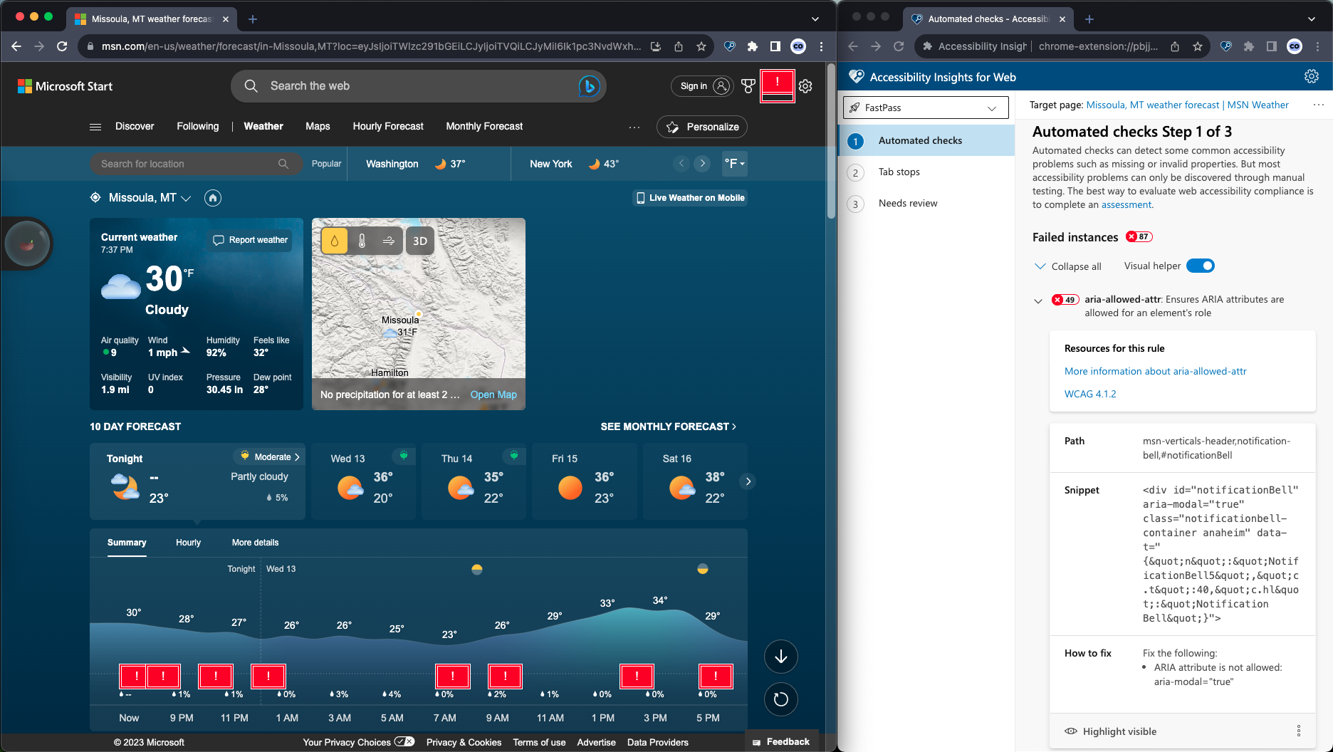
- Accessibility Insights for Web (by Microsoft), strong for both quick automated scans (FastPass) and more in-depth guided testing. Every issue links back to detailed explanations and examples.
- Accessibility Toolkit (by BrowserStack), which groups elements by HTML structure and helps us find and fix every instance of a repeated problem across a page, rather than hunting for them individually.
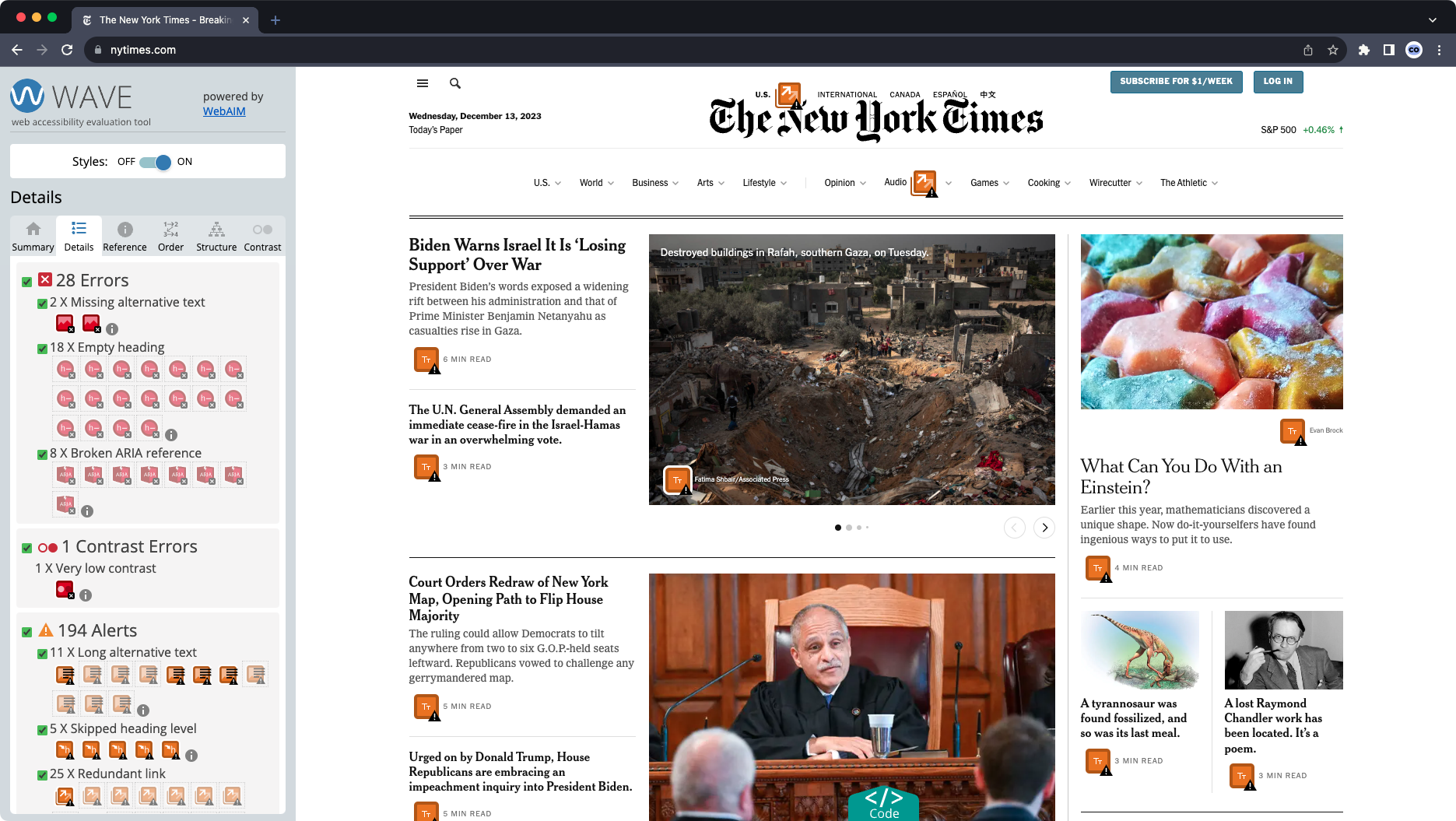 WAVE offers a quick toggle to turn CSS styles on and off, giving a full look at every element in the DOM. This is sometimes extremely helpful for uncovering the root cause of an issue with overlapping elements or content that appears dynamically.
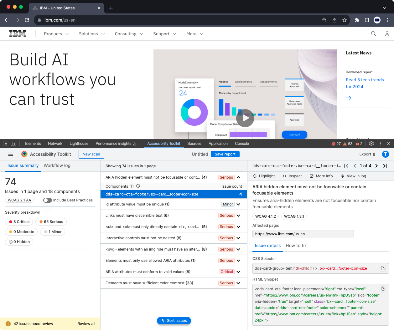 Accessibility Toolkit shows elements as recurring "components" grouped together by their HTML structure, which greatly helps with ensuring you find and fix every instance of a problem, instead of sifting through the whole page looking individually for a problem component that shows up in several locations.
These tools don’t always agree with each other, which is why it’s a good idea to run more than one and never rely on automated results alone.
Guided manual testing
Accessibility Insights for Web has an assessment mode that walks through each WCAG requirement with step-by-step guidance on how to test it. It turns the intimidating WCAG checklist into an approachable process.
Test keyboard navigation by tabbing through every page, checking that focus order is logical, that no interactive elements are skipped, and that there are no keyboard traps. We test with VoiceOver (macOS/iOS), Narrator (Windows), and TalkBack (Android) to verify that screen readers can parse the content, read it in the correct order, and announce interactive elements accurately.
User testing
Automated and manual testing catch the technical issues. But the only way to truly confirm a site is accessible is to have people with disabilities use it. Real users navigating with screen readers, keyboard-only input, or switch devices will find barriers that no amount of internal QA can surface. Their feedback tells you not just whether something technically passes a WCAG criterion, but whether it actually works for the people it needs to work for.
Several organizations specialize in connecting development teams with testers who use assistive technology daily. We’ve worked with clients who have hired firms like the Blind Institute of Technology, AccessWorks, and Fable for exactly this purpose. Disability advocacy groups like the ADA National Network, World Institute on Disability, National Federation of the Blind, and American Foundation for the Blind can also help connect you with resources.
The gold standard: a third-party accessibility audit
No matter how carefully we build, the gold standard for accessibility confidence is a formal audit by a certified third-party firm. We always recommend this to our clients, and we’ve worked alongside several audit firms hired by the organizations we serve.
Here’s why: automated scanning tools, even the good ones, catch roughly 25 to 30 percent of WCAG issues. A UK government study tested this directly by embedding 142 known accessibility barriers on a page. The best-performing automated tool found 40 percent of them. The worst found 13 percent. The rest required human expertise to identify. A formal audit closes that gap by combining automated scanning with manual expert review and assistive technology testing by people who use it every day.
What a third-party audit typically includes
An accessibility firm will crawl your site with automated tools, then conduct a manual review of your pages against the full WCAG 2.1 success criteria. The best firms employ testers with disabilities who evaluate the site using the same assistive technologies your real users rely on: screen readers like JAWS and NVDA, voice recognition software, switch devices, and magnification tools. They test the things automation can’t evaluate. Whether alt text is actually accurate, not just present. Whether a form’s error messages make sense when read aloud. Whether a complex interactive component is genuinely usable with a keyboard.
What you’ll receive
A thorough audit typically delivers a detailed findings report that maps each issue to a specific WCAG success criterion, with screenshots, severity ratings, and recommended fixes. Many firms also provide a prioritized remediation plan so your team knows what to tackle first. If you need it for procurement or compliance documentation, your audit firm can also produce a VPAT (Voluntary Product Accessibility Template), sometimes called an Accessibility Conformance Report, which formally documents how your site performs against WCAG, Section 508, and EN 301 549 standards.
Remediation after the audit
The audit identifies the problems. Remediation is the work of fixing them. This is where we come in. We’ve worked through remediation cycles with our clients, taking audit findings and translating them into design updates, code fixes, and content changes. Issues are typically prioritized by severity: blockers that prevent access to core functionality get addressed first, followed by critical and serious issues, then moderate and minor ones. The key is treating remediation as a collaborative process between the audit firm, your development team, and your content editors, because the fixes span all three areas.
Our position
Studio Simpatico does not guarantee WCAG compliance on the sites we build. We don’t think anyone should make that guarantee without a formal third-party audit. What we do is build accessibility into every phase of our process so that the sites we launch start from a strong, WCAG 2.1-aligned foundation. When a client is ready for a formal audit, whether ahead of the ADA 2026 deadline or for any other reason, we help them find the right firm and then work through remediation together.
For nonprofits, healthcare organizations, and other mission-driven groups, this isn’t optional. Your audiences are broad. Your content needs to reach everyone. Many of your funders and partners will increasingly require it. And a site that can’t be experienced can’t make an impact.
Amber Weinberg and Nate Goodburn contributed to this post.