 hi, i'm
And it doesn’t end there. Your visual identity is just one piece of your brand. Your brand includes a whole mess of things: your name, the quality of your products, how you’re covered in the press, how you talk to your customers on social media, how your employees behave at a conference. Your brand is you.
In this article, we’ll give you insight into how Simpatico thinks about these concepts, and more importantly, how we tackle the daunting process of helping you define, refine, and shape your brand.
What’s in a name? A visual identity? Why are they important?
There are powerful societal associations we make with words and names. If you don’t believe this, try opening Salmonella Kitchen and see how well things go. Understanding these elements’ power in our advertising-driven society elucidates the importance of creating a visual identity that fits you—the equivalent of a great haircut or outfit that shows off your best features. It’s not about arbitrarily selecting some colors or browsing through inspiration catalogues so a client can pick his “favorite font”; it’s internalizing what intrinsically makes you you and creating a visual language to communicate that.
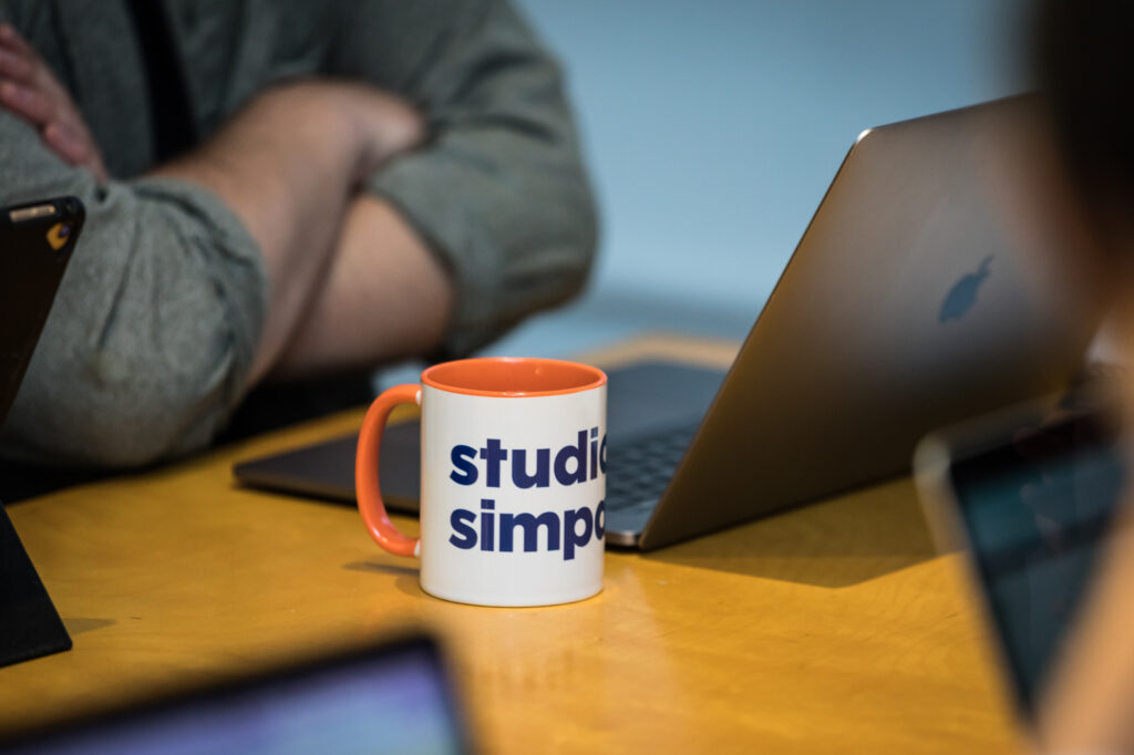
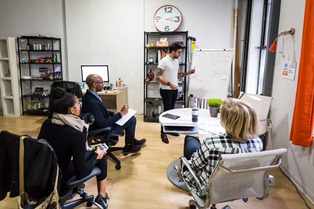
Back in February, Studio Simpatico’s first branding project was…Studio Simpatico. We’re skeptical of cobblers with tattered footwear, so we approached discovery like we would for any client: we defined our mission, values, personality traits, and competitive values. Simpatico’s brand is that although we’re serious about our craft, we also believe our friendliness and lack of pretentiousness are significant competitive advantages. To that end, we deliberately chose to use all lowercase, rounded letters in our final logo to convey our accessibility. The wordmark features a bright, orange CO—a “can’t miss it” nod to our status as a company and a collaborative environment. It’s tongue-in-cheek, a little cheesy, self-deprecating, and techy…all undeniably us.
How do we get started? What’s the first step of the process?
The idea someone might write the next great American novel with a shaky understanding of the English language is far-fetched. The idea that someone might create a brand identity for your company without a deep understanding of your business and personality is equally absurd. Consequently, our process begins with asking the right questions: “Why are we here? Who are we here for? What makes us different? What is our personality? What do we do and how do we do it? What do we most value?” Only when a mature level of understanding is reached can we start brainstorming names and concepts.
In the brainstorming phase, unfortunately our process doesn’t end when we have our first “eureka” idea moment. Any name finalist is subjected to substantial additional scrutiny: Is it easy to pronounce? How does it sound in a sentence, in a press release, in a Tweet? Can it become an acronym, an abbreviation? Does anyone hold the trademark? If not, can it be trademarked? (Shameless self-promotion: Just last month we became the proud owners of the trademark for Studio Simpatico. Woot woot! Sorry. Back to the article.)
So how does all this discovery work lead to a cohesive visual identity and a logo?
Among other activities, we often ask our clients to come up with a list of representative adjectives for their organization. We use those values to identify a metaphor or concept that can shape the entire brand. For instance, if branding Nike: Nike is the Greek goddess of victory and the product is about movement, speed, and athleticism. We might brainstorm a metaphor of wings or motion trails, which might have led to the iconic Nike “swoosh.”
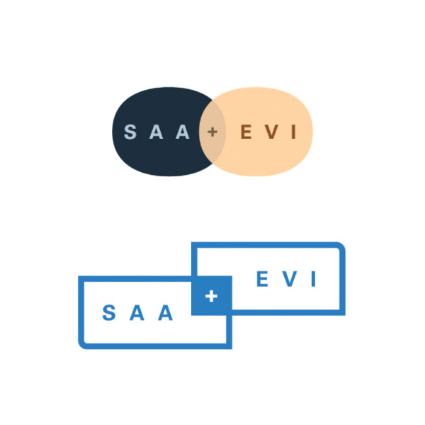
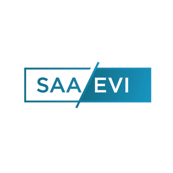
Seeing the process come to life with SAA|EVI
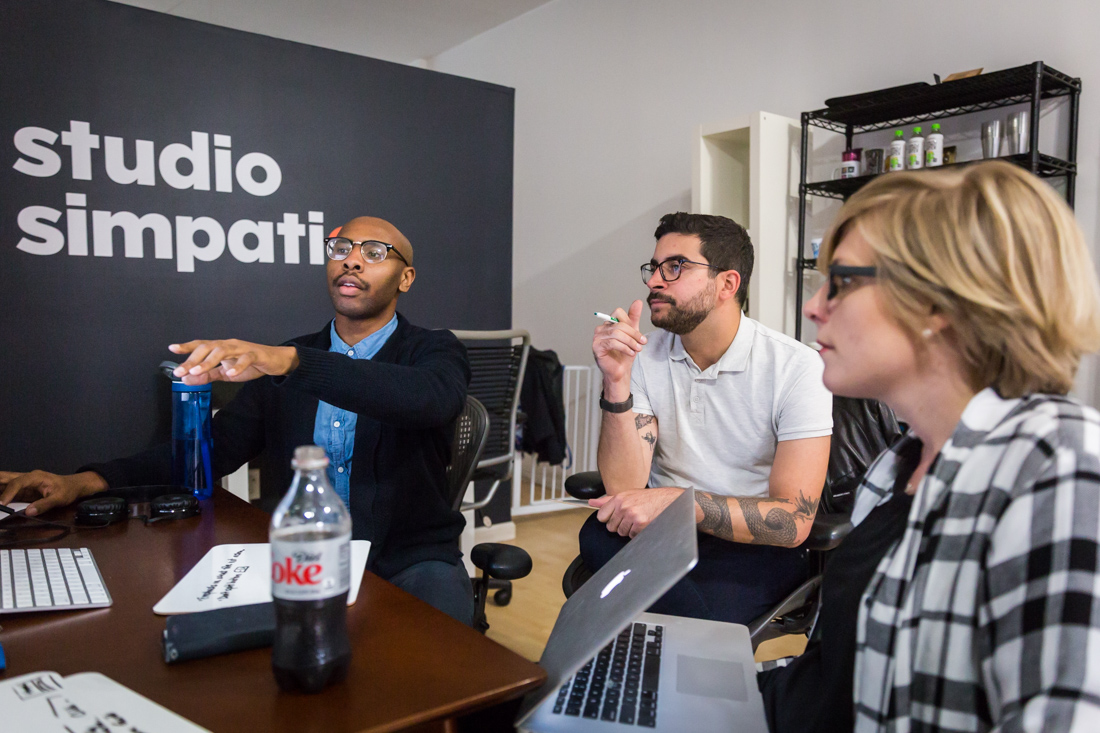
But — because we weren’t the ones who branded Nike, let’s look at a recent example of when Simpatico used this approach to bring a brand to life: Our work with Ernst Valery and David Alexander, the principals of SAA|EVI, a real estate investment and development firm whose core mission is to strengthen and revitalize urban communities.
Following Discovery, we developed a series of logos based on five key concepts. Each concept uses a different metaphor that speaks to the heart of SAA|EVI’s mission and values:
Symbiosis – Mutually beneficial relationships make up the fabric of nature. Symbiosis is emblematic of the relationship between diverse residents in a thriving neighborhood — despite seemingly enormous differences, relationships emerge organically to establish a working, growing, and most importantly, sustainable ecosystem.
Yin Yang – Opposing forces not only balance one another out, but in many cases, actually depend on each other. This idea of dependence mixed with balance mirrors how healthy communities are made up of a different constituent groups that support one another. If this support breaks, so does the community.
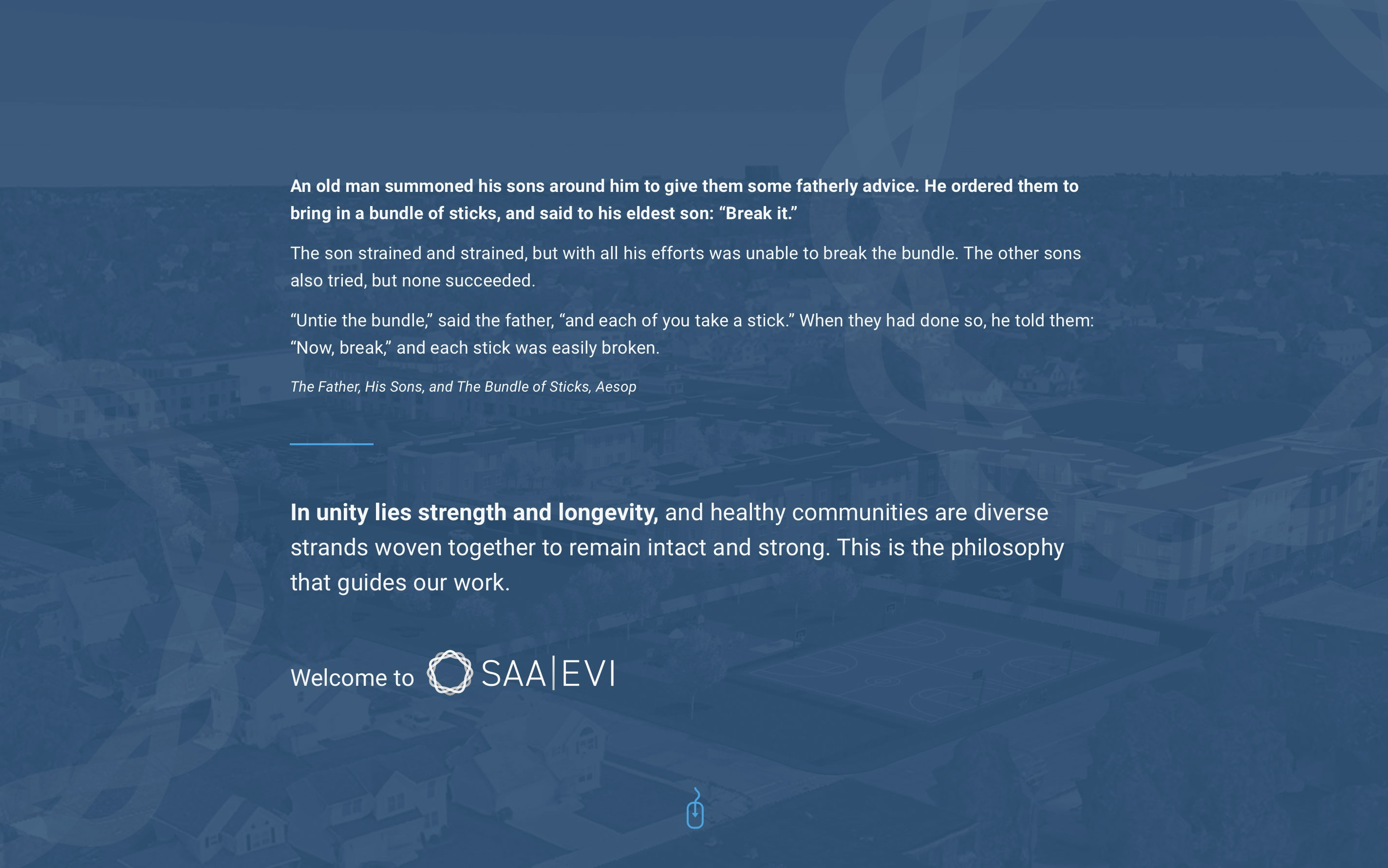
The Woven Basket – Derived from one of Aesop’s famous fables where an old man calls for his sons to break a woven bundle of sticks. Each son tries but to no avail. The old man then tells his sons to untie the bundle so each can take a stick, only then do the individual sticks snap. The lesson of the story is that in unity there is strength and longevity, which captures the brand’s commitment to the communities it serves.
The Chorus – The Chorus in ancient Greek dramas was an expositional group of people meant to represent the common man. They would speak of issues in their communities and guide the audience’s thoughts on the matter. A chorus is also a united voice made of individuals with varying pitch, tone, etc. — a harmony that unites a diverse group.
Constructing Communities – Community building isn’t a one time thing. Rather, it’s a dynamic, communal, ongoing, and organic activity. It takes shepherding and active engagement throughout. This leads us to a kind of city view like in Sim City — a bird’s eye view of the pieces of a community fitting together to create a functioning, sustainable, and alive entity.
While we included some visual inspiration in our presentation of possible concepts/metaphors, they were in no way proposals for the final artwork; our goal for this phase was to get a sense of what spoke to the client. In the case of David and Ernst, it was the woven basket. Based on this feedback, we continued to iterate on the woven basket until it evolved into the final logo, currently found on all of SAA|EVI’s marketing and brand collateral.
More examples
Using a strong metaphor to drive the creation of a brand offers a strong foundation for the rest of our work. Check out some more logo and brand projects that we’ve done that stem from a strong brand concept:
REDI (Real Estate Developer Index) is a movement to encourage socially responsible real estate development. To begin the project, which started as the DRI (Developer Rating Index), we invented the new name as an inspirational acronym that allowed for a double meaning: Everyone needs to “get REDI” for a paradigm shift. The logo calls to mind a street grid and the bright colors convey authenticity, vibrancy, and diversity.
During our first discovery session, Alex Hodara of Hodara Real Estate explained how his company involves being ahead of the curve when it comes to identifying new markets. He specializes in tech-forward, affordable, modern living, so we created a visual language to match. The “H” in the logo bridges the gap, and the square acts as a stage for innovation and a blank canvas for the future.
Our next branding challenge
The next brand we are helping realize is a watermelon juice brand who uses healthy but unsold fruits from watermelon farms and empowers farmers to press their own juices, creating the most direct link between farmer and consumer as well as a fun, refreshing, simply made drink that is accessible to all kinds of consumers. Following our same process, we’ve come up with the following name options:
- Real Big Watermelon Juice
- Simple Grove Watermelon Juice
- Melon Patch
- Farm Pressed Watermelon Juice
Stay tuned to find out which name came out on top and how it’s being visualized as we tackle this new and exciting branding challenge!