Natural Areas Conservancy
A from-scratch website redesign and build for a NYC-based nature organization
A from-scratch website redesign and build for a NYC-based nature organization
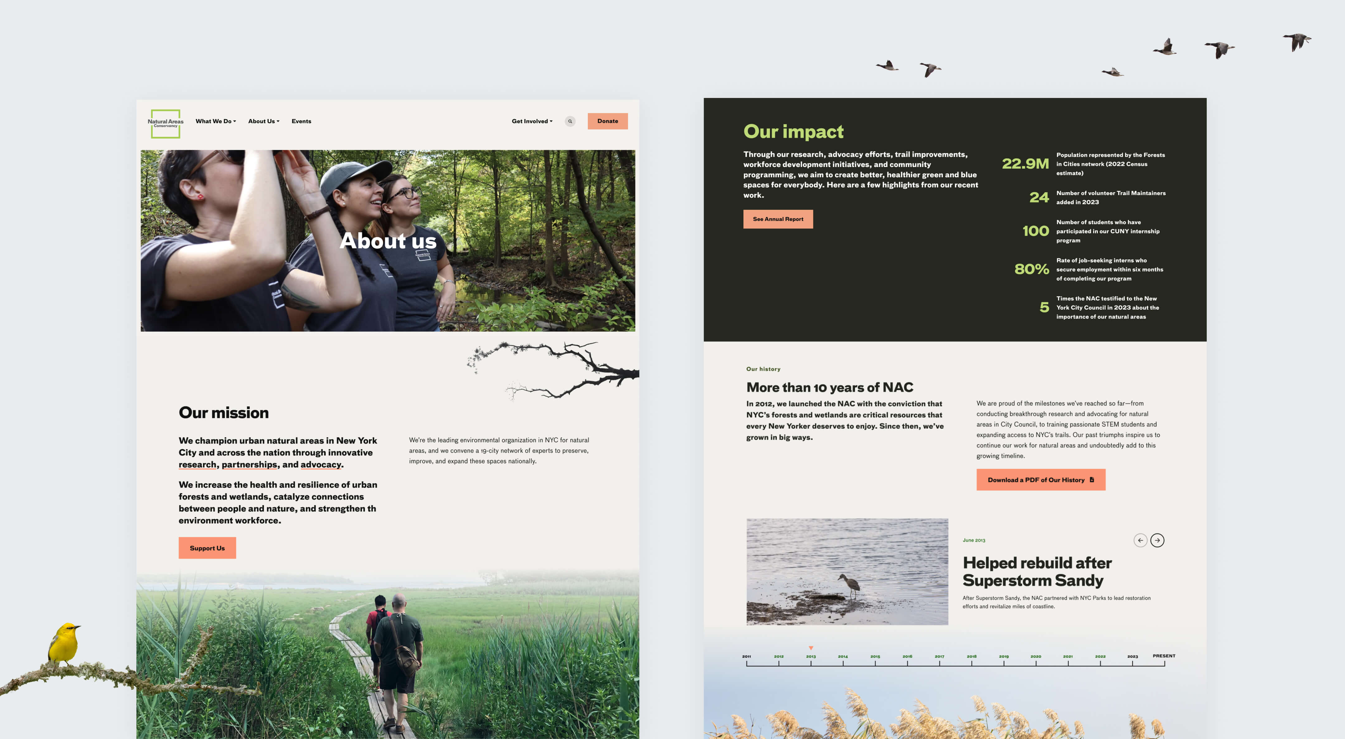
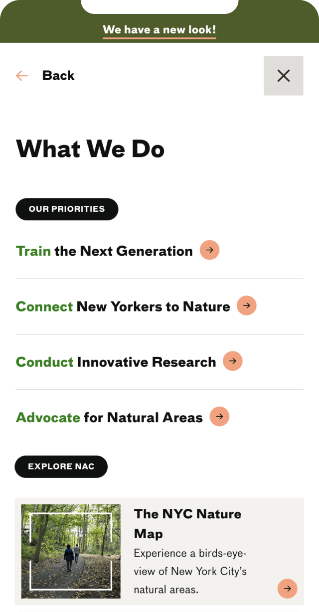
We began with a discovery and UX phase in which we got to know the organization, their audiences, and their needs. We applied what we learned to a brand-new site map, wireframed new landing pages to share NAC’s programming more effectively, and created the skeleton of a new modular system for the site.
NAC came to us with a succinct but clear brand guide that defined fonts and colors but that did not extend specifically into web in any way. They didn’t want to veer away from what they had established, but they did want to extend their brand so that they had a bit more flexibility, especially in color palette.
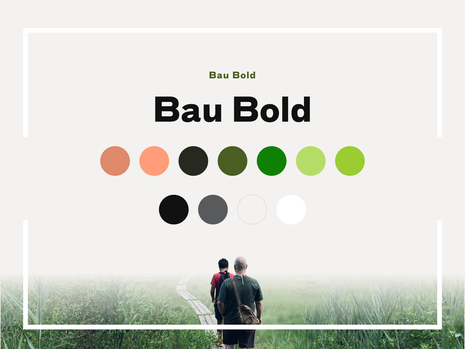
Our designers explored various color combinations that built off the organization’s existing green, and came up with a nature-inspired but still sleek palette with a bit more range than they had before. Very dark forest green, natural beige, and bright lime give the site plenty of contrast, while a pop of peachy pink adds playfulness and brings attention to important elements.
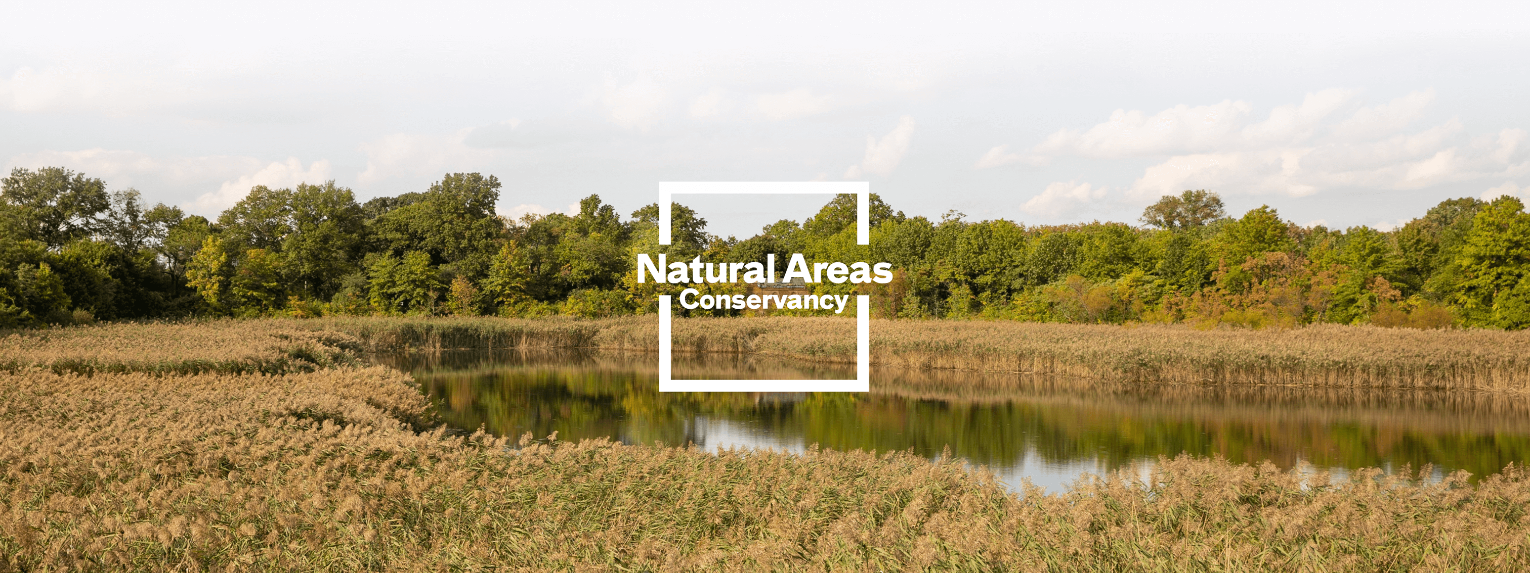
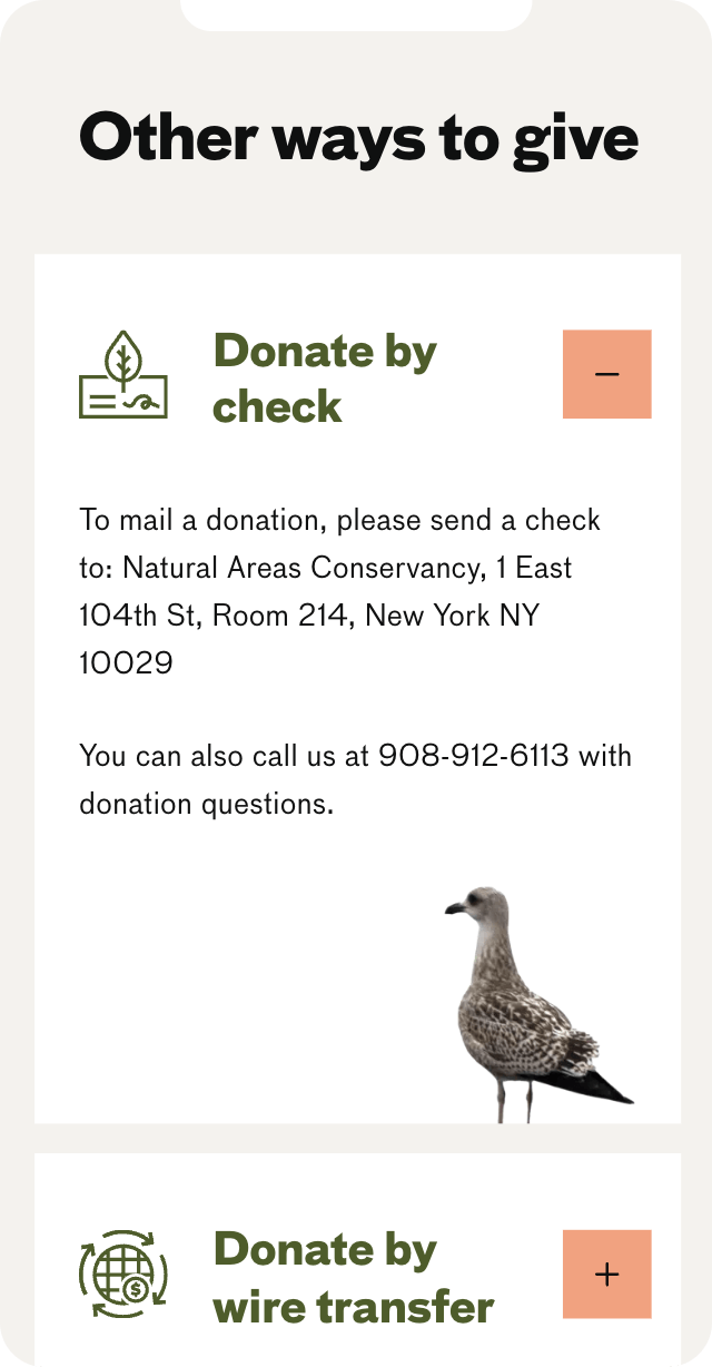
NAC came to us seeking a way to highlight their organization’s collection of beautiful photographs, of which they had plenty. Rather than just find ways to put photos next to text, our designers found ways to incorporate the photos into the modular layouts in creative ways, using photography as a graphic element and bringing nature into every aspect of the site.
We also added delight to the site by sprinkling in some small animated interactions, like in the use of the logo’s frame as a graphic element on photos across the site. This attention to detail complements NAC’s own detail-oriented and thoughtful work and research, ensuring that the heart of the organization comes through on the site.


We bookended our engagement with NAC with an SEO assessment of the site during discovery and after development. We performed a keyword analysis during the UX phase to ensure that the site is findable by NAC’s target audience, and we assisted with content planning to make sure NAC’s strategy covers the important topics that matter to their audience. Finally, we did a full site technical audit to ensure SEO best practices were in place and to optimize performance and user experience.
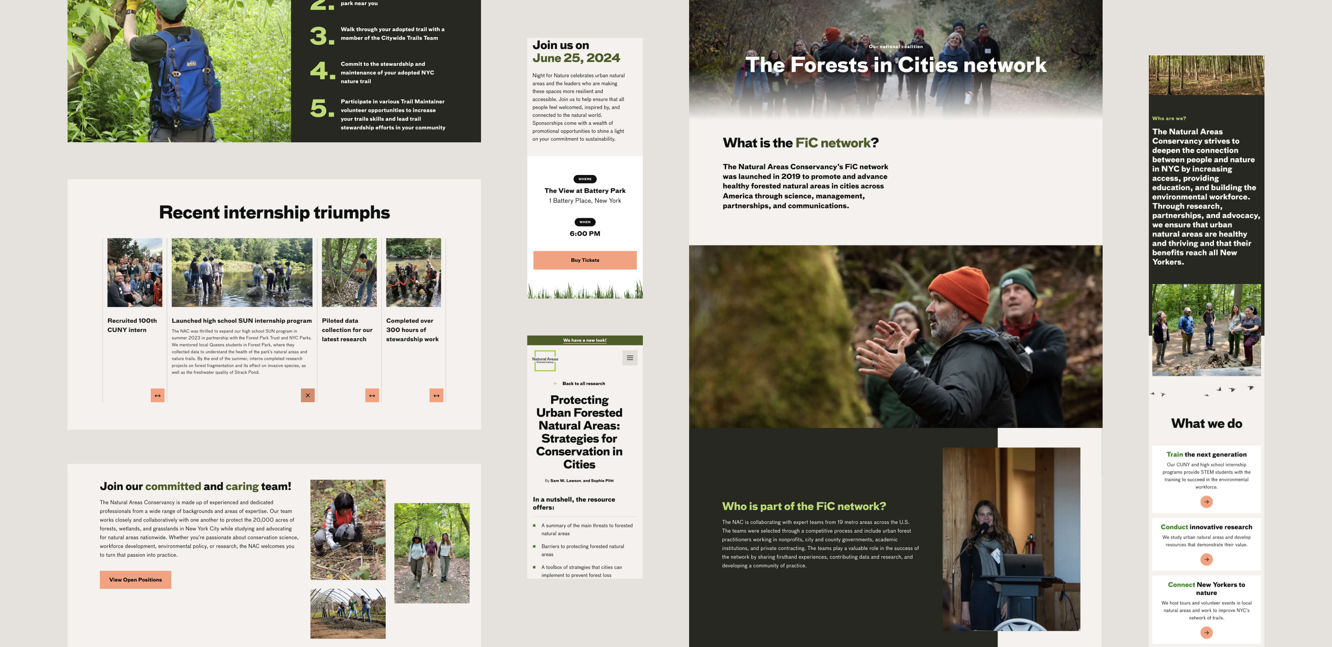
Any site worth its salt these days is as good on mobile as it is on desktop, and NAC’s is no exception. We ensured that the site is beautiful and functional on any screen size, so fans of NAC can easily browse and learn about their local natural areas anywhere they might be.
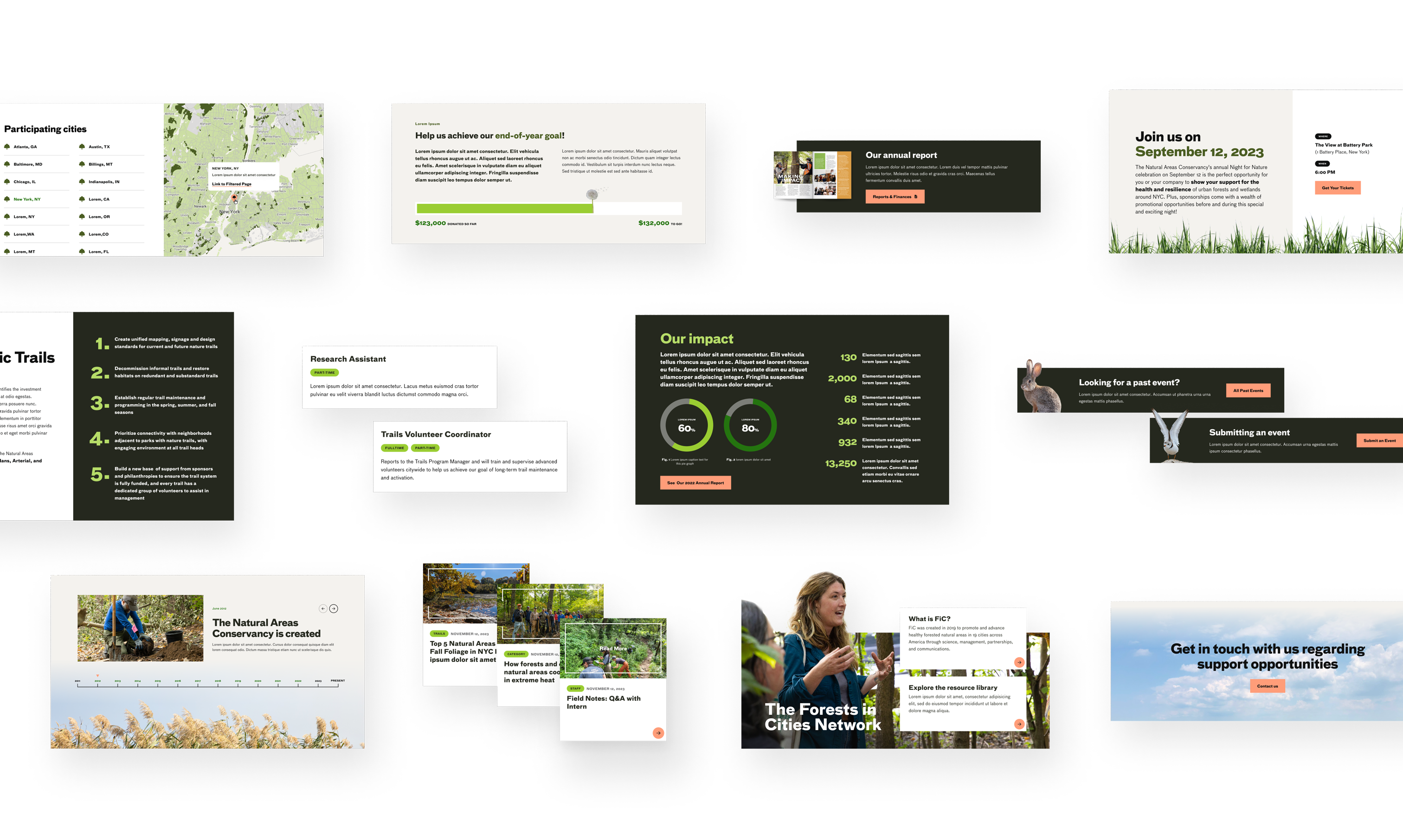
We also kept the NAC team’s future ease of use in mind. Using the bespoke building block modules we built, the team can create new custom pages whenever they are needed. This will allow NAC’s communications team to build pages themselves with no need to code anything new, or to be locked in to a default page design.