Big Green
A ground-up redesign of the website for a non-profit helping to promote gardening and healthy eating across the United States
A ground-up redesign of the website for a non-profit helping to promote gardening and healthy eating across the United States
When the team at Big Green approached us, they had a WordPress site they couldn’t edit, and as a result they had created a handful of satellite sites due to the lack of flexibility. They also were transitioning from being more programmatically driven to doing more grant-making, and they wanted their site to reflect their new identity.
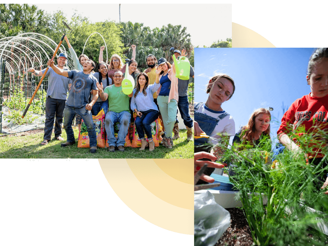
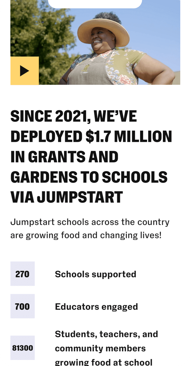
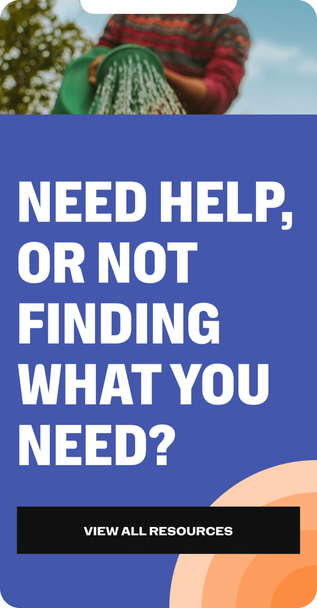
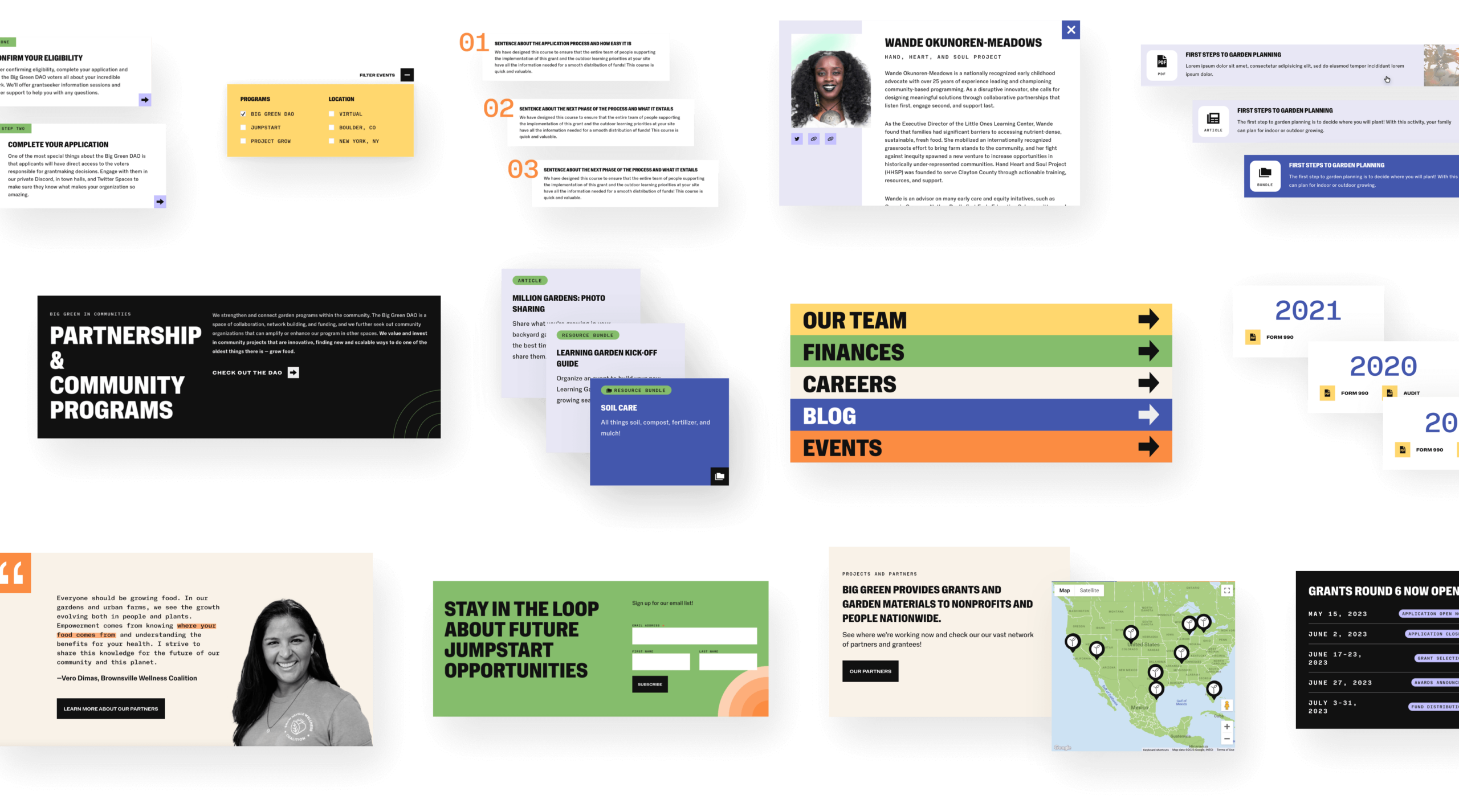
One of the wonderful things about Big Green is their deep well of resources for school, home, and community gardeners. Their current site just wasn’t up to the task of categorizing and surfacing these tools, so we knew part of our job would be to create a new system.
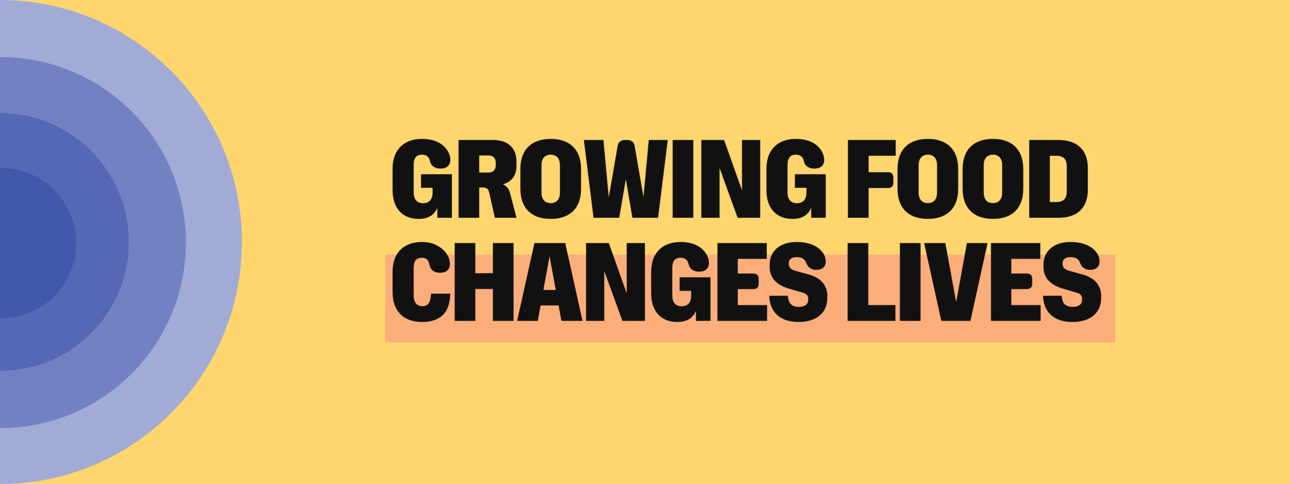
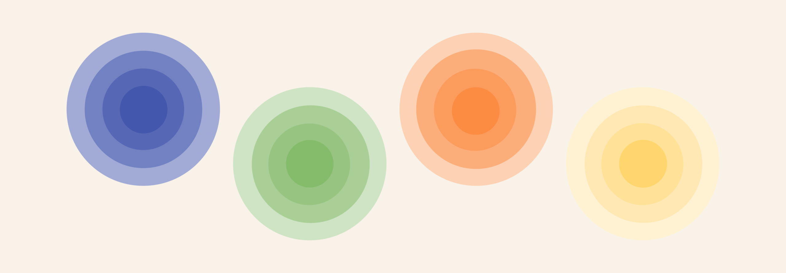
Our task was clear: to create a cohesive, organized, and flexible new website that could be easily adapted to future needs, as well as an update to their look and new custom illustrations. We started with the new look and feel, with colors inspired by the vegetables often grown in Big Green gardens, and NaN Foundry’s Holo typeface. These elements come together on the site with bright sunburst graphics and bold, colorful imagery to create a friendly, positive, and confident visual identity that feels modern.
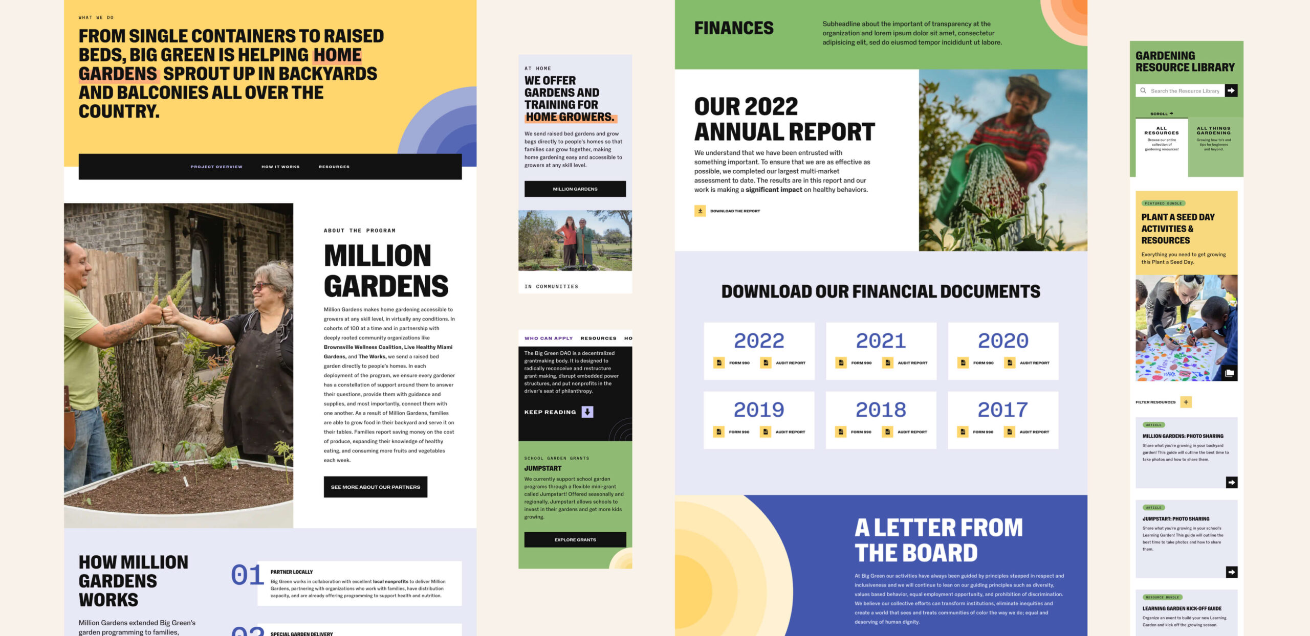
We knew with a nonprofit of their size, Big Green would need the ability to create new pages on the fly as they added new programs. A modular design was our plan. We started by completing a full audit of all of their pages, sites, and resources. From there our UX team created a new site map and wireframes that brought together the disparate satellite sites, and outlined a new system of organizing the resource database.
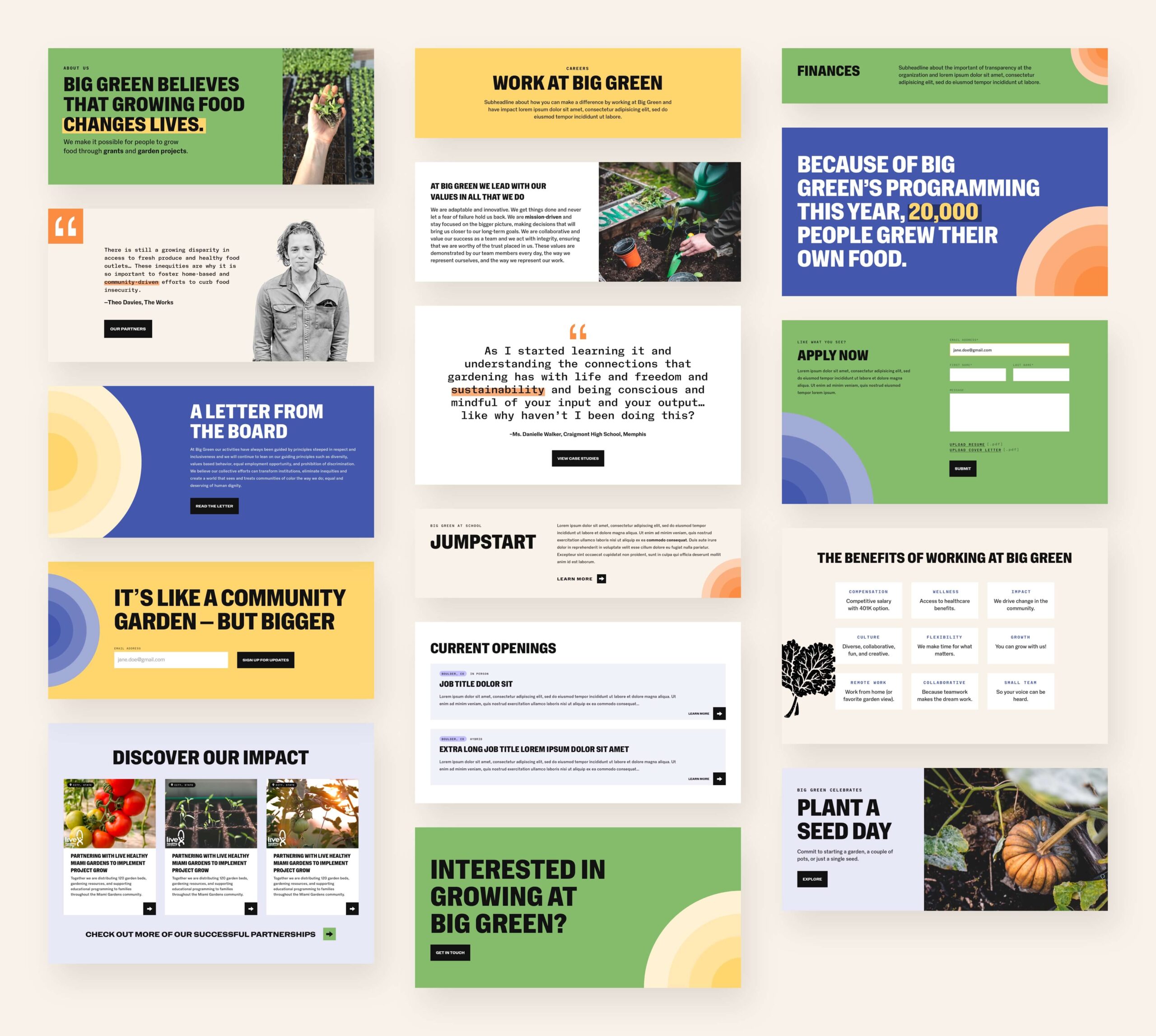
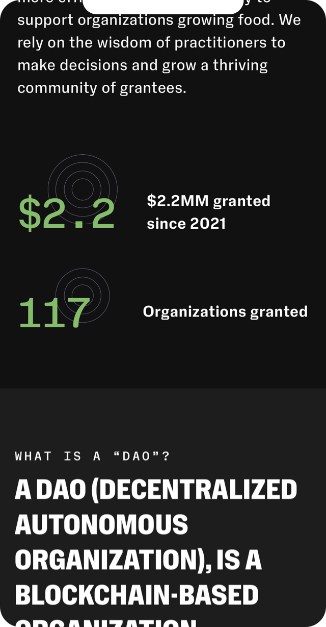
Once UX was complete, our design team created visuals for each page with our new modular system, making sure all the pieces slotted together. The full breadth of pages included Big Green’s programs, their staff, contact info, and financials, the resource database, and pages on grant-making through their Big Green DAO (Decentralized Autonomous Organization, a grant-making entity governed by blockchain). For the DAO in particular, we established a different visual style in order to communicate its standalone functions and give it a slightly futuristic, tech-forward feel.
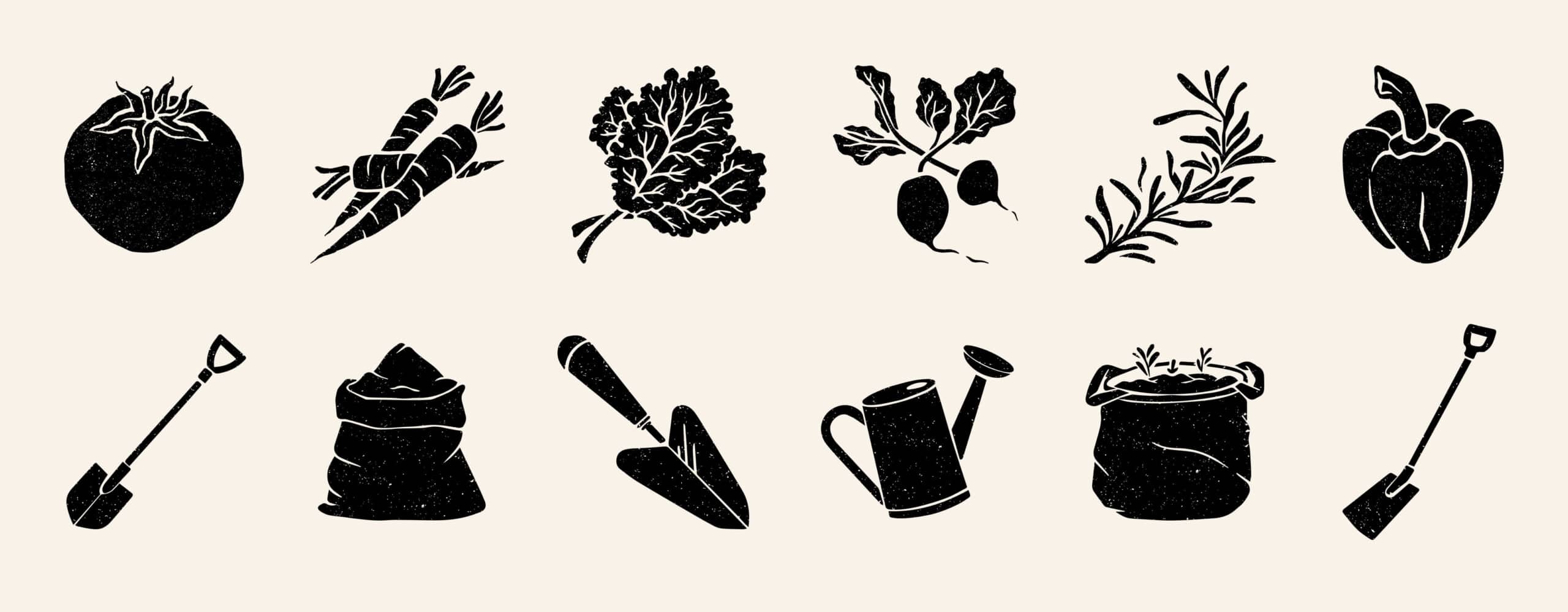
Part of the DNA of Big Green’s previous identity was their vegetable illustrations. We knew from the beginning that illustration would remain a part of their new identity, but we wanted to make sure the new style would fit in with their new font, clean layouts, and colorful backgrounds. Our solution: all black silhouettes of vegetables and garden tools with textured accents and an organic (no pun intended!) feel. The curves of these custom illustrations work to soften the straight lines found elsewhere across the site, and because they are all black, they look incredible printed as well as on the web.