Onera Inc
Building a new website for the San Francisco startup positioned to harness AI to power the modern supply chain
Building a new website for the San Francisco startup positioned to harness AI to power the modern supply chain
Onera came to us with a logo and a website that they were reluctant to show potential customers. They were in search of a web design and development partner who could create a new, modern marketing website to communicate the value propositions of their products.

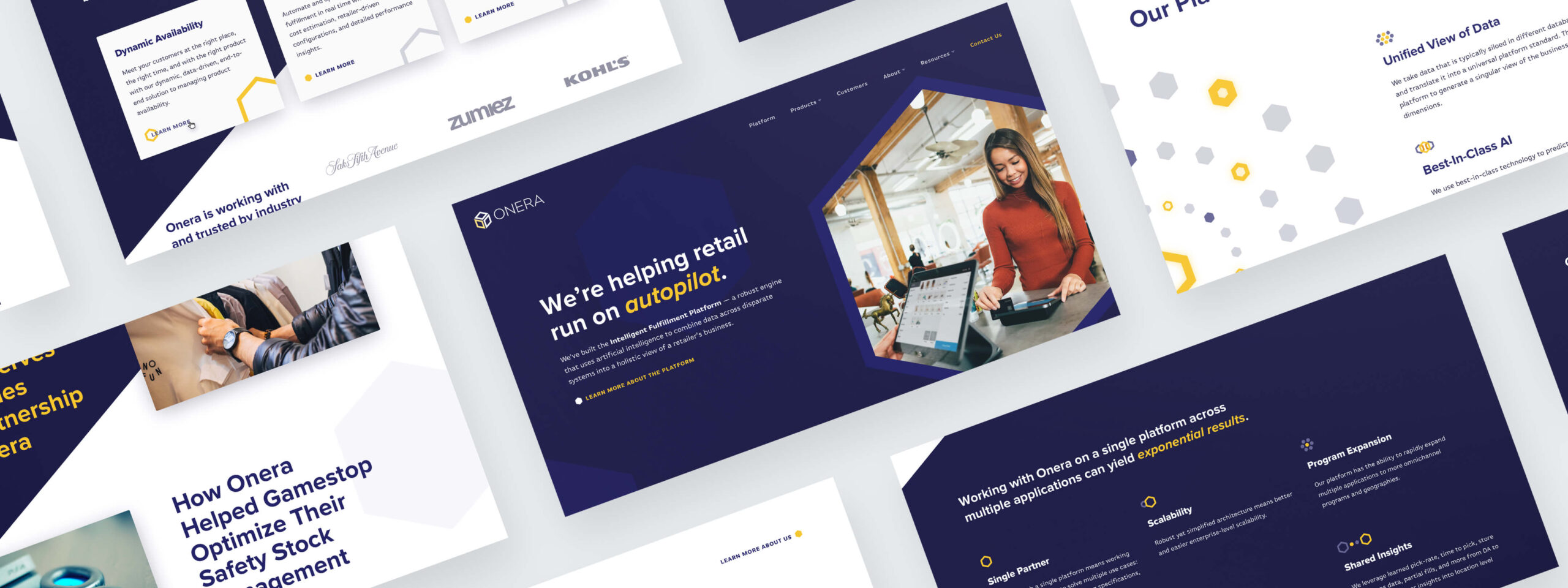
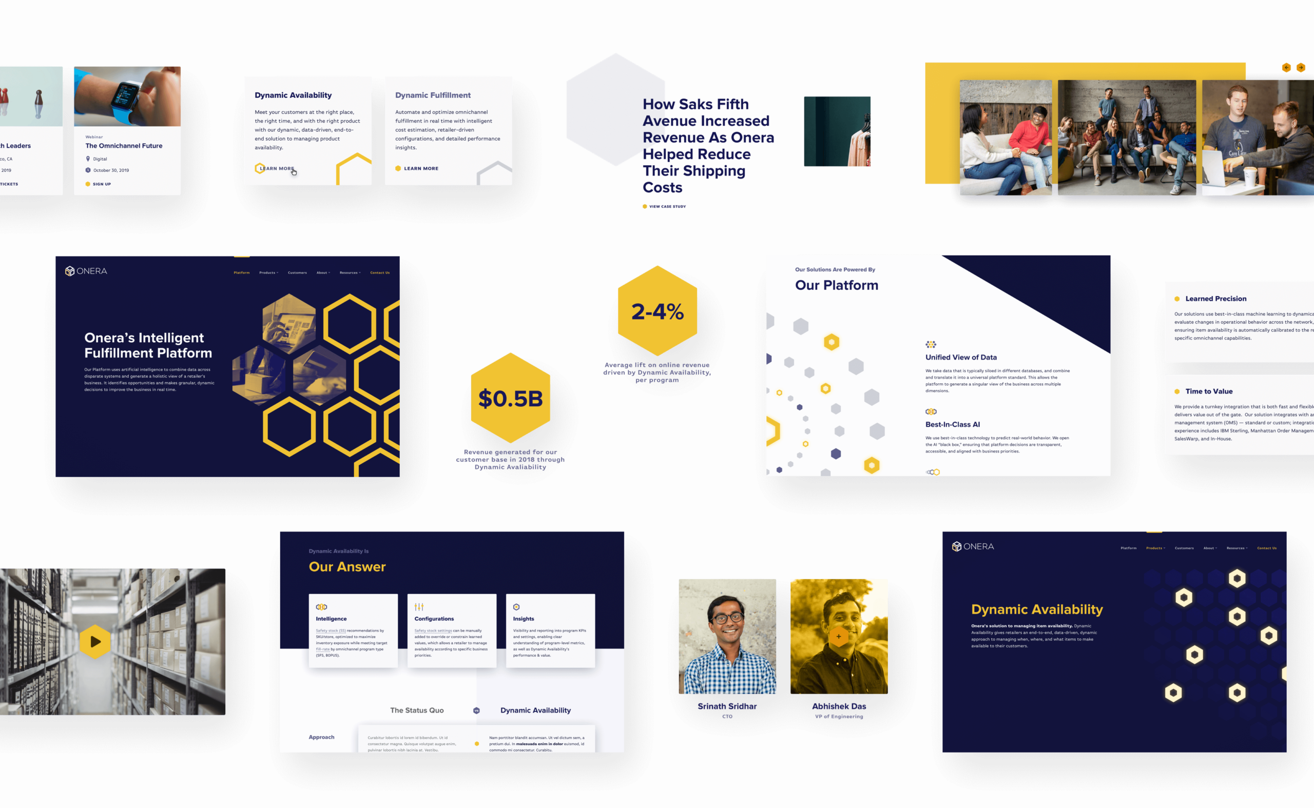
Onera is a technology solutions provider that develops state-of-the-art algorithms to help some of the largest businesses solve real-time optimization problems. From the beginning of the engagement, we identified how vital it would be that Onera’s website visually communicate their technical sophistication to prospective clients. Consequently, we knew that the new site would need to feel techy, cutting edge, and sophisticated.

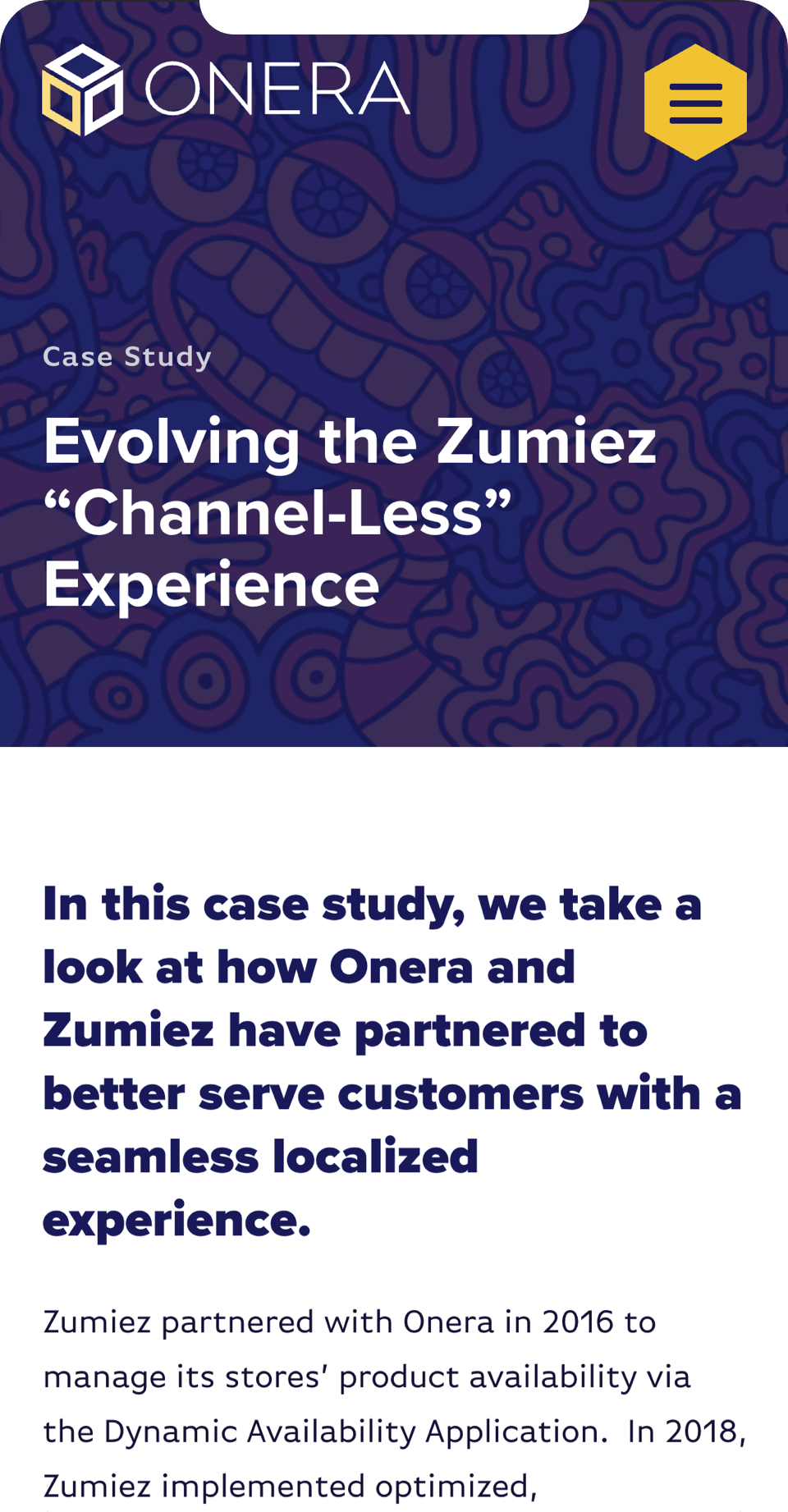

We began our design exploration with the existing logomark: a geometric box, a nod to their overall offering of retail fulfillment. Our creative exploration led us to extending the box into its silhouette: a hexagon. The site’s product pages, which each share the stories and value props of each of Onera’s custom built product offerings, feature hexagons in dynamic CSS animations that visualize the different solutions in an abstract, branded way. The site also features a bold, high contrast, purple and gold color palette, which reflects Onera’s direct, honest, confident (but never cocky) tone and voice.
We found it necessary to create a visual pattern that would help the user grasp this relationship between Onera’s platform and products, as well as each product’s unique set of features.Sinan Imre CoFounder & Creative Director
want a behind the scenes look at the Onera redesign?
read the Simpatico Q&A with Sinan and Amber


