Internal projects are notorious: you often hear how difficult it is for agencies to work on their own brand or collateral. How did you keep momentum? How did you avoid there being too many passionate cooks in the kitchen to make progress?
Hah, so true — internal or personal work for creatives can sometimes seem impossible! Our first decision was to treat this project as we do any client project. While client projects were still our priority during this time, our own redesign also had an established a timeline, milestones, and scheduled check-ins. For me and Bruce, there is a sense of urgency and responsibility that comes with knowing when our developers need to begin developing to hit a certain launch date — we don’t want to rush any part of the process, certainly not development. Staying true to the project structure that we follow with our clients helped keep us on our toes and constantly moving forward.
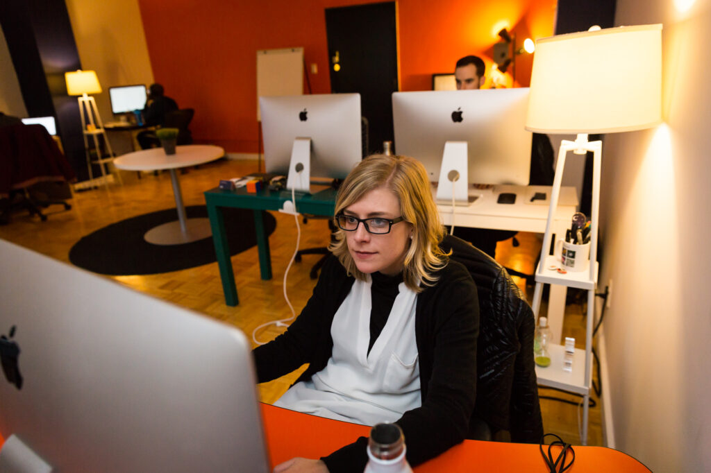
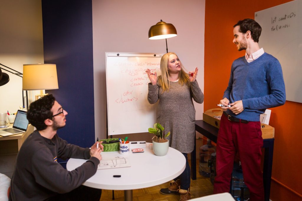
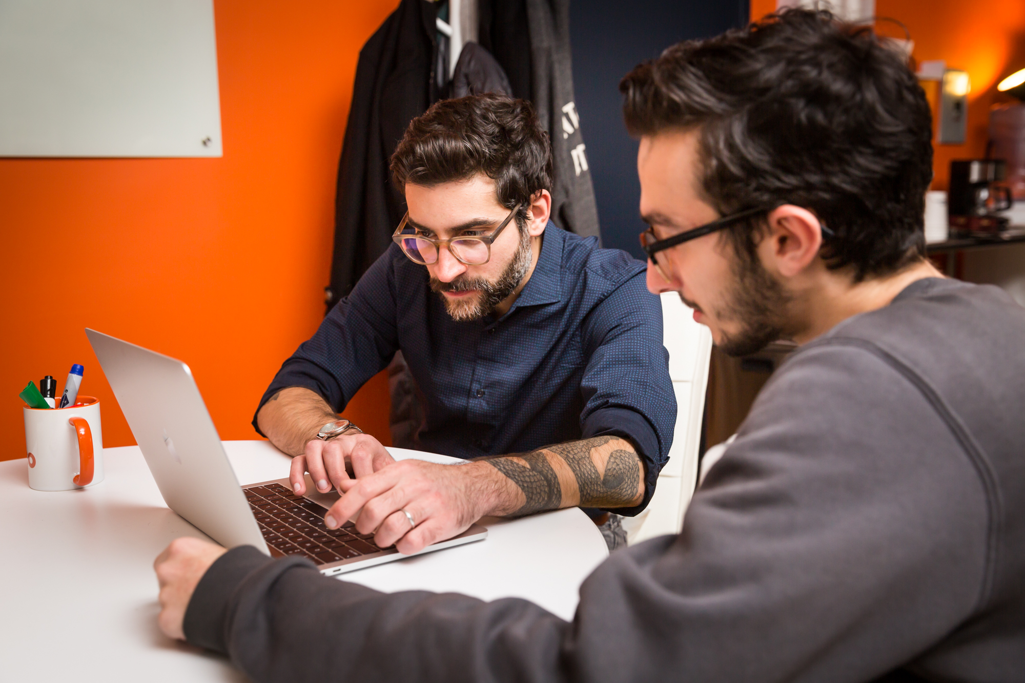
Since the day we decided to undertake this project, we’ve had a Slack channel dedicated to brainstorming and sharing ideas. Apart from “official” check-in meetings where Bruce and I would present the work in progress to the entire team, #simpatico was (and still is) constantly ringing with new ideas, thoughts, and comments. Being in constant communication like this made sure that everyone was aligned on the new visual style, but it also allowed everyone to efficiently add their core skills and expertise to the project early on. Corey and Evan were already thinking about dynamic interactions and filtering while we were still designing the Homepage. Thanks to Amber, designing for accessibility always remained top of mind, and Tamara’s UX and IA work early on made our design work that much easier and logical.
 Hello, I'm
You’re your own worst critic, pretty sure that’s what it boils down to — in my case anyway. Most designers by nature already have a good amount of obsessiveness about their work (as they should), so it’s hard enough to perfect things on a client project, let alone your own baby.
One thing that I truly think helped, was Sinan and I treated the Simpatico Redesign just like any other client project. We kept a full design process and had a pretty solid timeline and schedule on the production side of things. Having that structure really guided us to have a traditional exploration phase, one that I feel is necessary for any successful project.
On the second part of your question, I’d actually say that the extra passionate cooks benefited us… Sinan and I work really well together, we bounce ideas off each other and really value each other’s input and vision. That being said, I think the two of us both being involved helped progress things much faster (and stronger). On a broader scale, similar to a lot of the projects we take on, the whole Simpatico crew had input on what we were creating and I think it demonstrated how well we work together as a team more than ever.
The Simpatico identity received a makeover along with the website; we’re noticing a lot of new typographic and visual elements at play. What were the attributes you identified about Studio Simpatico that you wanted to communicate through the refined visual identity? How did they take shape?
I’ll let Bruce speak to the specifics of our design choices, but we started off knowing that our values had not changed. When we talk about our work, we mean the work that results from collaboration and creative thinking with our clients. Internally, we like to create a space (physical or virtual) where peer feedback and brainstorming is encouraged without judgement. With our clients, we ask a lot of questions, try to understand their business as best as we can, and undertake creative challenges with them.
Since none of this had changed, one of our main challenges was to find a more contemporary, interactive, and customized way to express all of these values. On a more practical note, we wanted more flexibility in managing our blog and creating custom landing pages with ease. We took this opportunity to rethink both our brand-related and functional wants and needs.
Bruce, over to you with the visual design deets…
Hello, I'm I would say color and typography had a huge impact on the overall design. When we started our color exploration, we wanted to keep our blue and orange but expand our overall palette so we could play with more contrasting colors as well as shape our look and feel to be more dynamic, exciting, and lively. I feel proud that we didn’t just throw out our existing palette, but that we really enhanced and strengthened it as a whole.
Typography is hands down my favorite part of design — there is so much emotion that a typeface evokes just on itself. Our display font, Apertura is a rounded geometric sans serif with humanist qualities. It has so much personality, but not to the point where it’s screaming at you. It’s inviting, sociable, and quirky in all the best ways. We also chose to set our headlines in lowercase type, which further connects the visuals to our ‘simpatico’ vibe. Input Sans we’re using for an accent type, one which connects our tech and dev side to our brand (and also Sinan and my love for monospace typography). Last but not least, we chose Gibson to use for a secondary style and body text throughout. It has a lot of similar humanist and personable qualities as Apertura, but is super legible and works great at small sizes.
Speaking of ‘taking shape’, one large part of our new visual style are the forms and rounded components we’re using throughout. A lot of the curves and wavy elements that we’ve implemented really showcase our personality and our team lifestyle. Juxtaposing these organic shapes with some of the more structured and linear elements create a beautiful balance of synergy, liveliness, and collaboration.
What were each of your roles in regards to the redesign?
Hello, I'm I don’t know if either of us had a specific ‘role’ from a traditional standpoint. Sinan and I worked on this in a true collaborative fashion — brainstorming ideas off each other, critiquing our designs, etc. I think that’s one thing we do super well as a team.
Pretty much what Bruce said… Our entire team does a great job collaborating internally, but Bruce and I are especially aligned in the way we carry out a visual design project. While Bruce did spend more time in the weeds in Sketch, we collected inspiration together, were both in the same Sketch file as we always are thanks to Plant, and we probably got on more Slack calls with each other than during any other time.
What one thing on the new site are you most proud of?
Hello, I'm I’m honestly proud of all of it, but if I had to pick one thing it would probably be that we found the perfect balance… as we were going through our exploration process and started honing in on what ‘we’ should look like, we wanted to make sure we could show our personality, while still being able to appeal to all audiences. It’s modern and shows our identity of a team without going too far into an over-trendy and off-putting universe.
Well… since Bruce gave such a thoughtful answer, I’ll go with something more trivial. I. Love. The. Squiggles. I think that’s what we’re calling it now — it’s been called a wave, slinky, and many other things, but it was something we spent considerable time on. For example, each heading style has its own unique squiggle that also moves at a slightly different pace than others. I’m proud of this effort from the team to get these small interactions looking and working perfectly without losing sight of the bigger picture. I think it’s that dedication that has resulted in a site that truly feels alive, and fully represents our vibrant and creative personality as a studio.
What was the most challenging part of the redesign? Was there something you wished you did better?
One of the challenges for me was curating all of our early ideas. From the minute we started this process, all of us were beyond excited which resulted in a lot of great ideas. In a way, it’s a good problem to have, but we had to bid farewell to certain ideas in favor of a consistent brand experience throughout the site. Honestly, I don’t know if I would change that if we were to do this all over again. I don’t think we would have landed where did without first casting a wide net first and trying out everyone’s ideas.
Hello, I'm I would probably repeat my last note on finding that perfect balance. There’s always going to be things I wish I did better and I’m sure in time we’ll update things here and there (web design is always changing after all) but this goes back to the “you’re your own worst critic” statement from the beginning. We could spend months or even years perfecting things, but I am truly super proud of what we’ve created.. It is 100% Simpatico. It’s us.
How did taking accessibility into account affect the design process?
Hello, I'm Luckily for us, we have Amber on our team (a true accessibility wiz)! In general, we always like to think about accessibility pretty early on in the process and our site was no exception. Things like color contrast and type size were thought out and all pass AA compliance (we used our fancy Sketch plugin to make sure). On a broader scale, some of the more flashier parts of the site (animations, video, etc.), we worked closely with our dev team to make sure what we were creating was realistic and… well, just possible 🙂
I have two words for you. Amber Weinberg.
Amber brings to the table what we like to call AWE — Amber Weinberg Energy — and accessibility is a significant part of AWE. Apart from the tools that Bruce mentioned, we were fortunate to have someone who reviewed our efforts to make visual and interaction design exciting but also accessible.