We love Sketch (yeah, we said it)! It is the first of its kind. The cool kid on the block. A tool made for web and UI design, developed by designers for designers. (No offense, Macromedia Fireworks. You were on the right track pre-Adobe acquisition, but things just haven’t been the same since 2005.)
Sure, generally speaking, anything you can do on Photoshop you can do on Sketch–and of course, no shade to our diehard Photoshop friends. We ourselves still enjoy a clone, stamp, or blend. But just before you rule this love a fad, here’s why Sketch has us smitten.
Sketch is Lightweight
Unlike other software, Sketch’s interface and tools are lightweight. Whereas Photoshop offers a variety of effects across ten menus for one function, Sketch offers one, narrowing the options and making for a more UI-specific, easy-to-navigate workspace.
Sketch is also impressively lightweight when it comes to file sizes. A single file on Sketch with 12 artboards that covers an entire web design is a manageable 200MB, while a file of 4 artboards on Photoshop is over double that size. Simple functionality makes less to accommodate in a file, which makes a huge difference considering that files are often shared and synced across multiple computers.
Sketch Follows CSS Logic
We all know that we use CSS to style HTML elements. Guess what? Sketch knows it too! Whatever style you apply to an object in Sketch, the software automatically (or using the Sketch Measure plugin) generates the CSS for that object, which lessens the confusion between designer and developer, eases the transition of phases, and ensures that everything you do is recreatable in CSS. It ensures consistency and functionality. No more converting tracking to letter-spacing; Sketch designs in web speak.
Automatically generated annotations that are actually written as CSS. The developer can pretty much copy & paste this into his or her CSS to style this button.
Native Tools and Plugins
Sketch offers a lot of web-specific native tools and plugins (like layout grids). Because web and UI design follows particular patterns, designers share common frustrations in their workflows. Plugins for Sketch are made by designers for designers to address these shared challenges. It’s a community of designers creating solutions to make shared parts of their design processes easier.
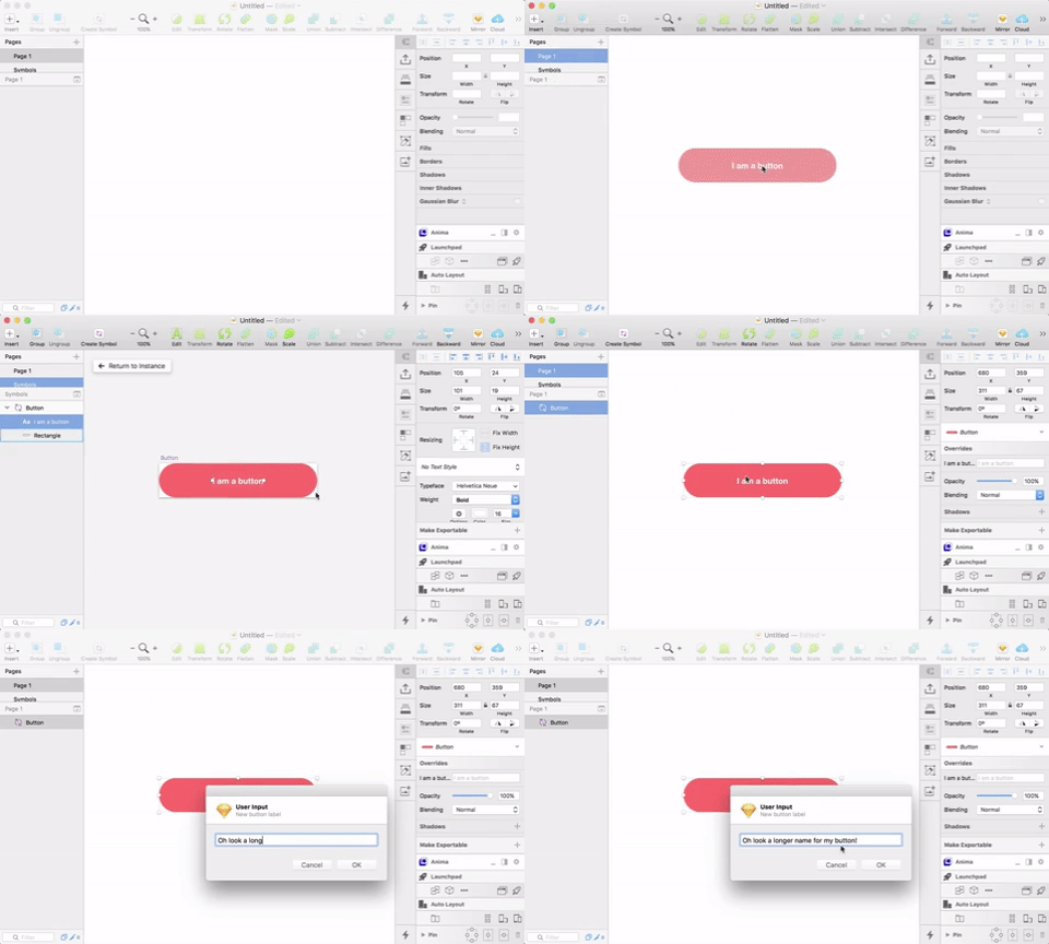
Combined with Sketch’s native symbols functionality, this plugin helps keep button padding consistent when you update your button copy!
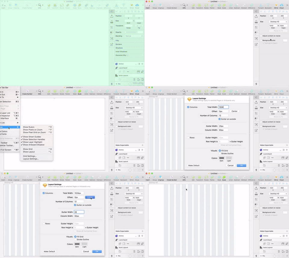
No need for plugins or hacks! Sketch’s native Layout Grid allows for super quick column grids to ensure your web design elements are in perfect alignment.
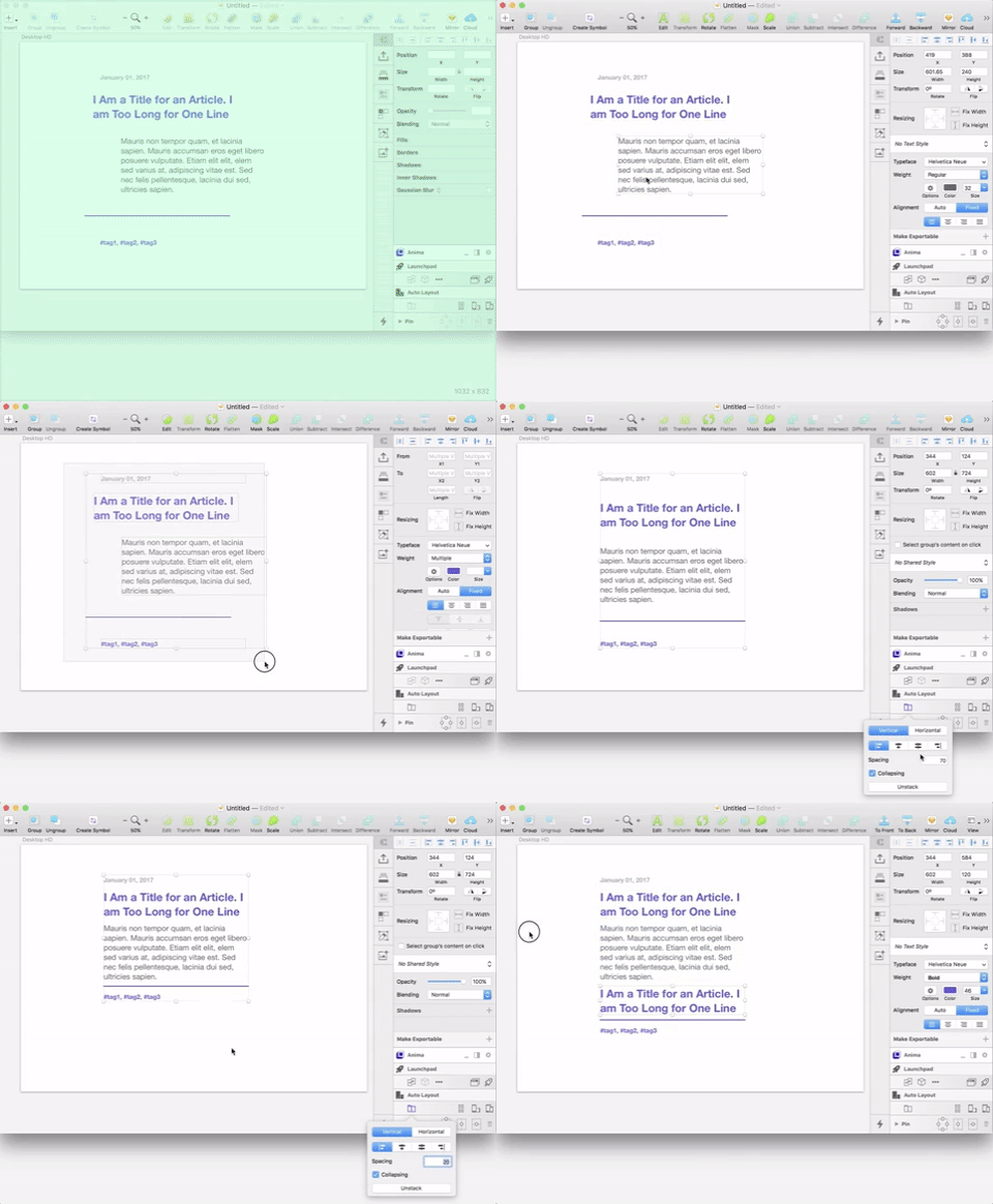
Even though the latest version of Sketch now boasts responsive resizing, Anima’s Stacked Groups alone is a tremendous plugin that allows you to keep consistent spacing between various design elements.
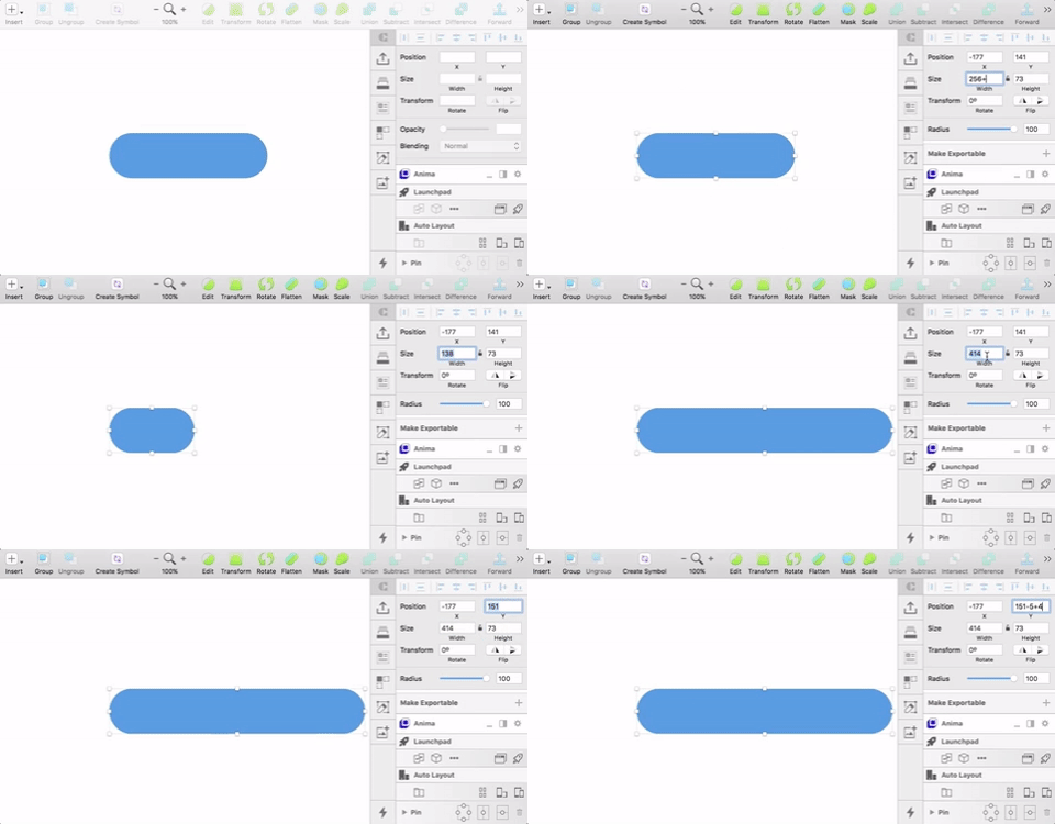
Size and displacement values in Sketch accept simple math, which means you can size and place things in multiples or perfect alignment without having to reach for the calculator!
Symbols
Building a website or UI is a matter of creating building blocks and using them to create a website that is consistent. Sketch’s native symbols feature ensures that the elements in any design remain consistent even after you’ve passed files to a client. It gives the client the foundation to build further without deviation from the original design.
The Sketch Together YouTube channel has fantastic tutorials to improve your workflow in Sketch. This video in particular is a great primer on how nested symbols can help you create a consistent and easy-to-use button system for your next web/product design project!
Exporting
Finally, exporting designs from Sketch (whether for previewing or for providing annotated files for developers) is super easy. Because Photoshop is primarily a tool for editing bitmap photos (it’s in the name, people), it is very confusing to start a web design project and then figure out which resolution best accommodates a retina design. Conversely, in Sketch, you always design at actual size and can easily export at any multiple of your file’s dimensions. This spares developers of the constant simple division required in Photoshop exports to accurately determine the true size that will display on web. Phew!
In short, Sketch is made with designers and developers (like us) in mind and spares us beaucoup de time, math, and inconsistencies. That’s a win-win in our book!
