SimplyPut
A brand identity and marketing website for SimplyPut, a new natural-language-driven data company
A brand identity and marketing website for SimplyPut, a new natural-language-driven data company


The founders at SimplyPut were looking for a partner who could help them design a friendly visual identity that would convey the simplicity and approachability of their product. While SimplyPut is a tech startup whose product uses AI natural language processing, its company is all about people. Its goal is to make a company’s data easier to access by allowing every employee to ask direct, colloquial questions – and getting an answer back that’s clear and concise. Using SimplyPut’s product, all this is possible without pinging the data professionals who work at the company. In this way, SimplyPut simplifies the work of both the data professionals and everyone else at the company.

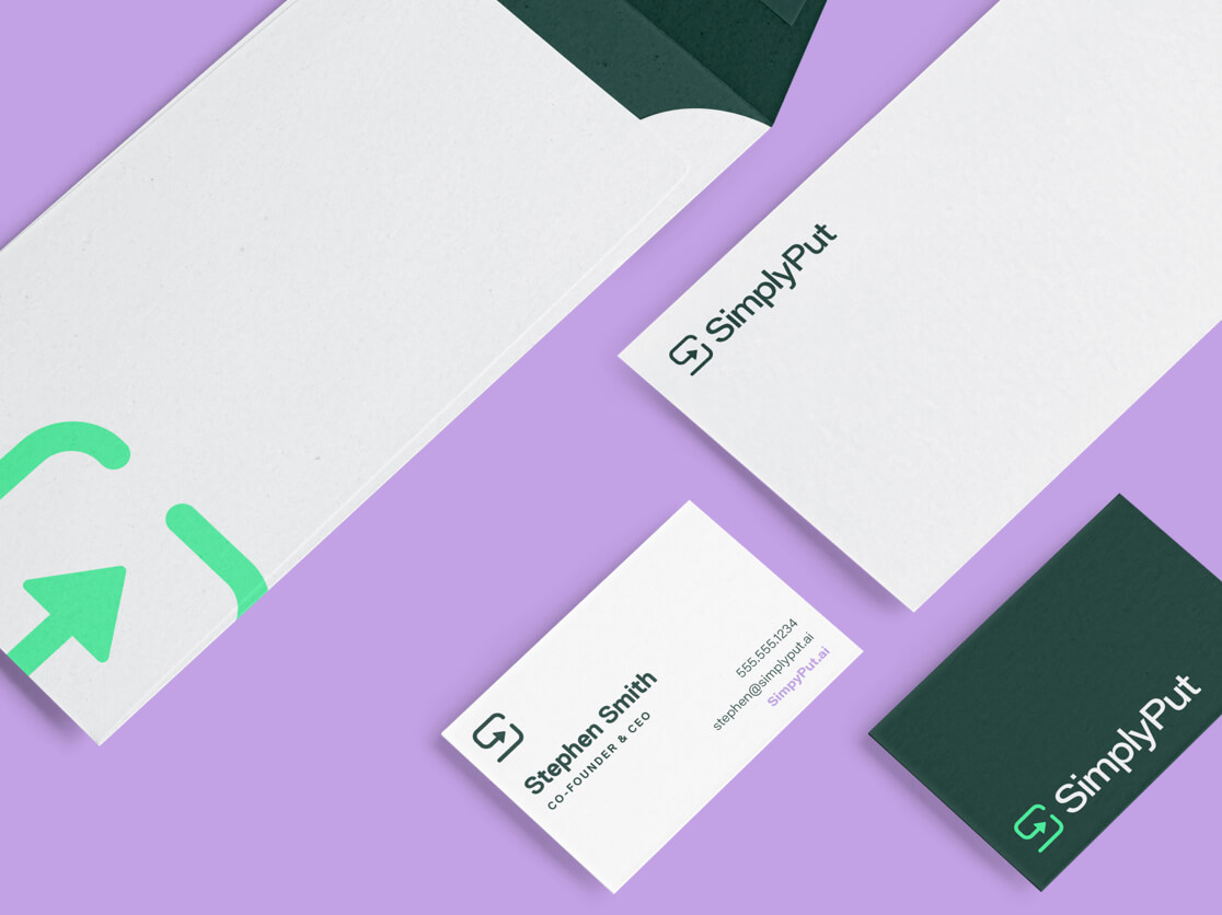
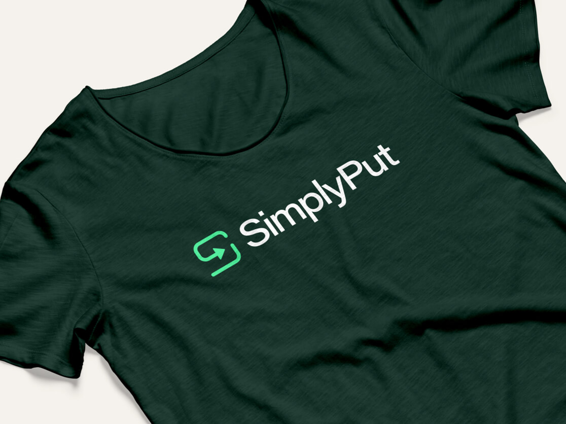
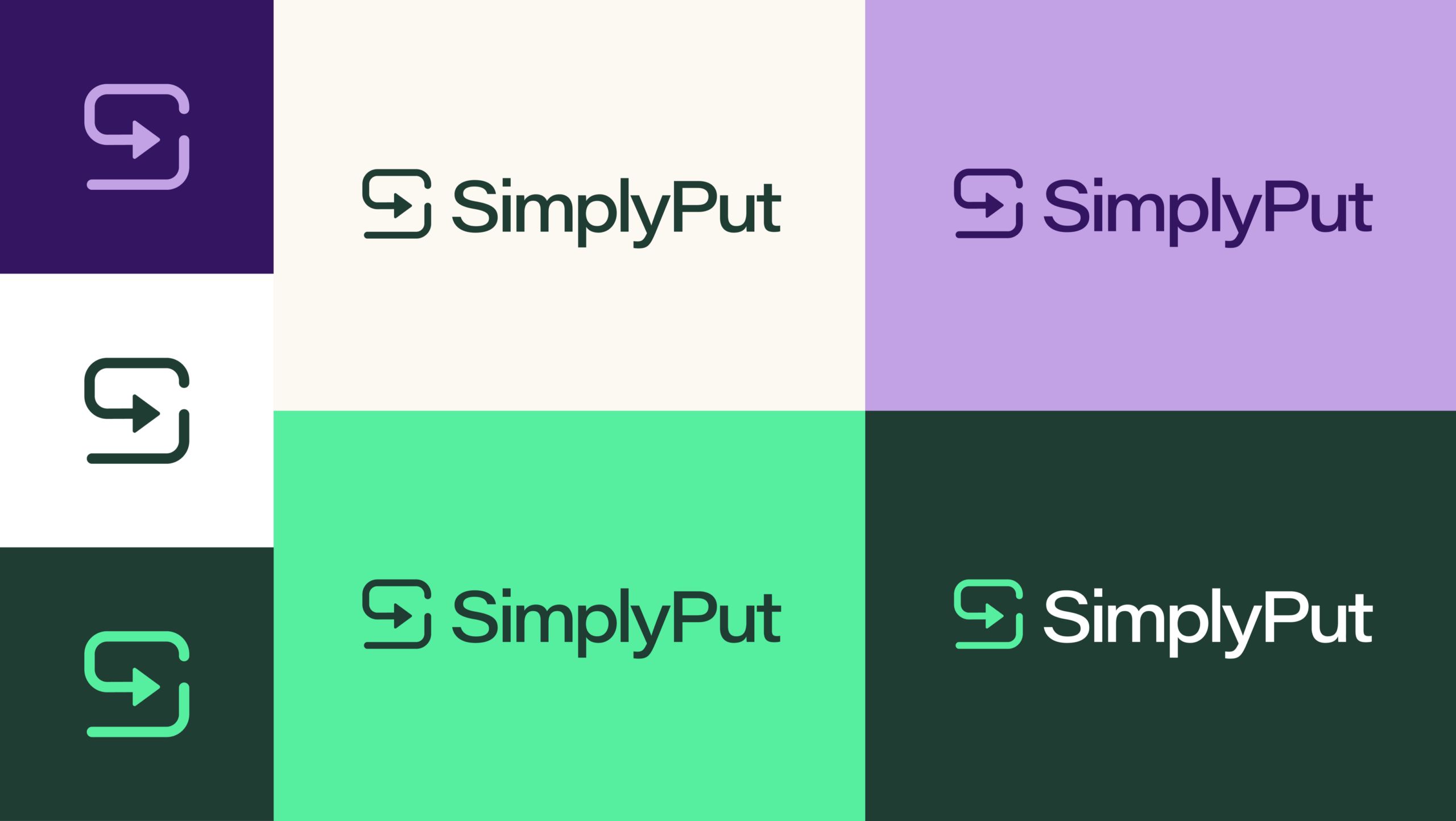
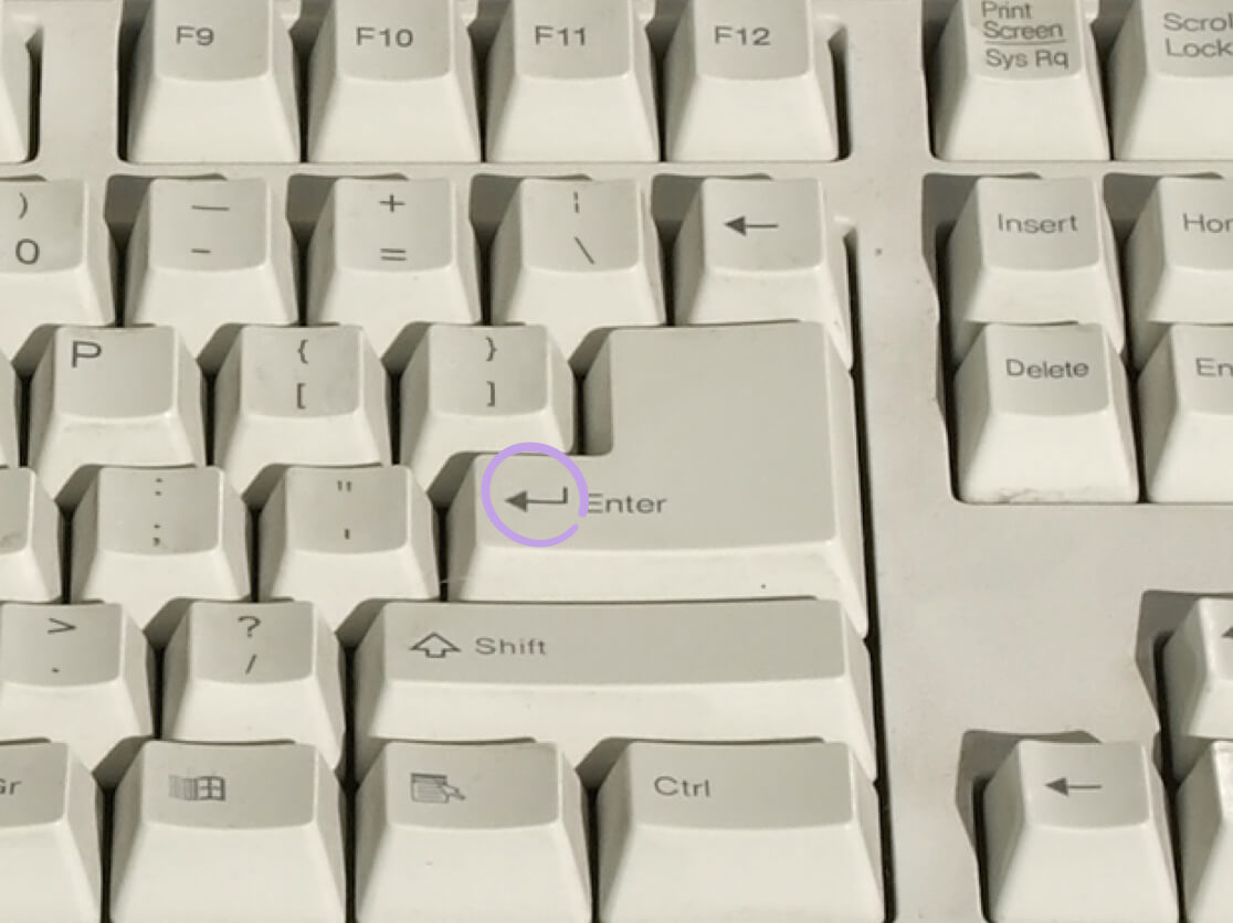
Our creative process began with a discovery session with the SimplyPut founders to learn more about their product, preferences, and goals for the future of the brand. We tested the product, and researched the market as well as taking a look at the landscape of other AI brand identities. During the ideation that followed, our team proposed a concept visually grounded in nature and emphasizing the human, down-to-earth attitude of the company, to veer away from the typical look of an AI product. The new SimplyPut logo features an arrow inspired by the “return” key on a keyboard, emphasizing ease of use and directness of the product. All you have to do to get your answer is type the question and hit return!


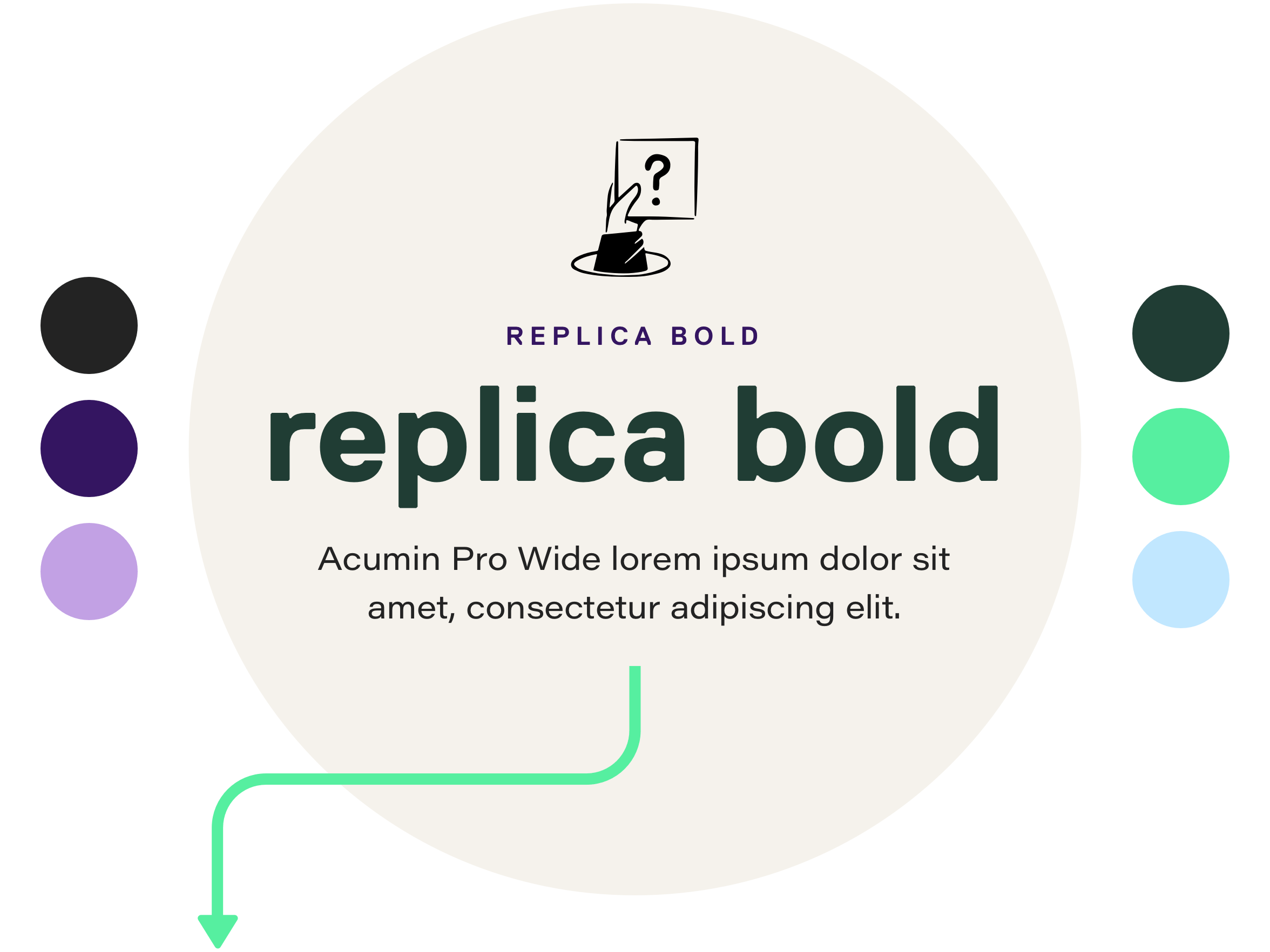
In our design explorations we landed on Replica and Acumin Pro Wide as SimplyPut’s brand fonts. Replica, from Swiss type foundry Lineto, is a highly structured typeface with beveled edges, making it ideal for bold, tightly set headlines. The beveled corners give the characters both a rigid, dependable personality as well as looking slightly rounded at smaller sizes, making the overall personality both grounded and approachable.
Acumin Pro is a neo-grotesque typeface that’s extremely versatile, thanks to its variable design. Using the extended version of the font lends a contemporary, tech-y flavor to the overall branding of SimplyPut, snapping the brand back to its tech-world roots while remaining clear and concise in its legibility and design.
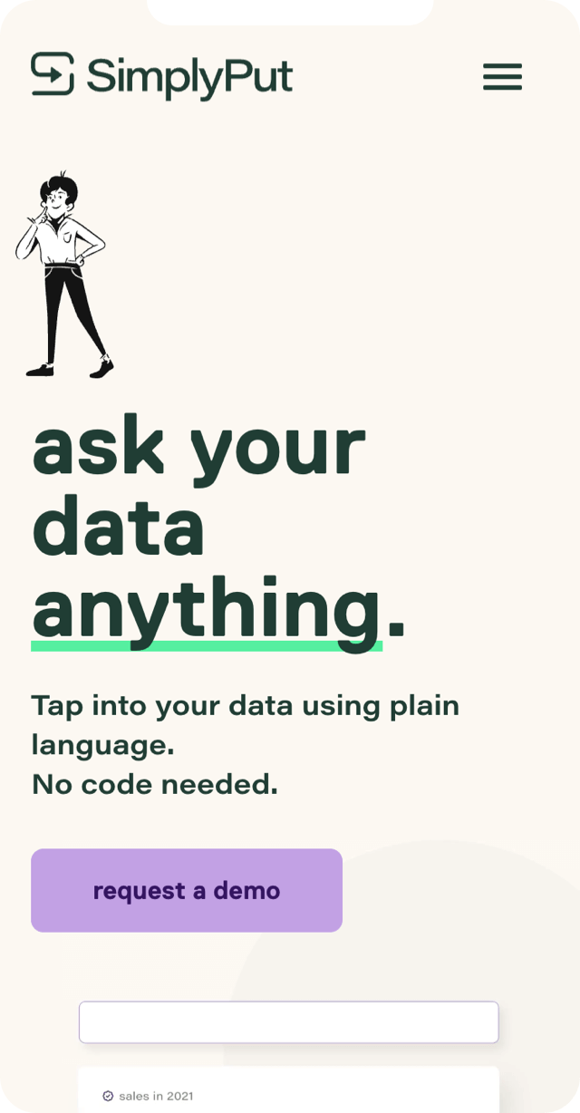
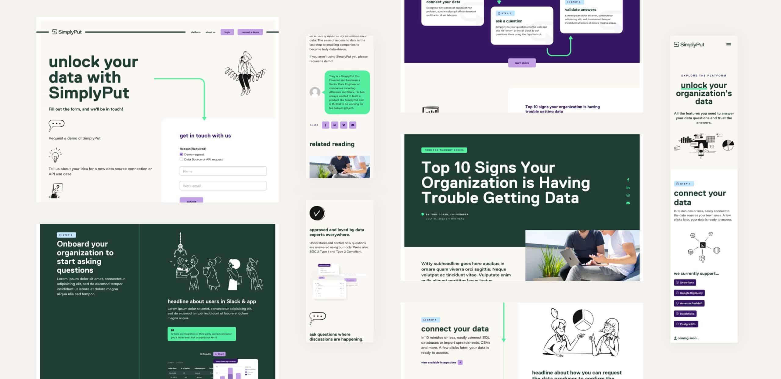
Once UX details were complete and the brand identity finalized, our design team began working on the website. In order to emphasize the human side of the brand and the fact that the product is for and about real people, we incorporated characterful, original illustrations, customized for each location. We extended the arrow used in the new SimplyPut logo to create graphic elements and movement throughout the site, bringing viewers from one area to another simply and smoothly.
To demonstrate how SimplyPut’s product works, we created custom animations for the Product page. These animations allow potential customers to get a feel for the straightforwardness of the product, as well as how easy it is to customize from the perspective of a data professional.
