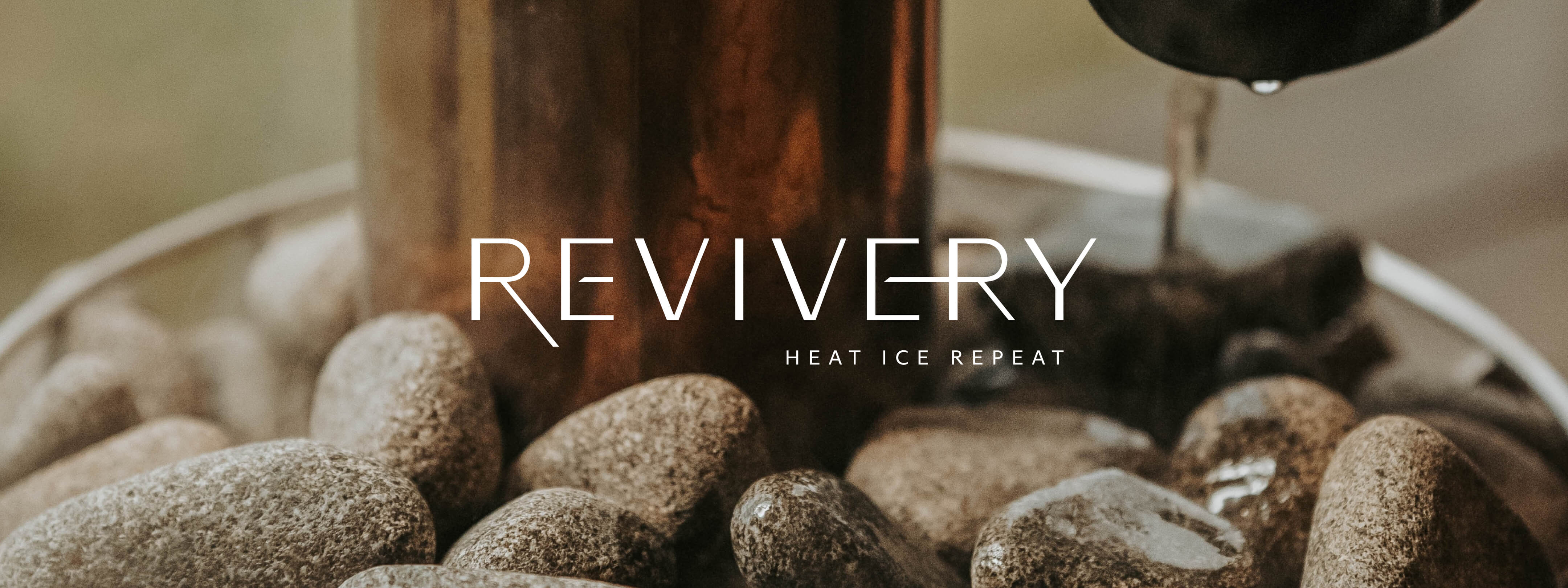
Revivery
A fleshed-out visual identity and brand new website for a high-end sauna and cold plunge spa based in Tampa
A fleshed-out visual identity and brand new website for a high-end sauna and cold plunge spa based in Tampa
To begin our work with Revivery, we had to start by understanding their goals for the company and how they were thinking about it in the landscape of spa and wellness brands. We had a deep dive kick-off with the Revivery team, who came admirably prepared with market research, concepts for the interiors, and the beginnings of a visual identity. They walked us through their vision in detail.
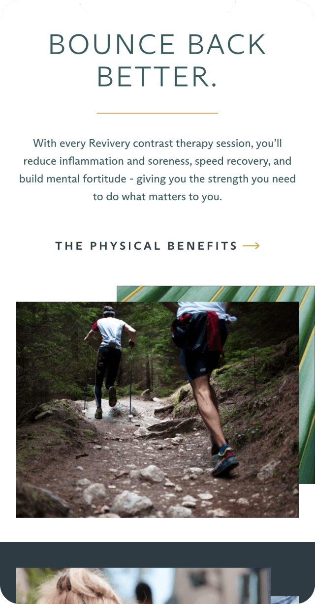
The team knew that one of the most appealing aspects of sauna and cold plunge in combination is all the physical health benefits that come with it. Along with cardiovascular stimulation that rivals what you get with exercise, this combination can help shorten recovery times for athletes, and can improve metabolism. Leaning into these value propositions was key for the Revivery team.
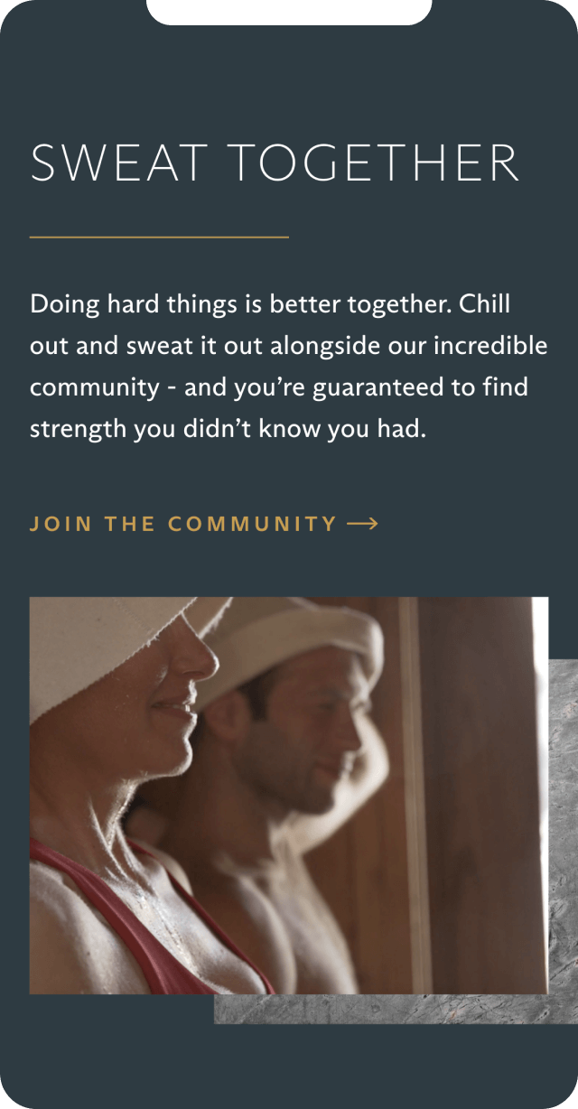
The team also had a strong understanding and veneration of Nordic sauna traditions (Finnish in particular) and their social impacts. In Finnish sauna tradition, inviting someone to join you in the sauna is a sign of respect and trust; similarly, the Revivery team wanted their sauna experiences to be more than just about physical wellness. Their business plan was all about guided sauna and cold plunge experiences, which is not as common in the sauna and spa space, and in their testing they found that their users not only physically felt better but they were bonding with the others in their guided experiences.
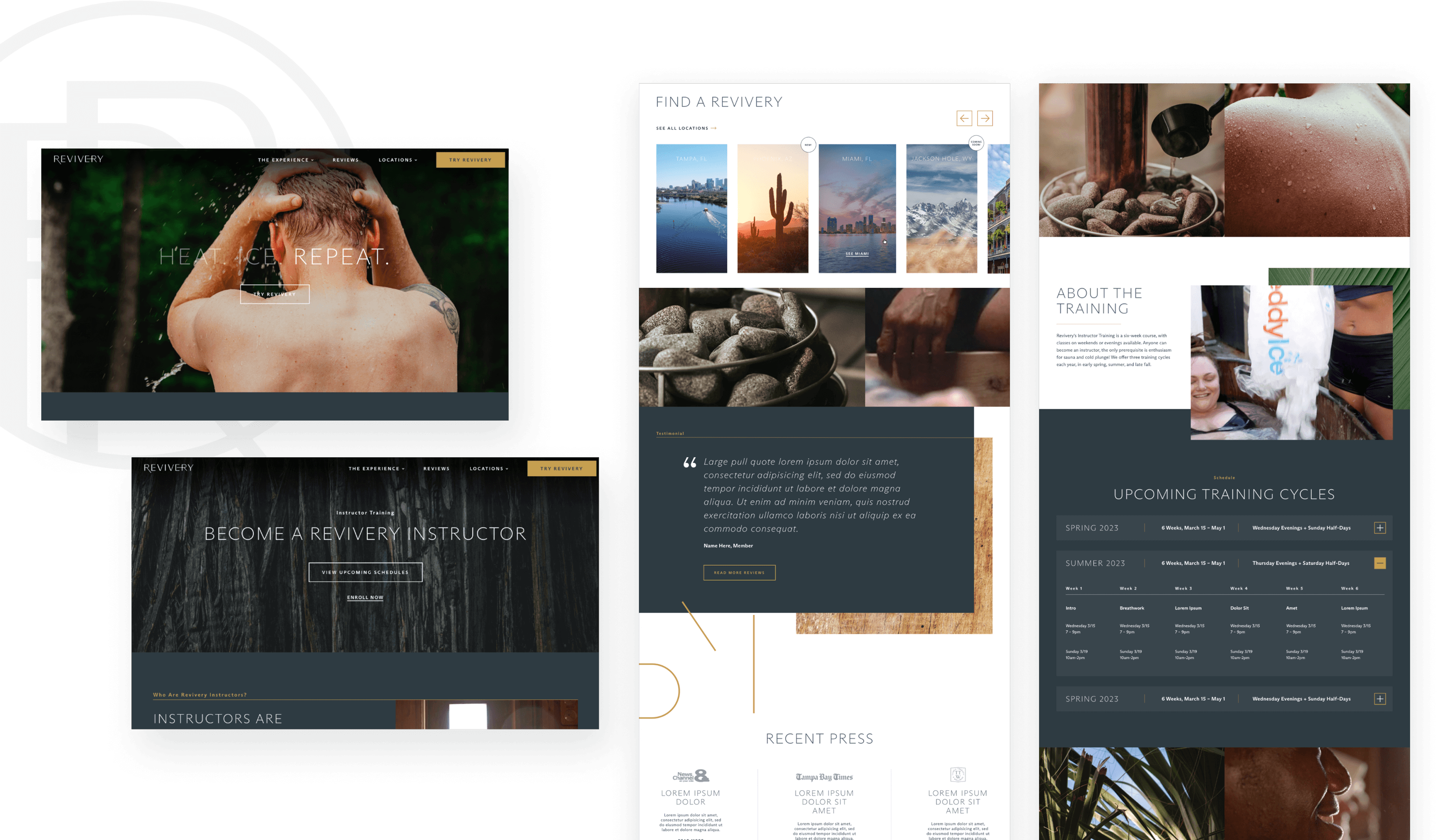
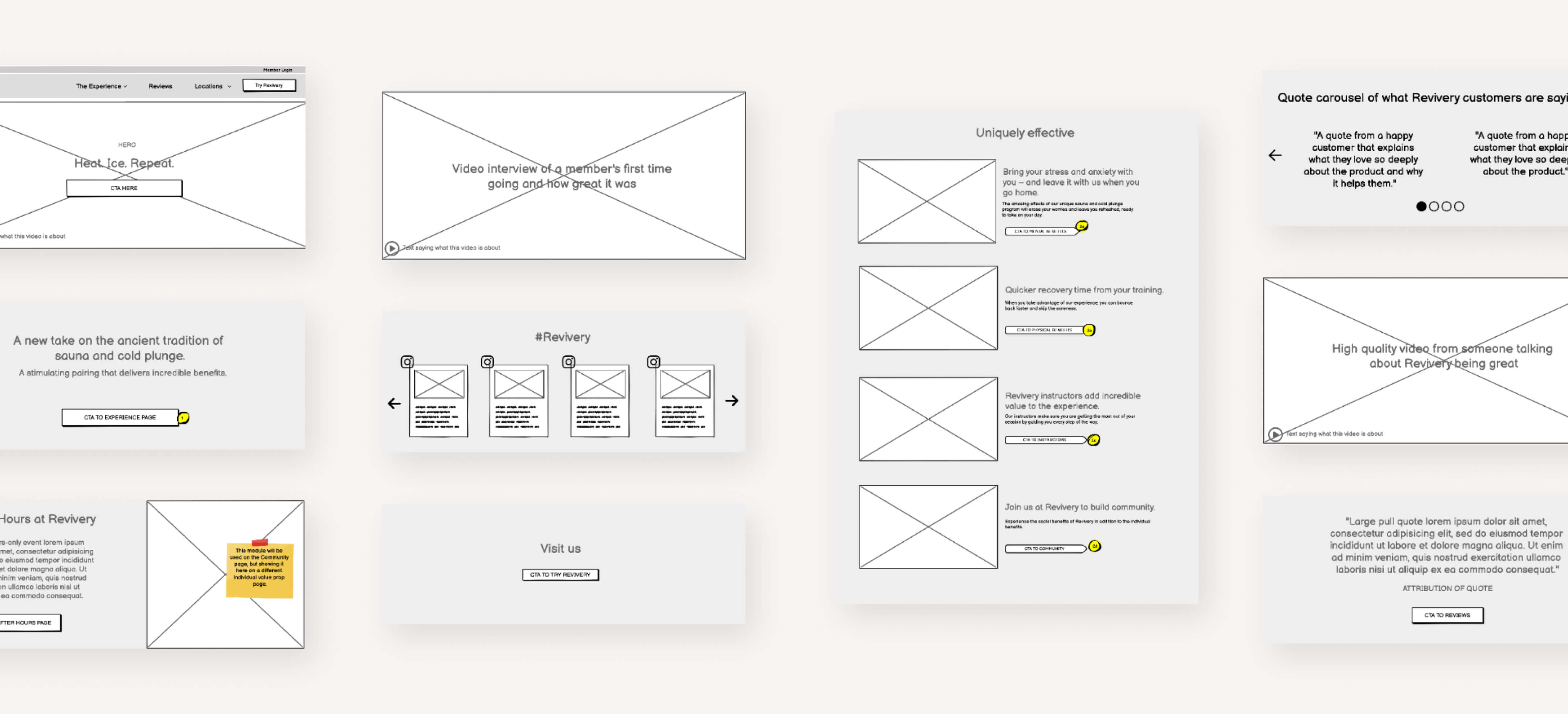
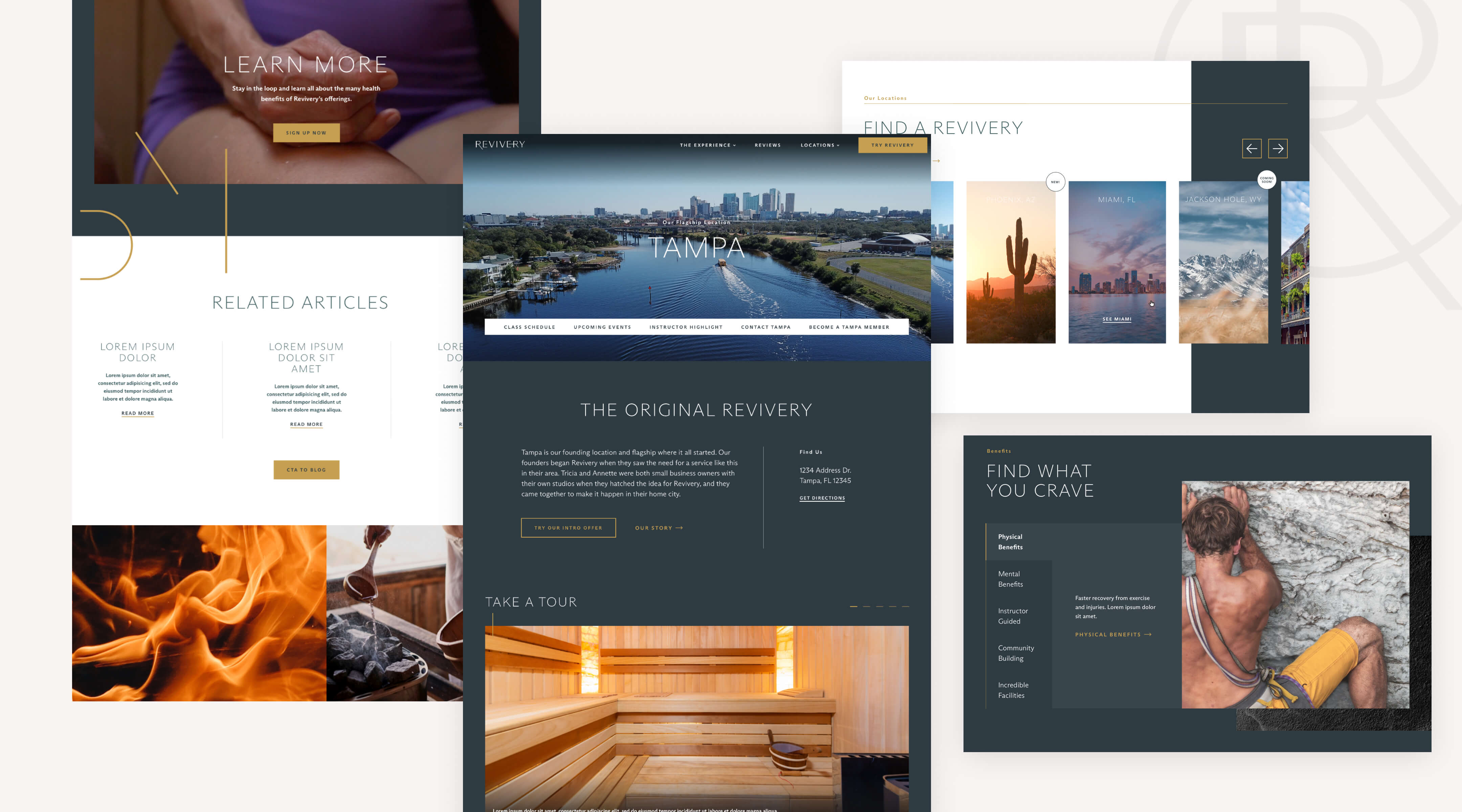
We poured all the research from our Discovery phase into our work on the user experience for the site. Starting with a site map, then moving into detailed wireframes, we laid out what landing pages would be needed, and how these pages could be structured to really make the value props of Revivery shine. These landing pages focused on the science backing up the sauna and cold plunge health benefits, highlights on the mental and the physical benefits, a deep dive into the community aspect, and profiles of the instructors.
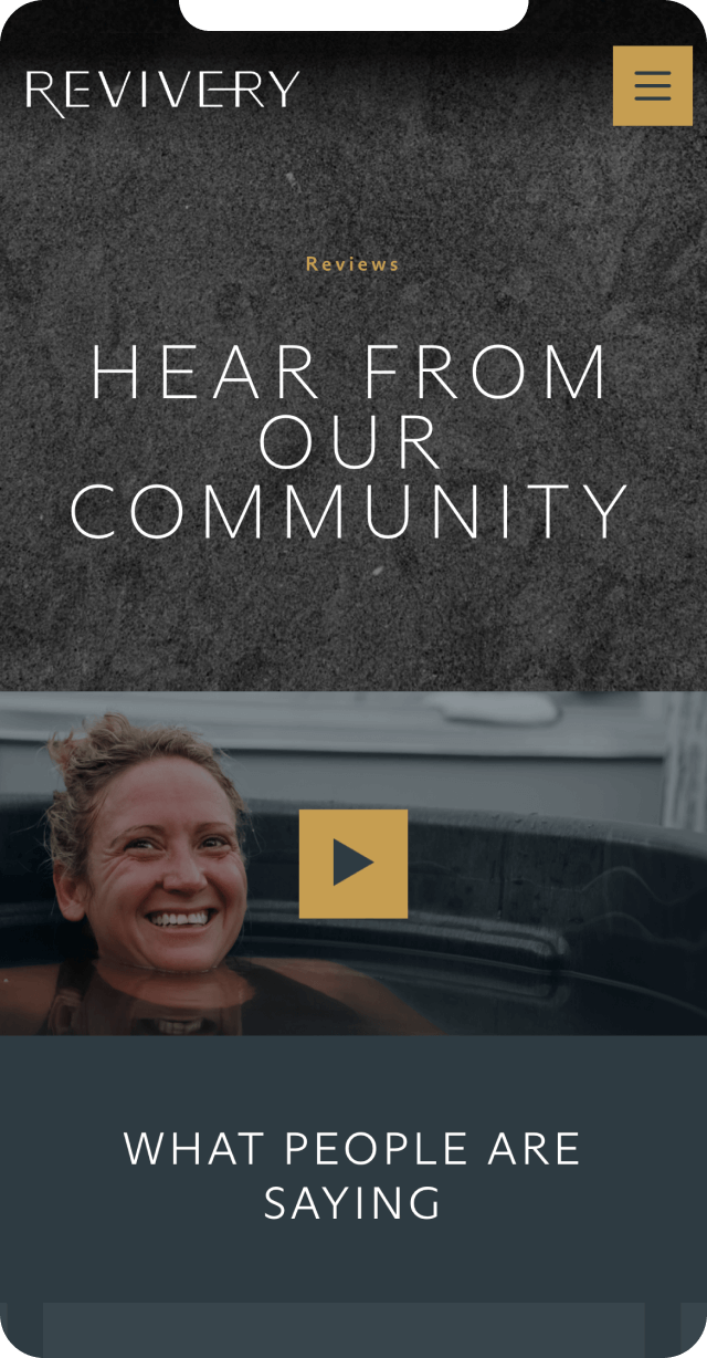
The Revivery team shared with us that they would be leaning into a more masculine look for the brand, in accordance with their market research and their target audiences. They came to us with the beginnings of a visual identity, and told us the existing mood board wasn’t quite right – it was filled with photography that didn’t convey the depth and real experience behind the brand; they wanted the feeling of camaraderie and positivity to come through the photography.
They also shared with us their plans for their first physical space, which would be based on the Japanese art of kintsugi: the tradition of repairing broken pottery with lacquer and gold or silver dust, so that the broken vessel becomes even more beautiful once repaired – once again bringing in the notion of recovery. Their space would be filled with natural materials – wood, of course, in a nod to traditional Nordic sauna design, but also stone and concrete with added gold-plated veining to bring in the look of kintsugi.
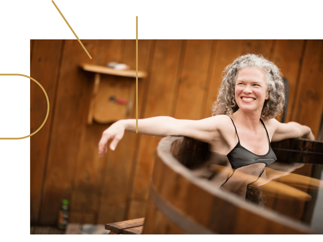
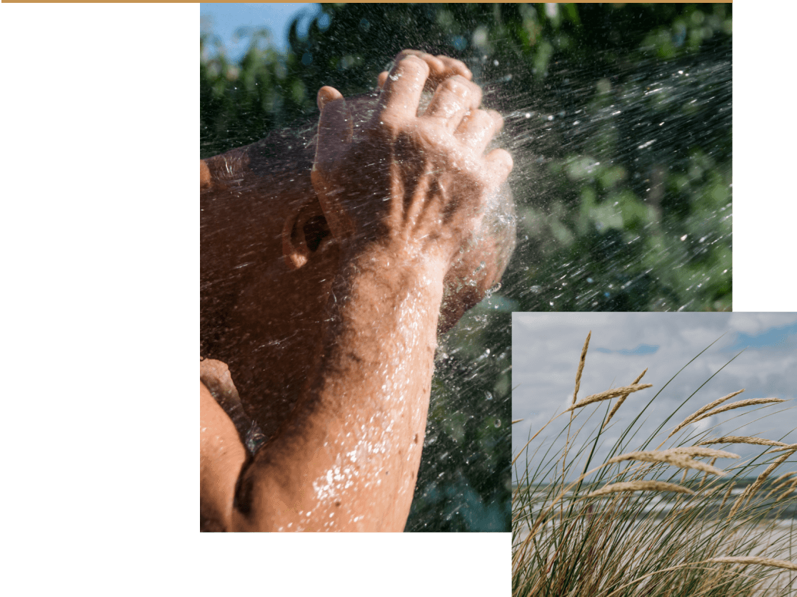
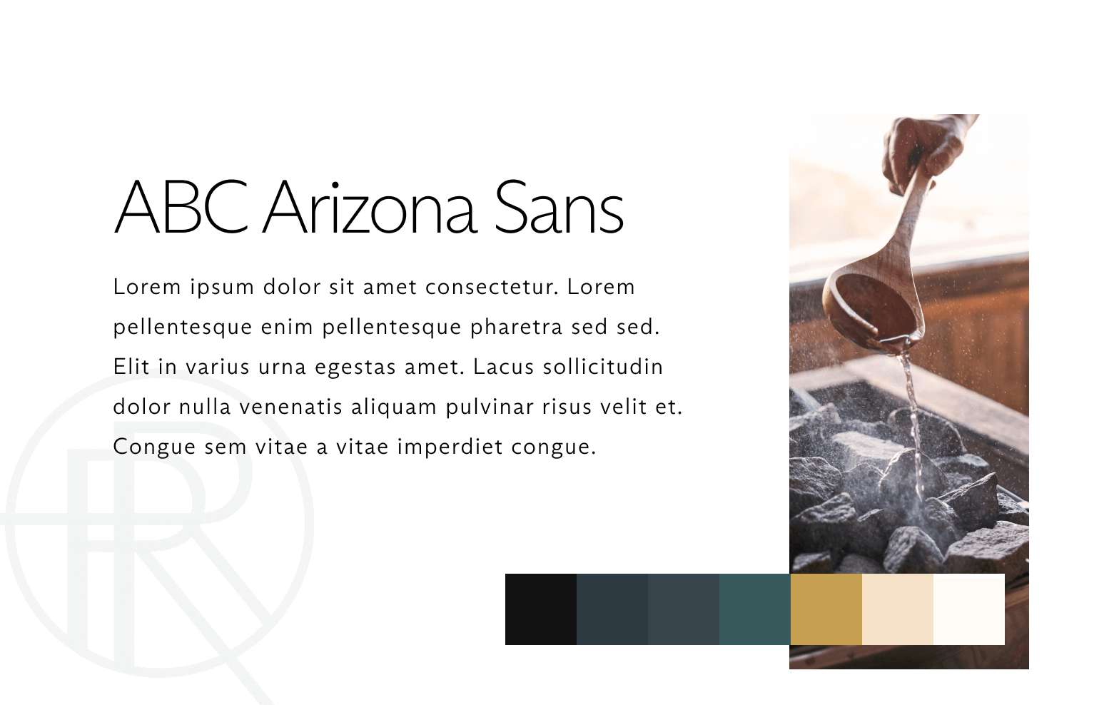
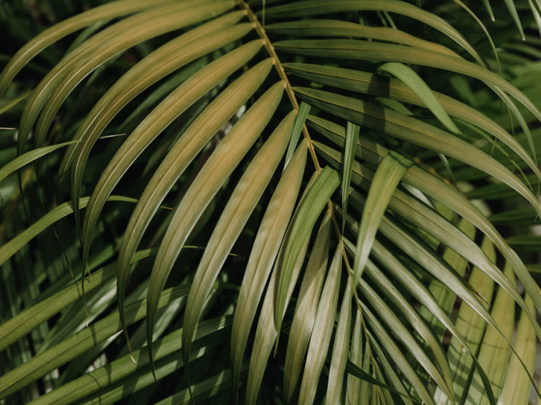
We got right to work extending and modifying the visual identity so it aligned better with the company’s goals and personality. We started by adjusting the photography art direction to show more images of real people (not stock models) laughing and communing as they took part in the Revivery experience. To go with these images, we also added texture to the visual identity using accent imagery of fire, water, wood, plants, charcoal, concrete, and stone – making sure that Revivery’s connection to nature and their veneration for quality materials was emphasized.
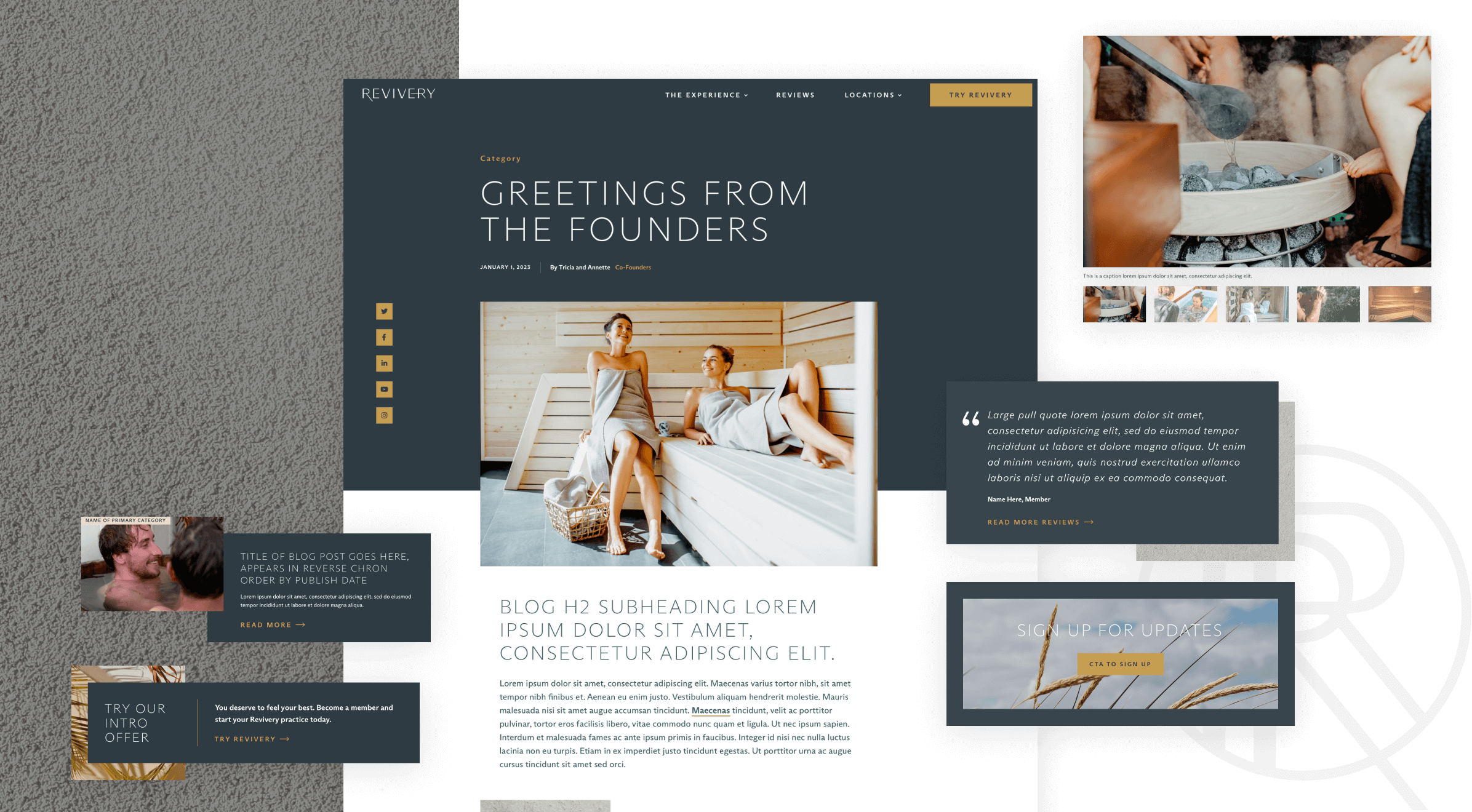
As we began building out the web design, the visual identity came even more into focus. We employed touches like layered images to show depth, and delicate gold lines to bring in the kintsugi feeling. The majority of the site is on a dark background, in keeping with Revivery’s more masculine slant, and we expanded the color palette of the brand to make sure we were adhering to accessibility guidelines.
In addition to small touches of movement like the use of parallax across the site, we also made sure to include plenty of immersive, full-width images and videos to give users a window into the Revivery experience. Juxtapositions of Revivery users within the sauna and cold plunges pair with images of athletes and subjects deep in meditative contemplation, to further target the Revivery demographics.
Bringing the designs to life for users is only half of what our dynamite developers did for Revivery. They also – as always – created an easy to use, intuitive CMS back end in WordPress so that the team could manage the site smoothly. A page builder with custom modular blocks means that the team can easily create new landing pages whenever they need to, without sacrificing the personality and unique look of their site. Plus, fully responsive pages mean that the site will always look and function perfectly no matter where Revivery users are – at home, at work, or on the go.
Revivery launches in a few short months, equipped with an immersive, easy to use website that tells their story. It was so much fun to dive deep into the world of saunas and cold plunges, and working with the Revivery team led to a rich, dynamic collaboration that underlined just how worthy it is to put in the effort to get it just right. We can’t wait to see how this company grows with such a great team behind it. If we’re ever in Tampa, you know where to find us!