Portico
A name, visual identity, and UX consulting support for a brand new cloud-based property management software.
A name, visual identity, and UX consulting support for a brand new cloud-based property management software.

Real estate developer TF Cornerstone owns and manages numerous luxury high-rise properties in the New York City area. Although the company previously used Buildinglink as their cloud-based property management solution, they decided to create an in-house engineering team and build their own. Shortly after launching the new software to all of their buildings, TFC reached out to Studio Simpatico to help them improve the tenant experience. Several months later, when they decided to take the platform to market (selling to other luxury buildings), they engaged Simpatico once again to create a name, visual identity, and marketing website for the new brand.
Simpatico’s naming process is highly collaborative, so we started with a discovery process where we dug into their ideas for how they wanted the brand and the product to be perceived, as well as their visual preferences for it.
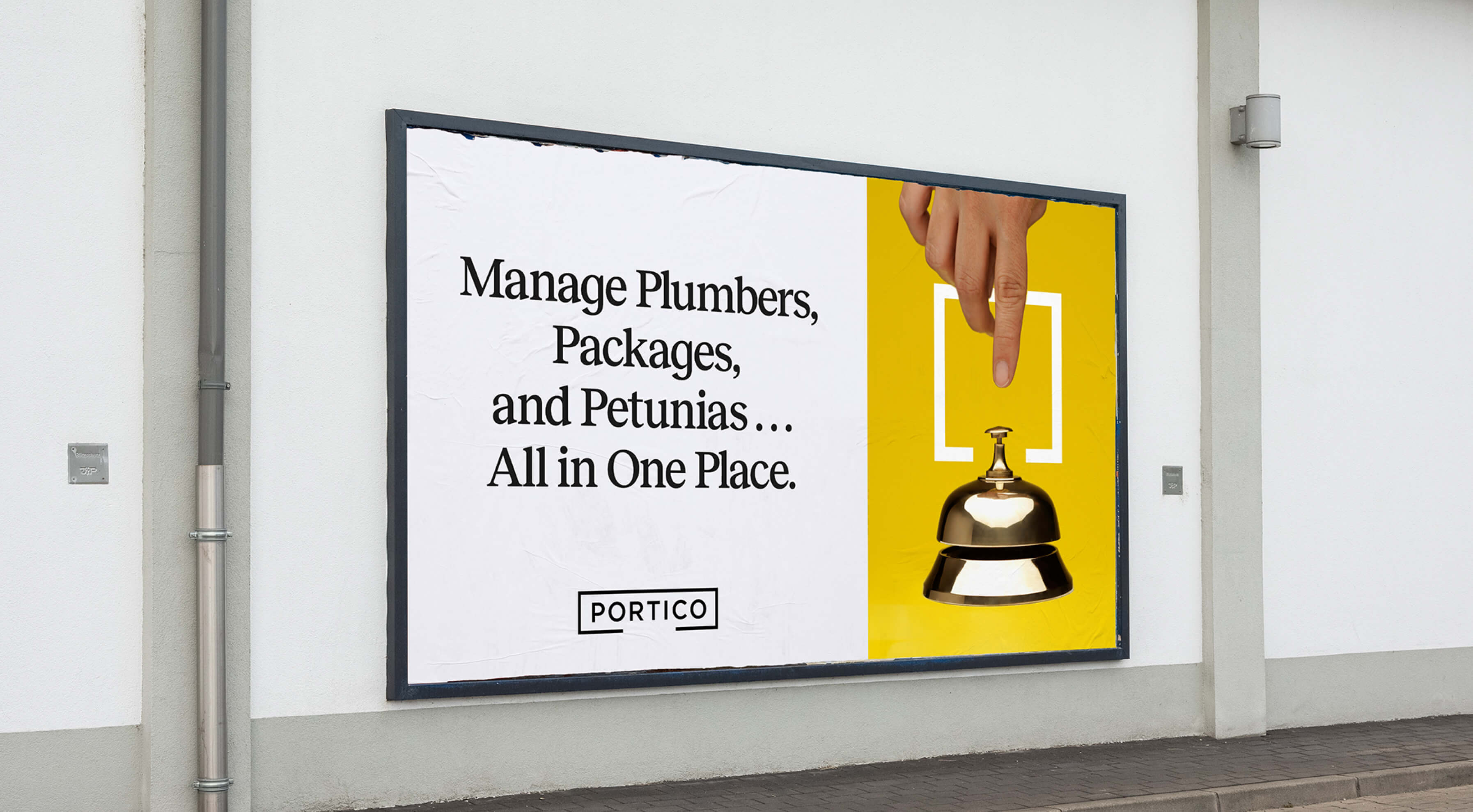
We then dove into brainstorming, coming up with a few different concepts that the team could pick from, and corresponding names. Over the course of a couple of rounds, we narrowed down the concepts to one that hit the right tone with the team: that of a “concierge” experience, with the feeling of time-tested, characterful, old New York. From there we came up with the name “Portico.”
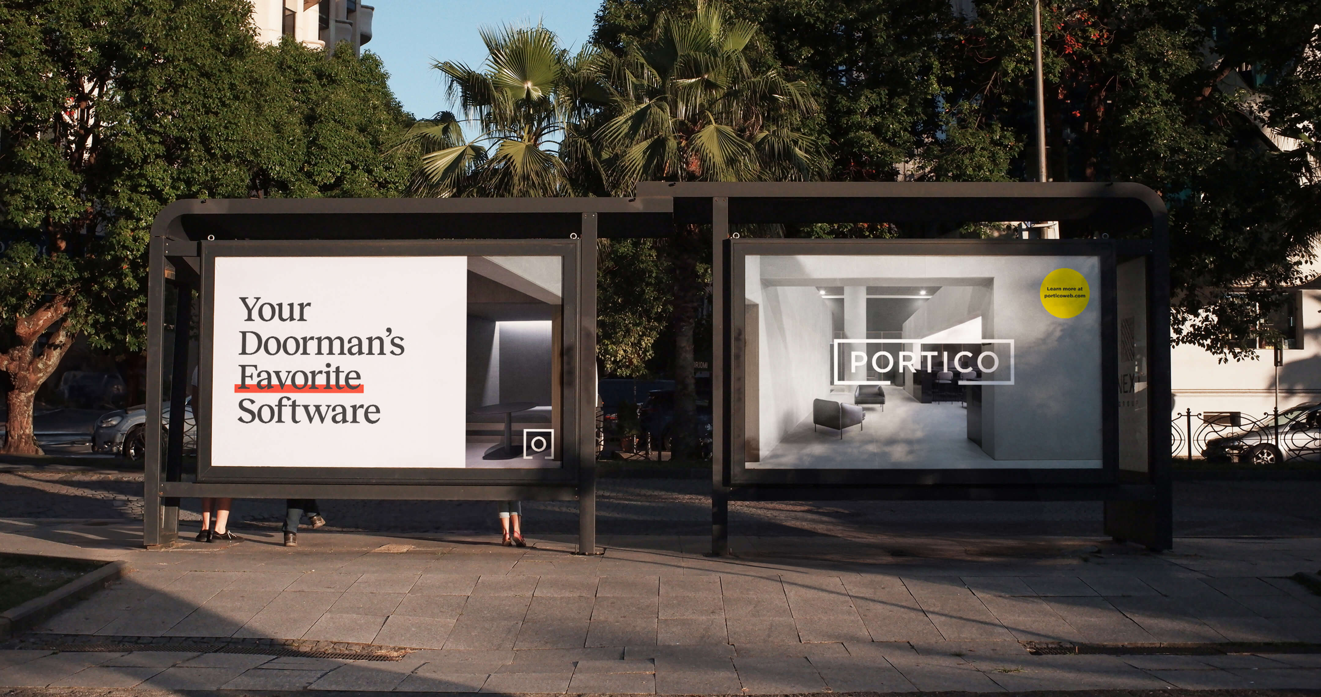
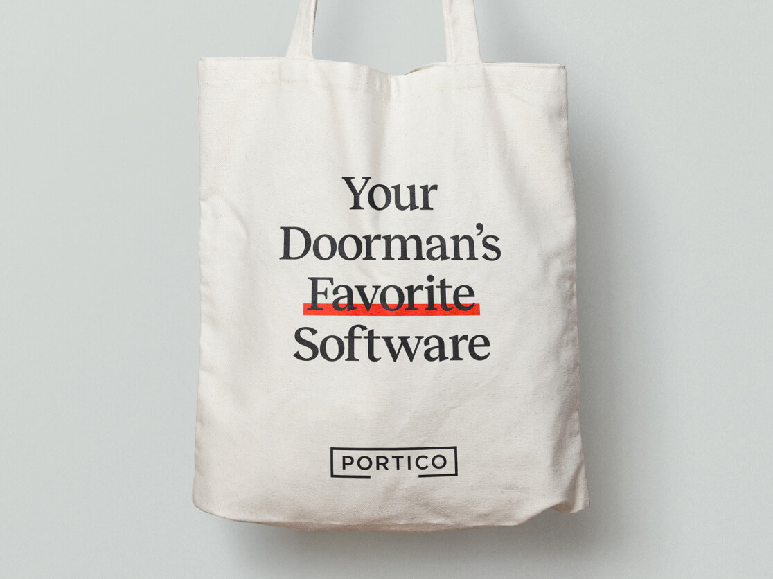
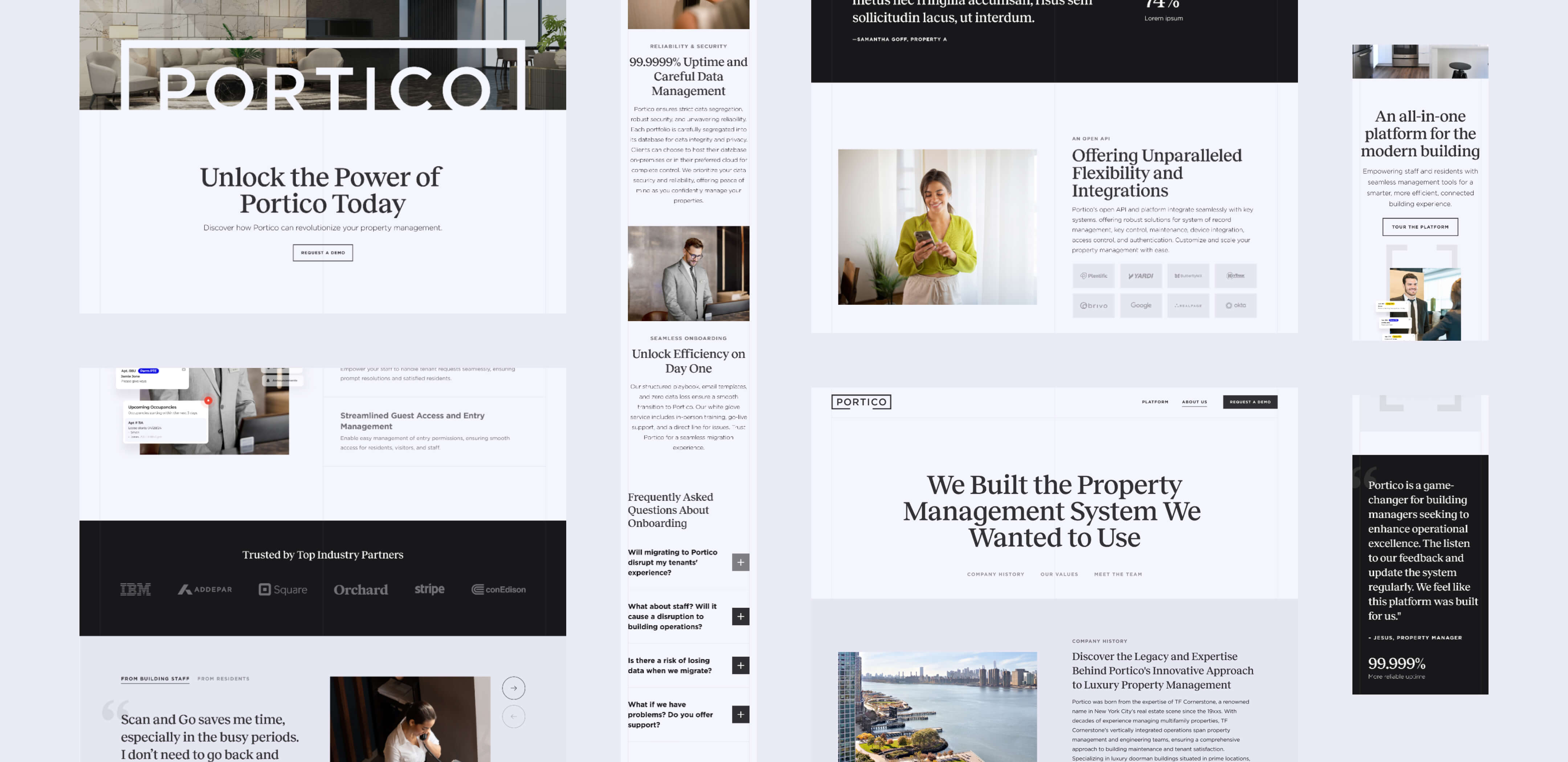
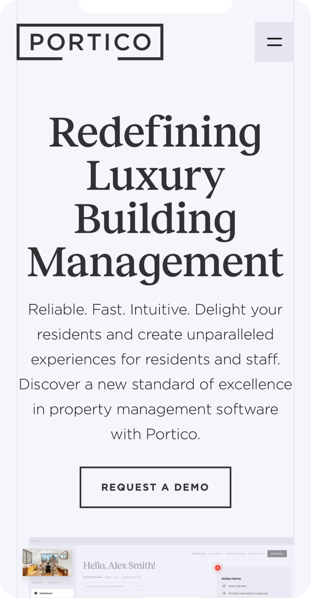
“Portico” brings to mind a lobby in a spacious, historic building. It’s the first impression of a visitor’s experience of a building, and it’s where the lobby staff will greet you – tying back to the concept of a concierge experience. Now that we had the name and underlying concept, it was time to move on to the tentpoles of the brand: logo, color, and typography.
We relied on our conceptual work to help us come up with logo options, drawing on the idea that, like a longstanding member of a hospitality team, the Portico product is dependable, trustworthy, and time-tested, while smoothly keeping up with the ever-changing needs of its clientele. We leaned into the concept of sturdy, straightforward old New York, where you know what you will get when you walk into an establishment––and it includes a big personality.
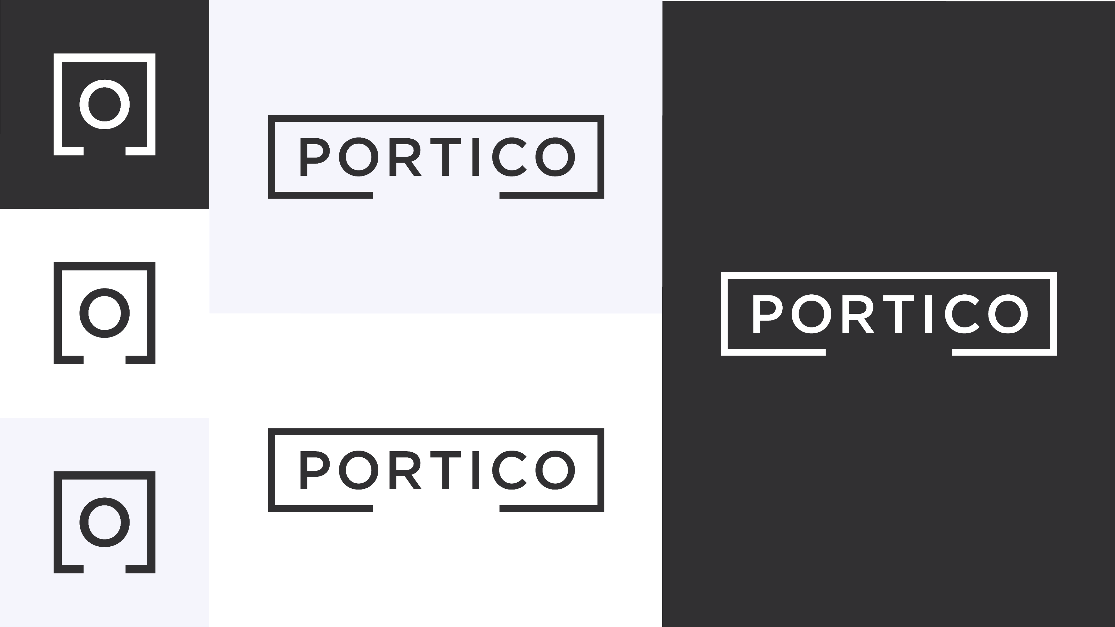
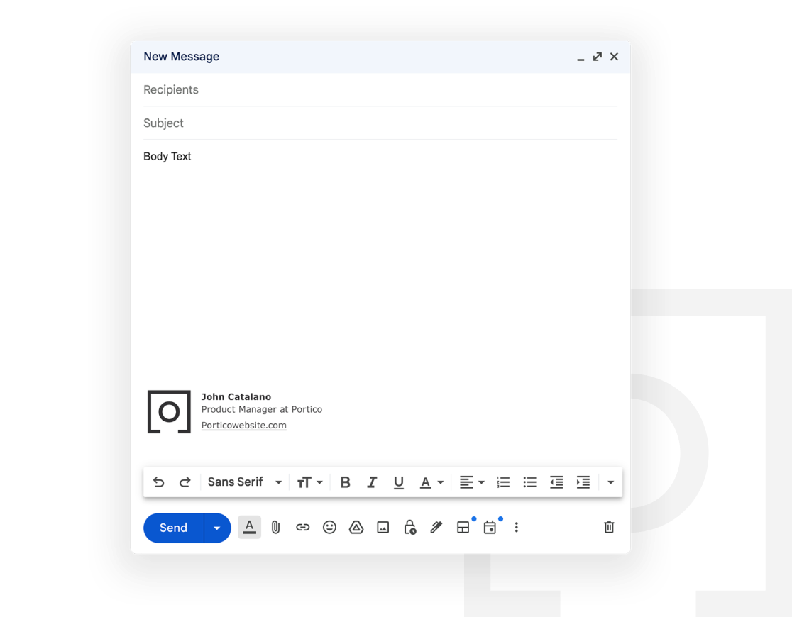
The Portico logo uses Gotham, which encapsulates all these ideas perfectly. The typeface is inspired by the timeless, humble, and idiosyncratic sans serif lettering found all around the city on handmade and vintage signage. Gotham is a workhorse that feels functional, legible, and familiar –– but extremely well-designed and sophisticated at the same time.
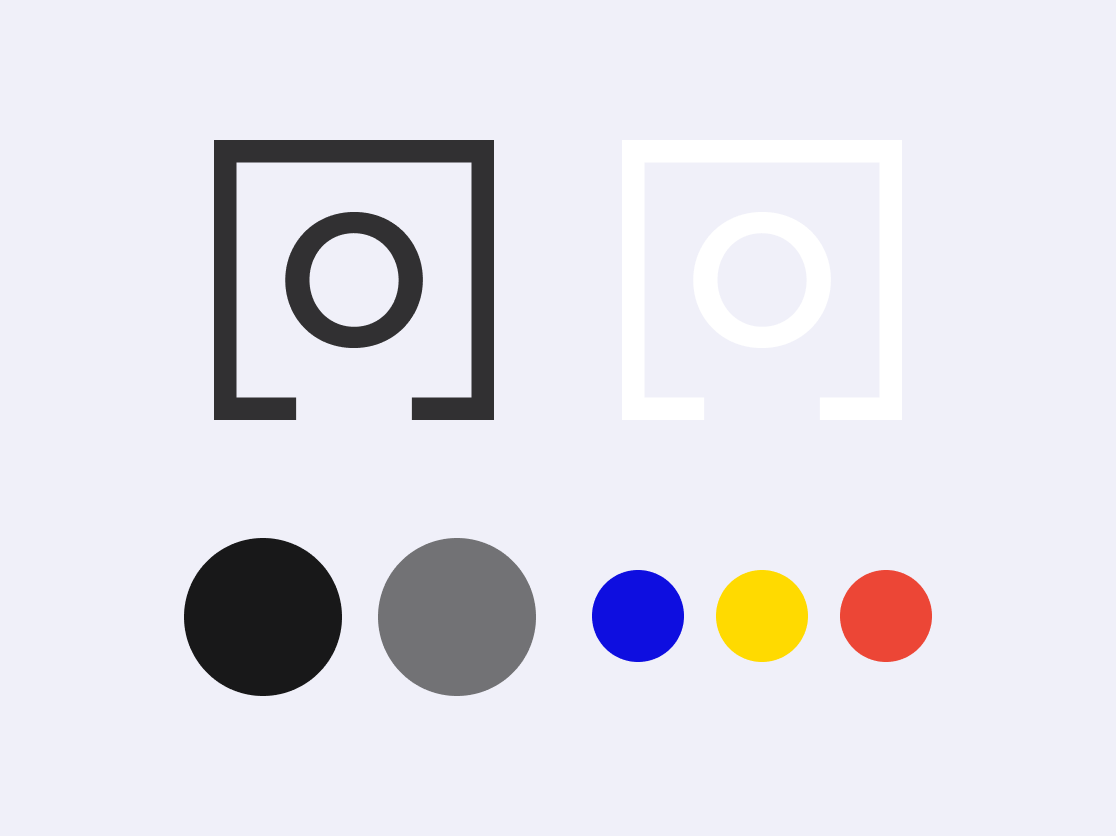
The open rectangle that surrounds the type in the logo serves as a reminder of the real estate origins of the product; it has the look of a room drawn by an architect in a blueprint or the shape of a lobby front desk, and gives the type a home to inhabit. Taken together, the logo gives a feeling of security, familiarity, and old-school class that you might get from walking into a historic building in New York.

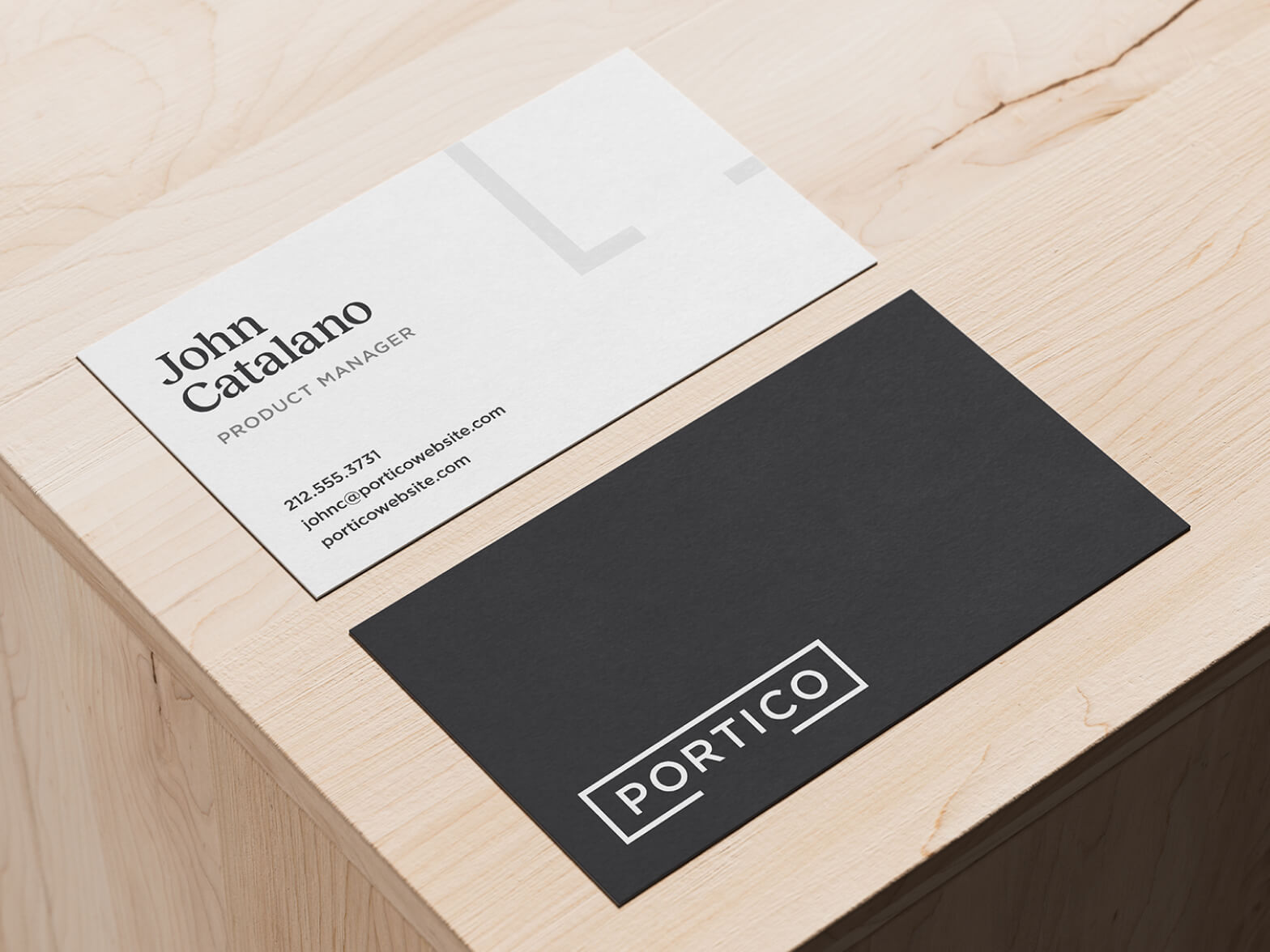
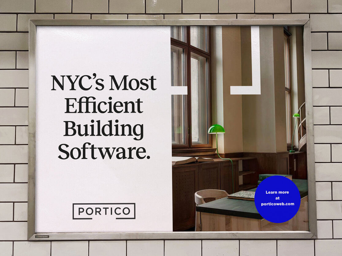
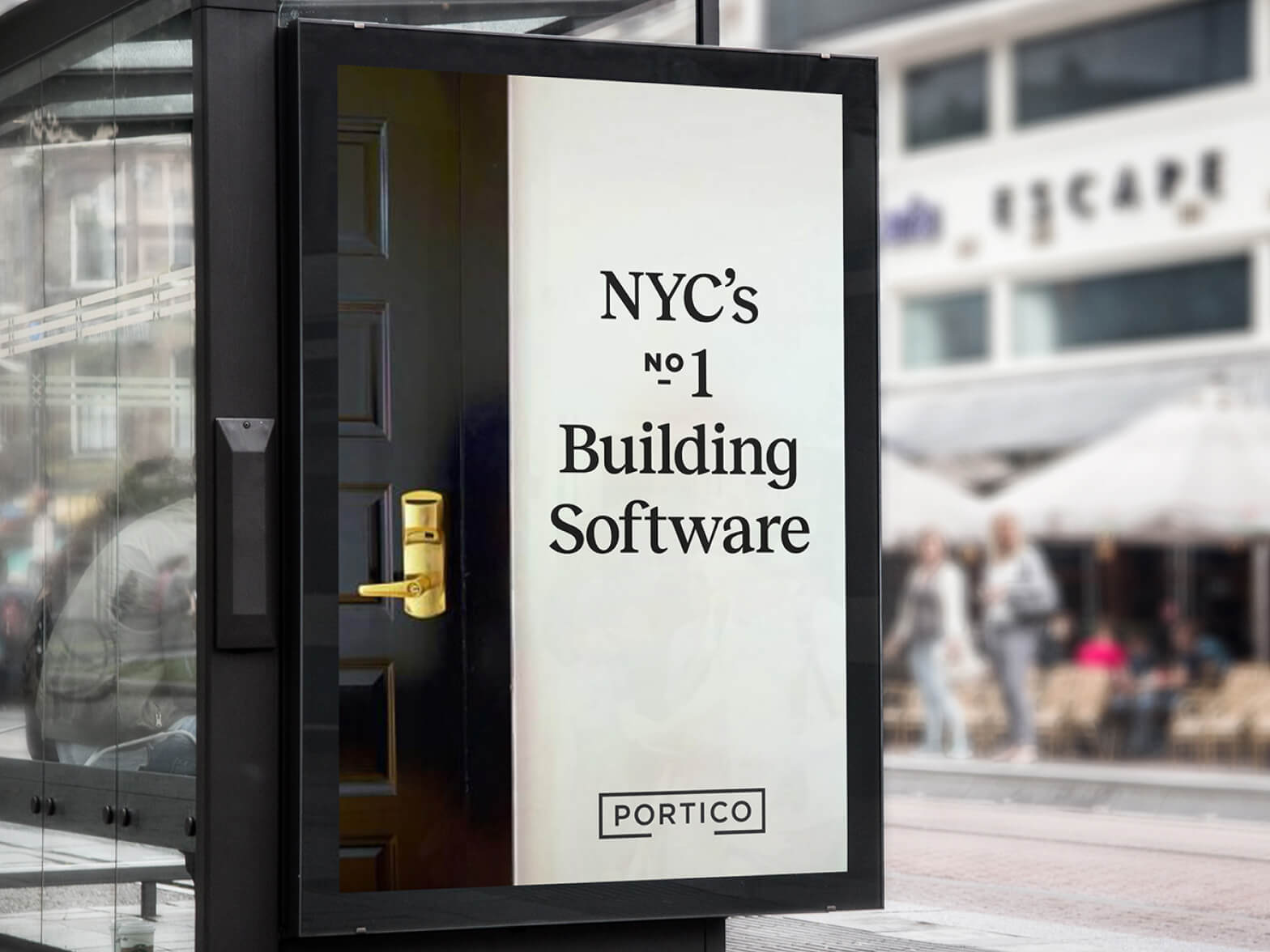
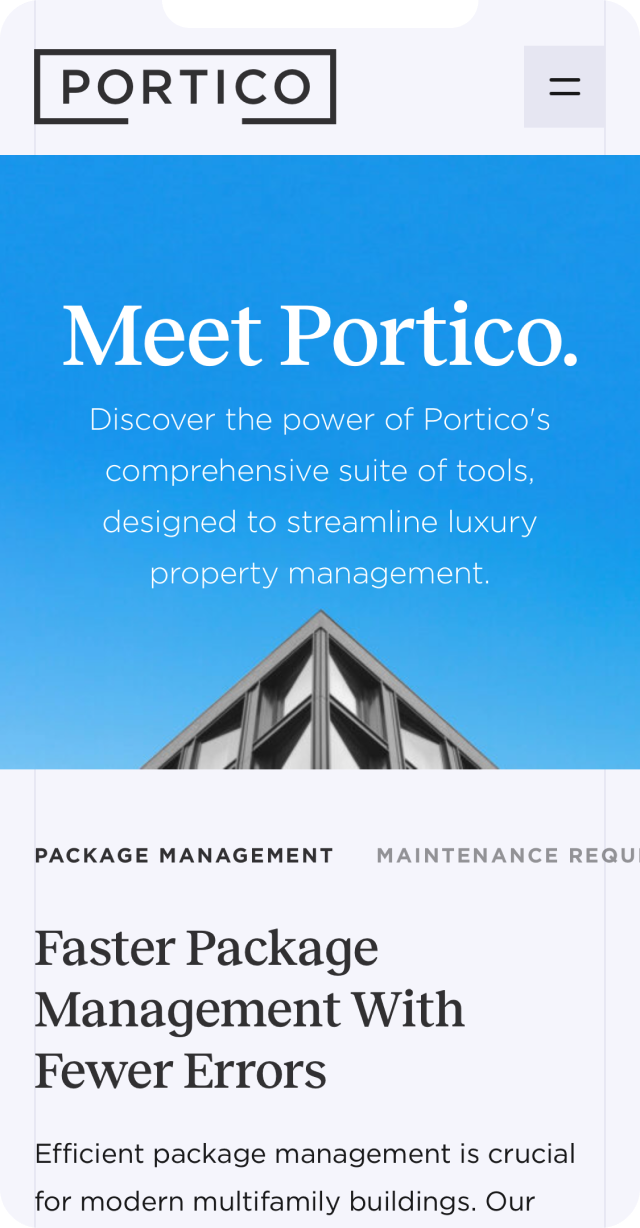
As we finalized the Portico logo, we fleshed out the brand’s visual identity. The color palette for Portico is primarily neutral, featuring the New York classics black and slate gray, with a suite of bright shades as secondary colors to be used sparingly as highlights.
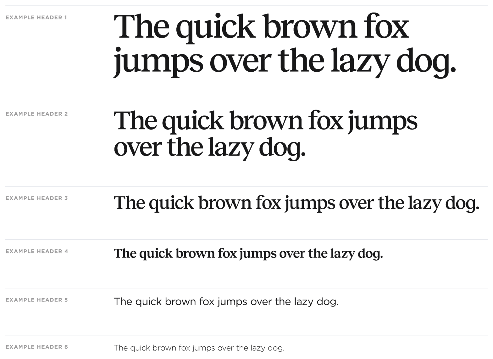
The primary font used for Portico’s brand is Reckless, a bold, confident, and friendly serif that would feel just as at home on a building awning as it would on a website. Gotham is the secondary font, unifying the branding with the logo. Together, the pair is legible, with a vintage-inspired but contemporary feeling, and lots of personality – just like the city of New York. It’s the perfect pairing to bring the brand’s clever copywriting to life.
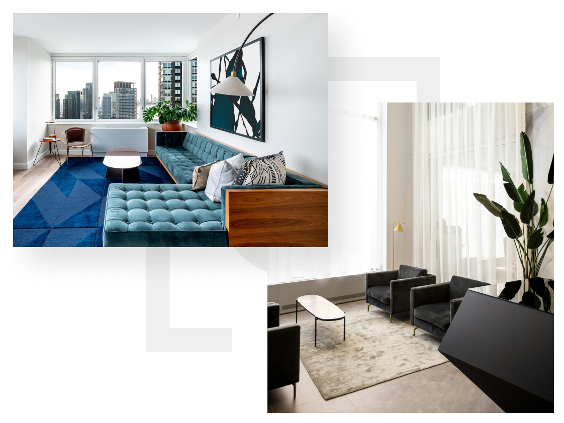
The Portico colors and typography pair nicely with the photography guidelines we outlined for the brand. A mix of interior and exterior shots of New York buildings and apartments sets the scene alongside detail and candid images of residents in action and building staff at work.
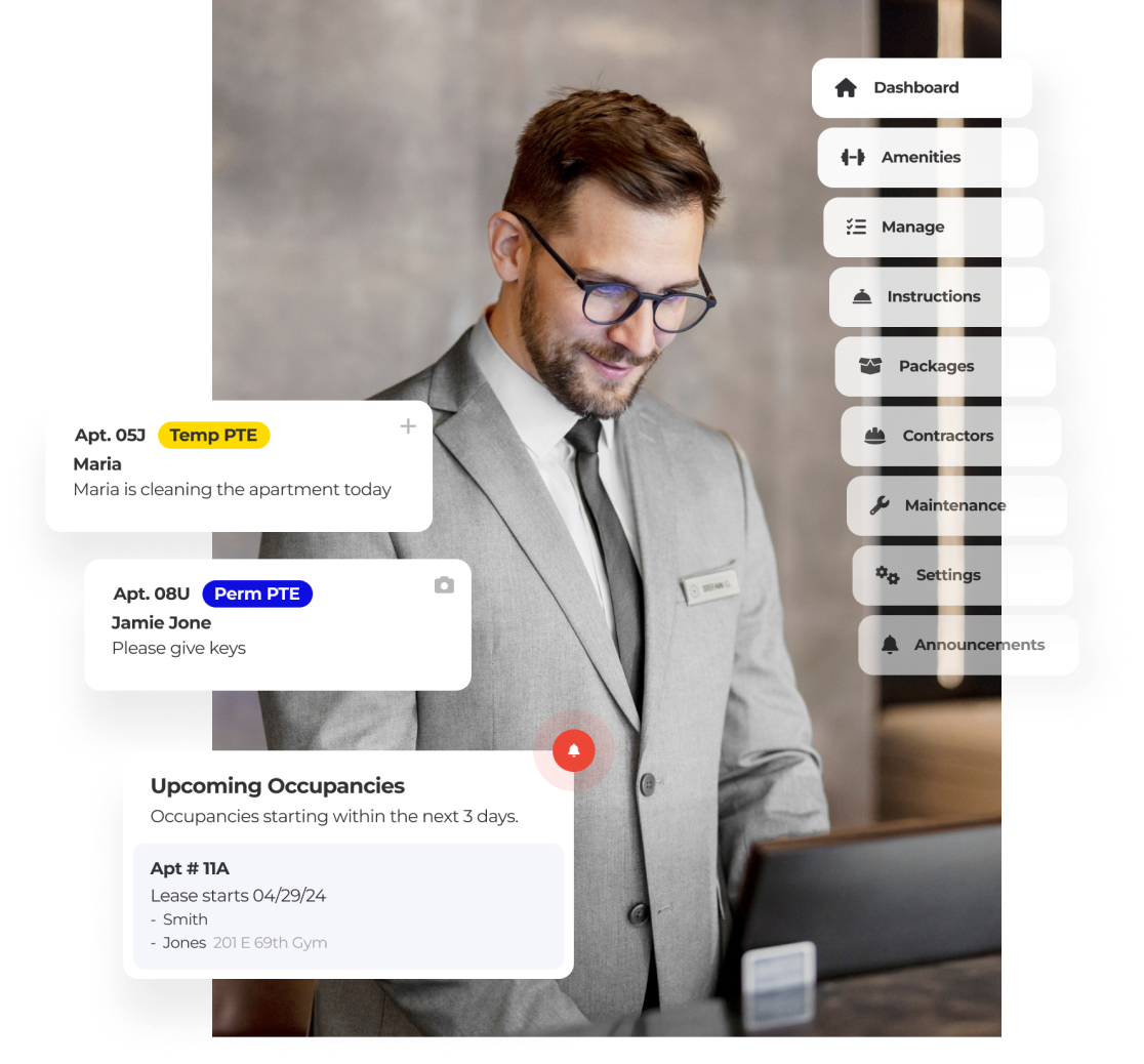

When TF Cornerstone first approached Studio Simpatico (without even knowing that owner Tamara Olson lives in a TF Cornerstone building!), they felt confident that the product was successfully serving building staff users. After all, they’d been receiving feedback and feature requests for months. However, they felt less confident that they understood whether their platform (more specifically, the MyTFC mobile app) was serving tenants. They asked Studio Simpatico for help, eager to learn more about the tenant experience, where the app was or wasn’t serving tenants, and ideas for improvement.
To gain these insights, we began our research by conducting a series of interviews with current tenants from several TF Cornerstone buildings. We designed a script with questions to help us understand the overall tenant experience, as well as determine how the MyTFC app was (or wasn’t) serving user needs.
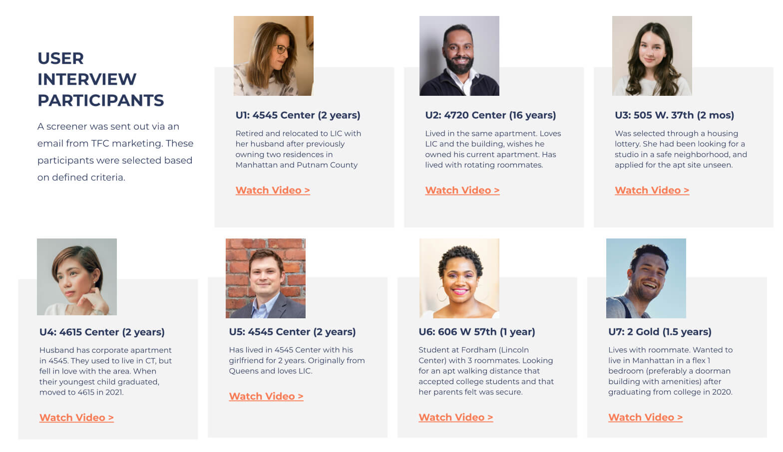
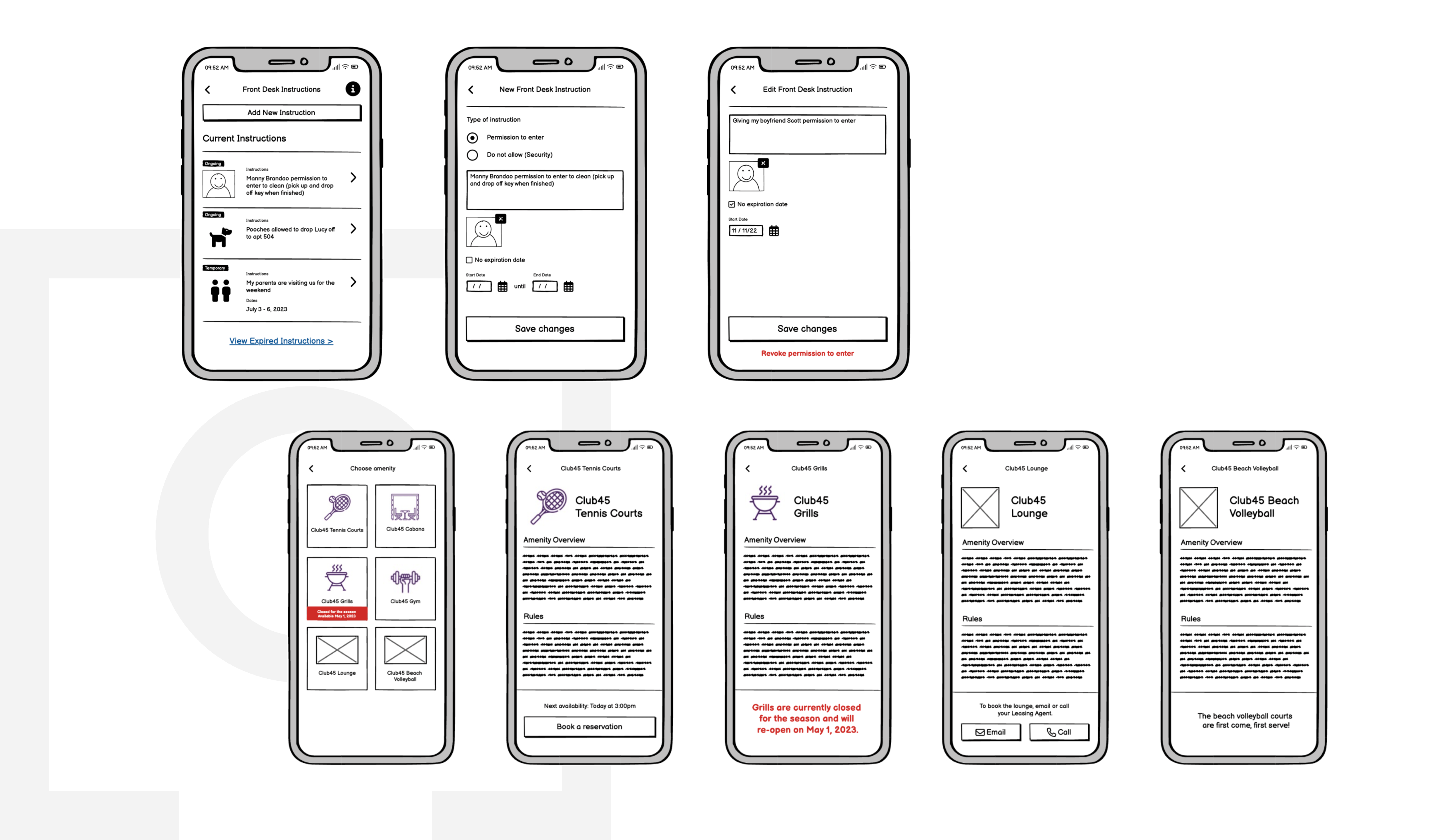
When the interviews were completed, we delivered a 1.5 hour presentation to the TFC engineering team. It distilled the findings of the interviews into themes and takeaways to help the engineers better understand tenants’ priorities and usage patterns. Additionally, we outlined UX recommendations for improvements (via low-fidelity wireframes) and suggested new features based on what we heard. Following the engagement, we received positive feedback from stakeholders, and learned that our research and recommendations empowered product managers to make several positive improvements to the existing app.
TFC’s final product is a fully fleshed-out new brand for their product Portico, with the resident experience, vision for the product, and future marketing taken into account at every step of the process. The TFC team was a delight to work with so closely, and we loved bringing this new brand to life!