OK! Magazine
A redesign to return the beloved gossip website to its celebrity-positive roots
A redesign to return the beloved gossip website to its celebrity-positive roots

from the client "The upgrades to okmagazine.com deliver an unparalleled user experience with a cleaner look and bolder design that delivers the kind of experience that consumers have come to expect and will provide an opportunity for us to engage them even more with each and every visit."
 Dylan Howard Chief Content Officer, OK! Magazine
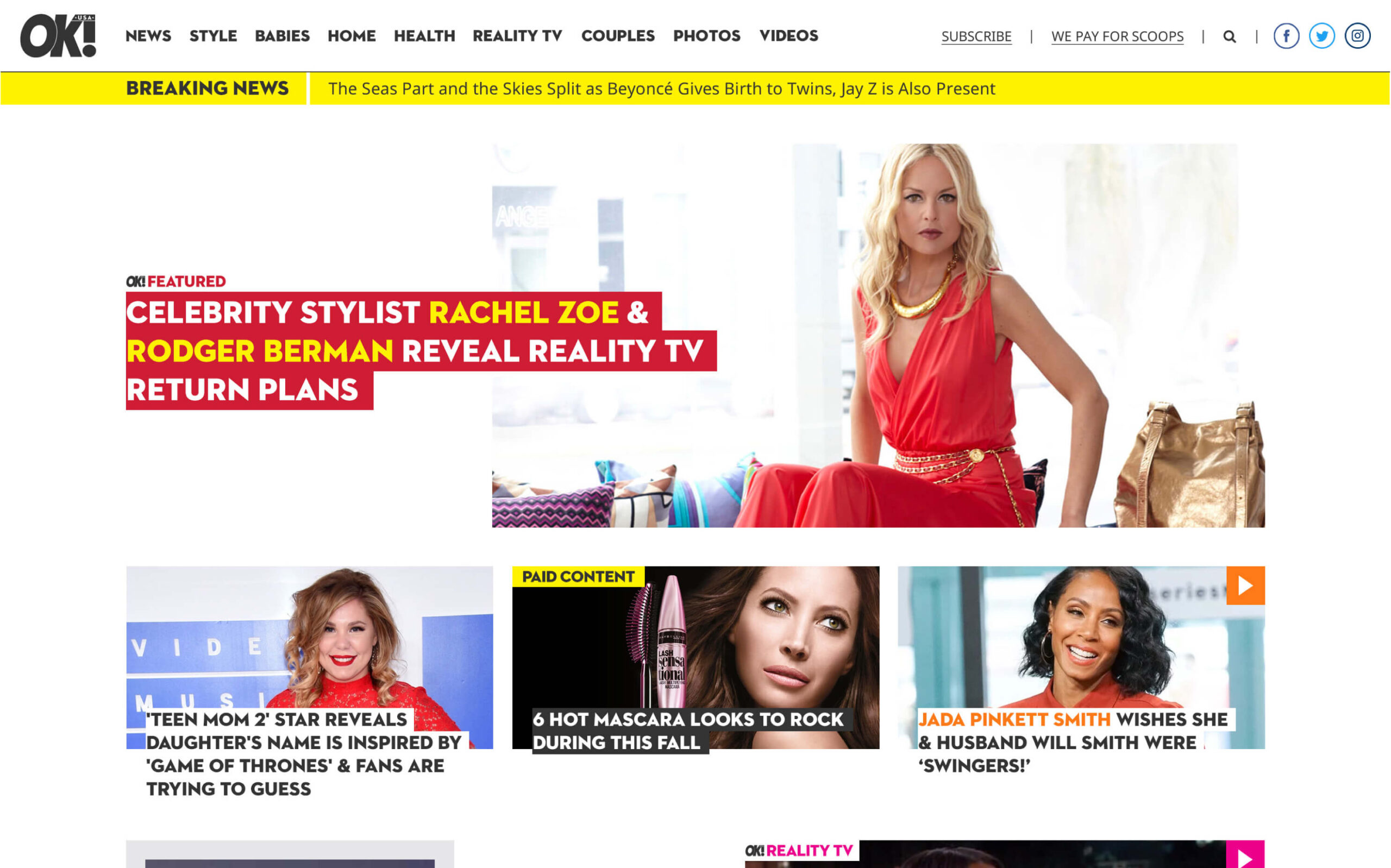
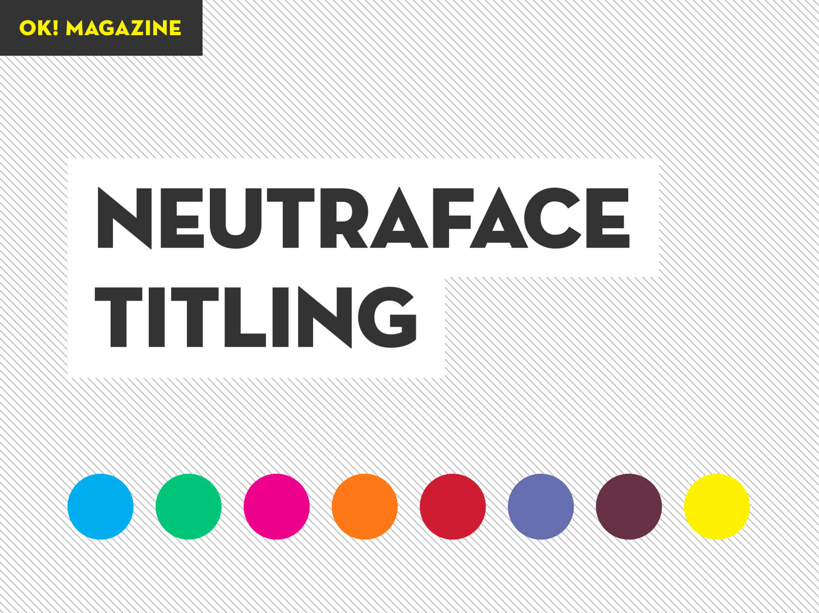
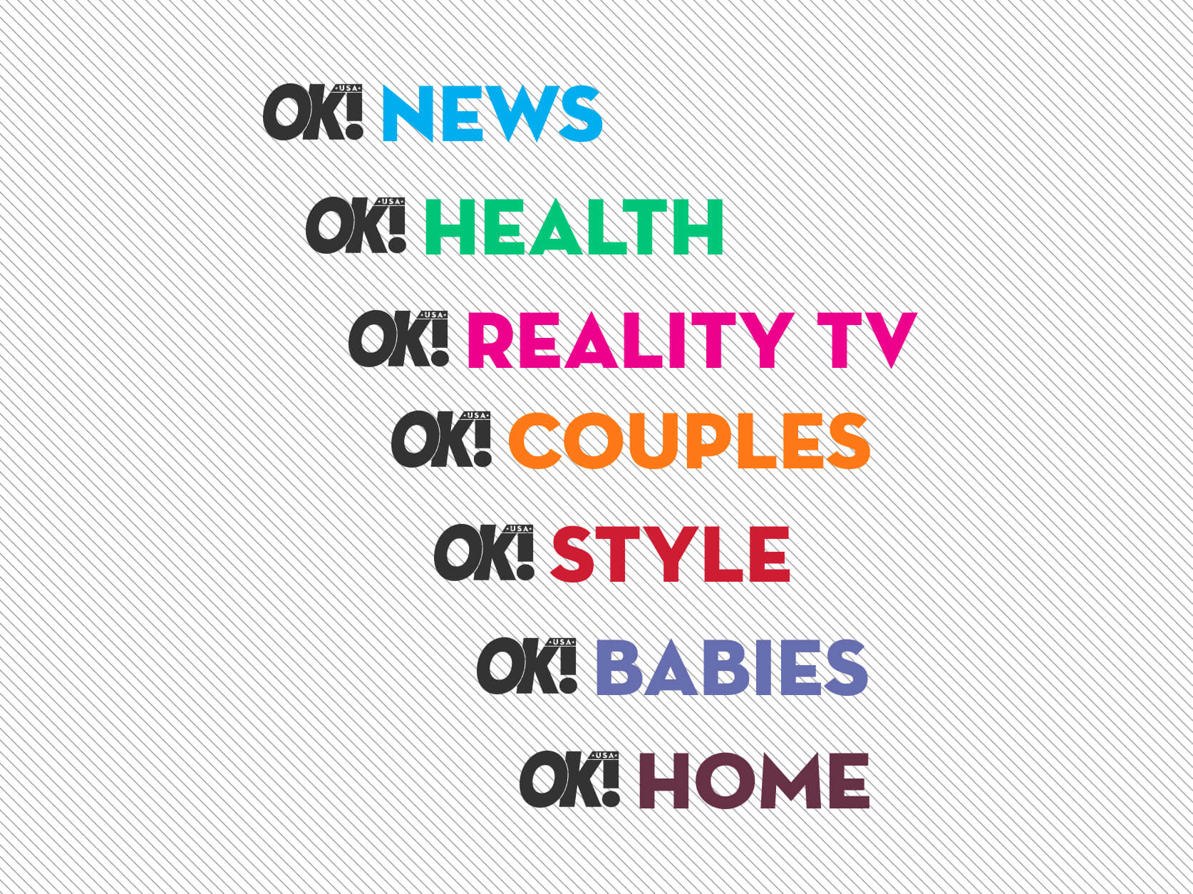
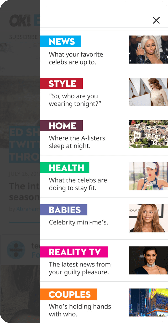
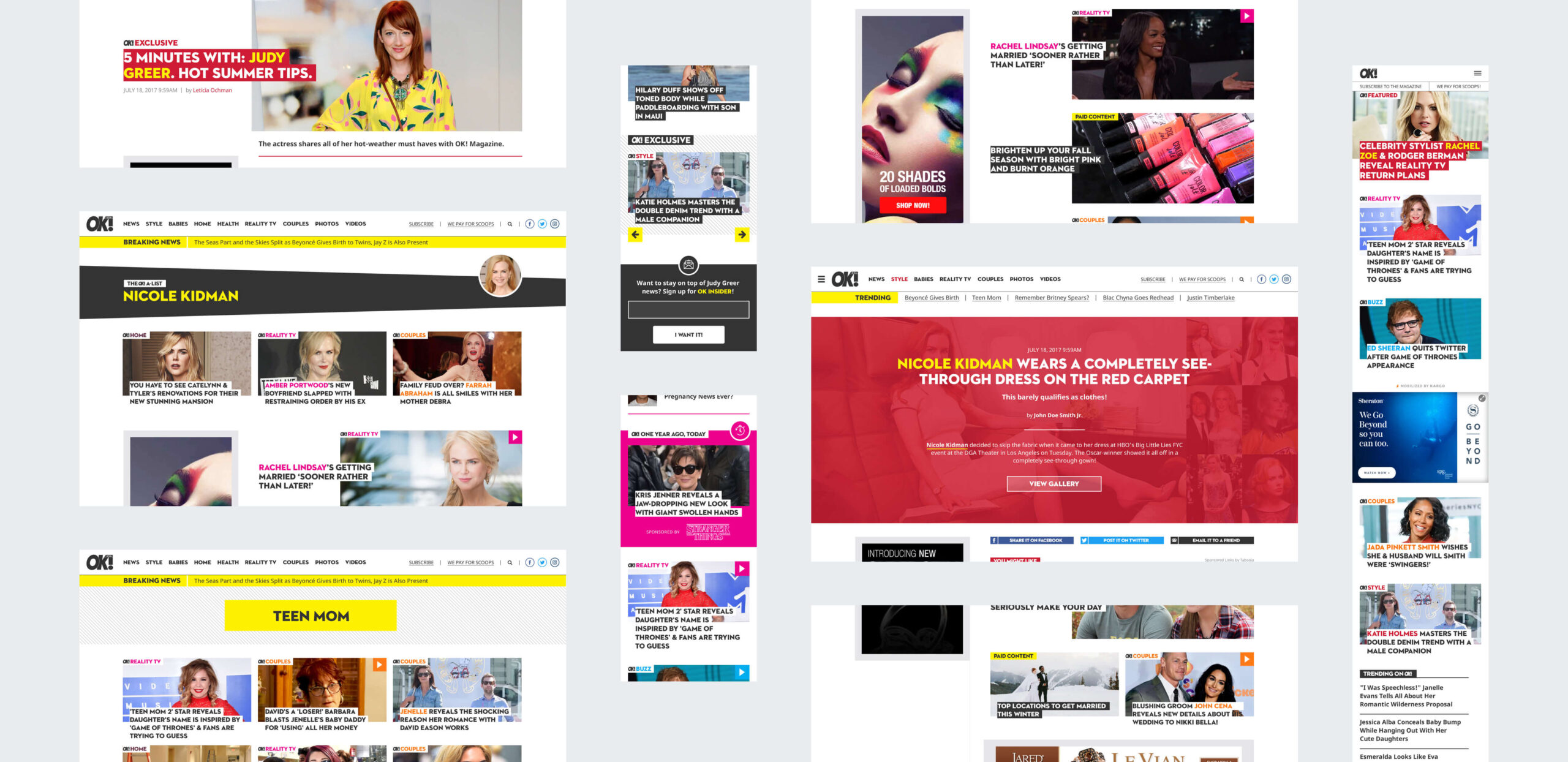
 Reaching back to its print roots as a celebrity-positive publication (a unique facet of OK! in the celebrity journalism vertical), one of our core goals was to bring that foundational aspect of the brand to the new digital design. Numerous elements of the new design were inspired by the beloved print publication: the use of the iconic Neutraface Titling typeface, the bold color palette, the omnipresent “OK!” branding, the focus on celebrities (represented by bolding their names), and big, glossy, immersive photo galleries. The new site also features prominent “channels” (OK! News, OK! Babies, OK! Style, etc.), a pattern also borrowed from the print property.
One of the primary goals we heard throughout discovery was a desire to keep users on-site for a longer period of time and increase PPV (pages per visit). To achieve this, we created “recirculation” units to surface content that we hypothesized would be compelling to users. From our conversations with the editors, we learned many users were arriving to stories about A-list celebrities via portals like Yahoo! News. We guessed this traffic would be less likely to click on stories about lesser known reality TV stars, so we introduced the concept of “A list” celebrities to the content management system which allowed the site to be smarter about which stories would be shown when. We also invented a creative way to surface older content: A “Timehop/Throwback Thursday” feature that surfaces content from one year ago, which also doubled as a sponsorship opportunity for advertisers. Finally, the site offers seamless integrations with monetization partners ShareThrough, Zergnet, and Taboola.
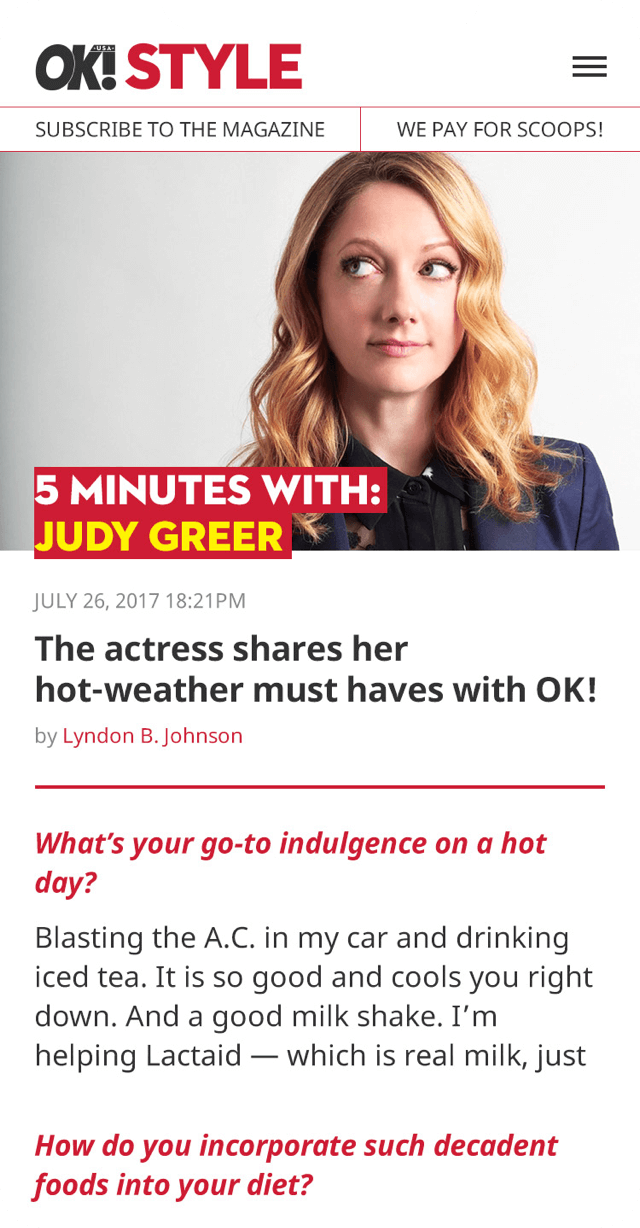

A deep dive into the Google Analytics data revealed that 90% of current traffic is mobile traffic. A mobile-first approach was a must, and for Simpatico “mobile-first” literally meant we first designed the mobile, and then figured out how to adapt that design for desktop.
From the sales and monetization teams, we consistently heard that direct advertisers want to be insulated from salacious content. However, from the editorial and audience development teams, we were met with a bit more reluctance (“salacious sells”). To address this, we proposed introducing a “positive/negative” toggle on articles in WordPress so the CMS develops more knowledge about content. This would give editorial and sales the ability to “turn off” salacious content on the homepage to make it brand safe for certain types of advertisers.
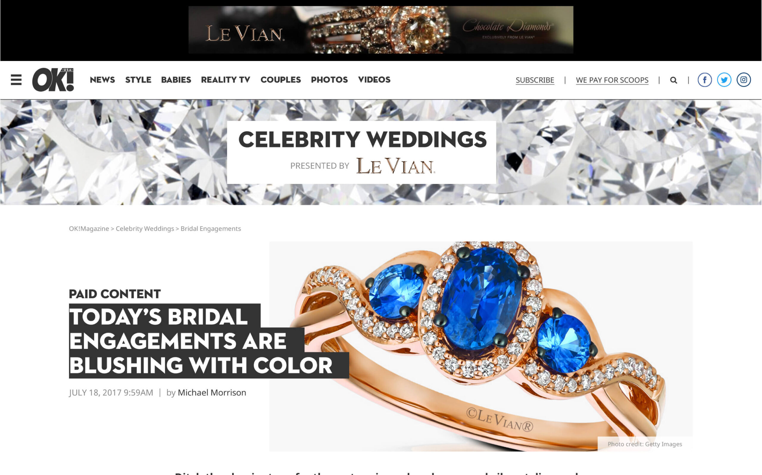
The modular, clean design offers plenty of white space and features a glossy photo-rich experience for readers. For advertisers, the redesign offers high impact ad units and first-to-market formats that degrade gracefully for programmatic selling. The ad units were designed to maximize viewability: the left rail ads “stick” to the top of the screen resulting in a beautiful, highly viewable ad experience. Not only do the top level content channels provide readers with a quick way to find interesting content, they make for excellent sponsorship opportunities. To accommodate one-off advertising specials, we created a design for content hubs that editorial can create “on the fly,” along with an alternate long-form article template perfect for sponsorships.
The site launched on November 15. Thanks to the improved design, the OK! sales team was able to land a launch sponsorship of the OK! Reality channel with MTV, and the user experience dramatically improved with this streamlined approach: since launch, the site experienced a dramatic 54% decrease in bounce rate, 55% increase in pages per session, and 40% increase in average session duration.