Landing Rock
A brand, identity, and product design for the new online cash management platform
A brand, identity, and product design for the new online cash management platform

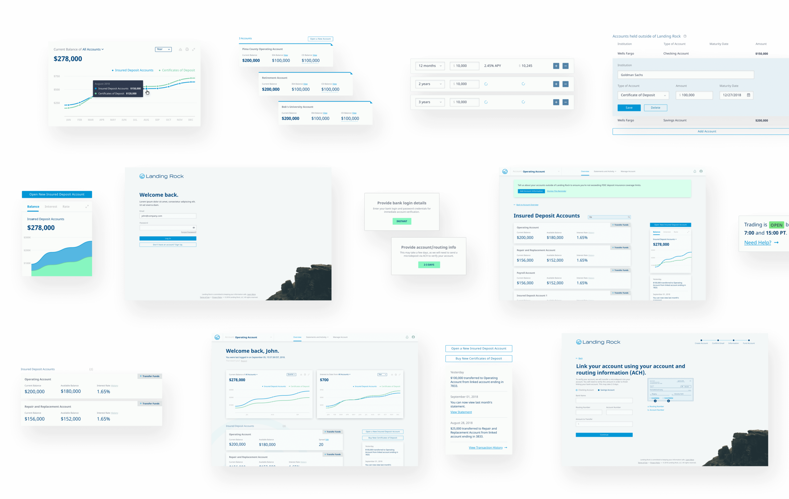
Landing Rock provides simple, easy-to-use, secure cash management solutions for advisors, businesses, charitable organizations, condominiums, homeowners’ associations, housing cooperatives, individuals, public entities, and publicly traded companies. Team Landing Rock was specifically looking for a UX-led firm that could serve as a “one stop shop” to design the platform, design a new visual identity, design and build the company’s marketing website, and provide fully responsive front-end code for the platform to supply to their .NET engineers.
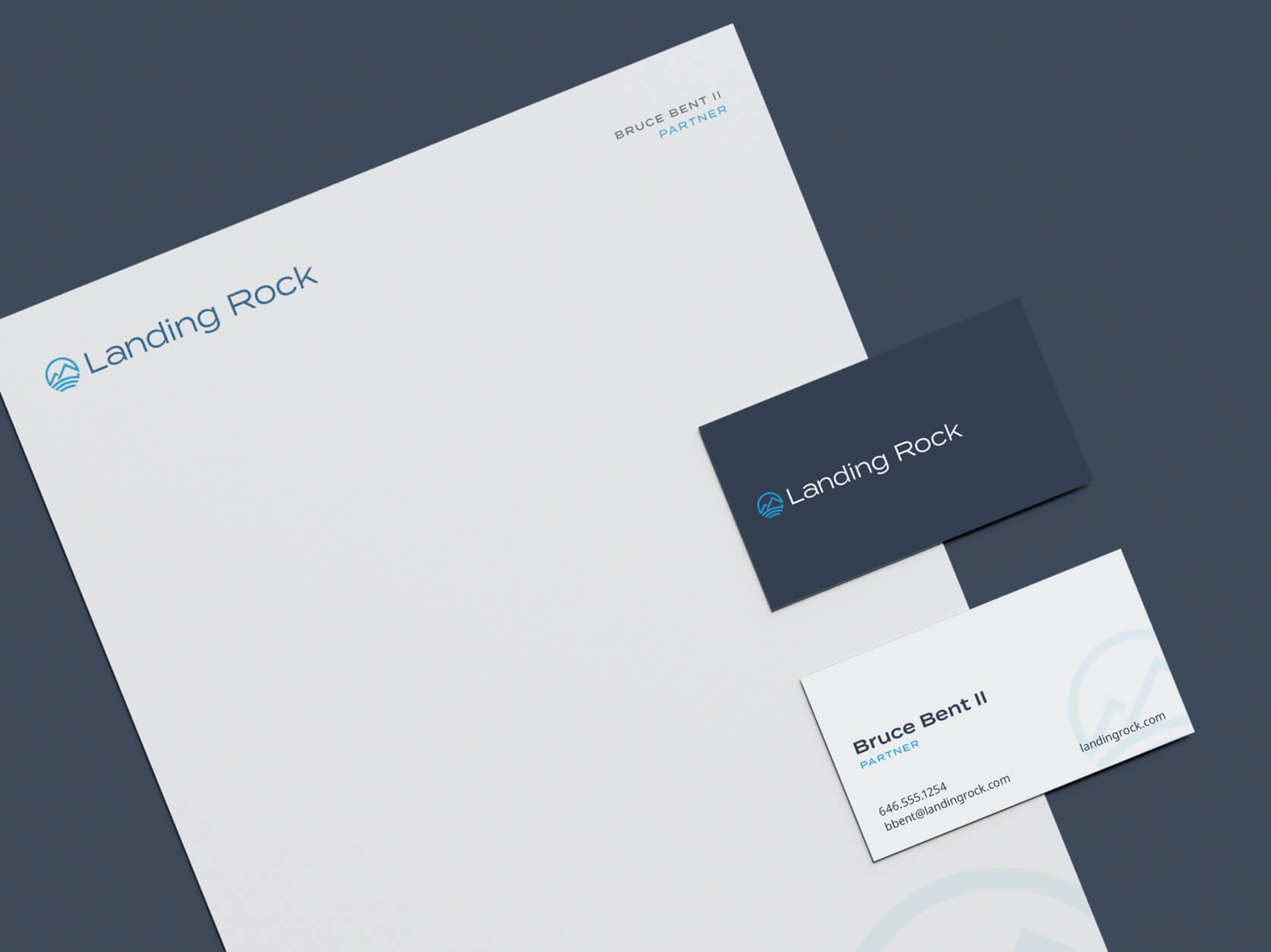
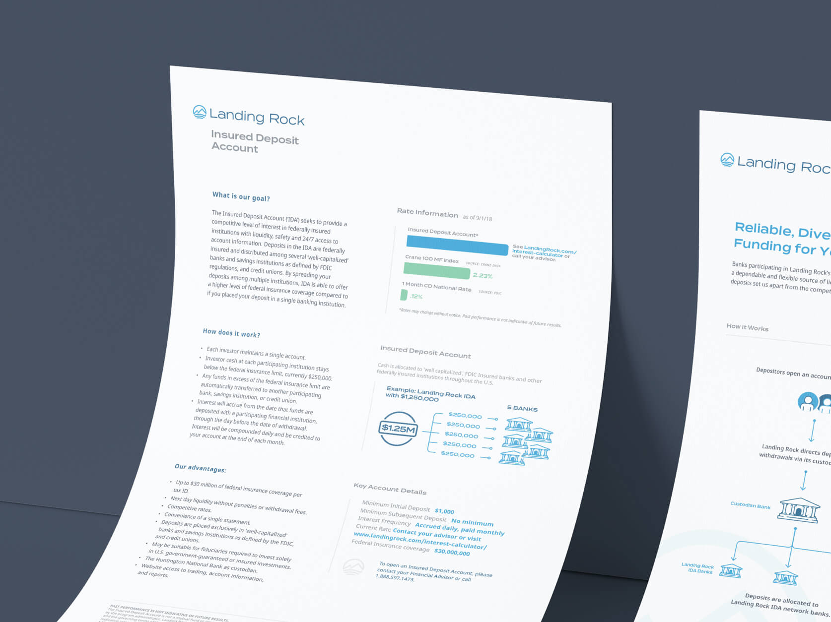
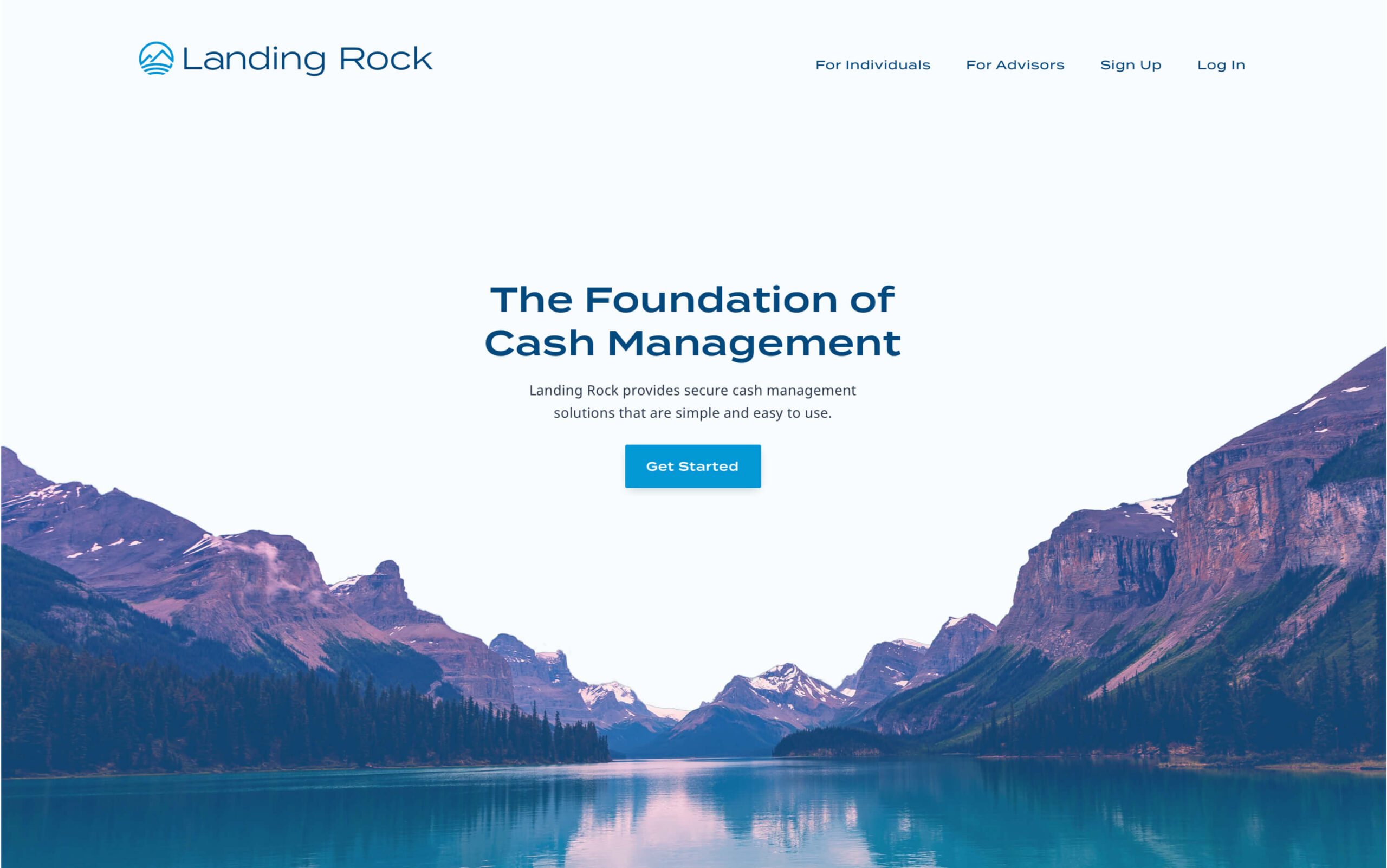
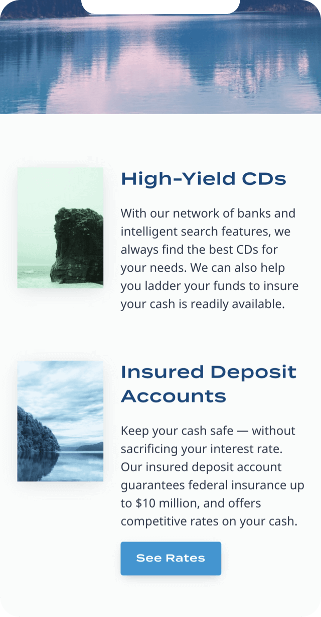
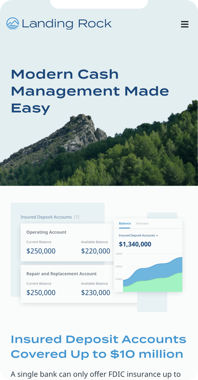

We began with a deep dive into the space. To be effective design and thought partners, we knew we’d need to fully understand the market, the intricacies of Landing Rock’s product offerings, and the technology capabilities. We carefully documented desired requirements into a PRD, and (after auditing several platforms for patterns and common/best UX practices) produced low-fidelity wireframes to capture user flows and screens. In parallel, our creative team worked closely with the client to articulate a visual identity to communicate the stability, competency, and modernity of the brand. These two efforts came back together as we moved on to create high-fidelity designs for all platform screens. Once these designs were approved, our last step was creating responsive, semantic HTML/CSS/JS code and working closely with the engineering team to ensure a successful, seamless implementation.
