HIAS
A mission-driven transformation for a global refugee aid organization.
A mission-driven transformation for a global refugee aid organization.
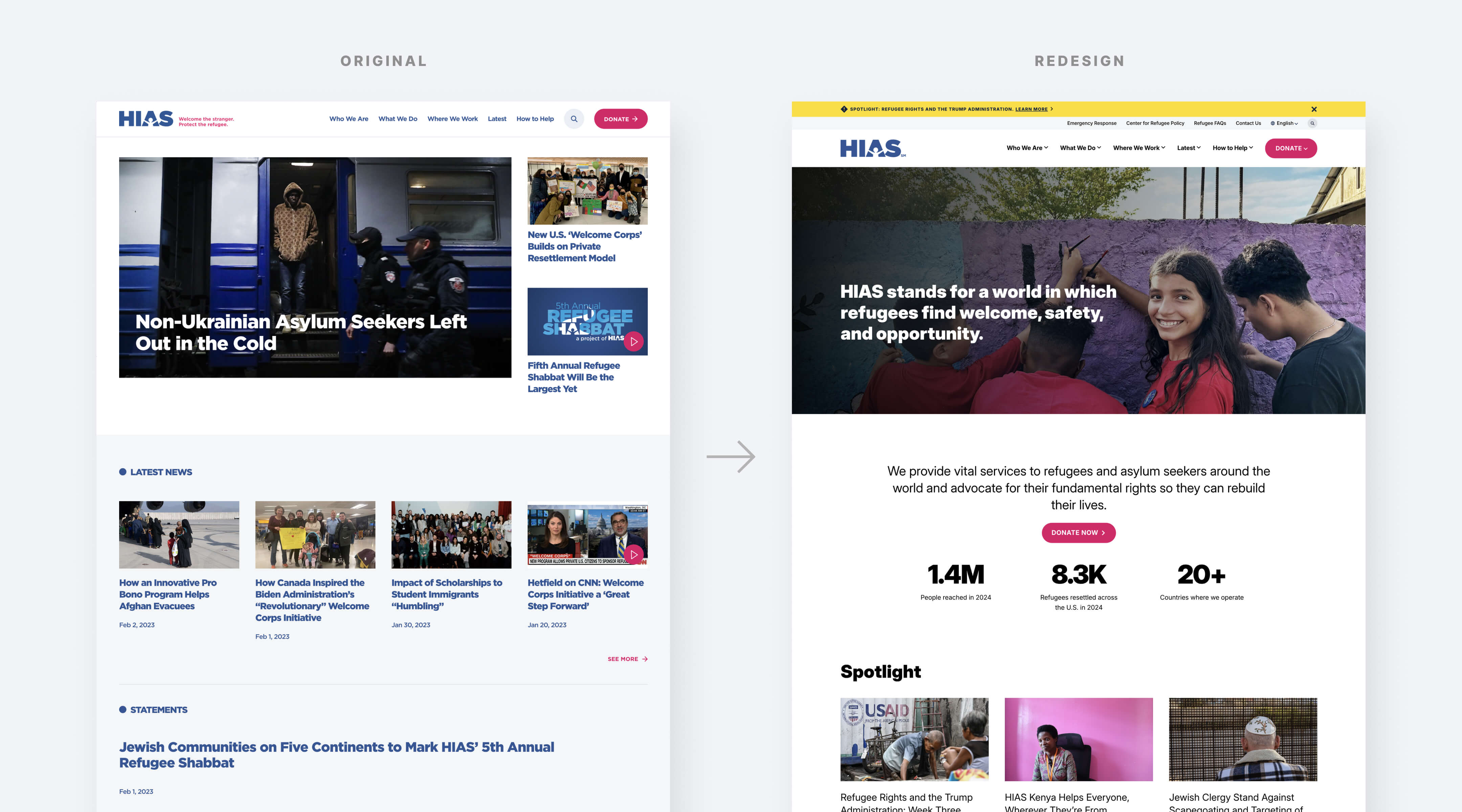
For over a century, HIAS has been a lifeline for refugees, offering critical support to those fleeing persecution, war, and displacement. But despite the organization’s life-changing work across more than 20 countries, its website was not telling that story effectively. Visitors arriving on the old site were met with a dense, news-heavy layout that read more like a media outlet than a humanitarian organization. The core mission—providing protection, advocacy, and aid to displaced people—was getting lost in the noise. The redesign needed to shift the focus back to the heart of HIAS: the refugees and asylum seekers it serves.
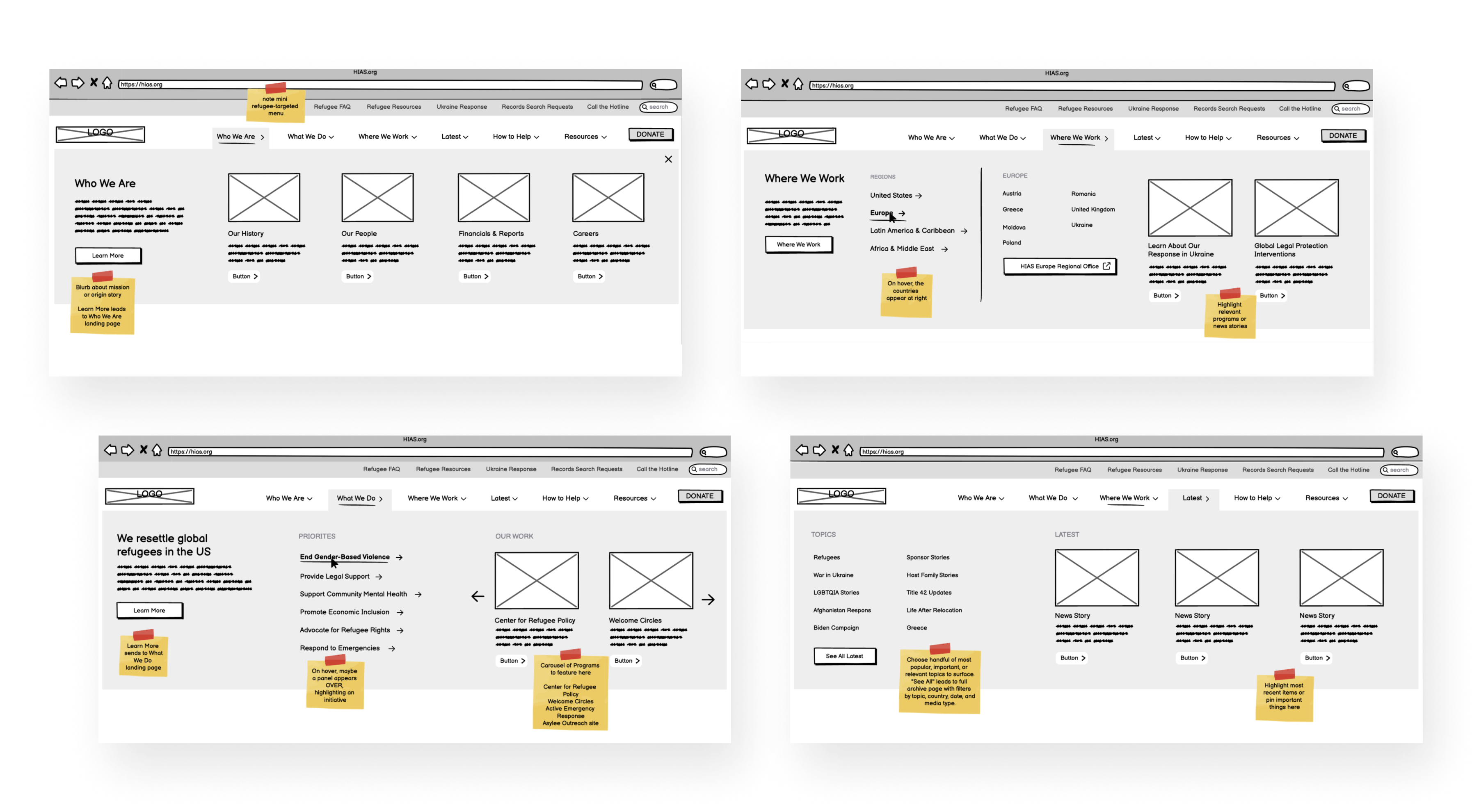
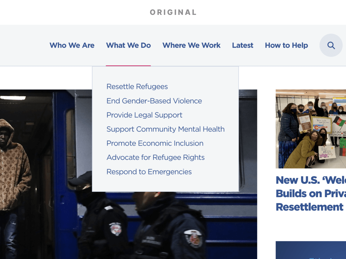
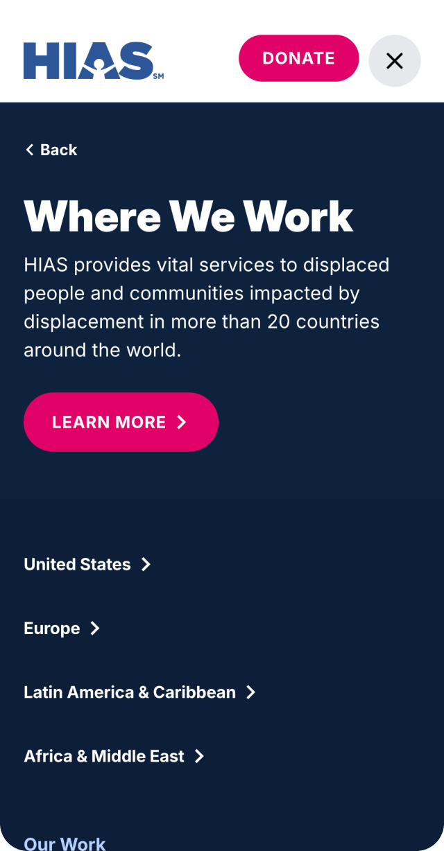
Through a full site audit and stakeholder interviews, we identified key barriers preventing visitors from accessing essential content. The navigation was restructured to ensure HIAS’s most impactful initiatives—including emergency response efforts, asylum services, and advocacy programs—were easily discoverable. The mega menu was redesigned to create clear pathways for different audience segments, ensuring that donors, volunteers, and refugees could quickly find what they needed. Wireframes were developed to establish a streamlined content hierarchy, reducing clutter and improving the user journey. Each decision was guided by the question: How do we make it as easy as possible for someone to understand what HIAS does and how they can take action?
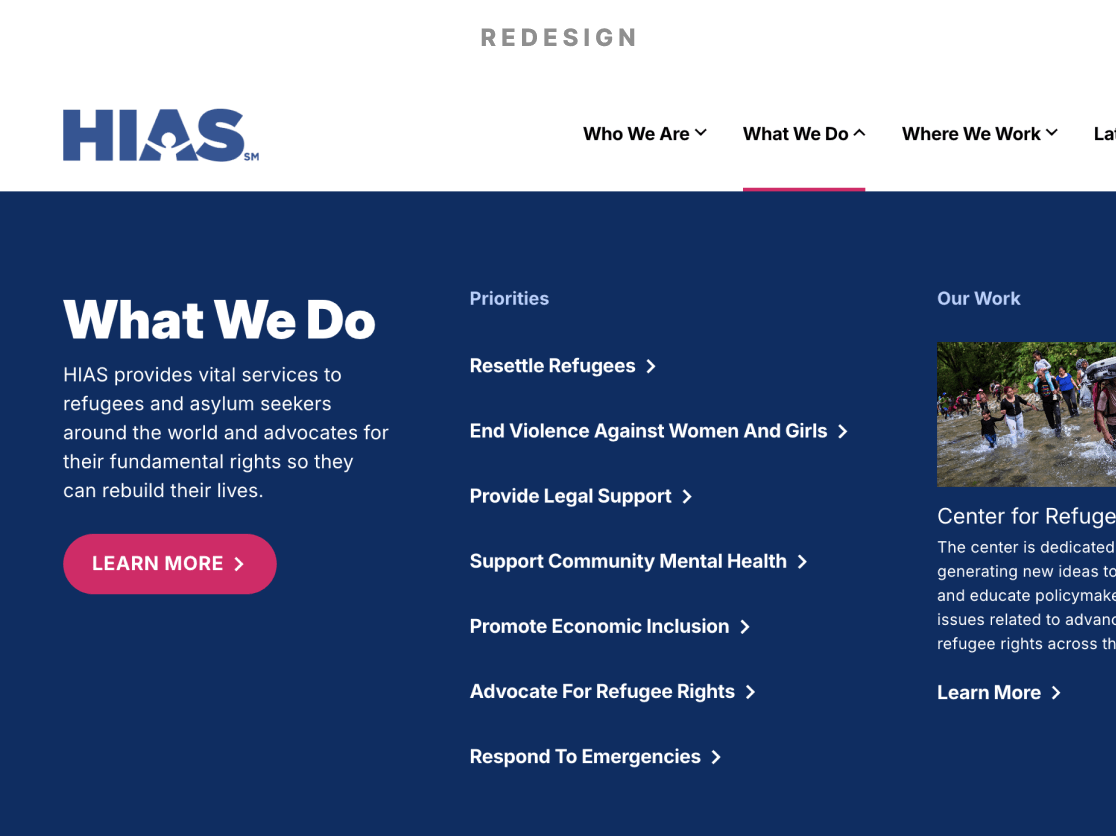
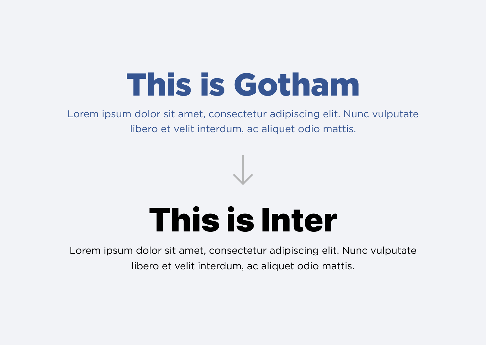
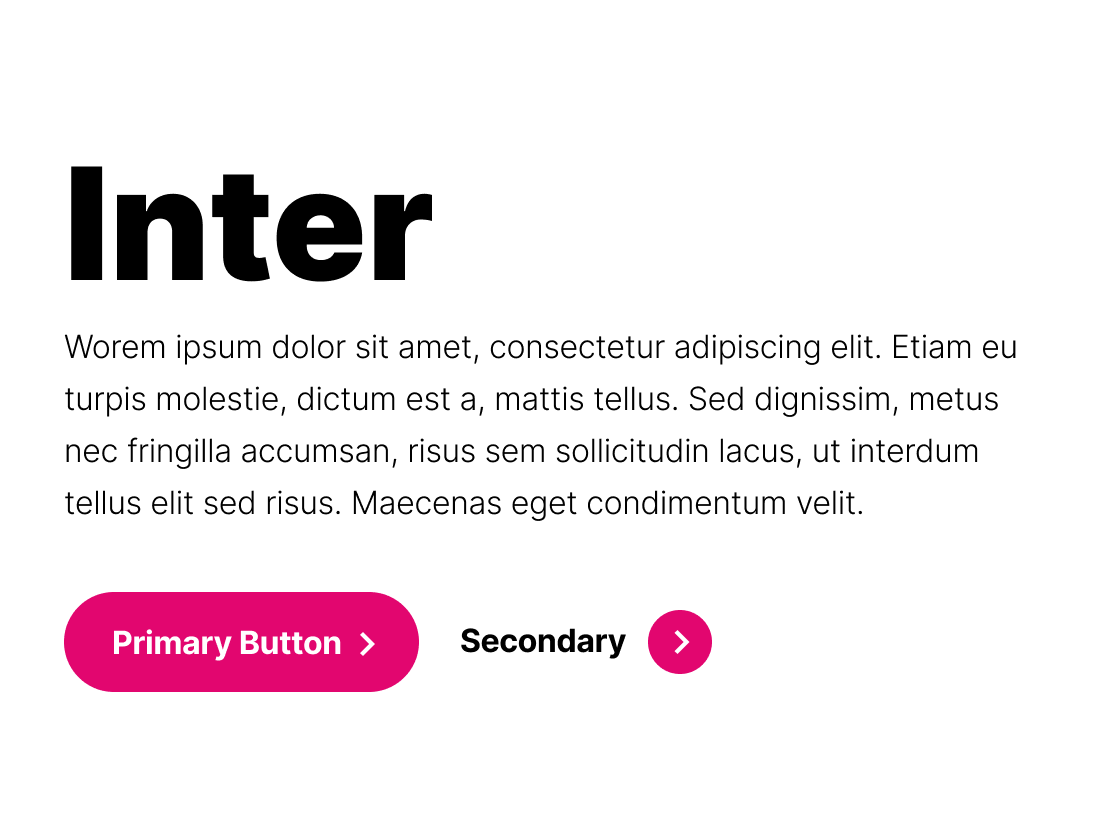
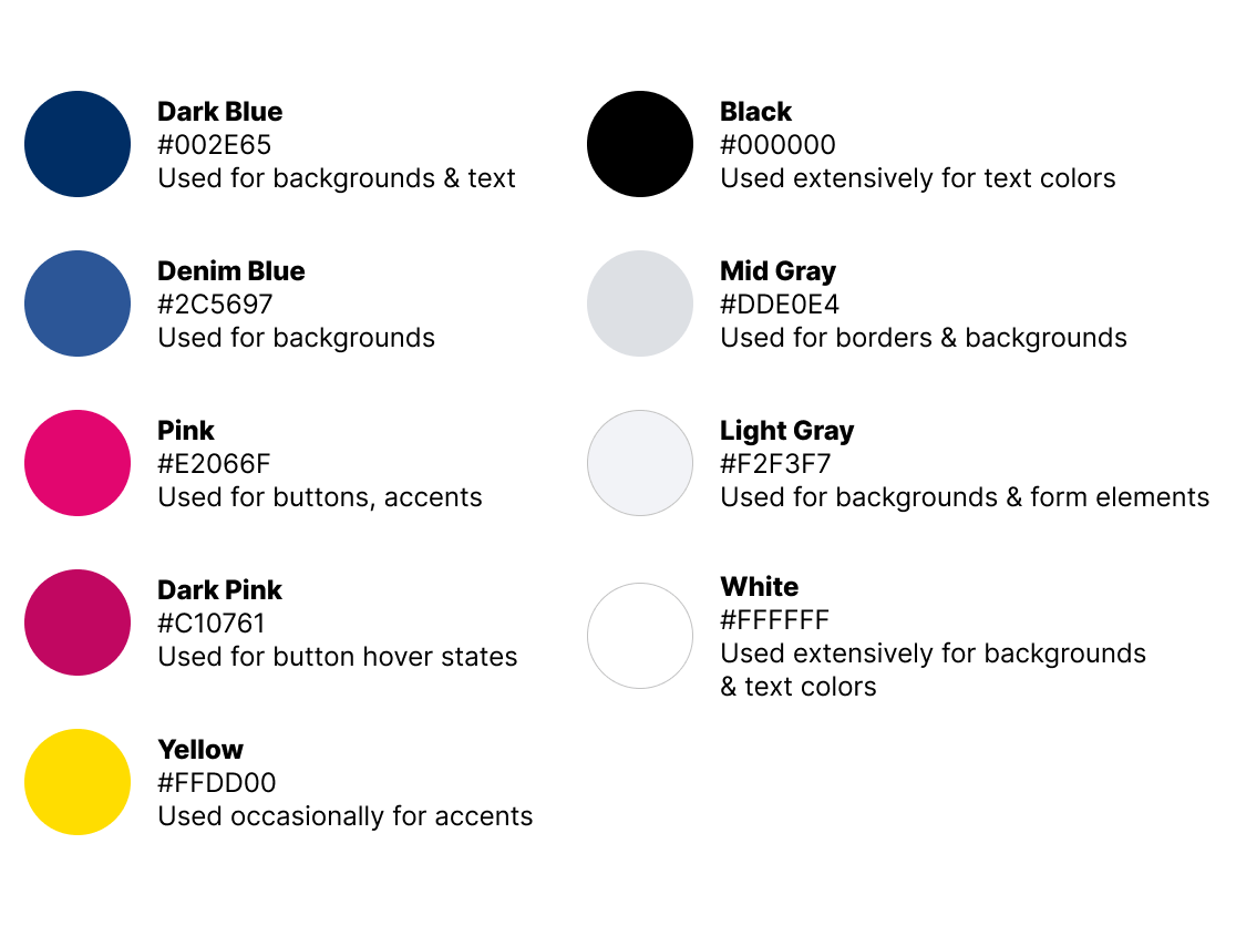
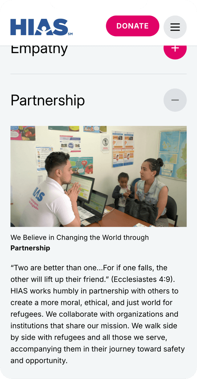
The updated visual identity was designed to reflect HIAS’s bold and unwavering commitment to protecting displaced people. A refined color palette introduced deeper blues for a sense of trust and stability, while strategic use of yellow provided a visual cue for urgent crises and emergency response content. The typography was updated from Gotham to Inter, improving readability across all devices and ensuring compliance with accessibility standards. Beyond aesthetics, the redesign also enhanced usability. A more spacious layout, improved contrast, and clearer calls to action made the site more engaging and easier to navigate. Refinements to the UI, such as dot-styled section headings, created a modern yet approachable visual language that aligns with HIAS’s mission. The design was seamlessly integrated within HIAS’s existing Gutenberg block system, allowing the team to apply styling updates flexibly and ensuring long-term maintainability.
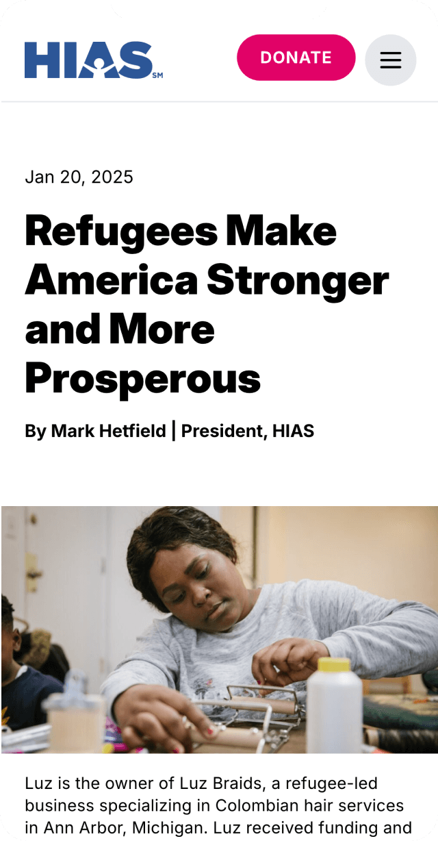
The homepage underwent a dramatic transformation, shifting from a text-heavy, news-style layout to a visually compelling introduction to HIAS’s mission. Impact metrics, success stories, and clear calls to action now take center stage, ensuring that visitors immediately understand the organization’s role in global refugee protection. Emergency response pages were restructured to better convey urgency. High-contrast yellow banners and reimagined content blocks direct attention to ongoing crises, while a more intuitive layout makes it easier for users to contribute to relief efforts. The Take Action page was also revamped to streamline the donation and advocacy process, ensuring that every visitor understands how they can support HIAS’s work. Integration with Classy allows for a more seamless fundraising experience, guiding users through a clearer and more engaging donation funnel.
Beyond user experience improvements, the site needed to function more efficiently for HIAS’s internal team. Multilingual integration with Weglot enables a seamless language-switching experience, ensuring that HIAS can effectively communicate with a global audience. The implementation of PublishPress refined editorial roles and workflows, giving the team better control over content updates and approvals. All donation funnels were optimized to direct users toward Classy-powered fundraising pages, streamlining the giving process and improving conversion rates. Additionally, leveraging the Gutenberg block system ensured that the HIAS team could easily make content updates without relying on developers, empowering them to maintain the site long-term.
Through this redesign, Studio Simpatico helped HIAS elevate its digital presence by shifting from a communications-heavy model to a mission-driven, accessible, and conversion-focused platform. The project resulted in a clearer, more intuitive user experience that puts HIAS’s mission front and center. The editorial workflow was strengthened, giving HIAS’s team more control over publishing and content management. The site now features a modernized, accessibility-conscious design, ensuring HIAS can effectively engage donors, refugees, and advocates alike.