Urban Pathways
A website overhaul and new look for a well-established NYC homeless services nonprofit
A website overhaul and new look for a well-established NYC homeless services nonprofit
When the Urban Pathways team approached us, they were hoping for a total overhaul to their site. Urban Pathways is a leader in creating ways forward for folks in their community experiencing homelessness. Their website serves as the initial point of contact for many audiences, including potential donors, clients, partners, and staff, and plays a huge role in forming the public’s perception of the organization.
They wanted a new site that was aesthetically appealing, fresh, and intuitive that would effectively communicate their mission and activities to their visitors. For an organization like theirs, the look of the site, its ease of use, and an effective conversion to donations are paramount to its success, and we were so excited to jump in with both feet to make a difference.
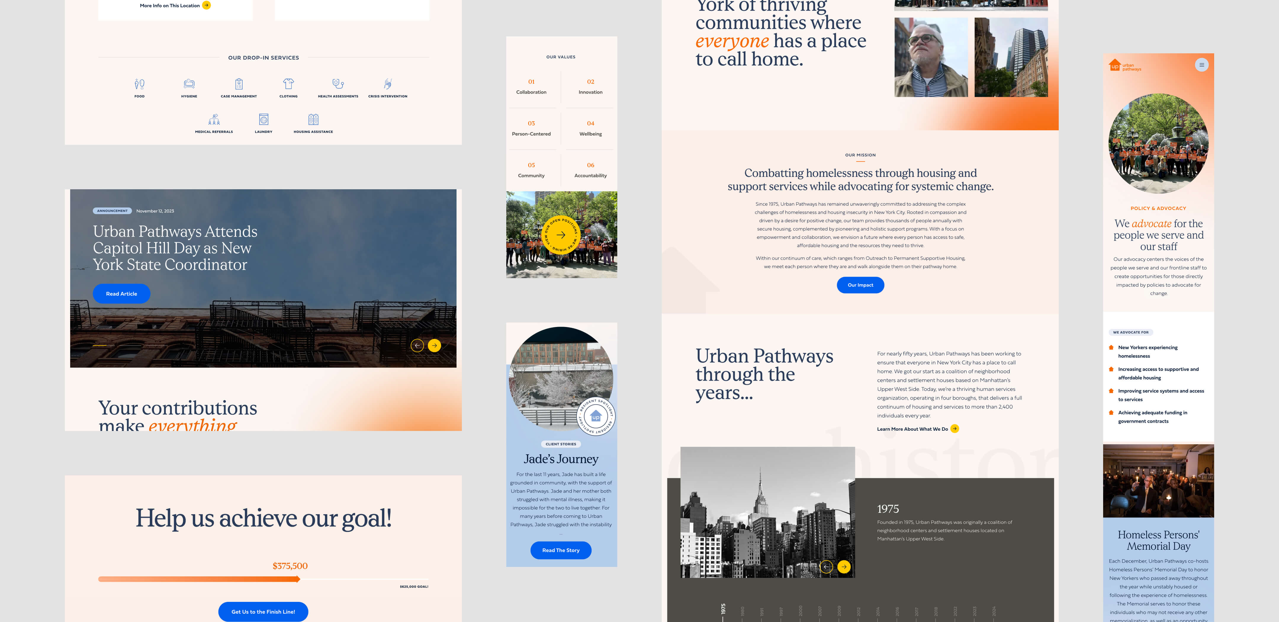
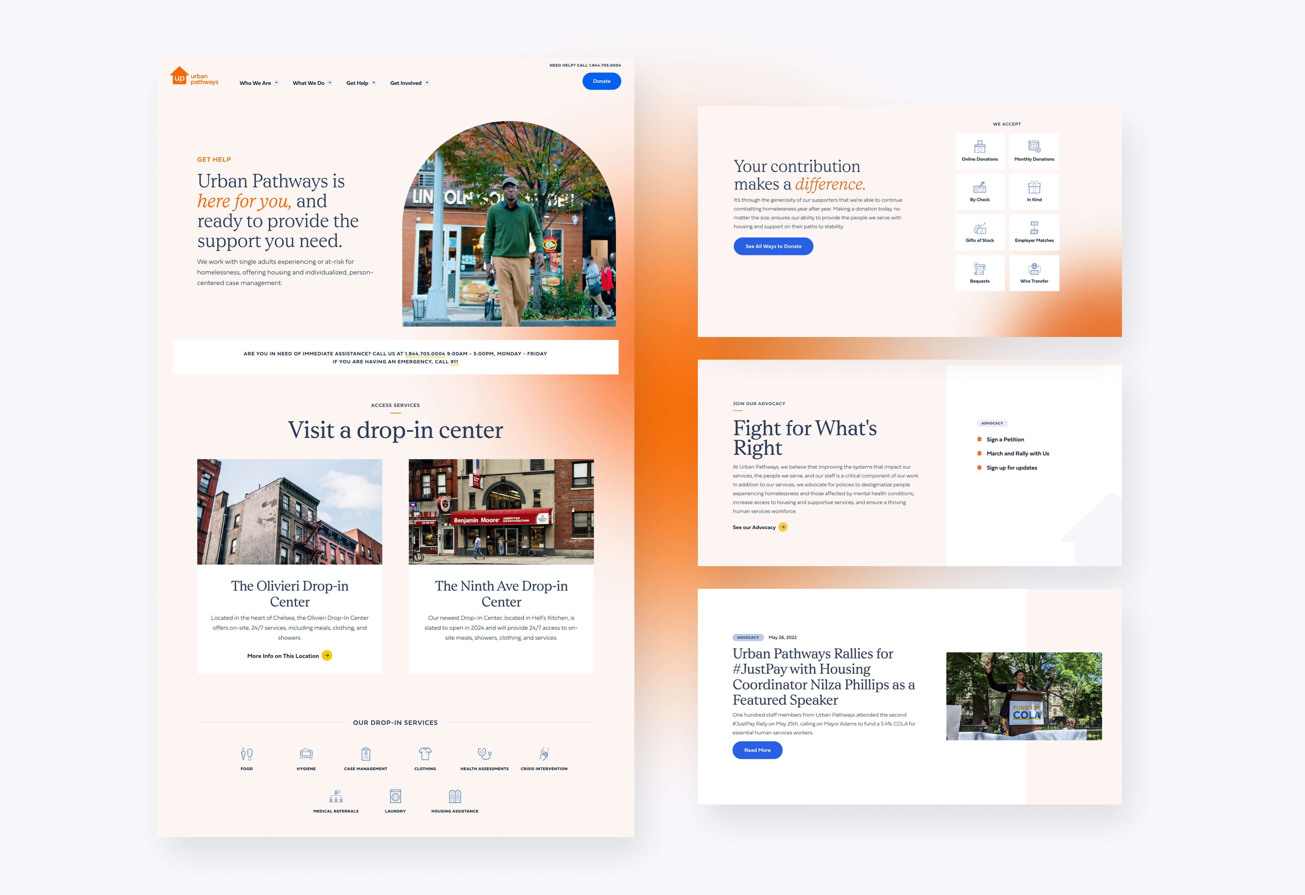
We began our work with Urban Pathways by conducting a thorough discovery and research phase, learning as much as we could about the organization’s services, its audiences, and its goals. We learned that the Urban Pathways team works on the ground doing outreach, as well as working with clients individually to provide support as they start down a new path towards self-sufficiency. Their services don’t stop at providing temporary housing; they also do health education and provide employment assistance for their clients. Visitors to the Urban Pathways website range from government officials to potential donors and partners, to people seeking assistance for themselves or a family member. With all this information in hand, we created a new site map featuring landing pages for each of the services, so that each aspect of the organization could have a light shone on it.
Once the site map was complete, we created custom wireframes for a new sitewide modular page builder that would be used to create most of the pages on the site. We took into account the content of each page and created individual wireframes for each, so that we were sure the available modules for the pagebuilder would address the organization’s actual needs. Those needs included keeping it simple; the Urban Pathways team is kept incredibly busy with their programmatic work, and they have very little time to devote to website updates. With the skeleton of the site established, it was time to flesh out the design.
Our visual design process began by distilling the organization’s values and personality. It was important to the Urban Pathways team that the new look telegraph attributes like hopeful, solutions-focused, positive, and aspirational, while keeping away from a discouraged or vulnerable feeling. We dove into research and ideation, finding visual references and graphics that aligned with the brand’s goals.
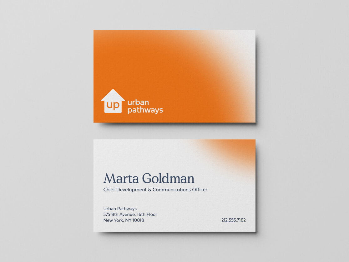
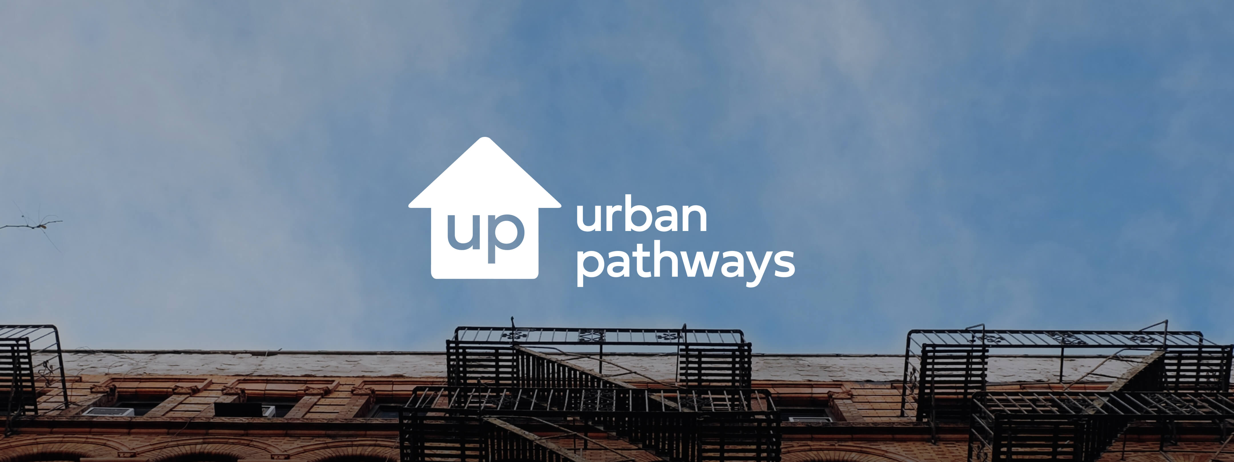
Once we understood the organization’s positioning and the team’s visual preferences, we got to work creating a new visual direction for the site that incorporated all of them. The team didn’t want to stray too far from their original colors, since they are an established brand, so instead, we tweaked their brand’s orange to make it more accessibility-friendly, and added a suite of secondary colors that brought some more vibrancy and versatility to the brand.
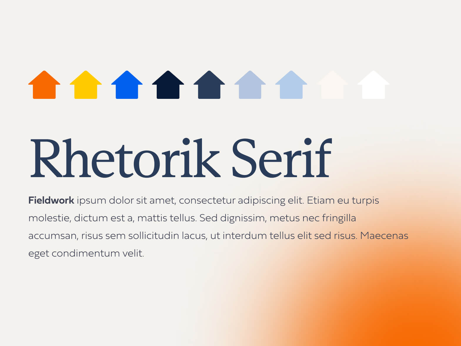
Urban Pathways had been using Roboto, a default-feeling font without much personality, so we upgraded them to the expressive Rhetorik Serif, a distinctive typeface that is robust enough to feel both friendly and professional at the same time. Supporting it is Fieldwork, a legible, humanist sans serif that’s geometric but has some warmth to it. Together this pairing hints at the organization’s deep commitment to their mission, and the team’s welcoming nature.
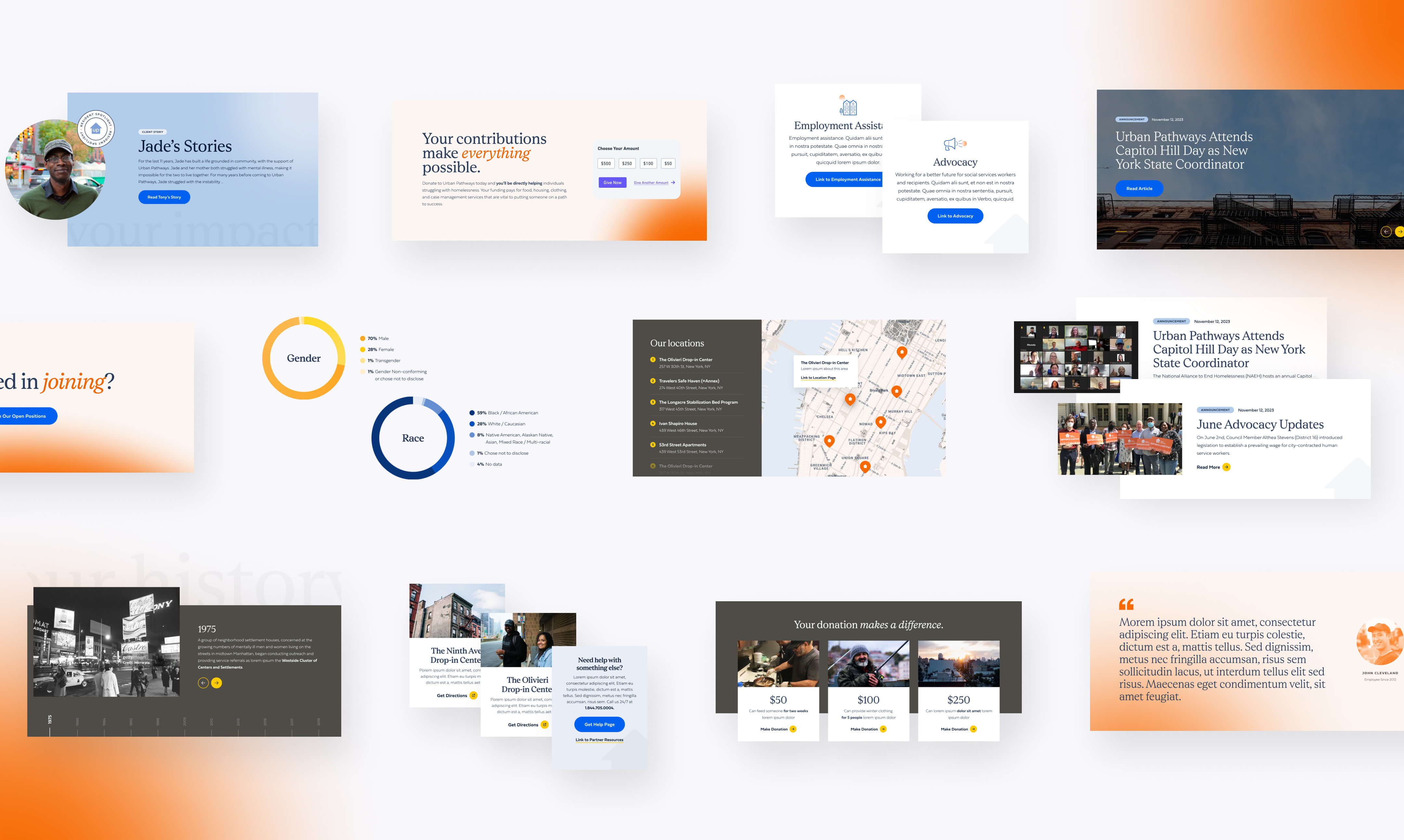
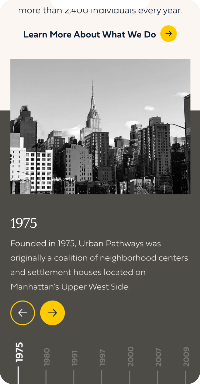
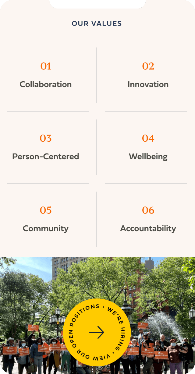
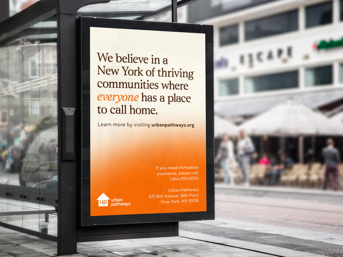
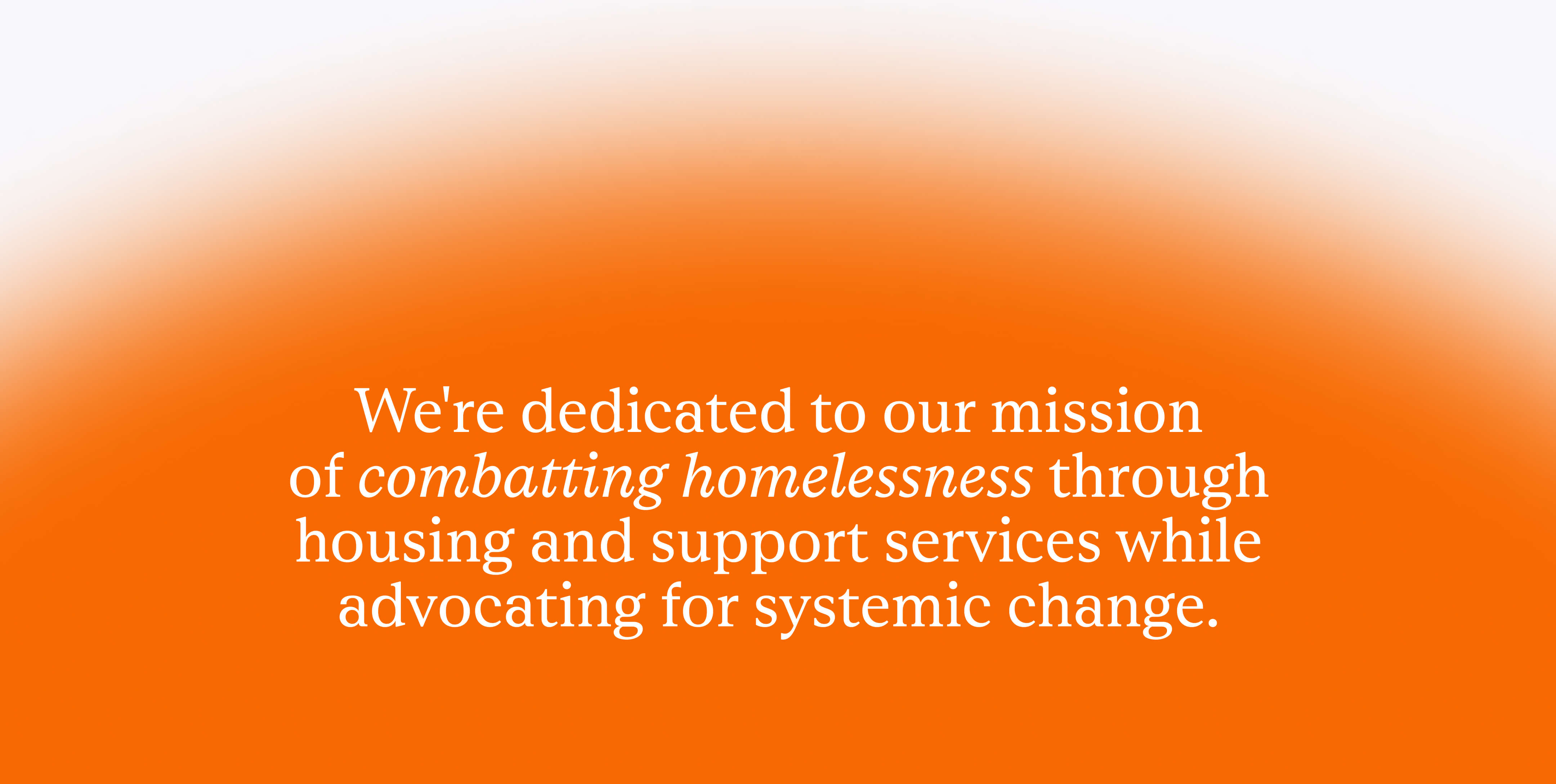
We utilized graphic elements throughout the new site to bring the organization’s mission to life visually. The biggest recurring motif is a glowing orange gradient, which grows and shrinks as the user scrolls through each page. This bright addition is a way of visualizing the idea of hope and new beginnings, and establishes orange as the primary brand color without it feeling overwhelming or flat.
We also implemented some creative ways of framing imagery throughout the site, utilizing circular, arched, and divided frames in familiar window and door shapes to convey the concept of seeing through a portal to a new future, helped along by Urban Pathways. This motif was in part inspired by the organization’s vision: “A New York of thriving communities where everyone has a place to call home.”
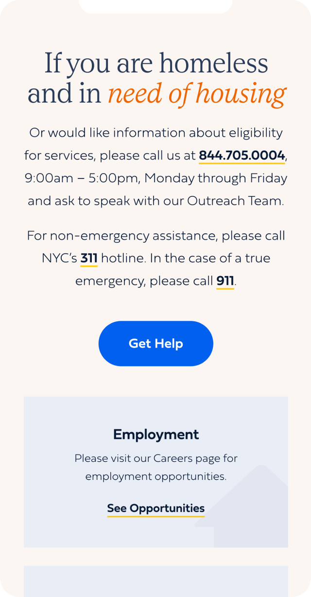
It’s all well and good to have a site that looks good, but what’s the use if it isn’t easy to figure out? We made sure that the new custom CMS is easy to navigate and intuitive, making it as simple as possible for the busy Urban Pathways staff to update in the future––and allowing them to spend more of their time on their clients, where it matters most. If they implement new programs in the future, it will be a breeze for them to create new landing pages using their new modular page builder.
The new site is fully responsive, which will allow visitors to the site to easily access it no matter where they are – which is of paramount importance for an organization like Urban Pathways, whose staff and clients could be out in the field.
The finished Urban Pathways website is bright and easy to navigate, captivating potential donors and those who need to find services alike with a smooth user journey and engaging content. It provides access to comprehensive information about the organization’s background, programming, and impact, and communicates the organization’s commitment to their work and the urgency of their needs. We’re proud to have worked with the Urban Pathways team, and we can’t wait to see how they flourish in the future with this strong first impression as their digital front door.