Central Park West Dentistry
A new website for the long-standing Upper West Side dentistry practice
A new website for the long-standing Upper West Side dentistry practice
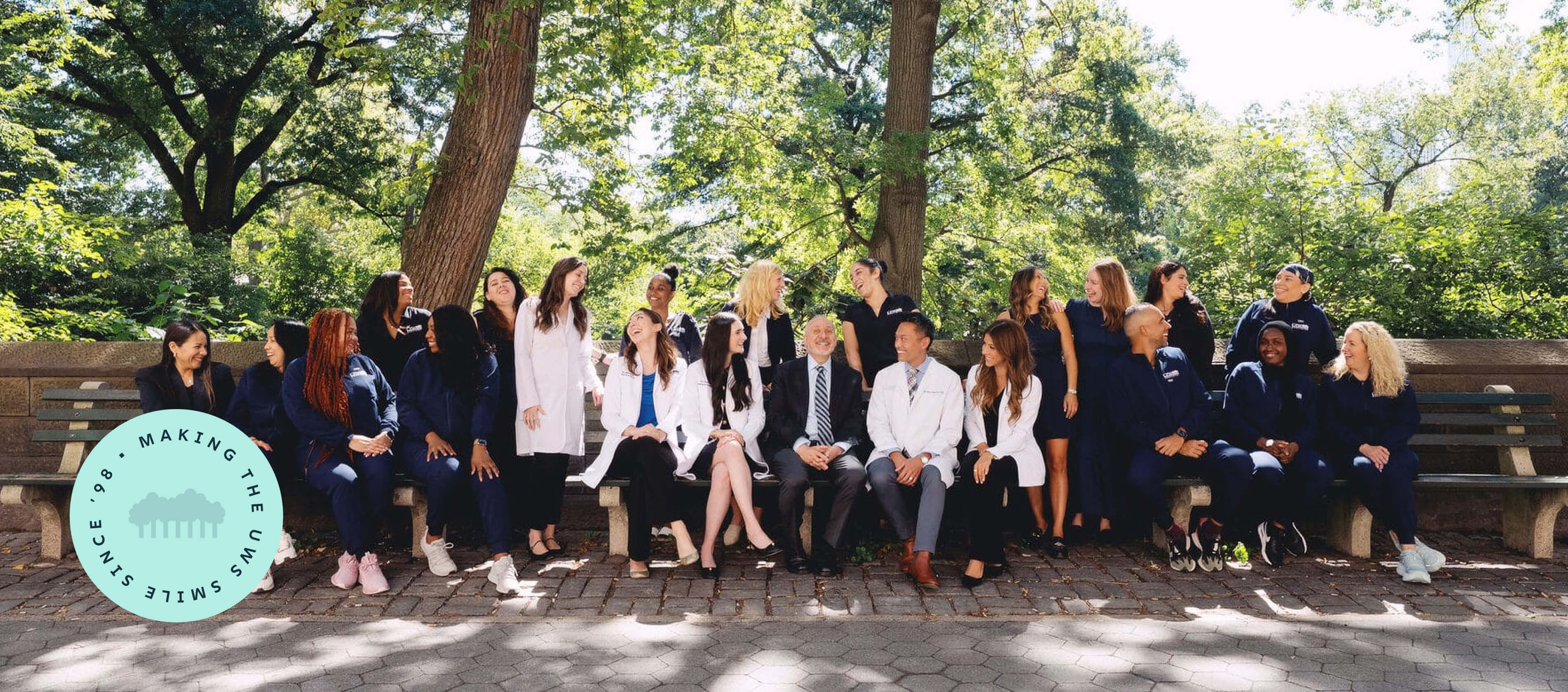
Central Park West Dentistry is a long-standing Upper West Side practice with a simple philosophy: take great care of people, practice prevention over upselling, and be there when patients need you. Founded as a small, two-room office, CPW has grown steadily over the years while holding tightly to its values. Many team members have been with the practice for over a decade, and patients often stay just as long.
As the practice expanded into a newly renovated space and welcomed new clinicians, the website began to lag behind reality. It did not fully communicate the warmth, accessibility, or trust patients felt once they walked through the door. At the same time, CPW operates in one of the most competitive dental markets in the country, where search visibility and first impressions matter deeply.
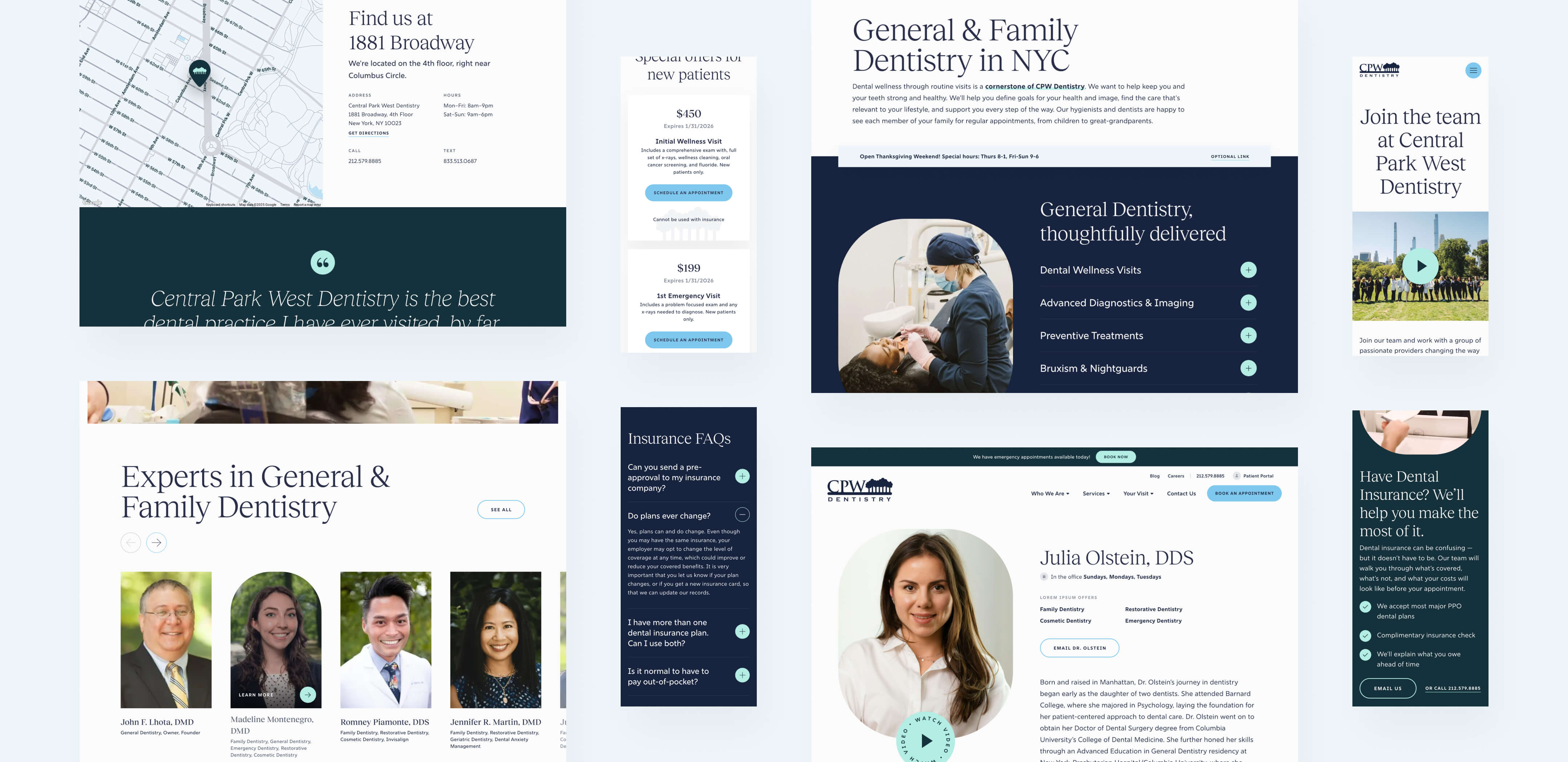
CPW came to Studio Simpatico with a clear ask. They wanted a standout aesthetic without feeling flashy or corporate. They wanted to preserve what already worked for SEO while making the site easier to use, easier to trust, and easier to grow with. This engagement included UX planning, visual design refinement, and the design and development of a custom WordPress theme, with a strong focus on the homepage, service pages, about content, and online scheduling flows.
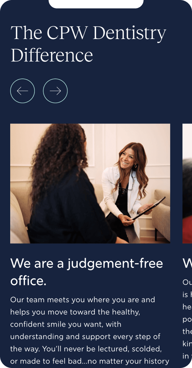
From the very first conversations, CPW spoke candidly about who they are and who they are not. They are not a venture-backed group practice chasing trends. They are not interested in pushing cosmetic treatments patients do not need. They are a prevention-first, judgment-free practice that believes dentistry works best when trust comes first.
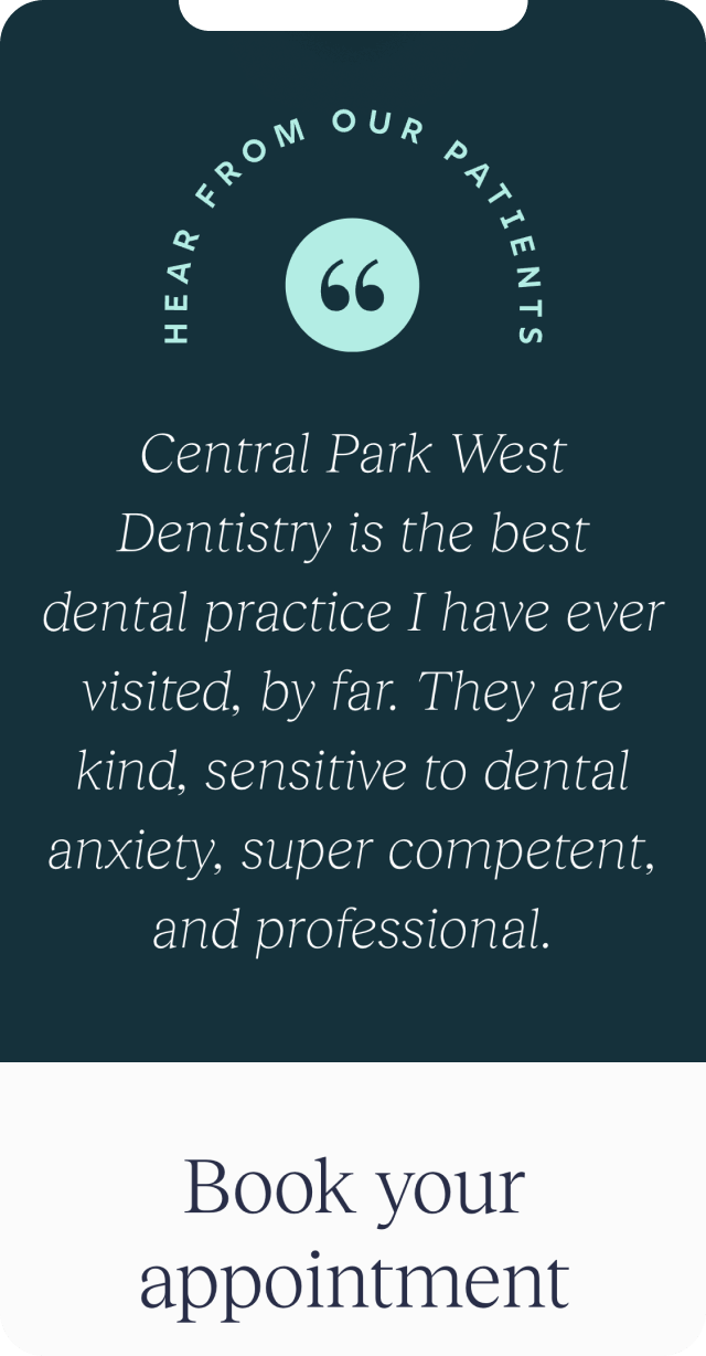
Discovery combined stakeholder conversations, content and analytics review, and a close look at how patients were already finding the practice. Emergency dentistry and long-tail blog content were performing well in search, and that equity needed to be protected. At the same time, the site needed clearer storytelling around the people behind the practice, the continuity of care, and what actually makes CPW different once you arrive.
These insights shaped every decision that followed. The strategy was not to start over, but to renovate carefully. Preserve URLs, page intent, and high-performing content. Clarify patient pathways. Make trust visible sooner. Every UX decision was measured against a simple question: does this make someone feel more confident choosing CPW?
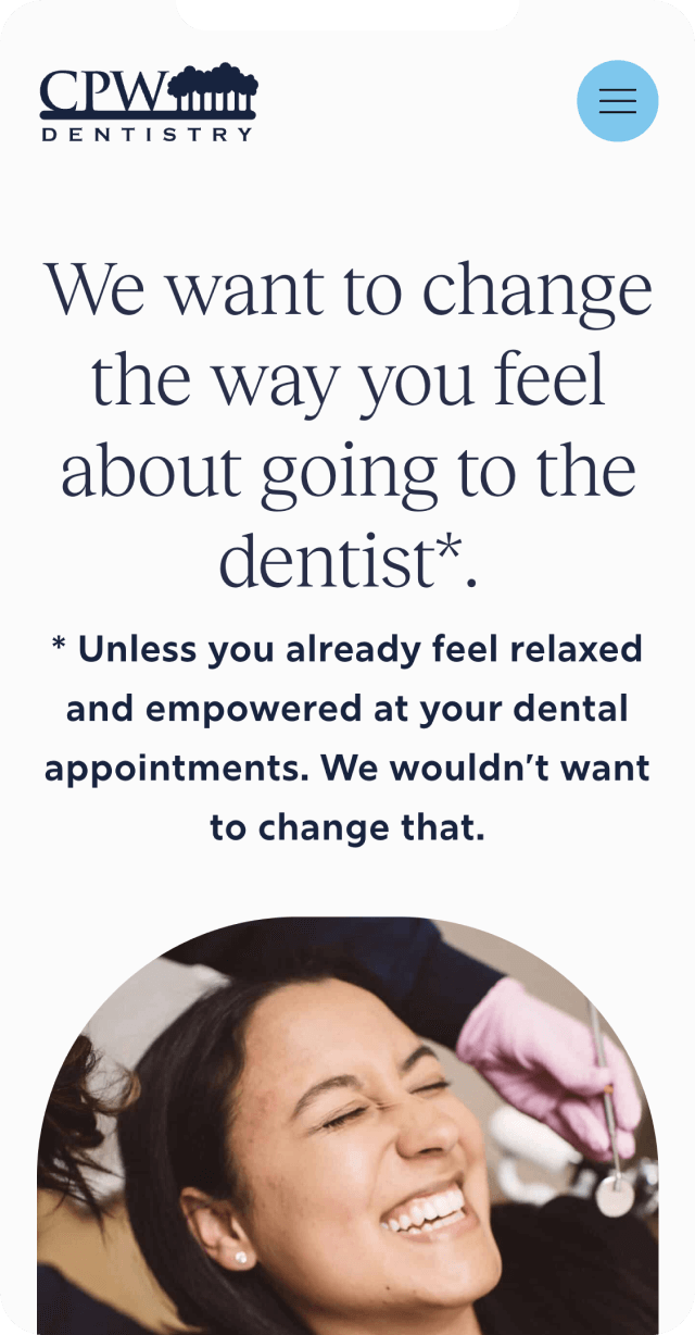
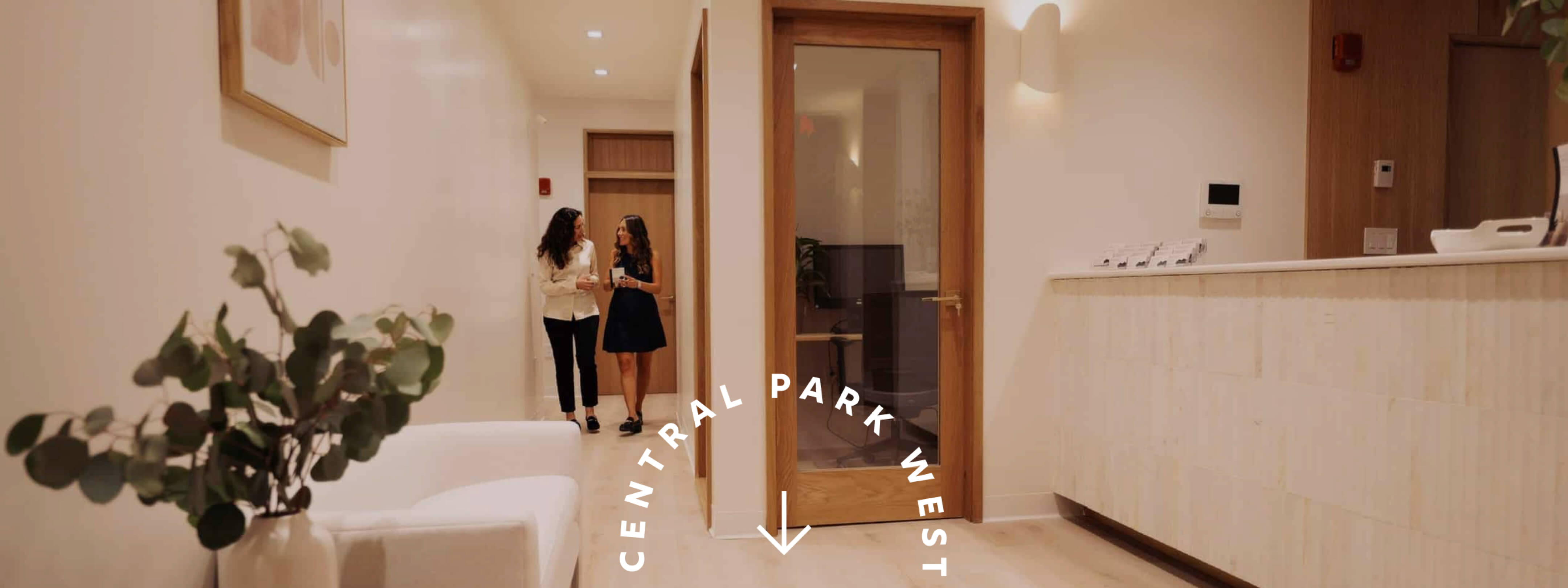
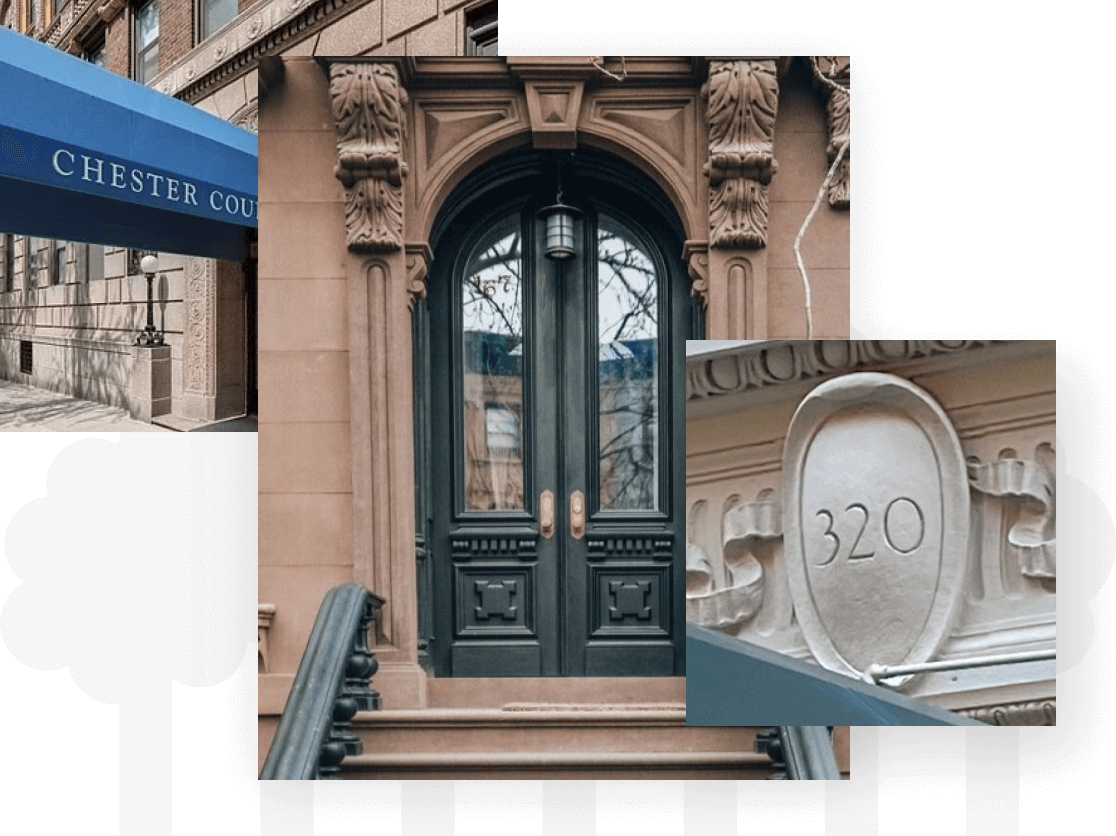
Early design conversations focused on how the Upper West Side actually looks and feels when you walk through it: stone buildings, carved lettering, understated storefront signage, parks and pathways, and a sense of permanence rather than trendiness. CPW wanted a site that felt at home in that environment, not something that looked parachuted in from a startup playbook.
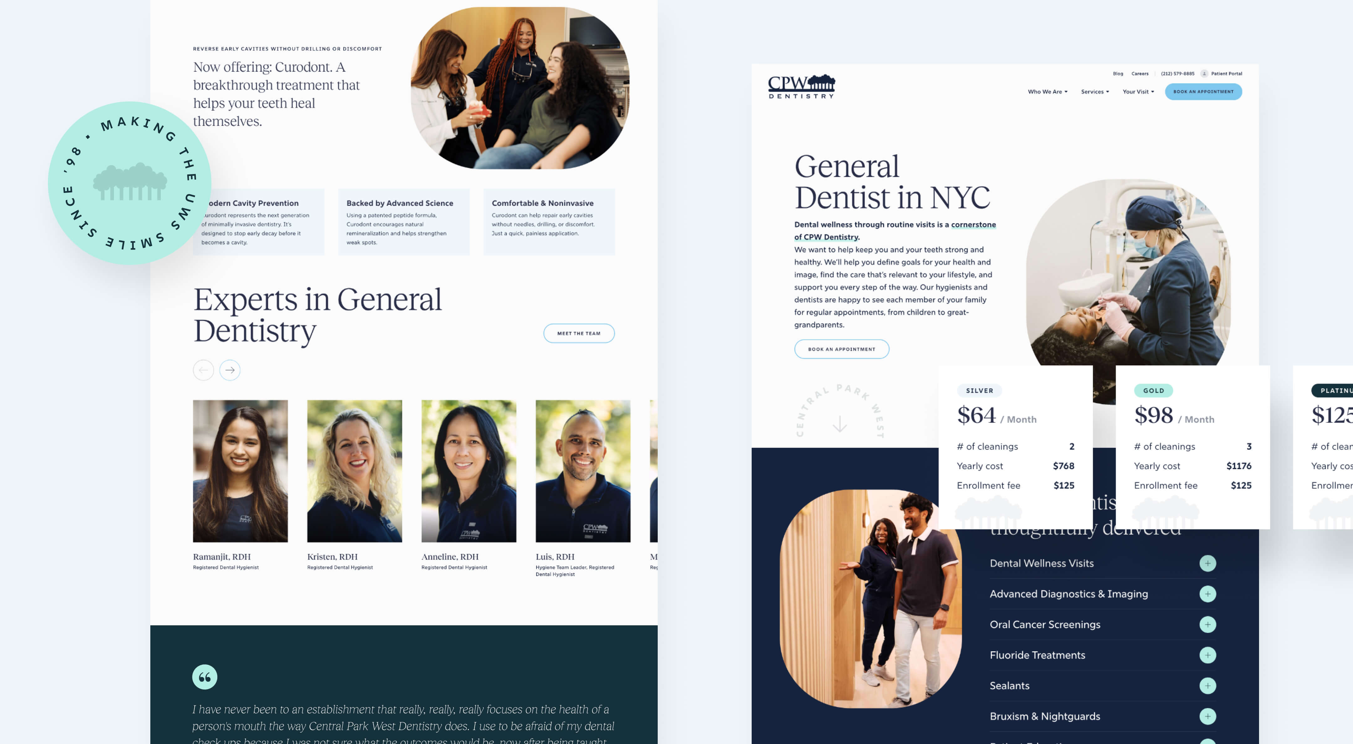
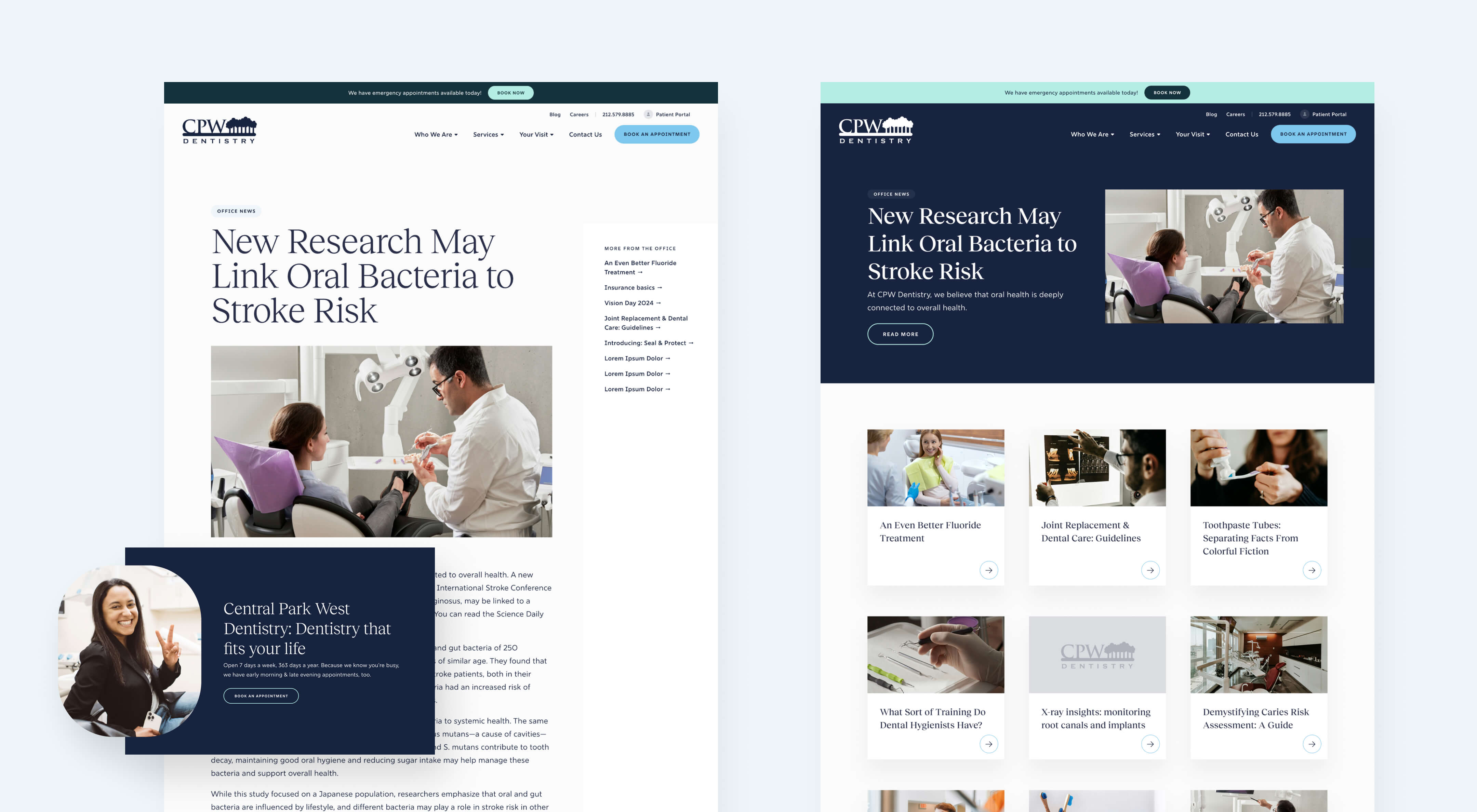
Typography became a primary vehicle for expressing that idea. Rather than leaning on highly recognizable, fashion-forward serif fonts, we explored letterforms inspired by the kinds of signage you see around Central Park and along Central Park West: engraved numbers, museum plaques, and building names set into stone. The selected serif carries subtle weight and structure, evoking craftsmanship and longevity while remaining friendly and readable. It feels confident without being precious, and distinctive without calling attention to itself.
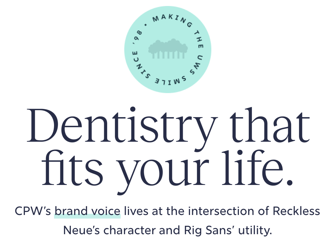
Color decisions followed the same logic. CPW’s existing blues already conveyed calm and trust, qualities that matter deeply in healthcare. Instead of replacing them, we refined the hues and expanded the palette to include warmer neutrals and greens drawn from the surrounding neighborhood and the park itself. These additions soften the overall tone and reduce any corporate edge, while still preserving familiarity for long-time patients.
Layout and visual rhythm were intentionally restrained. Rather than decorative flourishes or trendy UI treatments, we focused on clarity, balance, and breathing room. Pages rely on strong typographic hierarchy, generous spacing, and a steady cadence between text and imagery. The result feels composed and reassuring, echoing the experience of walking into a well-run, thoughtfully designed practice.


The final designs were translated into a fully custom WordPress theme designed for longevity and ease of use. Rather than relying on generic builders, we created a page system made up of custom modules that allow the team to assemble pages confidently without breaking design consistency.
The build included custom templates for blog archives, posts, and taxonomy views to support ongoing SEO performance, as well as CRM-ready form theming and GA4 integration. Image optimization and technical best practices were incorporated throughout so the site would perform well in search without requiring heavy ongoing maintenance.
After launch, Studio Simpatico continued working with CPW on accessibility remediation. Given a prior ADA claim, accessibility was treated as a shared responsibility rather than a checkbox. We addressed both technical and content-level considerations to support WCAG 2.1 AA compliance and help ensure the site remains welcoming and usable for all patients.


The new CPW Dentistry website delivers a clearer, calmer first impression that mirrors the in-office experience. Patients can quickly understand what the practice stands for, how care works, and how to take the next step, whether they are booking a cleaning or calling with an emergency.
The site preserves and strengthens existing search performance while presenting CPW as distinctly human in a landscape full of polished, impersonal competitors. Internally, the team now has a flexible platform they can grow with, update easily, and trust to support the next chapter of the practice.
Most importantly, the website finally tells the story CPW has been living for years. It makes great care feel approachable, trustworthy, and personal, before a patient ever sits in the chair.