Smart Arches Dental Implants
A functional, fresh, and friendly new website for a dental surgery company
A functional, fresh, and friendly new website for a dental surgery company

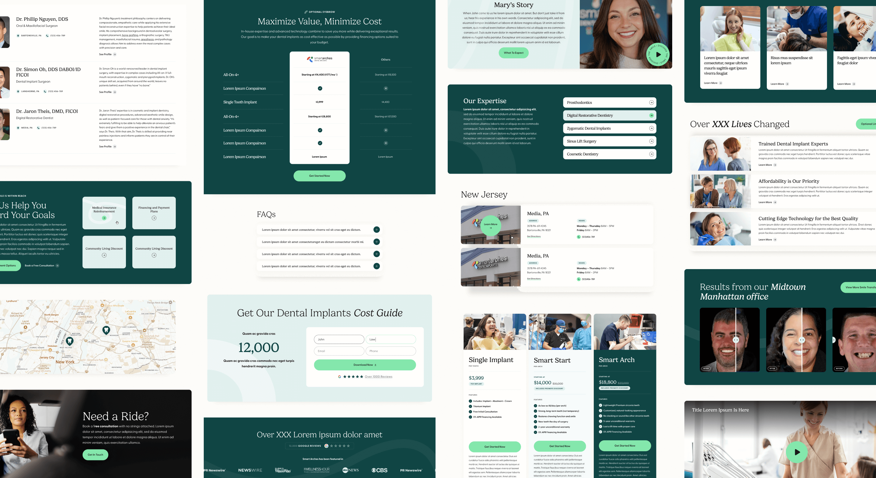
Discovery started with a meeting to get to know Smart Arches in depth, from their business offerings, audiences, and patients, to the company’s goals for their new website. One of the team’s biggest concerns was for their prospective customer’s user experience. The ease of locating price and financing information, as well as the presence of reassuring testimonials and educational information, were top of mind for the Smart Arches team. Additionally, since the majority of the company’s clients tend to be over 55, legibility, accessibility, ease of navigation, and familiarity were key for this project.
We poured our new knowledge into a new site map and wireframes, prioritizing storytelling about success stories, reassuring financial information, and photos of both Smart Arches doctors and patients. Showcasing the company’s cutting edge techniques and technologies added to the overall impression of Smart Arches as professional, approachable, and reliable.
Discoverability was also top of mind for the Smart Arches team. We worked closely with their digital marketing and SEO consultant to make sure the planned modular build would allow the team to easily create custom landing pages targeted for a variety of keywords, based on their research about what worked best.
We began the design process by looking at Smart Arches’s existing website and logo. The team made it clear that while they were keeping their existing logo, they wanted to explore other colors and were not married to their existing palette. The Smart Arches team sent over a handful of inspiration websites, most of which were using shades of green, blue, and teal, with a variety of styles. We assessed their inspiration sites and created three different directional moodboards for the team to choose from, with keywords like approachable, professional, friendly, and expert at the forefront.
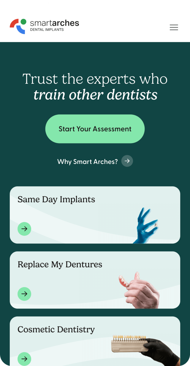
In the next phase, we showed the clients original work that brought in a combination of warm, friendly elements and professional, clean elements. They landed on the primary color of teal, a warm and friendly color that evokes the purity of nature and clean forest air. This is paired with a warm, neutral cream color for contrast and reassurance, and a bright minty green for extra freshness.
For fonts, we chose Gelica as the headline font, a quirky but familiar serif that brings to mind the hand drawn type of turn of the 19th century book covers, as well as their resurgence in the 1970s. It has slightly exaggerated curves, gentle transitions from thick to thin, and rounded terminals and serifs, without leaning cartoonish. This font stays firmly on the side of friendly – never cute.
To balance the personality in the headlines, we chose Greycliff as the supporting font. This geometric sans serif brings structure and legibility into the site, ensuring a polished look across the brand. A subtle, movement-filled background graphic brings a sense of whimsy and approachability to the website, and ties the whole design together.
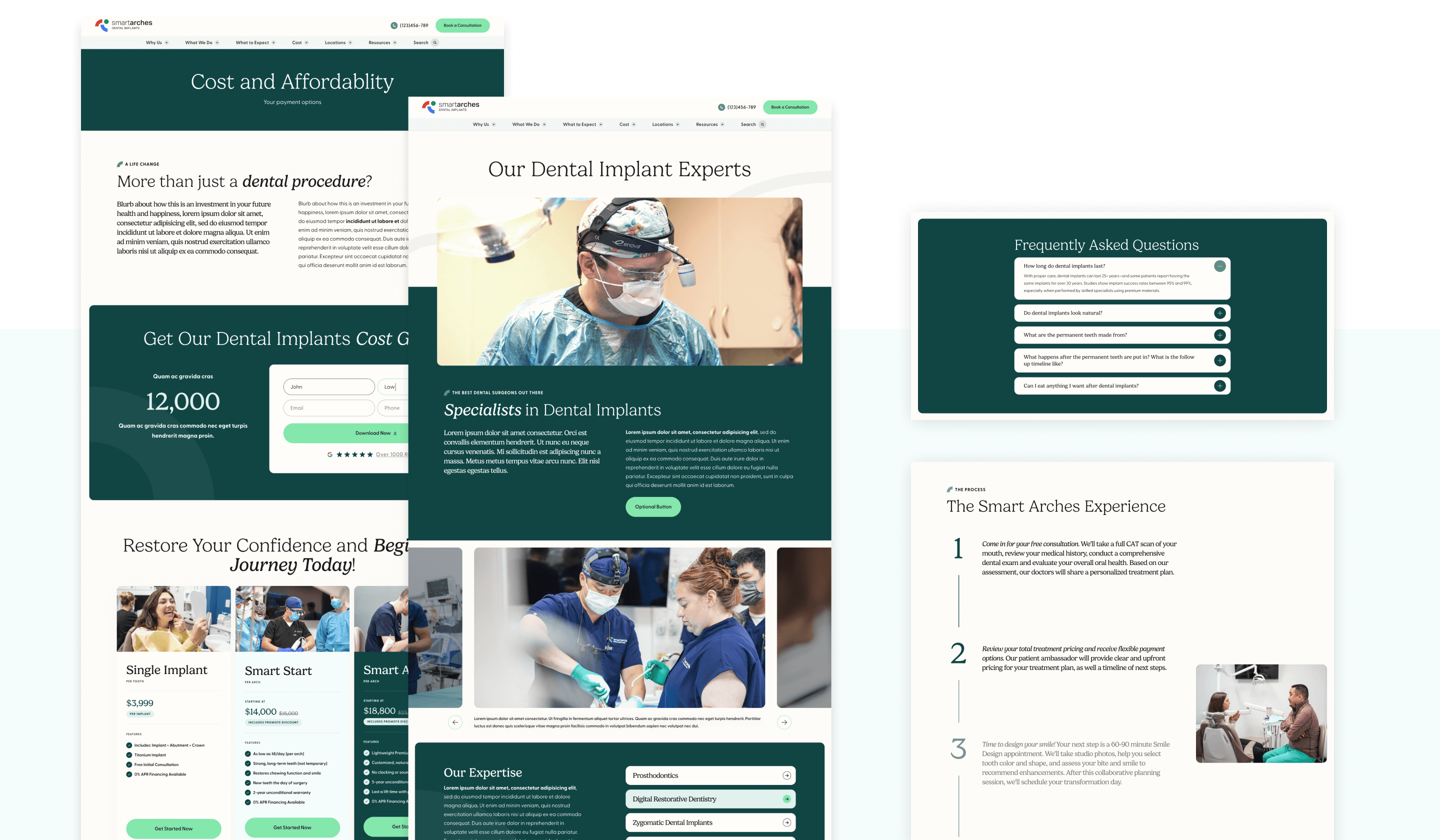
Once design was approved, we went to work on developing everything from desktop to mobile breakpoints. It was important that the user be able to use every element of the site from any screen size, and very important to consider accessibility. Luckily, responsiveness and accessibility considerations are built into our design and development processes from the jump, every time.


Smart Arches now has a website unlike any of their competitors’ sites, a home on the web that looks both professional and polished, as well as approachable. The content team can easily create new landing pages using their custom modular page builder, and any potential client can visit the site and quickly find what they’re looking for. There are multiple pathways for users to book a consultation, ensuring the site converts effectively. Our thanks to the wonderful team at Smart Arches – go check the site out!
