Hodara Real Estate
A visual identity and website for a growing real estate development and investment firm that provides affordable yet tech-integrated living in rising urban centers
A visual identity and website for a growing real estate development and investment firm that provides affordable yet tech-integrated living in rising urban centers

Hodara Real Estate was in need of a new brand and website to represent its innovative, ahead-of-the curve approach to development. Our team entered the fray to develop an identity that would incorporate the client’s strong visual instincts and preference for animation, as well as showcase previous successes to investors through an impressive portfolio.
Over the course of 3 months we dove into a thorough discovery process in which we introduced our latest design approach – Understand, Imagine, Make. The process allowed us to understand the client and industry before opening any design software. In-depth Q&A sessions revealed Hodara’s love for animation and strong visual instincts, which we then incorporated into the branding.
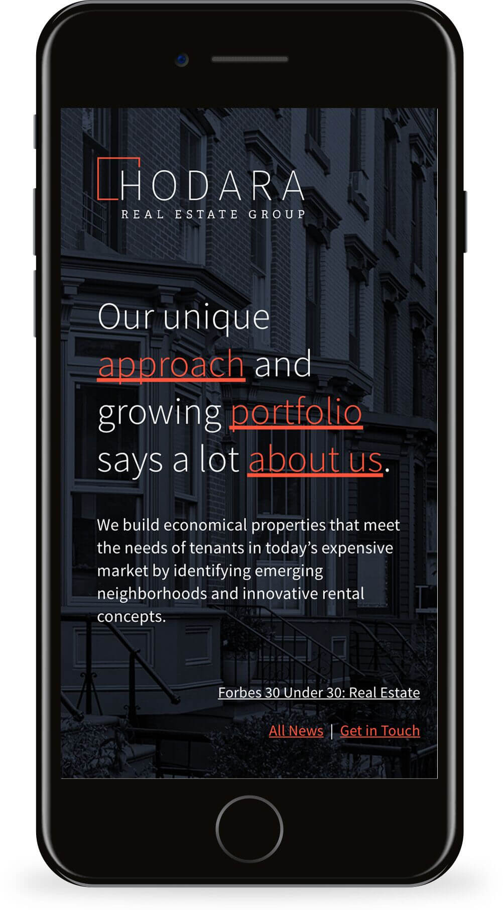
Considering the client’s approach to affordable and modern living we developed a robust design that “fills the gap” using clean, sharp lines and an expandable border. The function of the bordered logo is twofold, acting as a stage for innovation and a blank canvas for what future brings. We distilled the client’s story into a few content “buckets” (the company’s values, portfolio, and story), and used a one page site format to showcase the information. The site includes a parallax slideshow with rich photography to show the company’s values. The final product is a sleek, modern visual design that tells the client’s story.
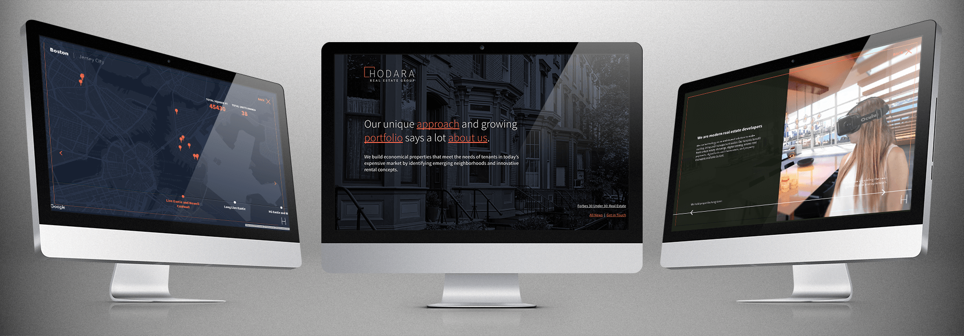
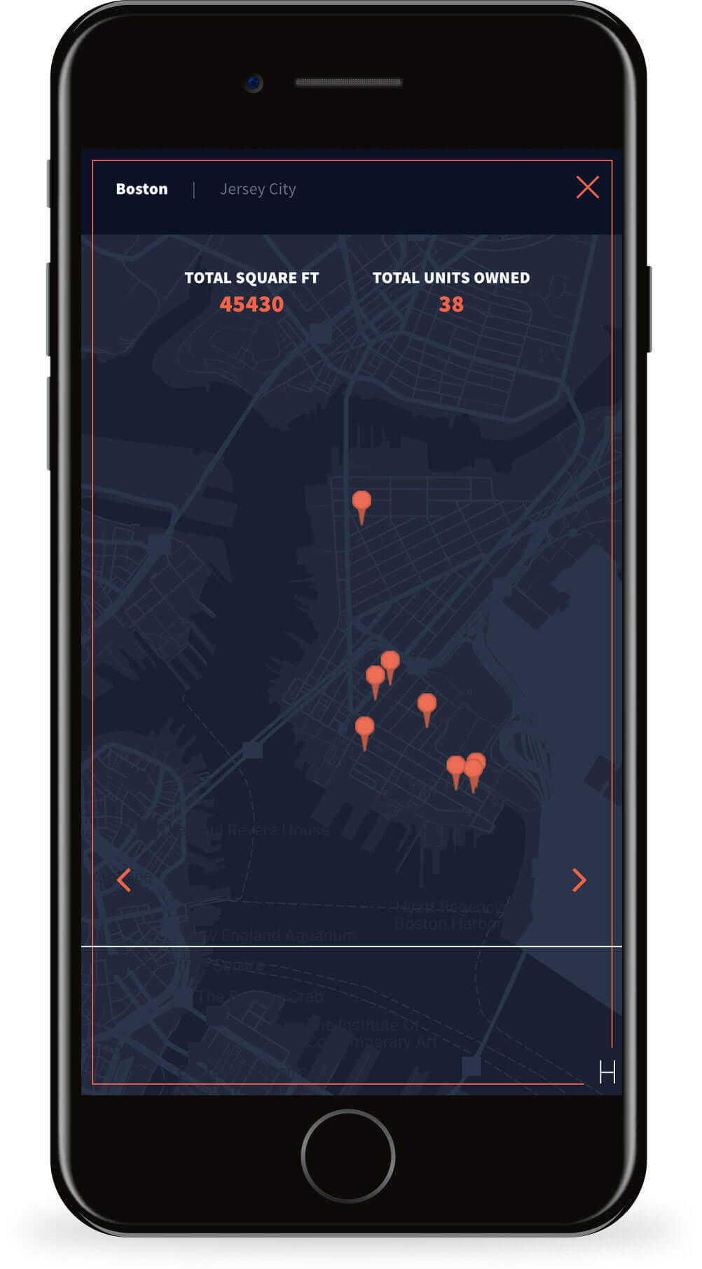
To showcase the client’s successes we designed an interactive map that uses movement and counter animation to show portfolio growth over time. The map uses a JavaScript timeline that interacts with the Google Maps API. The result: a dynamic portfolio for future tenants and potential investors.
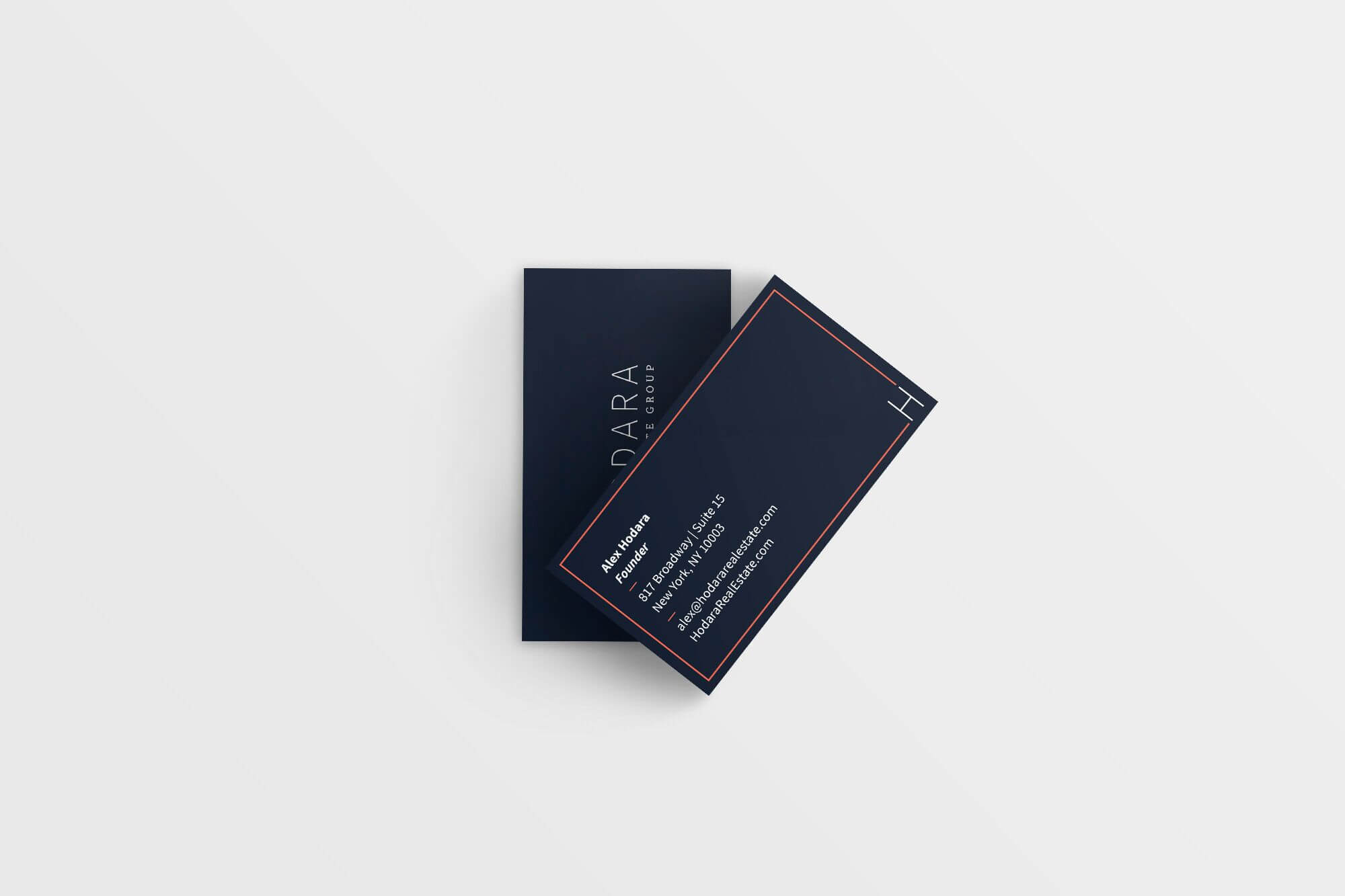
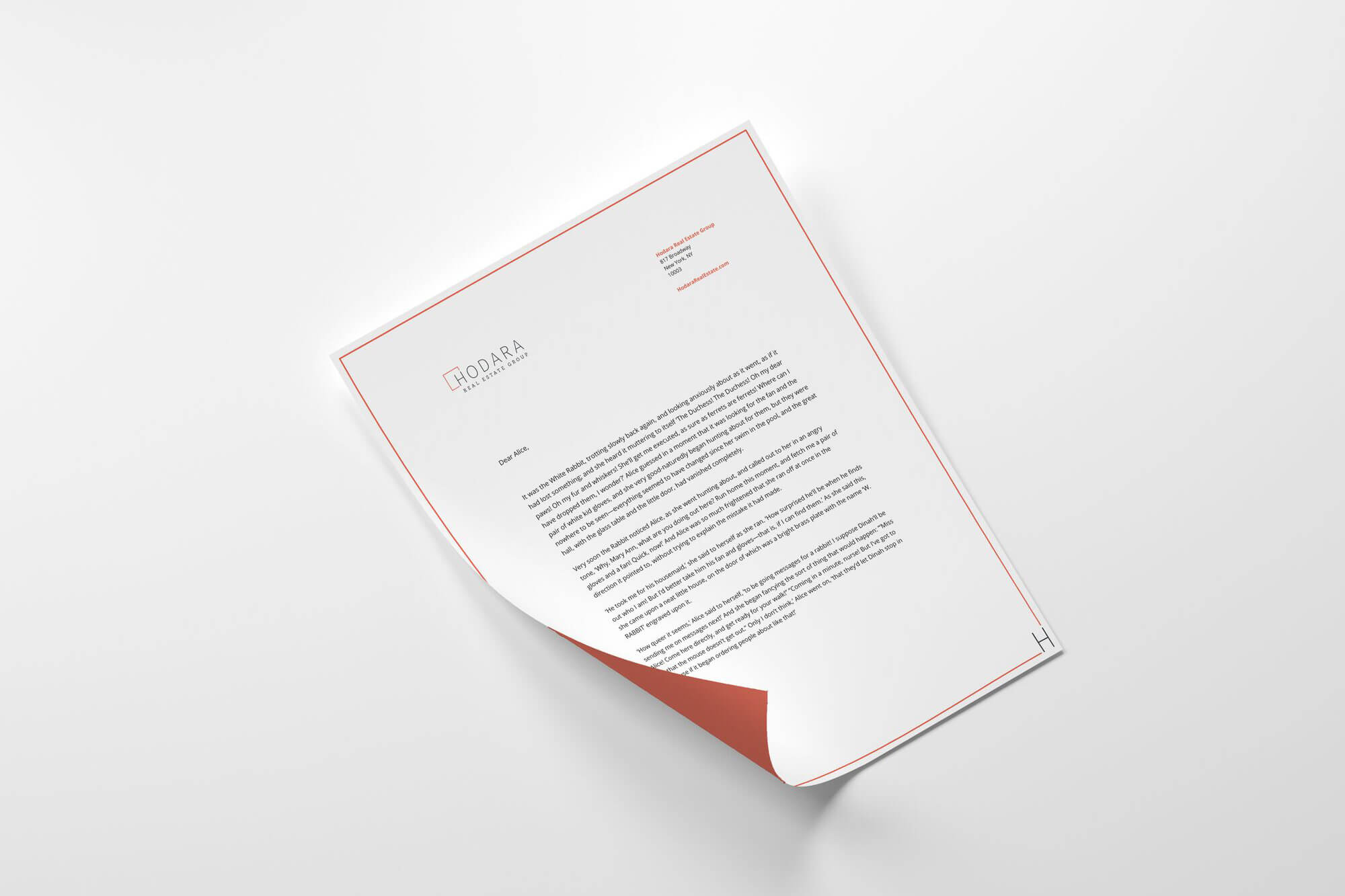
The brand and logo are an extension of the company in that they hold physical spaces. We branched beyond the digital landscape to materialize the brand’s presence through business cards, letterheads, an Excel theme, and wall vinyls.
from the client "This rebrand really focused me as I prepare for my next phase of growth in my portfolio."
 Alex Hodara CEO