Fieldtech
A crisp visual identity and marketing site for an insurance tech startup
A crisp visual identity and marketing site for an insurance tech startup

Our engagement with the Fieldtech team started with discovery. We learned that the Fieldtech product – an advanced insurance customer relationship management software – was built out of necessity and rolled out internally at the insurance firm Lenox Advisors. The product was so successful and so useful internally that they decided to spin it out into its own company and make it available to other firms. Cue Simpatico to help bring that company to life.
We dove deep into the product’s use cases and audiences, and the insurtech space, and talked at length with the Fieldtech team about how they wanted to position themselves. We landed on the intersection of welcoming, modern, and professional, with a hint of ushering the insurance industry into the future. From there we began to ideate on how the company’s personality would manifest through the brand.
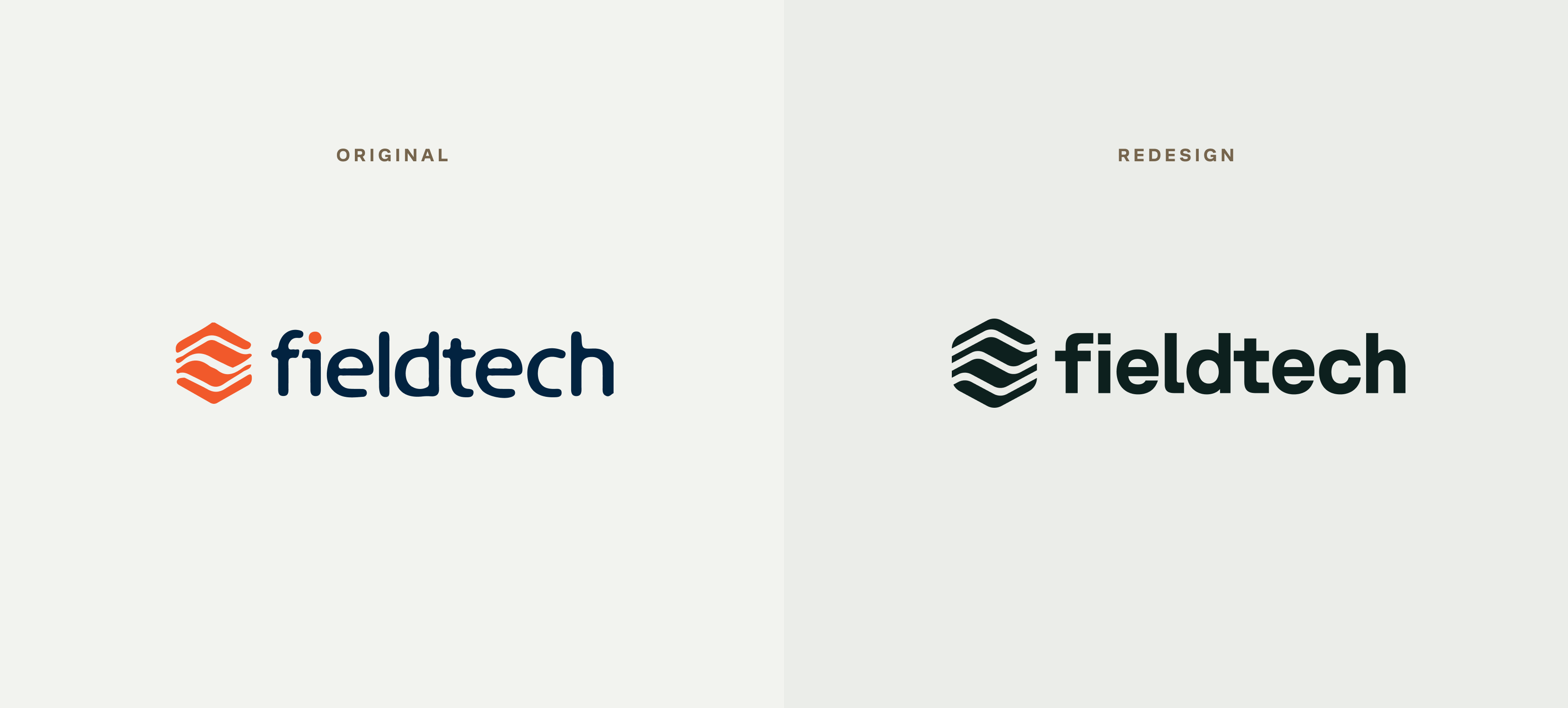
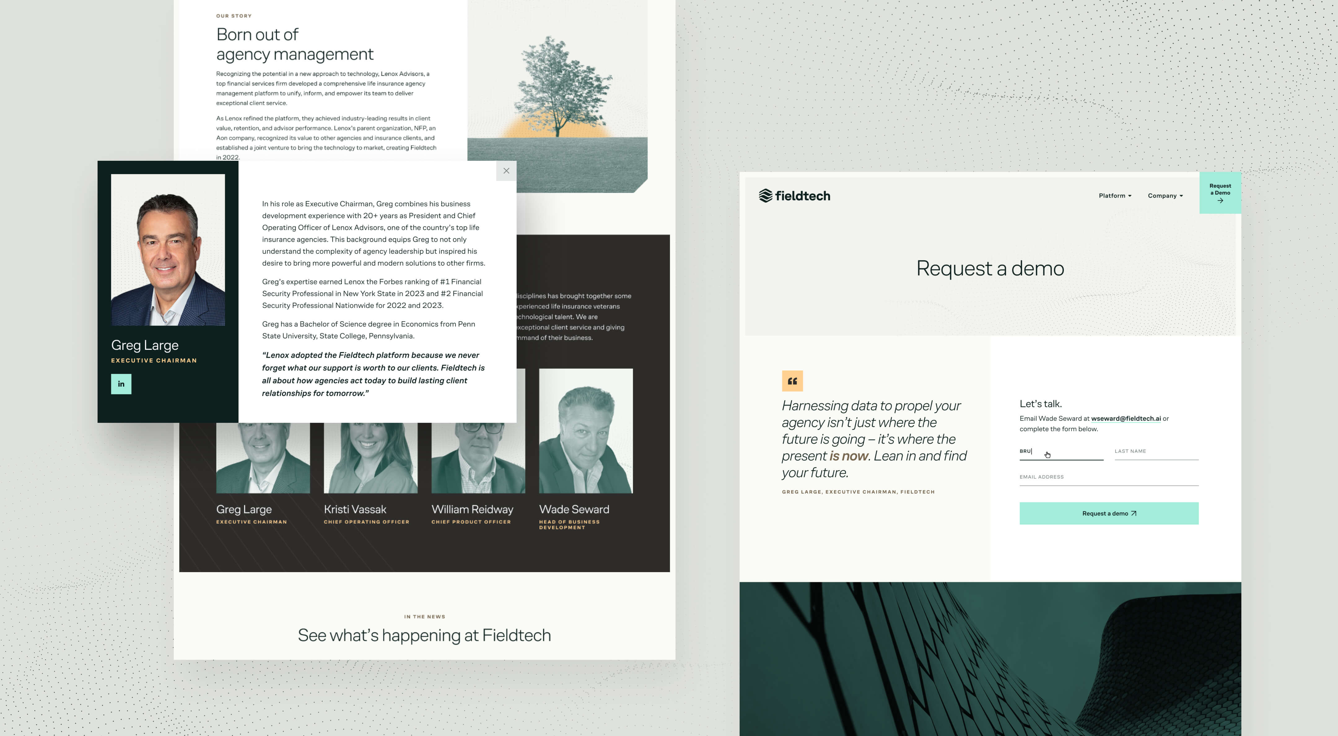
The existing Fieldtech logo had been created before the marketing deep dive had begun, and therefore wasn’t aligned with the new positioning. As part of our concepting for the new brand, we created various iterations of the logo that would remain true to the original while bringing it up to par and pairing it with our new goals for the brand.
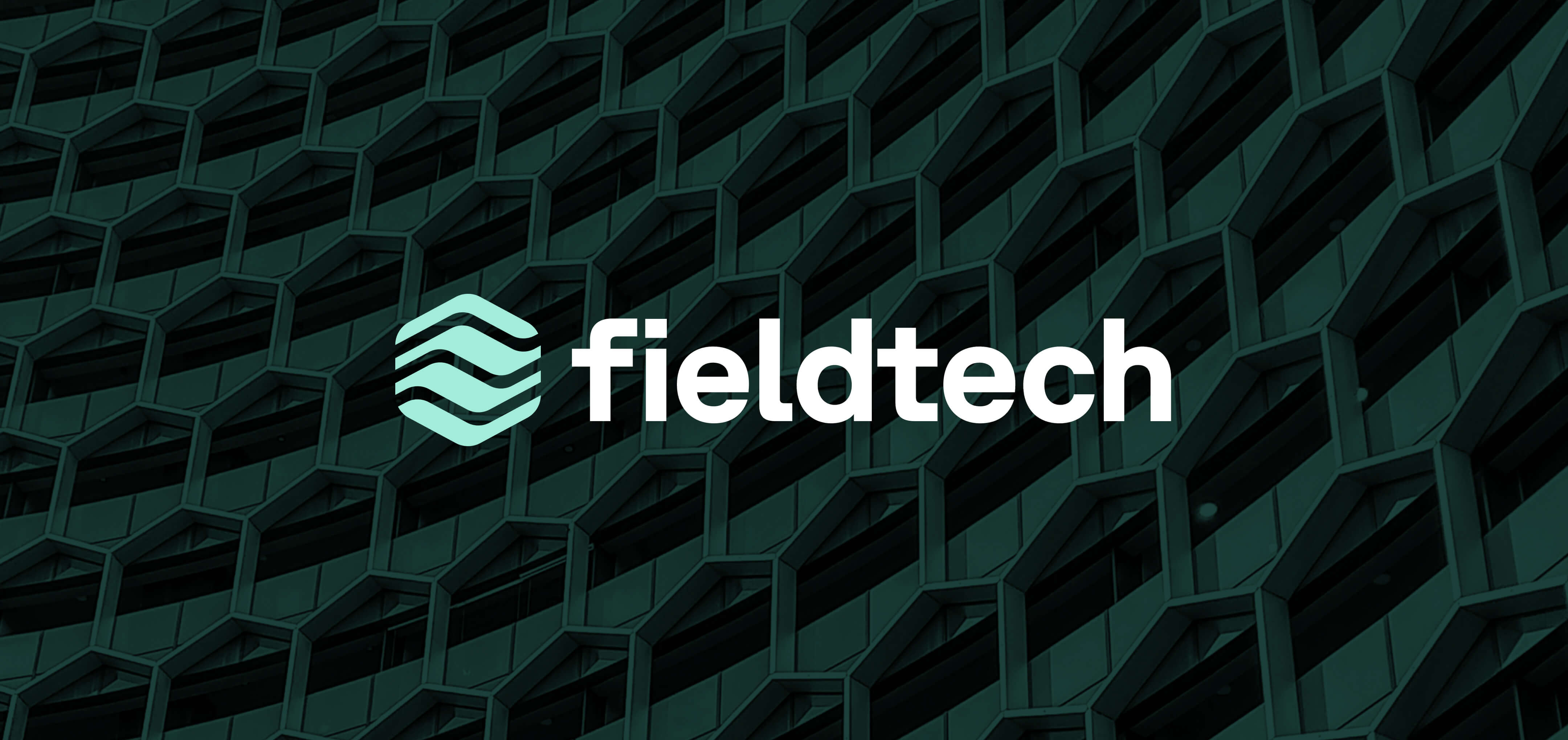
We cleaned up the hexagonal logo mark, making sure it still felt like the original mark but crisper and more regularly spaced. For the wordmark, which we kept all lowercase, we used Planar by Grilli Type, a functional, rigid grotesque typeface with carefully crafted curves that give it a slightly futuristic quality. This matched our concept nicely, emphasizing Fieldtech’s tech-forward, aspirational quality, but staying familiar enough to feel grounded and dependable.
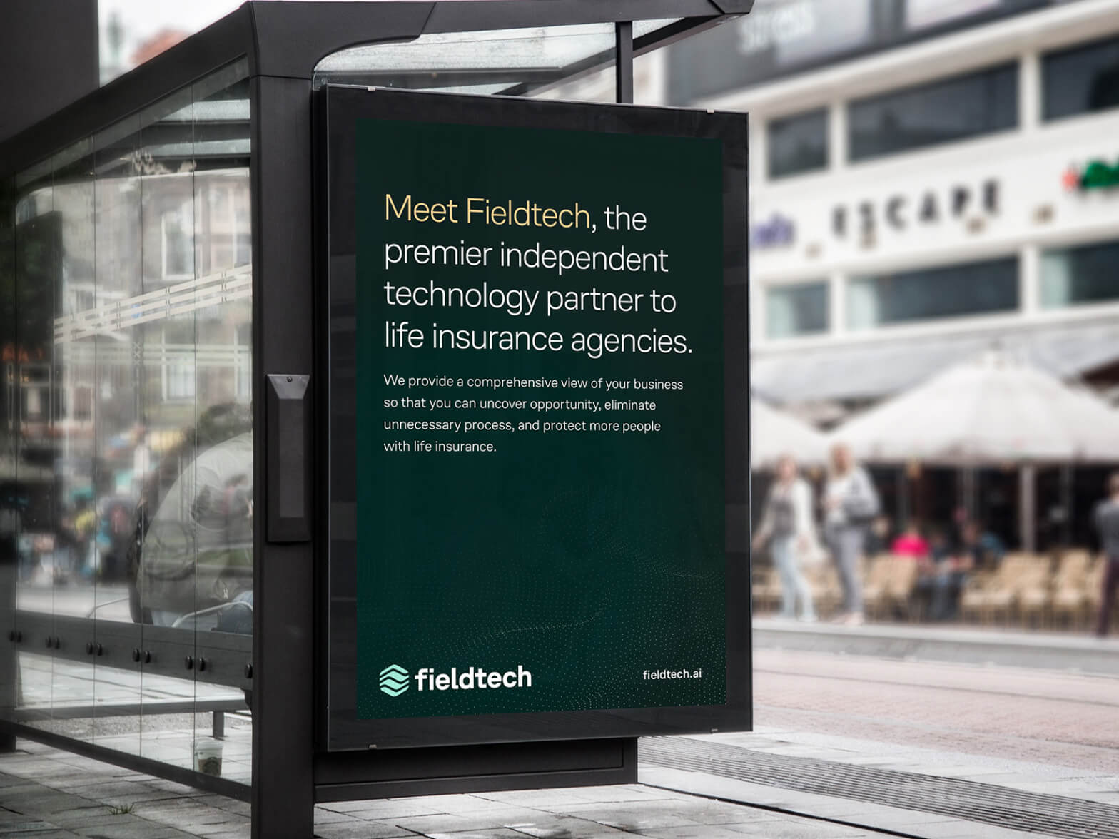
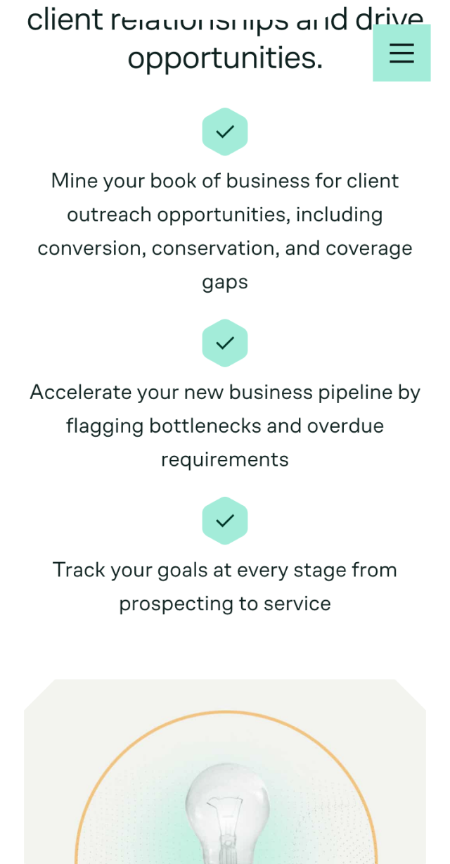
Our discussions regarding the visual identity involved teasing out exactly what qualities the Fieldtech team wanted to emphasize – and how the visual design would achieve that. The team wanted to make sure the company’s competence and reliability was never in question, but also wanted to make sure they came across as innovative and able to give their clients an edge. We achieved this delicate balance through use of color, graphic elements, typography, and assets.
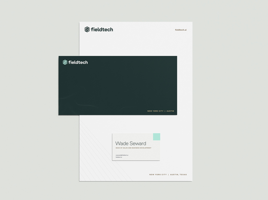
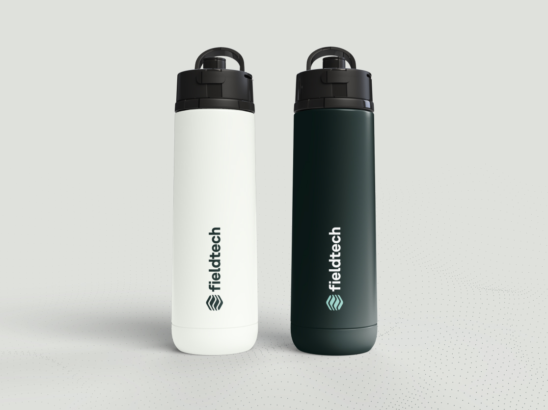
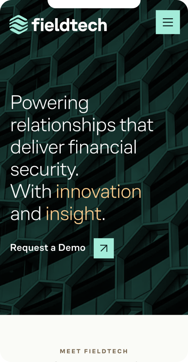
A rich dark green serves as the brand’s primary color, lending a sense of integrity and established reliability to the company. The dark green is supported by a fresh mint green, and shades of gold, which give a pop of contrast as well as an impression of quality.
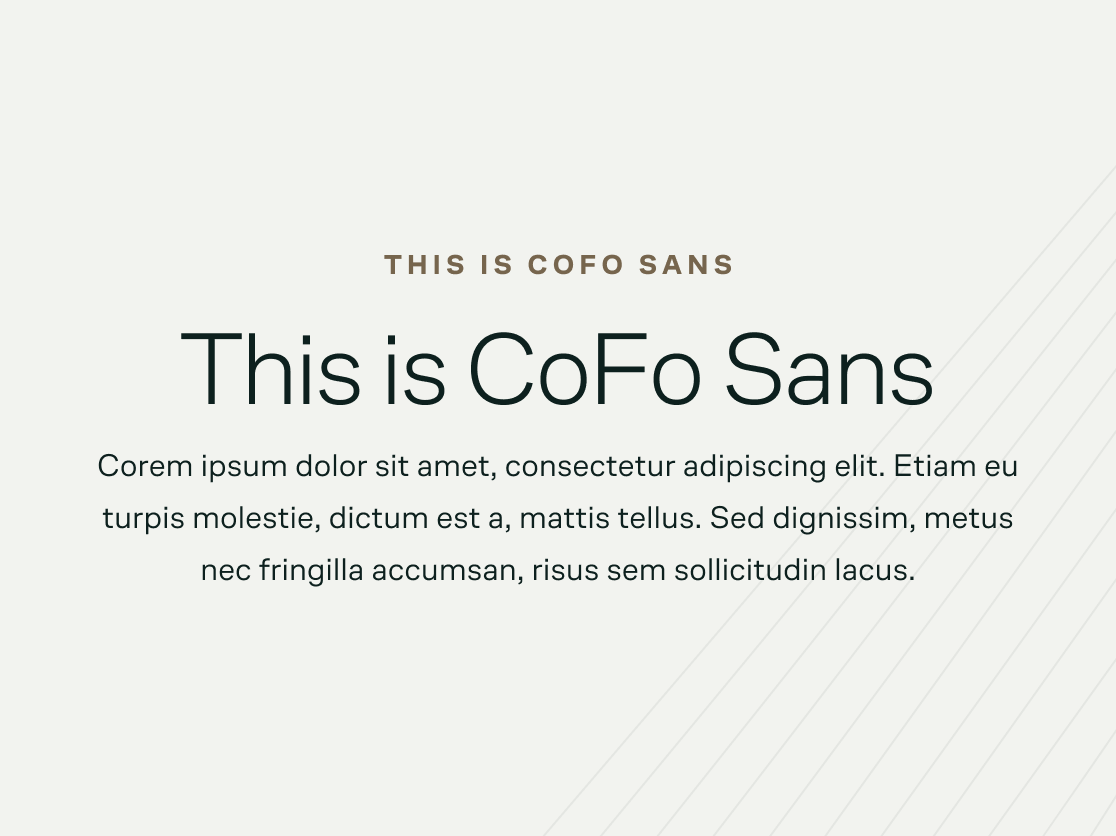

We paired these colors with elements like a wavy dot mesh pattern and a thin line pattern, which add visual interest, but also act as cues that this is a tech-forward company. As for the typography, we chose CoFo Sans by Contrast Foundry as the brand’s font, using it as the display headline font as well as the all-caps eyebrow font and body copy font. Its simplicity, cleanness, and airiness give the brand some of the aspirational qualities the team wanted to emphasize.
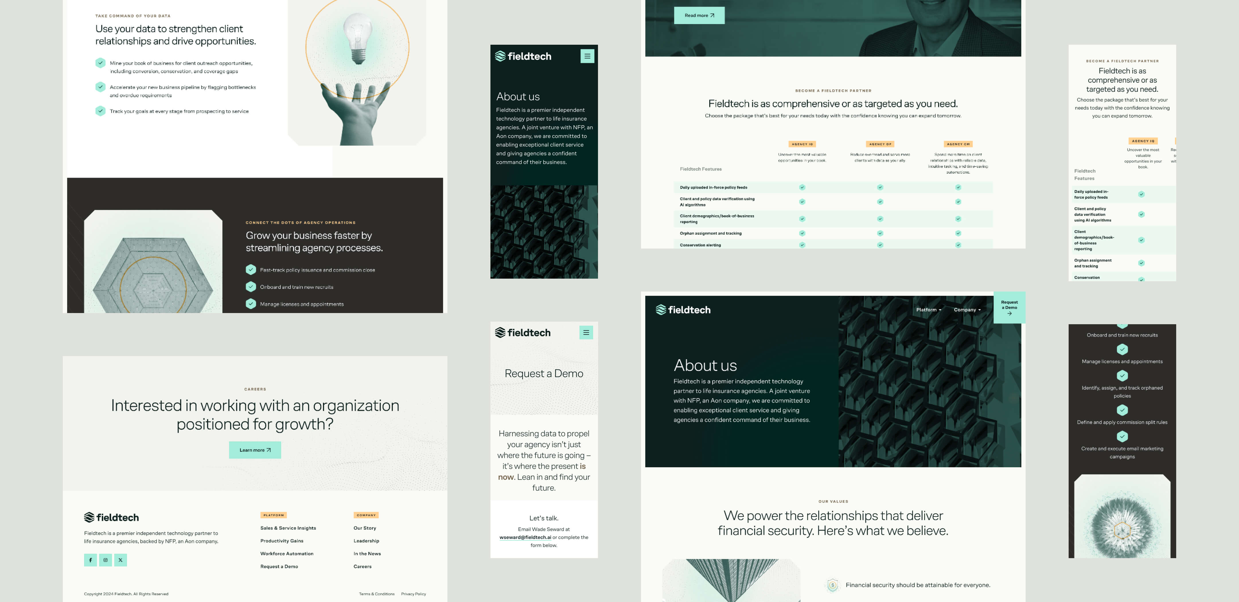


The final frontier of the visual identity was crossed when we began designing the website: How was the Fieldtech team going to convey the qualities of the product itself? We knew that they didn’t want to use screenshots or renderings of the UI itself, and straight stock photography was ruled out as too conventional and too obvious. So we went back to the drawing board and put on our ideating caps.
Our solution: duotone digital photo collages using representations of aspects of the product and how it makes a user feel. Using imagery that is evocative (but not obscure), as well as designed elements, we customized each photo collage illustration for its location on the marketing site to convey meaning and add another layer of visual interest across the site.
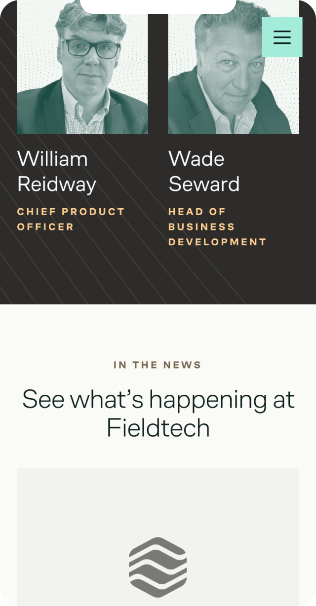
We extended this method into the background photography across the site as well, utilizing a duotone filter with strategically chosen imagery that complements the hexagonal brand mark and the geometric graphic elements across the site. The effect is a slight impression of metallic shine that says, this product is high-quality and reliable.
Because Fieldtech had no visual identity to speak of before we started our work with them, much of the work developing their identity was done using the website as the testing ground. Iterating fonts, colors, and photo assets on the work-in-progress site itself allowed us to see what we were creating as it evolved in real time. This was especially helpful as the team workshopped the tone of voice through the copy on the site, and we used their talking points as the basis of our photo collages. The process was highly collaborative, with thoughtful tweaks that rippled out to the rest of the design as we went. Because our two teams are both so small, we were able to be nimble and communicative while implementing these iterations.
Our final work for Fieldtech was wrapping up everything into a new Brand Guide with a bow on it. This included guidelines for photography usage and collage creation, collateral mockups, and specifications for application of the design on the web, along with the standards like logo guidelines and font usage. The final result for Fieldtech is a thoroughly tested visual identity, which has been proven in practice with its application on the new website.