Sweet Origins
A fresh brand identity for a boutique importer and distributor of tropical ingredients
A fresh brand identity for a boutique importer and distributor of tropical ingredients

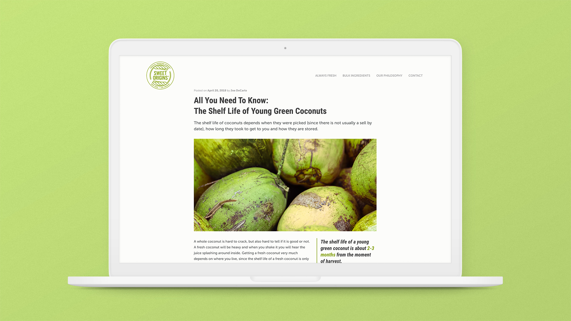
The founder of Sweet Origins, Joseph DeCarle Jr., built his company around a single premise: to import only the highest quality ingredients. While the products are ultra-premium quality, the brand needed to be approachable as well, like a small business with strong ties to growing and harvesting these fruits and vegetables. Lastly, there was the possibility that Sweet Origins would move toward selling branded and packaged products direct to consumers, so the visual identity needed to accommodate such growth in the future.
During our discovery process, we learned more about the regions that Sweet Origins imports quality ingredients from. These were all tropical areas with groves of tall, healthy palm trees. We also knew that palms were a common visual element used extensively in the tropical food and beverage industry. To make sure our logo was unique, we opted for a highly stylized depiction of palms, circling each other to create a badge — a logo style we found to be appropriate for a premium and modern, yet authentic business.
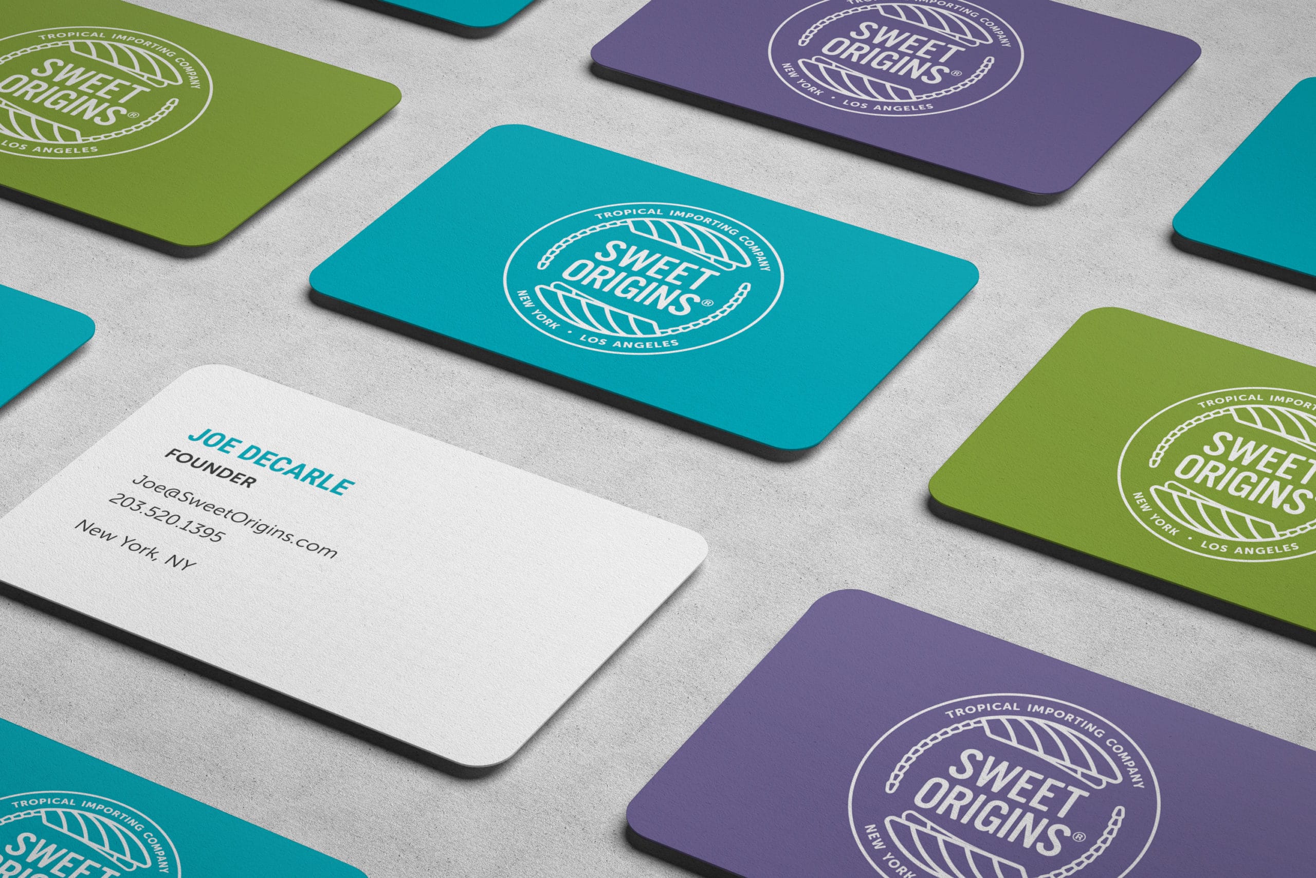
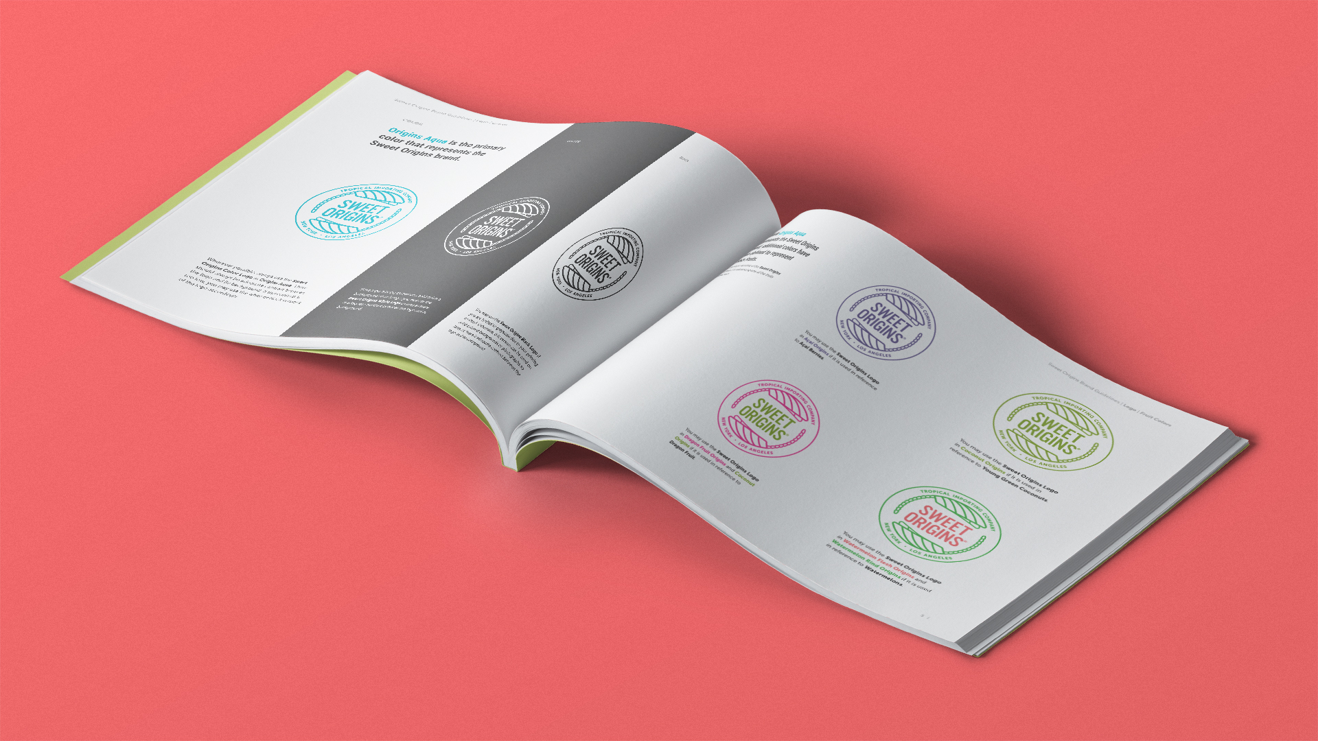
We wanted to bring an additional level of authenticity and approachability to the Sweet Origins brand. While we decided on a vibrant aquamarine color as the primary color for the brand, the logo could adopt the colors of the fruits that Sweet Origins is currently most involved with — green coconuts, açai berries, watermelons, and dragon fruit. In our style guide, we dictated when these colors could be used to make sure all future assets stay on brand.
With a logo that changes color based on certain fruits, we wanted to make sure all brand assets were used properly to best convey the Sweet Origins mission and values. We created a guide that includes logo, typography, color, and photography usage complete with real world examples.
Alluding back to the colors of premium quality tropical fruits, we designed a series of business cards that show the logo in various color schemes. Not only does this relate the brand back to its organic roots, but it acts as a point of engagement as different people have different colored business cards.