REDI
A name, brand, and website for Ernst Valery's Real Estate Developer Index initiative
A name, brand, and website for Ernst Valery's Real Estate Developer Index initiative
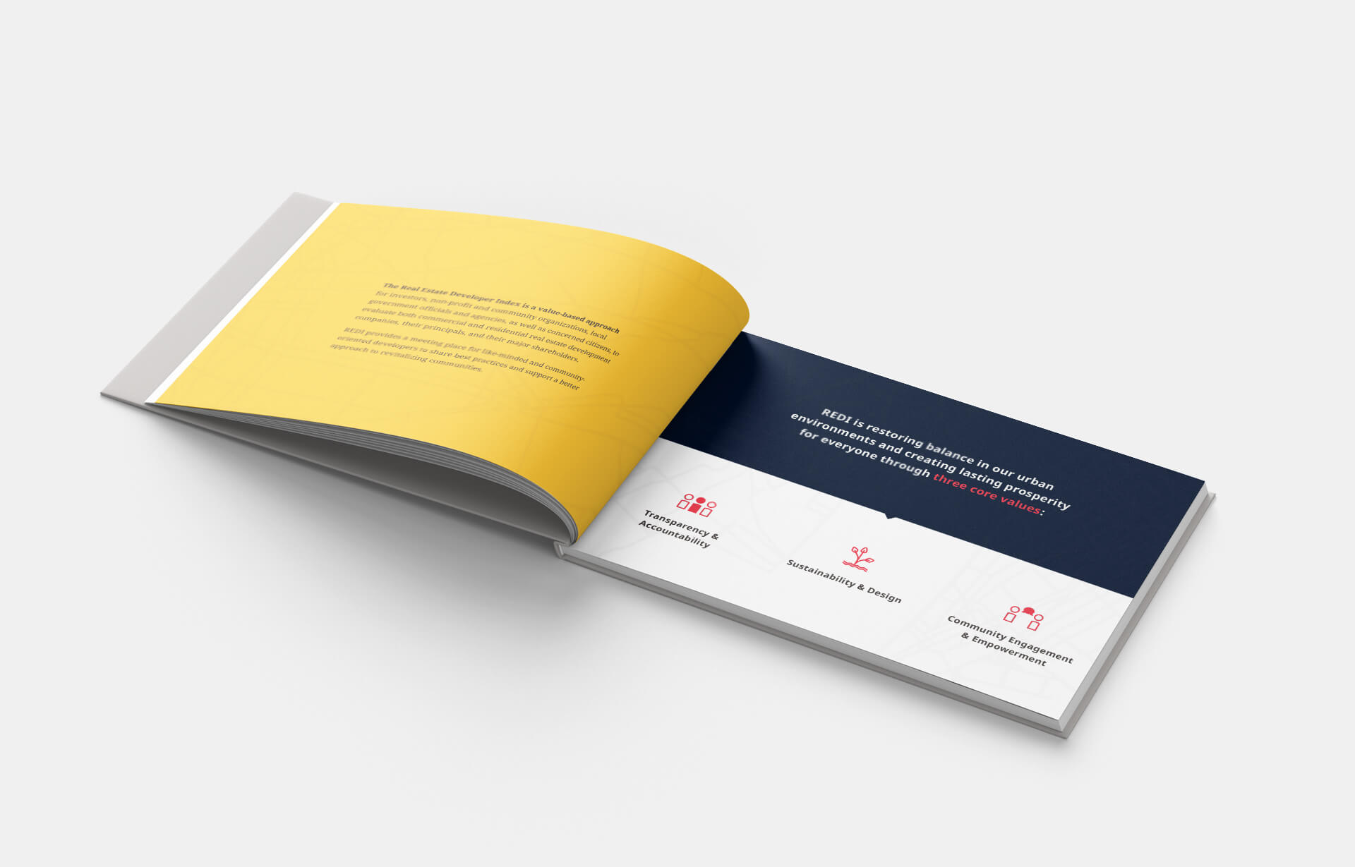
Although we liked the fact that the name of the movement would point to the index itself, we proposed exchanging “DRI” for “REDI,” an acronym standing for “Real Estate Developer Index” that could also be used in a more inspirational sense. The idea that everyone needs to “get REDI” points to the excitement and momentum of the movement.
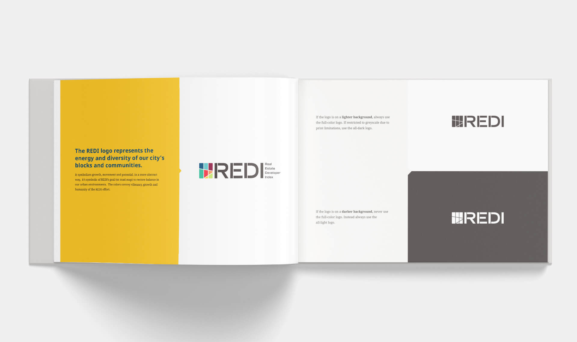
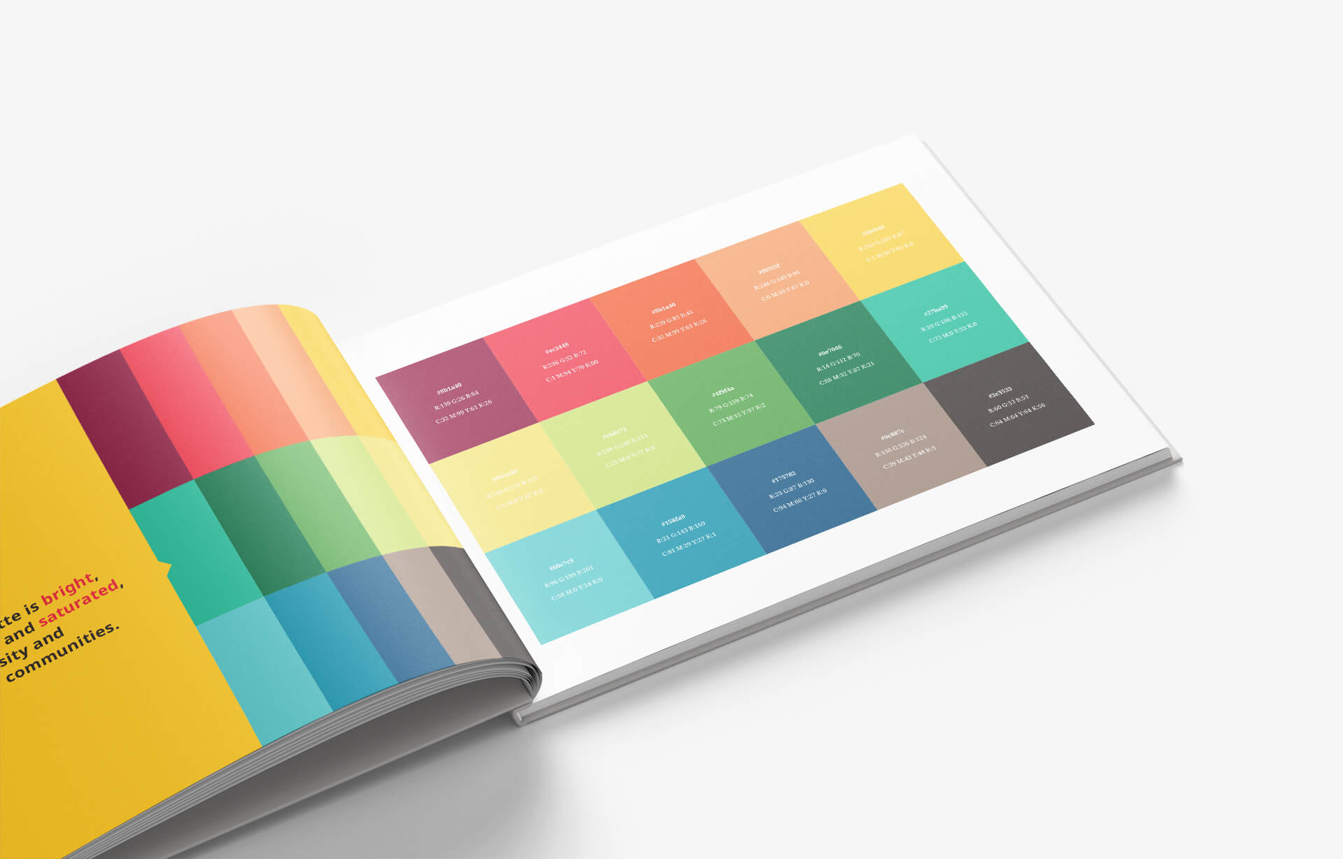
To kick off the process, we reviewed several concepts and mood boards with the client to ensure we were all on the same page about the endeavor’s ultimate goal and vision. The final logo calls to mind a street grid, bringing to mind ideas around urban strategic planning. The bright, vivid colors convey authenticity and diversity. We also created a style guide for future REDI designers and stakeholders to ensure consistency of brand tone and voice across all future deliverables. The PDF includes guidelines around how to use visual assets, the tone of voice that REDI should strike, and color/typography specifics.
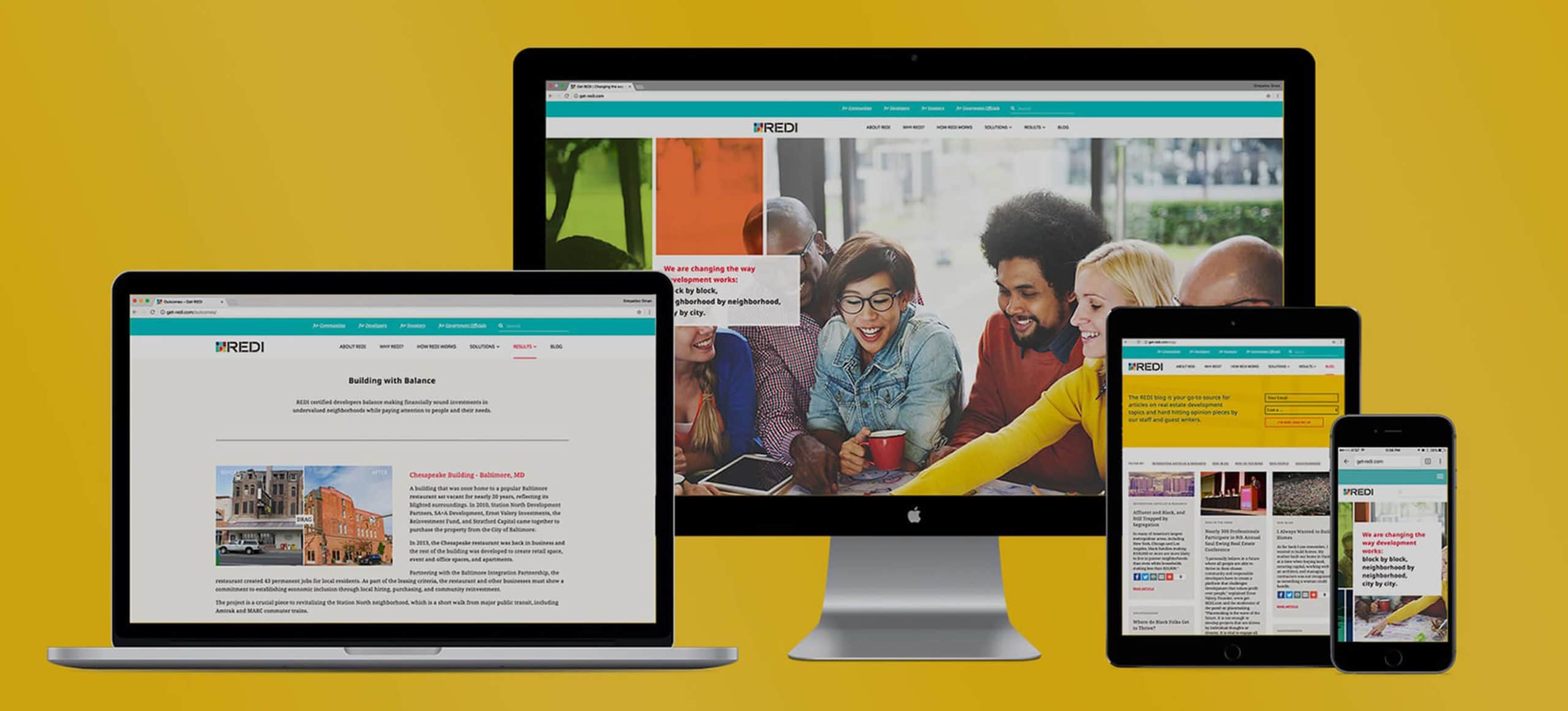
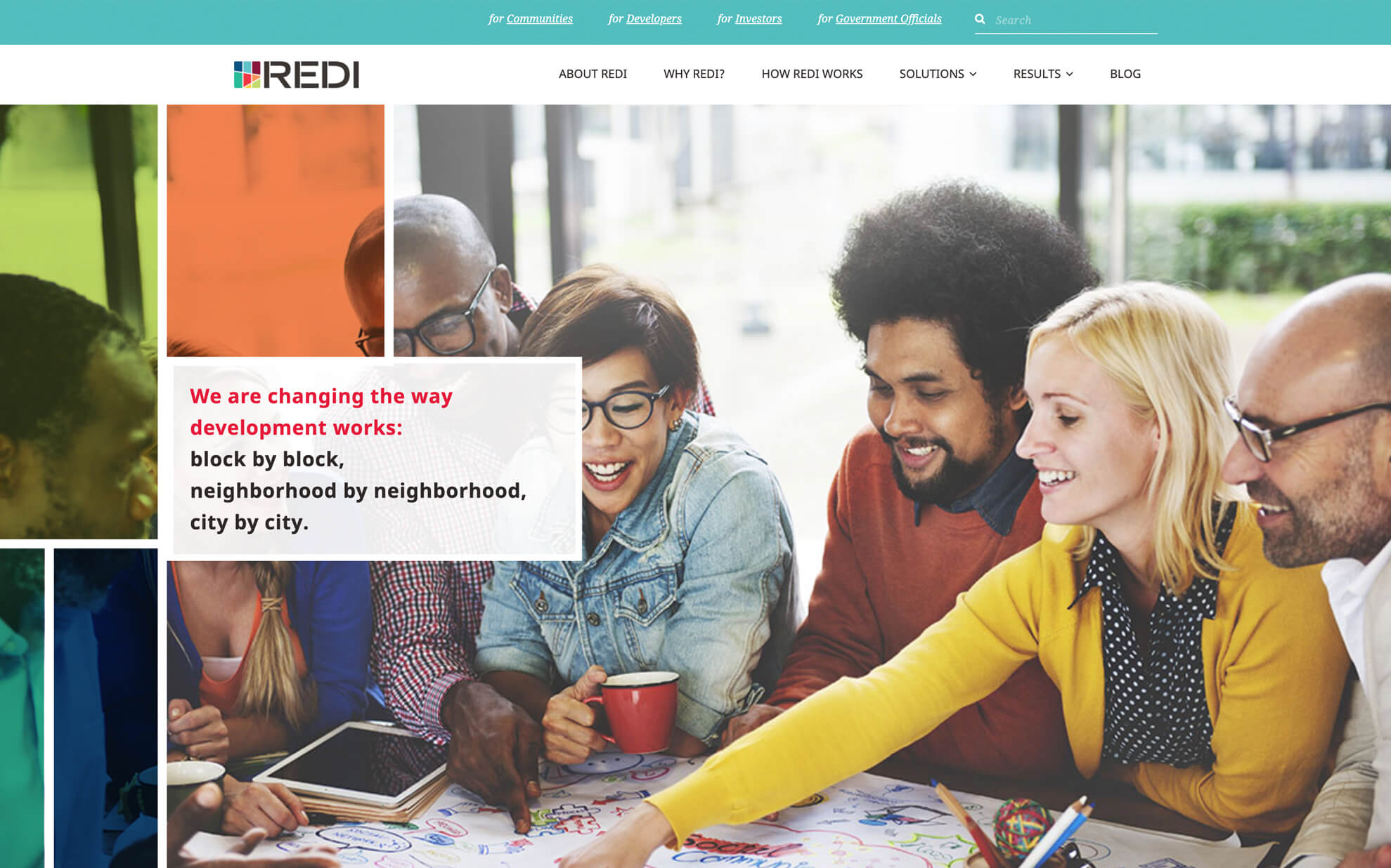
The user experience portion of the project was complex. Unlike many websites, REDI needed to reach and connect with a variety of users and audiences: investors, community members, developers, and legislators. The final wireframes outline the organization of content to address all of these audiences and drive them to the right actions and information. The final visual designs show the “paint” of the REDI visual language being applied to the wireframes.
In developing the front-end of the website, we incorporated several subtle jQuery and CSS effects to elevate the look and feel of the site: a coded visual language for each audience with unique, stylized illustrations; parallax scroll with CSS photo manipulation effects to create a branded “stained glass” style overlay; MailChimp list and group integration to allow the REDI staff the ability to target different types of users specifically; a masonry grid style blog layout with robust back-end infrastructure; and a before/after jQuery effect to add movement and interactivity to the Results page featuring projects.