NaNoWriMo
A new online experience and community for writers to set goals and share tips
A new online experience and community for writers to set goals and share tips
What started as a single event in November evolved to include multiple events throughout the year. As their organization grew, so did their user base. The redesign had to handle more events, more (and more diverse) users, and more devices. And it had to do all this without leaving the old brand too far behind, as the most devoted users in the world were extremely protective of it.
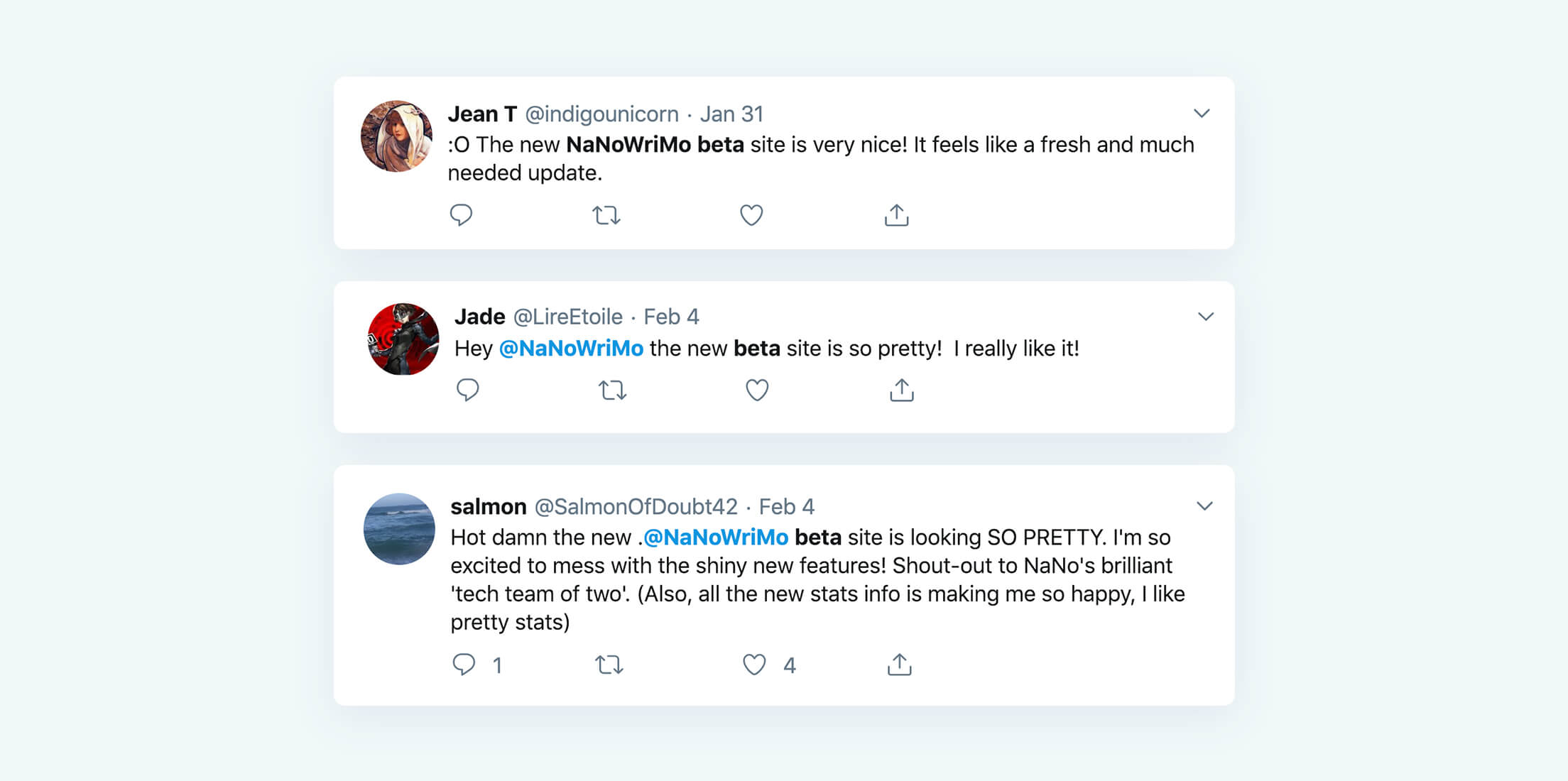
The first page in the story of the new NaNoWriMo was written with a week-long stakeholder interview and brainstorm session in their Berkeley, CA headquarters. Studio Simpatico worked with their team to help define what they currently were and what they wanted it to be. It was a thin line to walk as their site is home to perhaps the most devoted users we’ve encountered. Any updates would have to truly improve the experience. To ensure this, we worked closely with them for the following month to articulate everything they wanted to build in a PRD (product requirements document). We drew inspiration from our favorite books, their history, and even from fitness apps — a new twist on their goal-oriented brand.
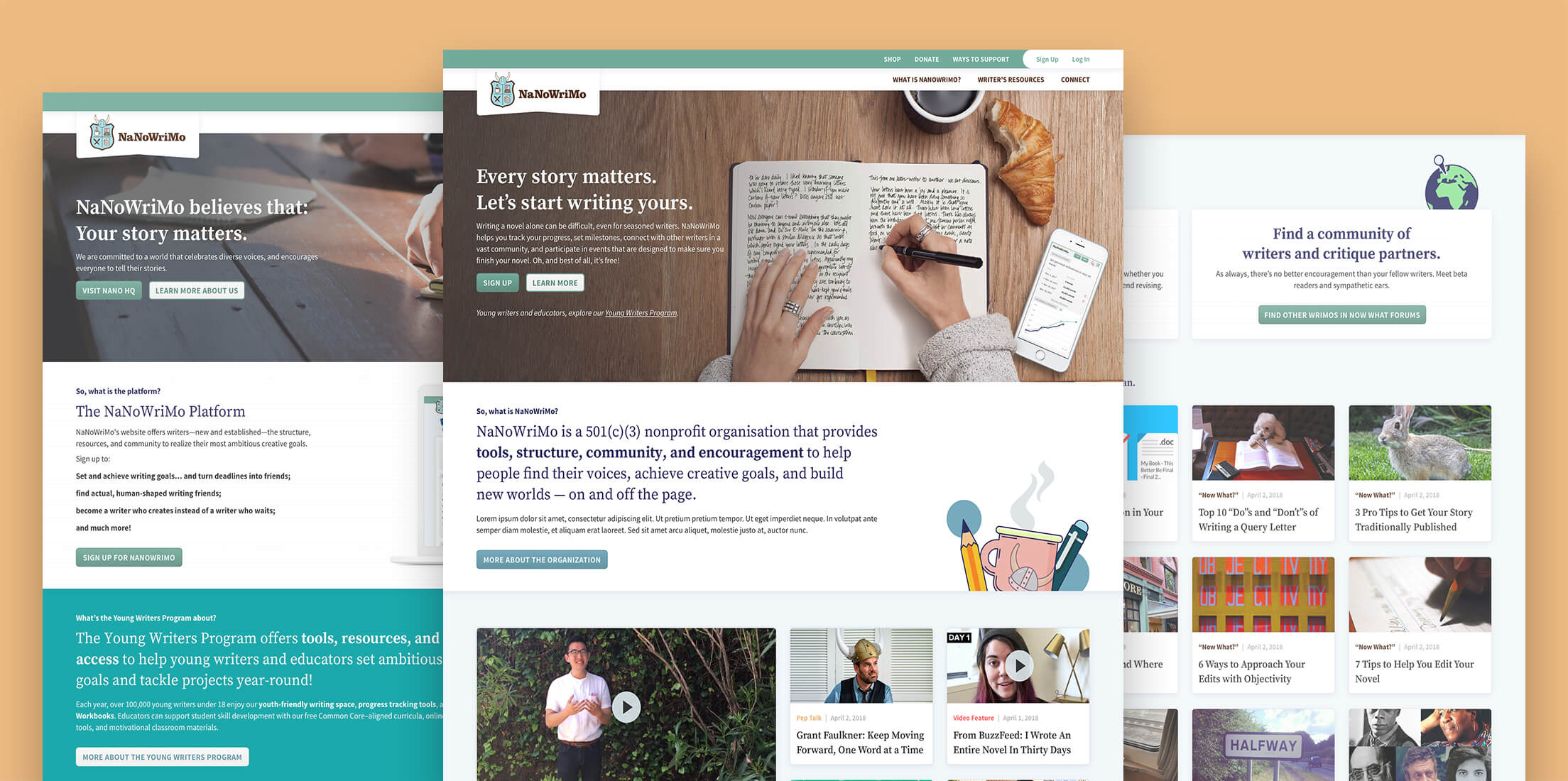
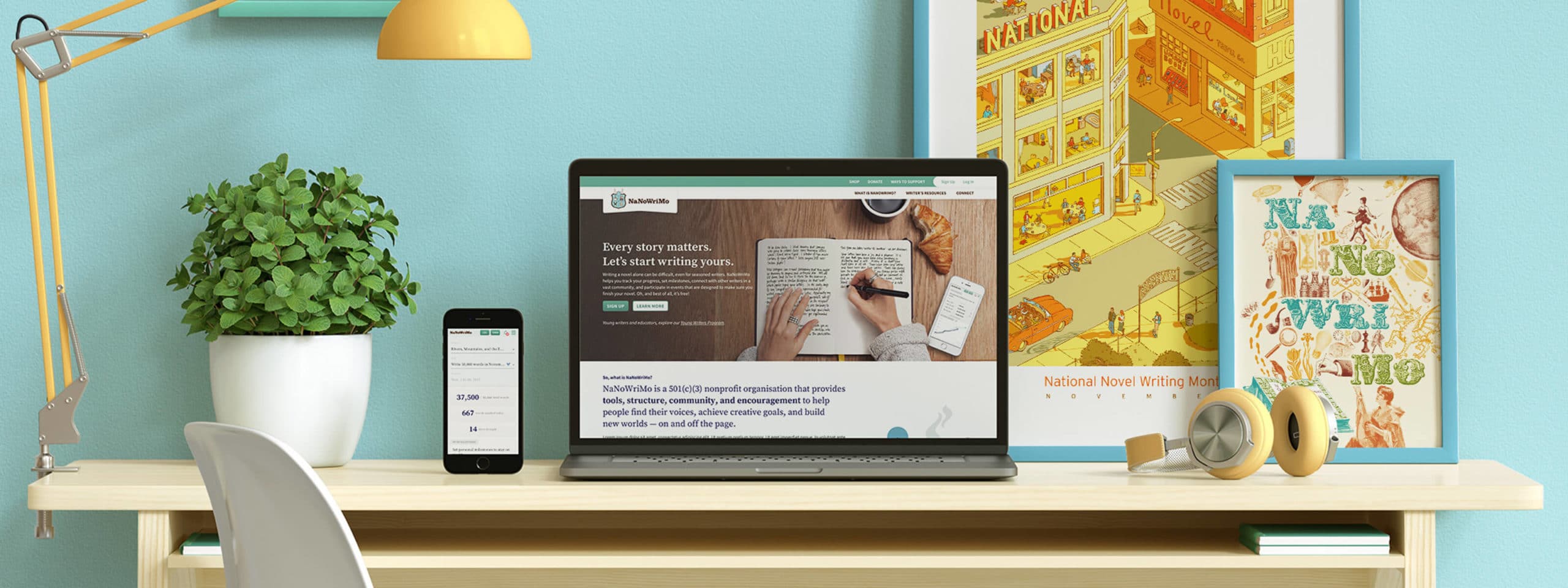
We couldn’t get rid of the iconic Viking horns. That much was clear. But updating the look and feel of NaNoWriMo while still making it feel like home to users meant some changes had to be made. Through the careful hybridization of modern design cues with the pleasantly-dusty calm of a familiar library, we reached a the visual harmony they were looking for. It looks how an old book on a new desk smells.

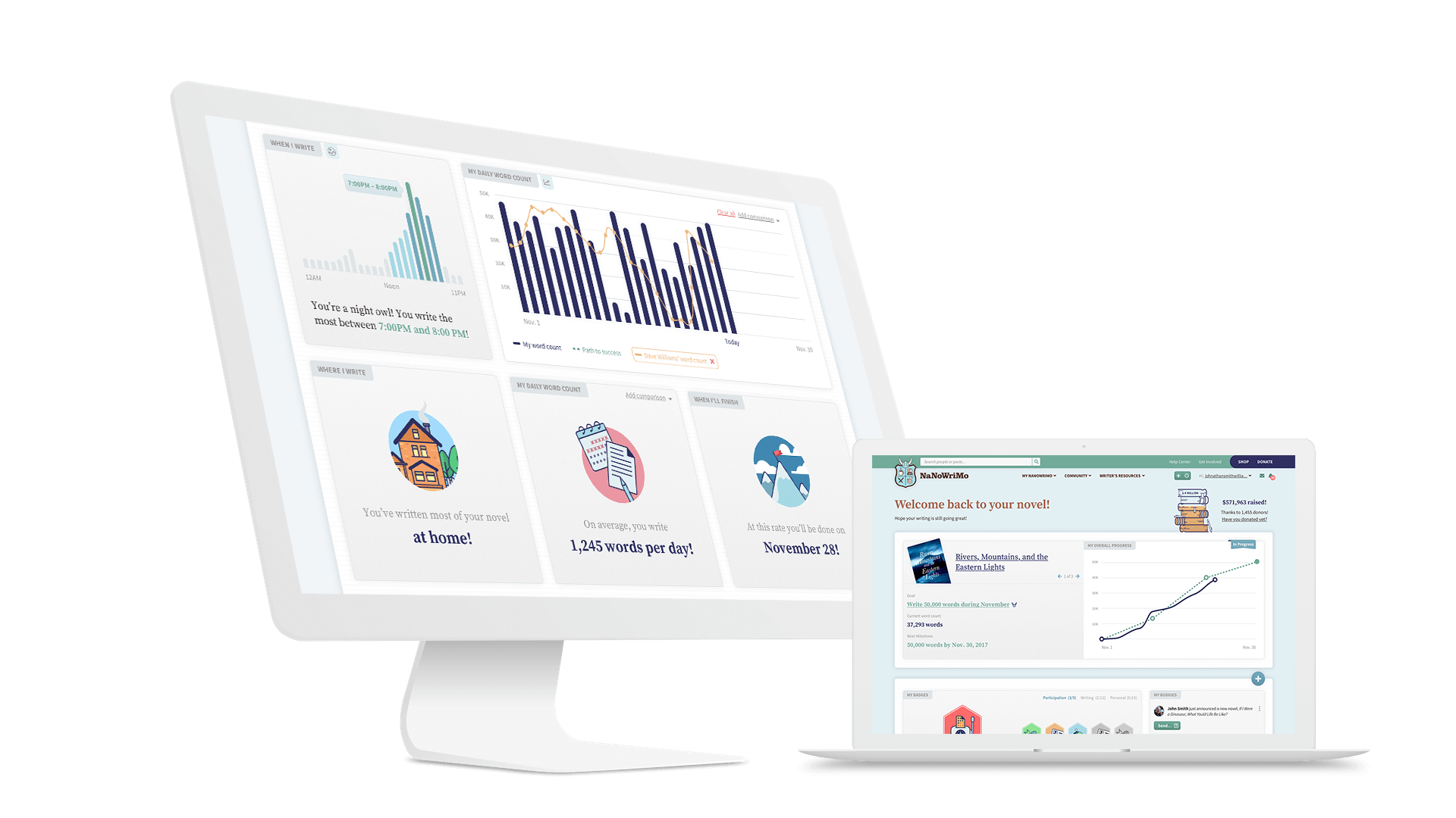
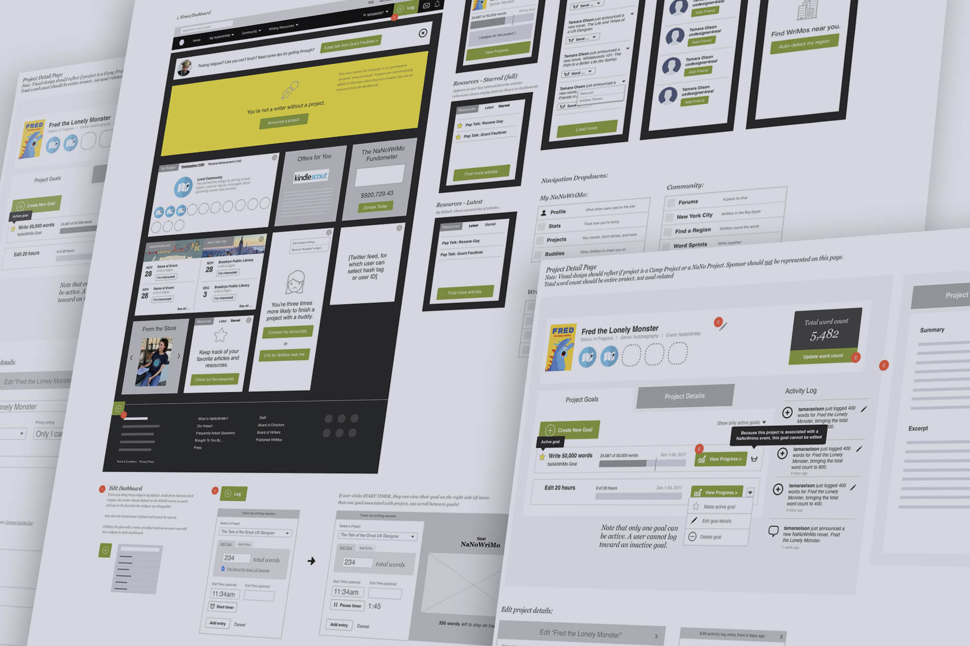
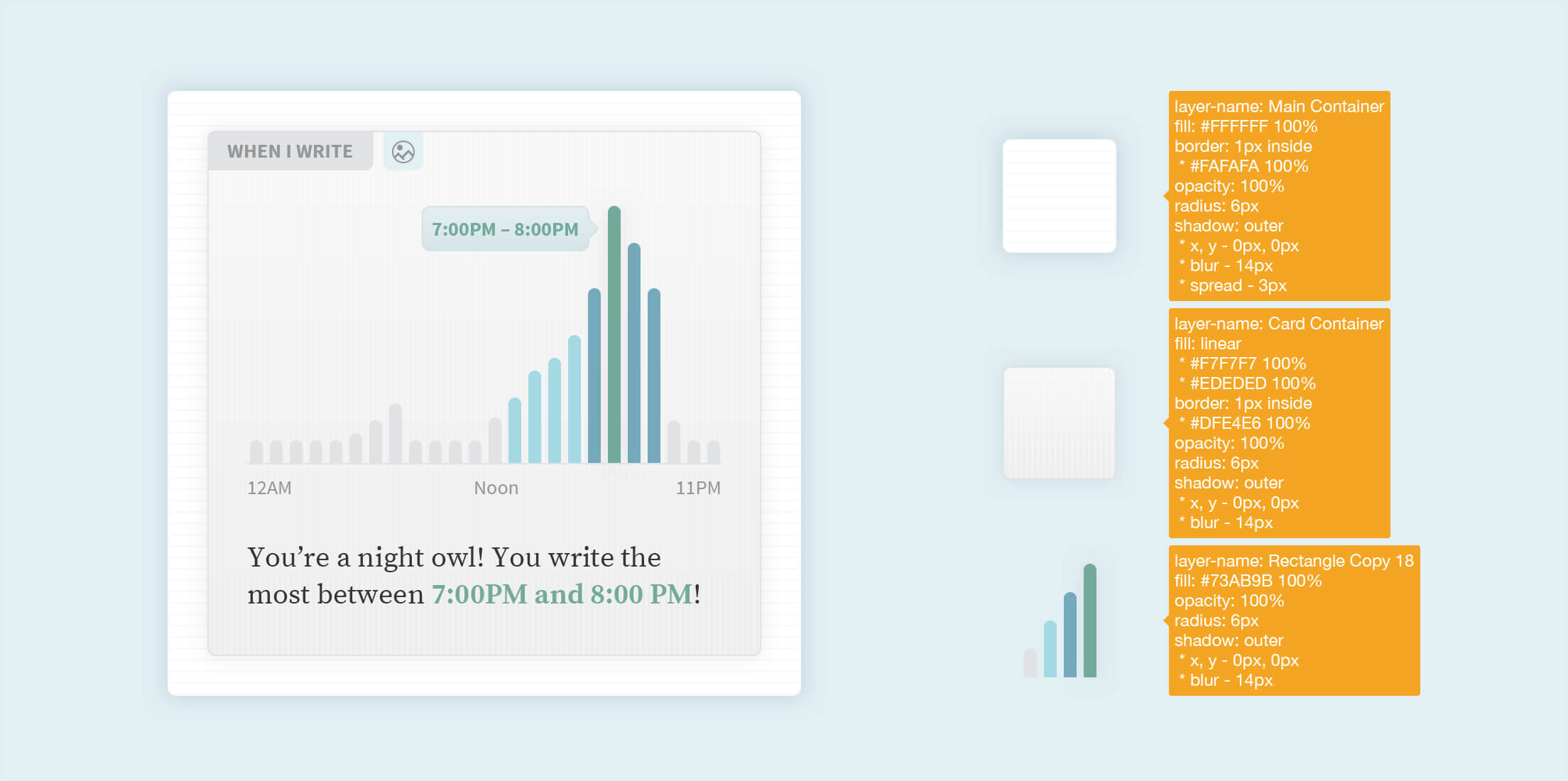
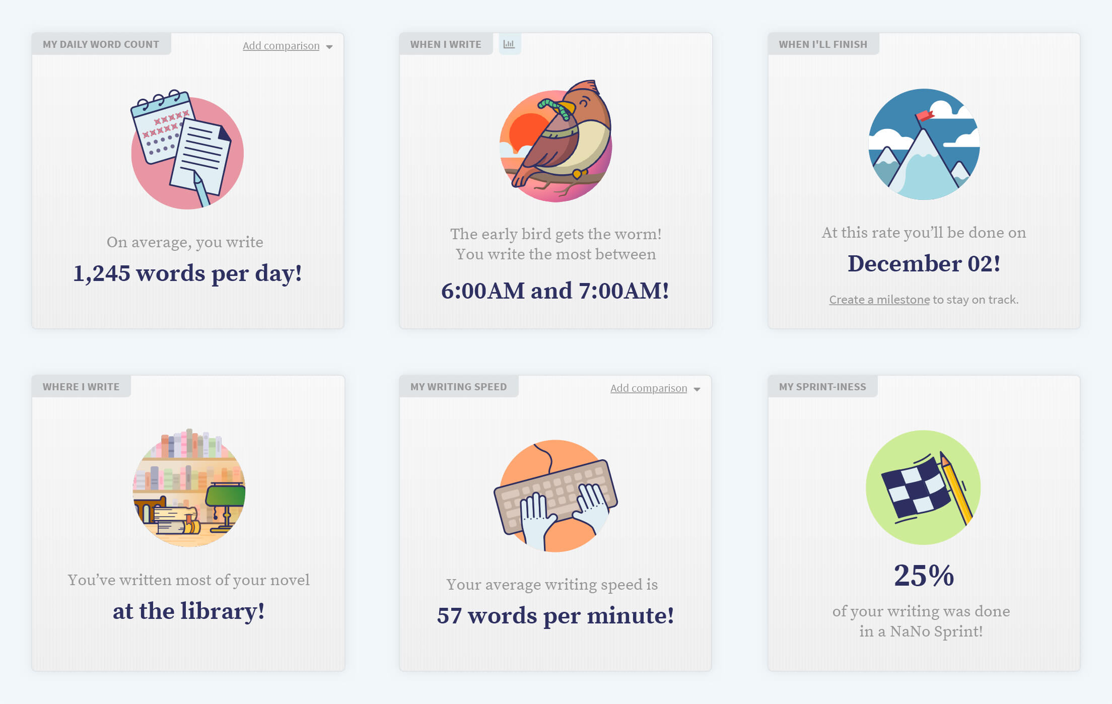
The new, broader NaNoWriMo demanded more functions from its site. Users would be planning events year round. They also would be writing more on mobile devices and spending more time interacting with one another on the site. All of this functionality was scoped, built and optimized by Simpatico with a careful eye toward maintaining the core experience. UX, site architecture and copy were optimized for intuitive navigation, and new functions were added where needed.
The successful partnership in creating the updated Nanowrimo spun off an additional page: a marketing site. Until this year, Nanowrimo had grown organically. With their user base increasing, and word of mouth spreading faster than ever, they required a marketing site for those unfamiliar with the organization to learn more and sign up. The refreshed look and feel extended seamlessly to this digital front door, completing their digital renovation. Both the marketing site and the new product design are currently in development.