M.M.LaFleur
A modular, custom WordPress theme for M.M.'s editorial brand, The M Dash
A modular, custom WordPress theme for M.M.'s editorial brand, The M Dash
from the client It was an absolute dream working with Studio Simpatico. It's really rare to find a group of people who assist with every part of in-house marketing development, whether that be in setting brand goals or user experience design, all the way through development of the end pages. Simpatico's design work was incredibly well researched, which helped to foster deep discussion, form clear scoping and expectations, and ultimately drove a really successful design.
 Justin Hughes Chief Digital Officer, M.M.LaFleur
 We kicked off our engagement with a one week discovery process that included: interviews with editors to better understand their plans for content; the creative team to understand their vision for The M Dash; the data team to understand current site traffic and patterns; and an internal audit of other sites that address the challenge of being both an editorial and e-commerce brand. We consolidated our findings into a comprehensive deck that outlined our proposed modular structure that would give the creative and editorial teams flexibility to design dynamic articles.
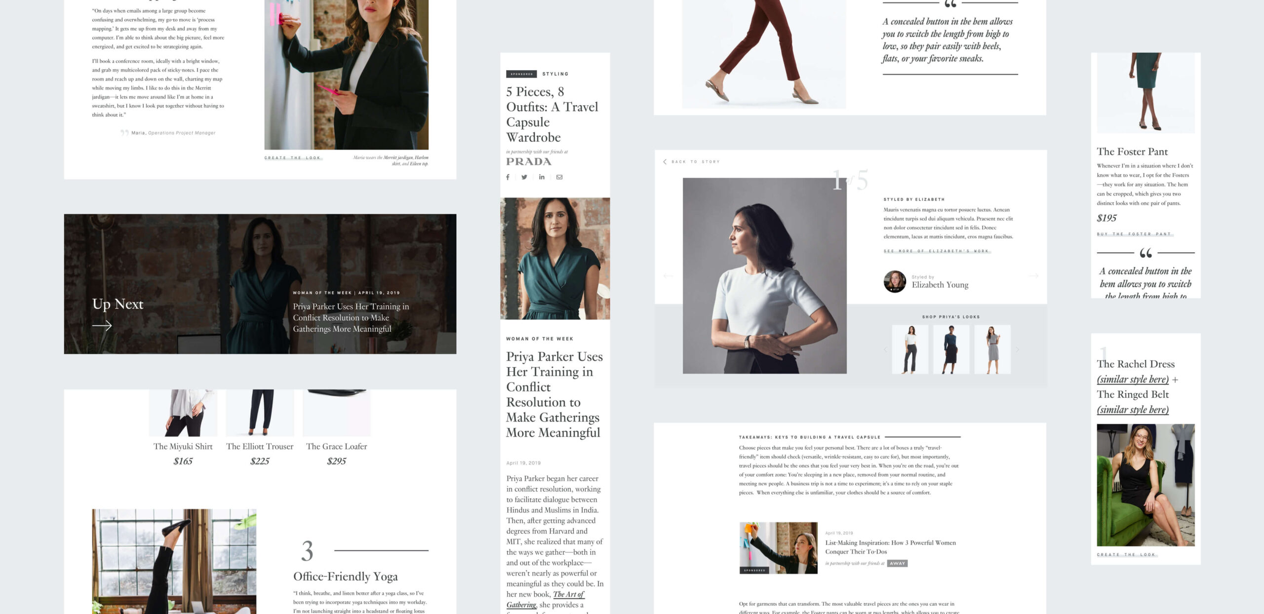
We partnered closely with the in-house M.M.LaFleur creative team to design a robust set of flexible modules in Sketch that would be used to create articles using the Advanced Custom Fields flexible content builder. Inspired by Porter and The Great Discontent, these modules included dynamic features including a two-column layout with a one-column sticky scroll.
from the client Totally unlike a typical agency, Simpatico also helped us plan for the future by thinking about designs atomically, rather than as templates, which post-project has continued to deliver on its value.
Justin Hughes Chief Digital Officer, M.M.LaFleur