Artistic Freedom Initiative
A redesigned digital presence for the global leader in protecting artists at risk
A redesigned digital presence for the global leader in protecting artists at risk
Artistic Freedom Initiative is the only organization of its kind, founded by immigration and human rights attorneys who provide pro bono legal representation, resettlement assistance, public arts programming, and global policy advocacy for artists facing persecution or censorship worldwide. What started a decade ago as a small legal operation grew rapidly after the 2021 Afghanistan crisis, when roughly 3,000 applications for assistance poured in and major institutional backing from the Mellon Foundation followed. Today AFI is a ten-person team in New York with a newly opened office in Geneva, running four flagship programs and working across every creative discipline from visual art to music to playwriting.
But the website still reflected the earliest version of the organization, built when AFI was two people and one program. As departments multiplied and a European office opened, the site became fragmented and difficult to navigate. Donors encountered no clear calls to action beyond a basic PayPal redirect. Artists seeking help couldn’t easily find the right services. Press mentions were updated manually, event archives lived in an outdated standalone page, and there was no way to convey the full, interconnected story of what AFI had become. The organization needed a digital presence that could match the ambition and complexity of its work and lay the groundwork for what comes next.
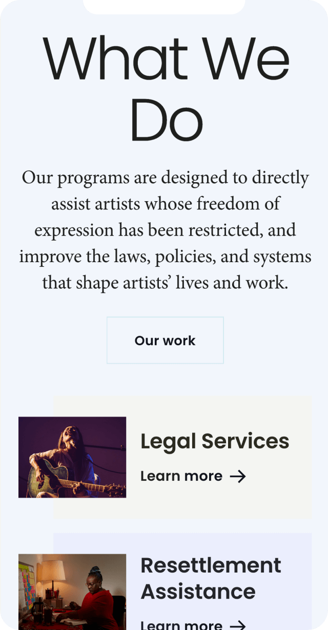
We kicked off with an extended session involving AFI’s co-executive directors, operations manager, development manager, and communications coordinator, a conversation that quickly revealed an organization wrestling with how to present itself at a moment of real transformation. The team walked us through how each program grew organically out of the one before it: legal services led to resettlement assistance when artists started asking where they’d live and how they’d build community, which led to public programming through Artists for Social Change, which led to a global policy and advocacy arm now producing human rights reports and lobbying international institutions from Geneva. Every program was built in direct response to what artists actually needed, and all four were designed to work together, but the existing site presented them as disconnected fragments with no shared narrative.
We ran a comprehensive site audit cataloging every page, post, and asset, then worked with the AFI team to determine what to keep, merge, archive, or retire. What surfaced was a pattern of content that had accumulated without a unifying structure: duplicate artist profile systems, a media section that was a repository rather than a resource, event flyers living on their own orphaned page. We also identified the core design tension that would shape everything: AFI wanted the gallery-white minimalism of a museum website like the Whitney, but needed the informational depth and programmatic clarity of a large-scale human rights organization like the International Rescue Committee. Co-executive director Sanjay Sethi put it plainly: the team would be asking for two contradictory things at once. Our job was to deliver both.
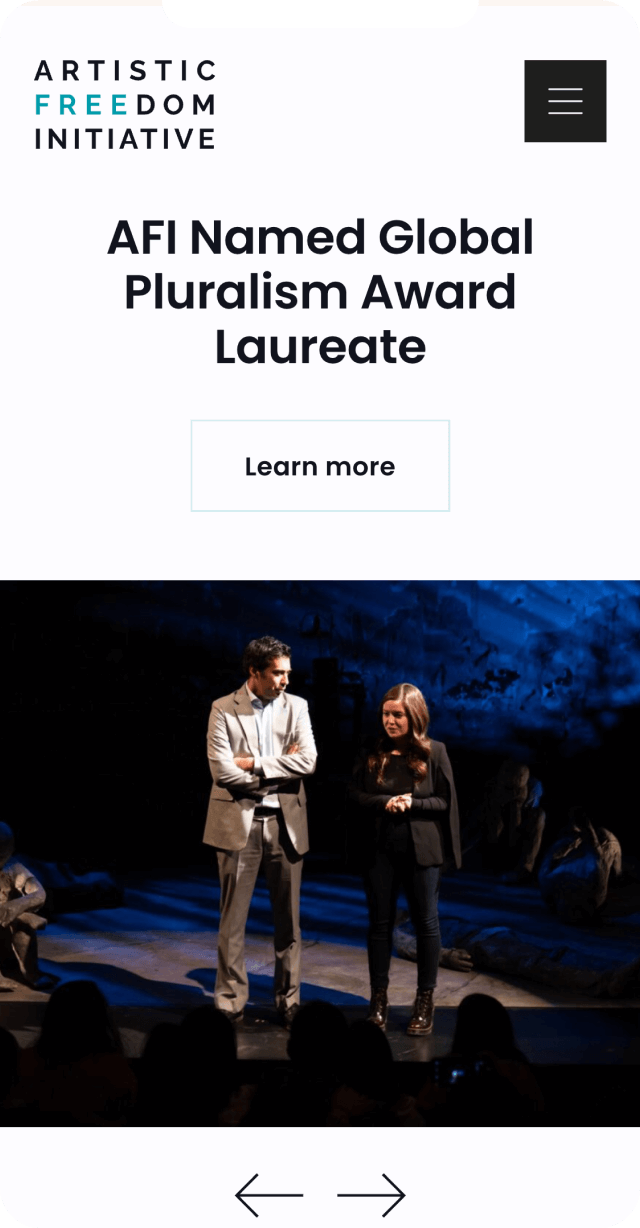
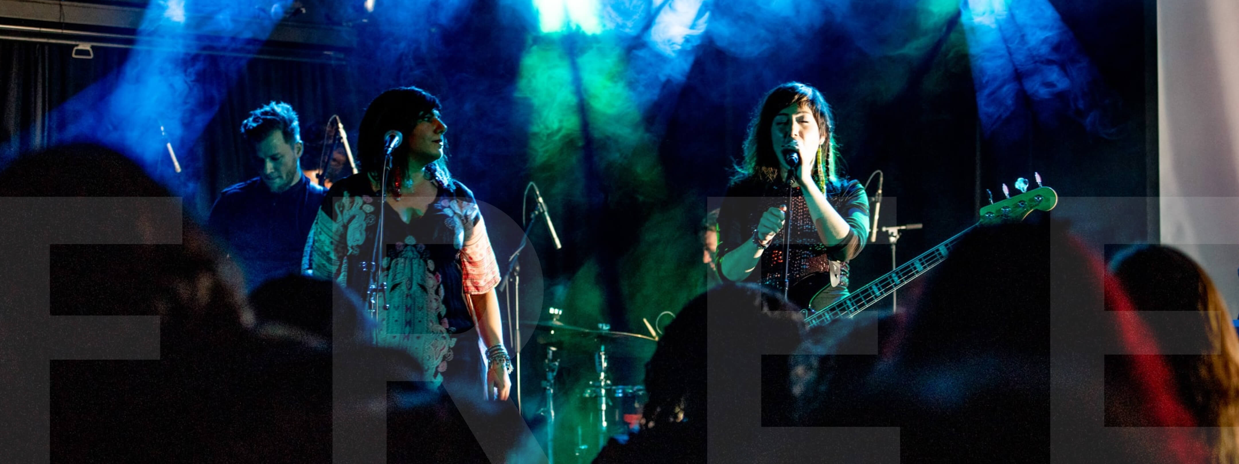
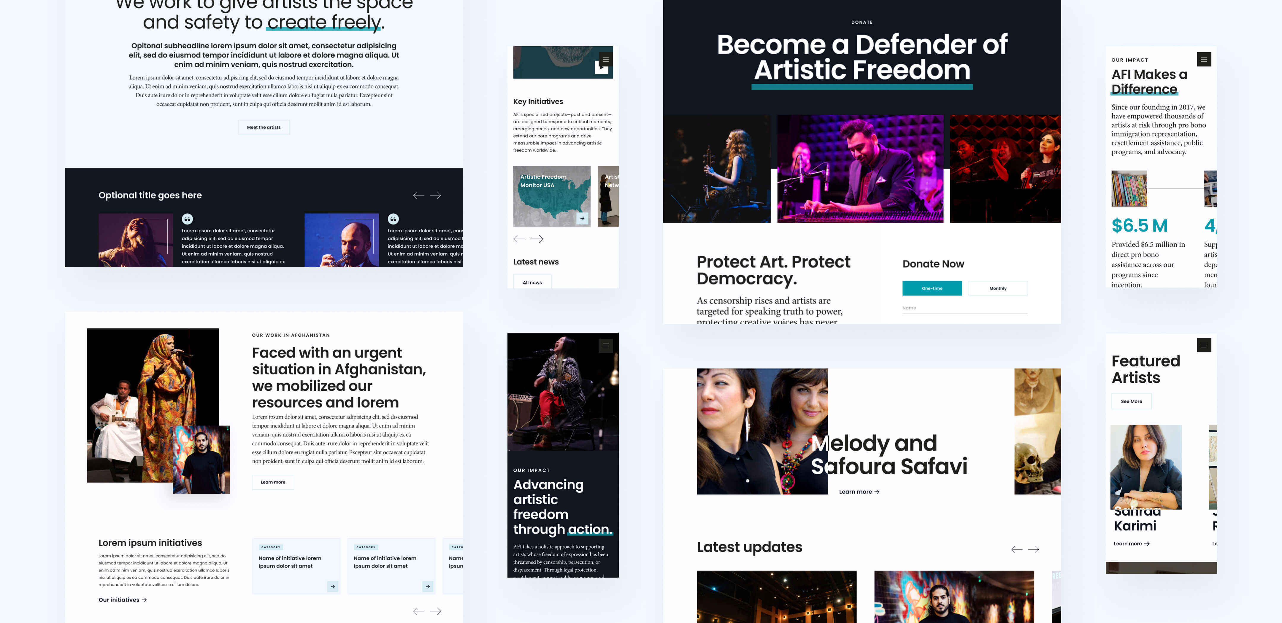
The visual direction didn’t come together on the first pass — it took iteration to land on something that felt right for an organization straddling two worlds. The breakthrough was realizing that minimalism and expressiveness aren’t actually at odds when the canvas itself does the work. We built the site on a foundation of white space and clean typography that gives it the gallery feel AFI wanted, then layered in animation and interaction design that bring real energy and movement to the experience. The effect is a site that feels alive without feeling cluttered — scroll-triggered transitions, subtle motion, and dynamic layout choices that nod to AFI’s identity as an arts organization without competing with the art and photography from their own network.
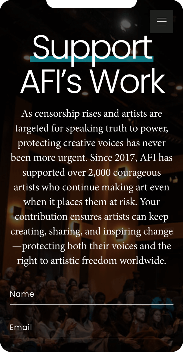
The teal brand color and existing logo were retained as anchors, while the broader palette was refined around white as a primary background: a choice the team felt strongly about, not just for aesthetic reasons but for what it represents: a canvas, a gallery wall, a sanctuary. Accent colors were introduced for each of AFI’s four program areas, giving individual teams visual identities for social media and communications while keeping everything recognizably AFI. The result is a site that reads as sophisticated and serious at the top level, then rewards deeper exploration with warmth, texture, and the kind of visual personality you’d expect from an organization that exists to protect creative expression.
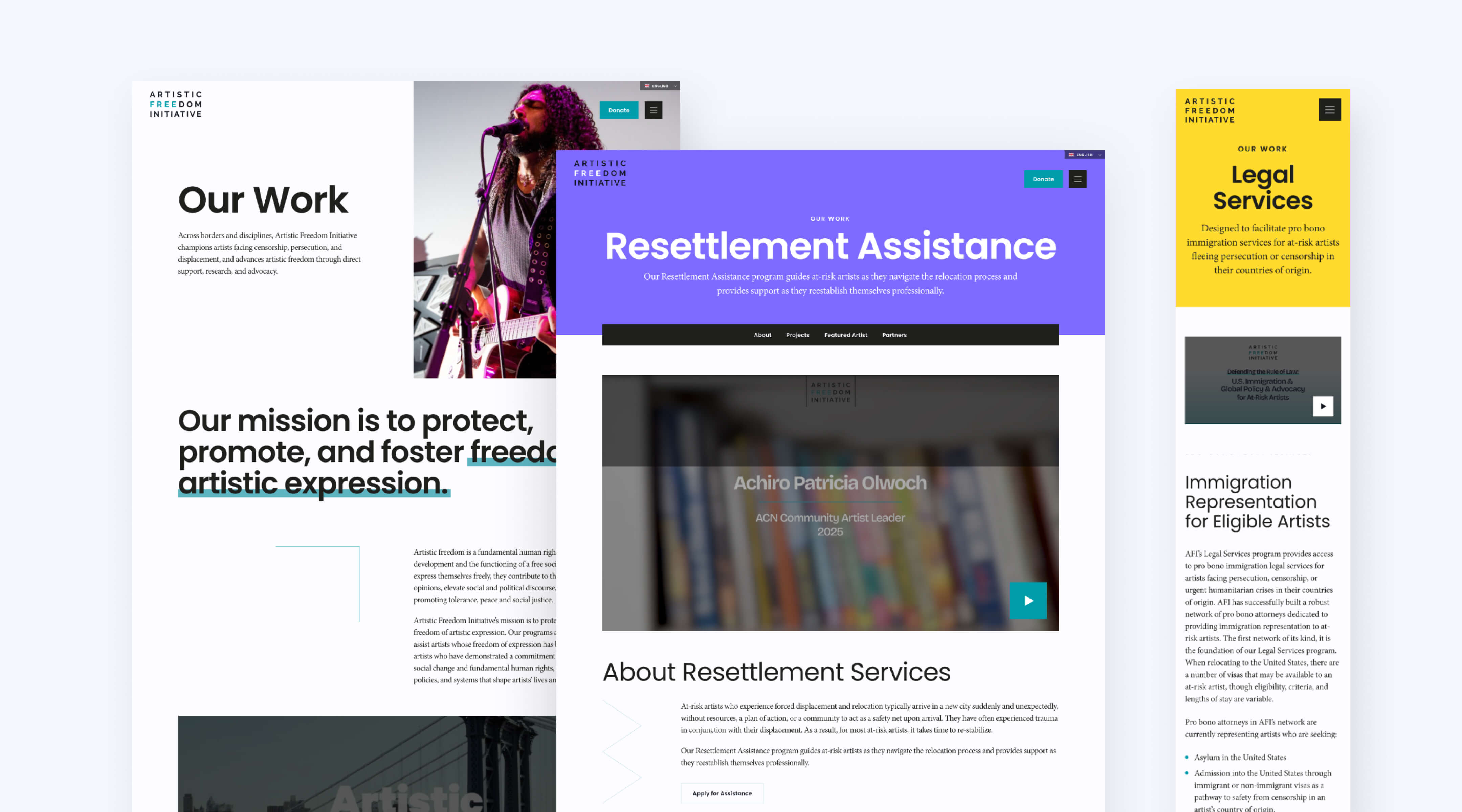
The site was built on WordPress with a modular page system that lets AFI’s small team create and update content without developer support. We designed and built templates for events, press mentions, artist profiles, team rosters, and program pages, all composable from a library of content blocks that maintain design consistency no matter who’s editing. The donation experience was overhauled, replacing a basic PayPal redirect with an integrated Stripe and GiveWP setup that embeds calls to action throughout the site rather than siloing them on a single donate page.
Multilingual support was implemented through Weglot to serve AFI’s Geneva office and European audience, with a dedicated landing page on its own URL (required under Swiss law) that remains fully integrated with the main site. We consolidated overlapping content systems, turned press mentions into a proper streamlined post type, and structured the information architecture so all four flagship programs carry equal weight while the content-heavy advocacy work has room to breathe.

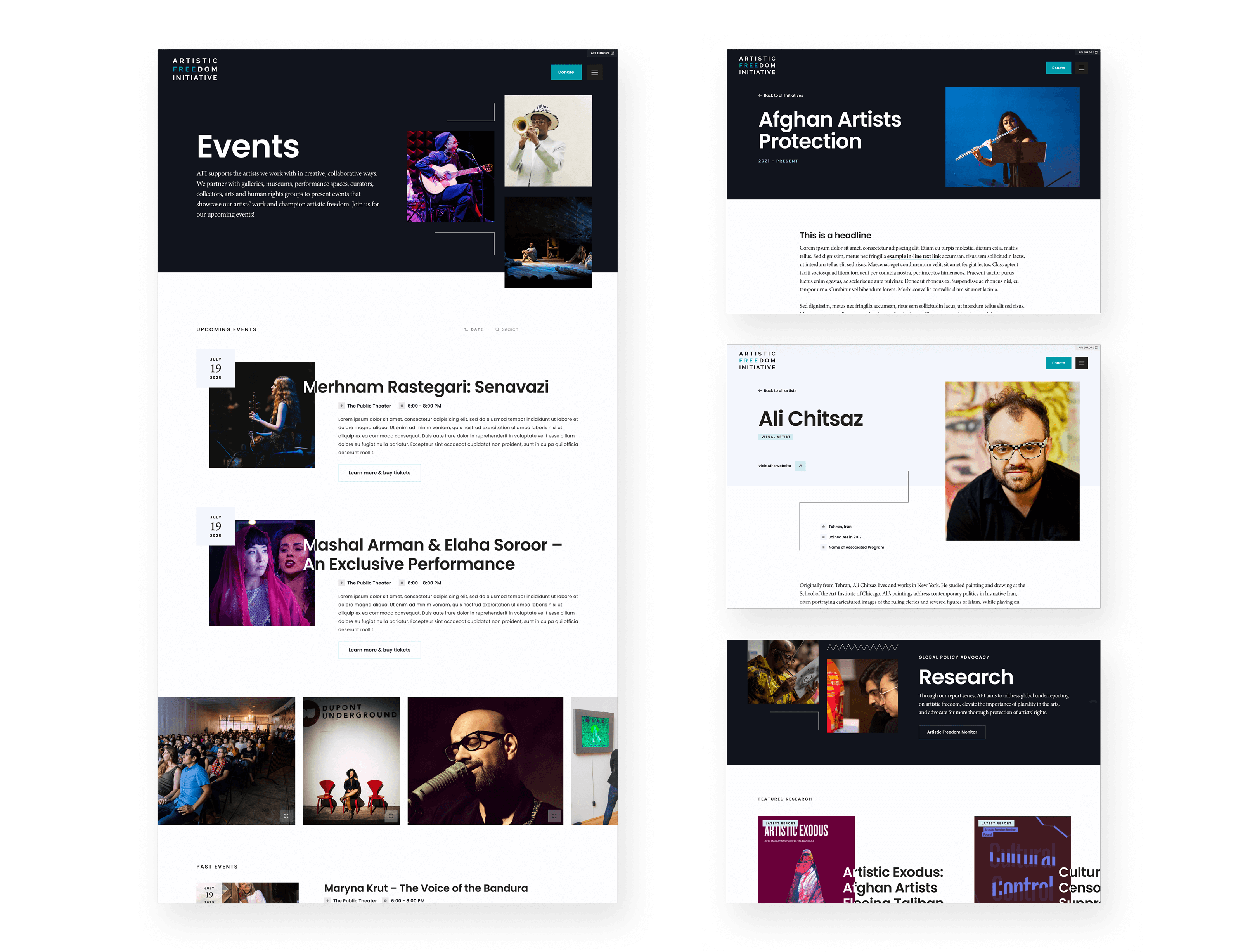
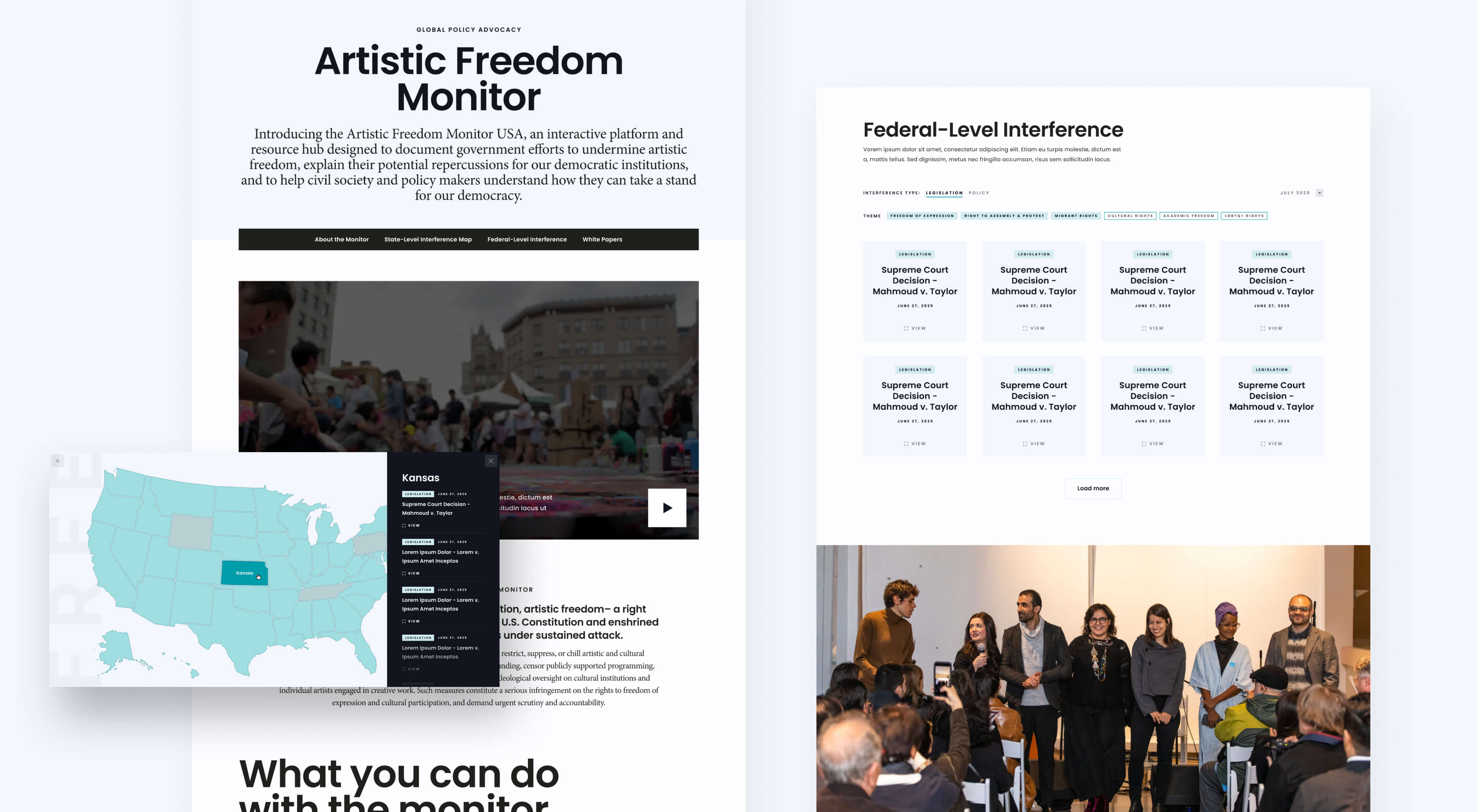
The most significant addition to the site is something that didn’t exist before we started. The Artistic Freedom Monitor USA is a first-of-its-kind tracking and accountability tool documenting government actions that threaten artistic freedom and the independence of cultural institutions across the United States. Built in partnership with Democracy Forward, Human Rights First, and the pro bono programs at Stanford Law School and UC Berkeley Law School, the Monitor features an interactive map visualizing state-level interference with artistic expression. It is both a research resource and a statement of institutional authority, the kind of tool that positions AFI not just as a service provider but as the definitive voice in its field.
AFI spent ten years building something no other organization offers: a holistic system of legal protection, resettlement support, creative programming, and global advocacy, all designed to walk alongside artists at every stage of their journey. The old website couldn’t tell that story. The new one gives donors a reason to give, artists a clear path to help, and the broader public a window into work that has never been more urgent.