C.A. Goldberg
A visual refresh and redesigned website for a dynamite high-profile New York law firm.
A visual refresh and redesigned website for a dynamite high-profile New York law firm.
Carrie’s felt that her firm’s old site was a little bit dated to the era around 2016, with a girl-boss vibe that no longer reflected her firm. She wanted to streamline the color palette, choose new fonts, and in general level up the look of the brand to feel more luxe, more serious – and more powerful – without losing the irreverent personality she and her team have become known for.
We started our visual identity process by looking at sites that the team sent over for inspiration and researching the landscape of New York law firms. What we saw was a lot of very serious sites with not a lot of personality. We knew we would have to break from the mold and create something that straddled the no-nonsense, familiar look that users expect, and the sophisticated, brazen personality that Carrie shows in her book and in the courtroom.
We compiled a moodboard of imagery and graphics we collected during our research and did a blue-sky brainstorm with the C.A. Goldberg team during our kickoff meeting, pinpointing their likes and dislikes. This team knows what they want, and we left the meeting with clear directives on how to proceed. Carrie and her team told us they prefer serif fonts; they wanted to come off as bold and forceful; they wanted a more serious look; and they love luxe sophistication.
As any visual designer will know, there’s nothing that sparks creativity more than clear guidelines, so we eagerly took the feedback from the team and it was off to the races!
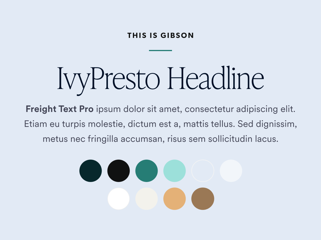

The new visual identity for C.A. Goldberg takes a little bit of inspiration from the traditional legal website, a little inspiration from luxury fashion, and a lot of inspiration from Carrie and her team. The color palette is rooted in a bold dark teal, with mint green as a fresh highlight color. A hint of gold gradient sprinkled around the site brings in that luxury feeling that Carrie was after, without becoming overwhelming. These more impactful primary colors are balanced by light tones of cream and grey, adding a soft touch to contrast the identity’s overall impactfulness.
For C.A. Goldberg’s headline font we chose IvyPresto, an Old Style but modern font by the Ivy Foundry that is based off of the sixteenth-century work of Hendrik van den Keere of Ghent. The font’s history gives it a timeless, mature quality, while the modern touch of the Ivy Foundry ensures this font is flexible and legible in our digital era. We used this beautiful serif font in the Thin weight, which gives it a tall, elegant aspect. To pair with Presto, we chose Freight Text, an extremely versatile workhorse and a grounded, classic serif font that will never go out of style. The font package is completed by Gibson, a sans serif that we used for buttons and eyebrow headings across the brand. It’s clean and geometric, adding a nice contrast to the two serif fonts.
Before we could start designing the actual website, we had to work on the foundation of the site: the user experience. The C.A. Goldberg team knew they wanted to make some changes to their information architecture, the foremost being that they wanted to bring their Big Tech Liability practice area into sharper focus across the site. With that in mind, our UX team created a fresh set of wireframes totally customized to the firm’s needs.
The most visible amendment to the site’s structure is a new megamenu, which allows the user to peruse C.A. Goldberg’s site with ease, and adds some magic moments that add value to even the most mundane task of navigating a site. We also created an entirely new menu category for their Big Tech work, allowing them to bring it to the forefront and making it super easy to get to.
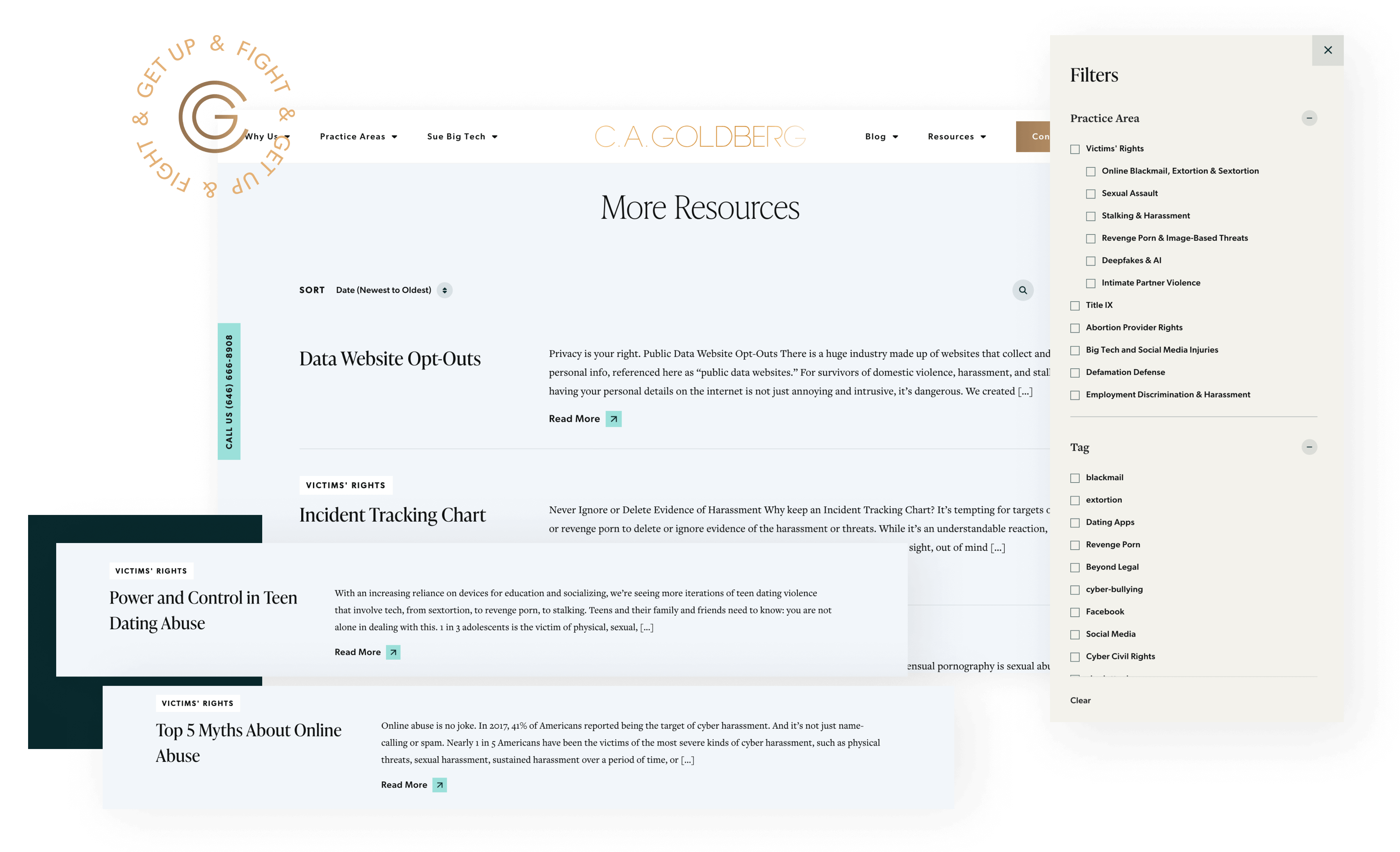
Another big change was the blog structure. On Carrie’s old site, the blog was a fractured dumping ground for anything and everything. On the new site, we created new categories and even separated Resources out into its own post type, since their users get a lot of value from these evergreen posts. We did a deep audit of all their taxonomies and tags, and made sure that everything aligned with the new vision for their brand.
One of the non-negotiables for this project was that Carrie’s personality had to come through. Carrie (and her team) is unafraid to speak truth to power, and is a fierce advocate for those who have been victimized. This passion needed to come through clearly in her brand, since it sets her firm apart and is something of a calling card. So as we began designing out the new website, we made sure to insert moments where her personality could shine.
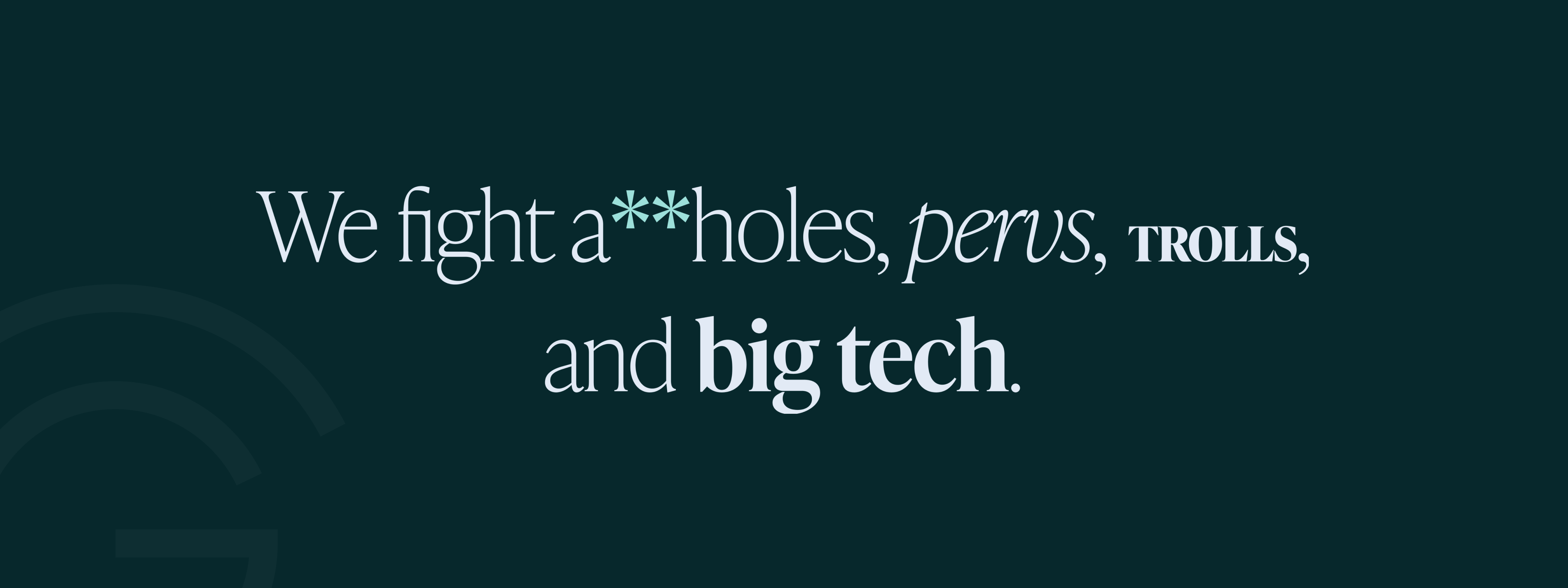
We created two animated text-based graphic elements that allow the C.A. Goldberg team to get their point across in a fun, audacious way. One uses different styles of type to add character to individual words, and the other gives the team a place to display their steadfast ideologies. We also designed custom asterisks for these features so that the team could safely include curse words, and instead of them feeling censored, it would become a purposeful design moment.
As we designed out and developed the new website, we incorporated movement and small moments of delightful animation wherever possible. Carrie requested an impactful homepage hero, with a large logo that shrinks on scroll and a featured video that tells the story of the firm. Throughout the site, other spots include the text graphics mentioned above, as well as the timeline, which uses an animated line and sticky scroll to make the user experience just a little special. Also sprinkled throughout the site is the rotating GET UP AND FIGHT badge, which acts as a little reminder of the go-getter attitude at C.A. Goldberg.
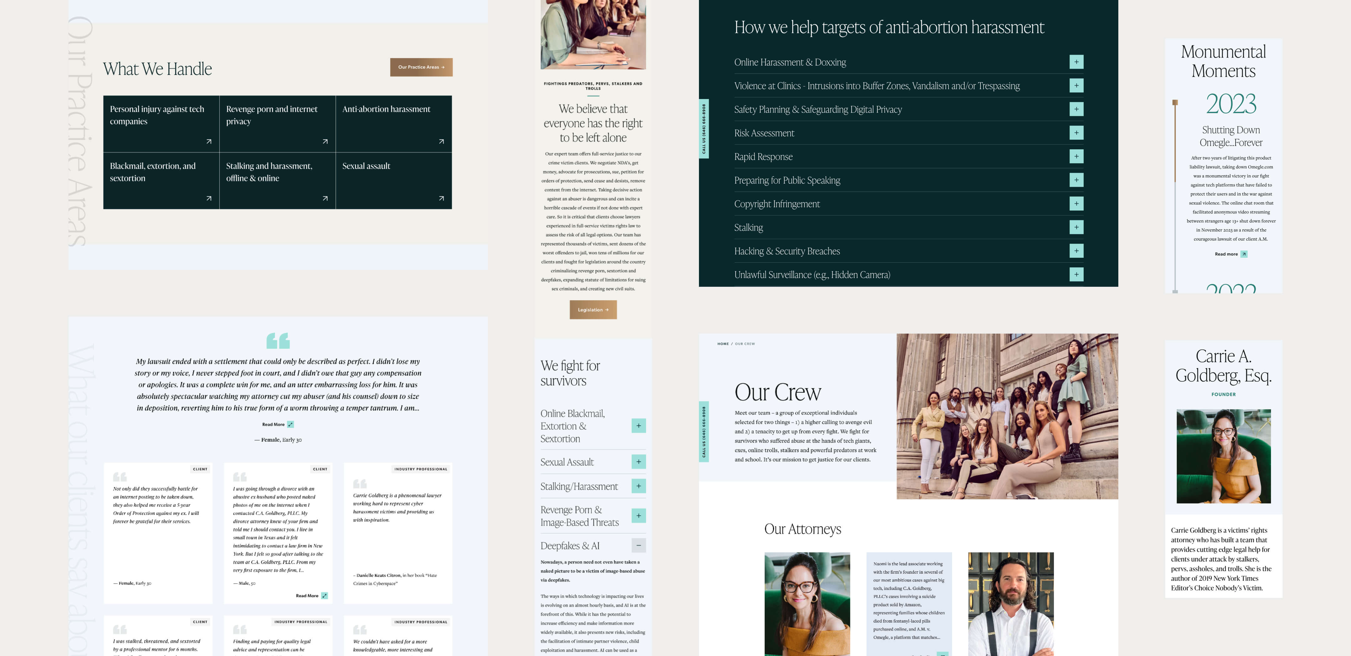
The new C.A. Goldberg site is totally responsive and optimized for all device sizes. We seamlessly incorporated the firm’s customer service chatbot, and provided a small floating element with the firm’s phone number so that clients can reach out easily. Between these elements and the new megamenu, the C.A. Goldberg site is easier for users to navigate than ever before.
The busy team’s experience of updating the back end of the site is just as important, so we ensured that the experience of populating the custom CMS is super smooth. Creating new pages with the modular page builder will be a breeze as the firm adds new practice areas or landing pages!
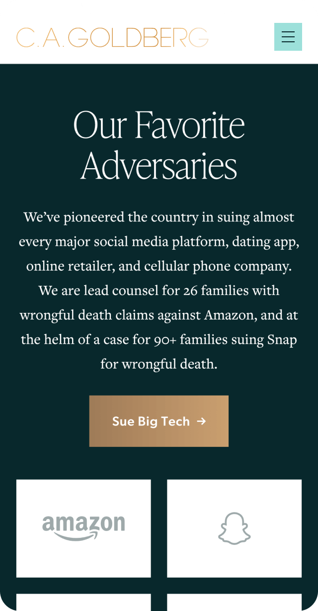
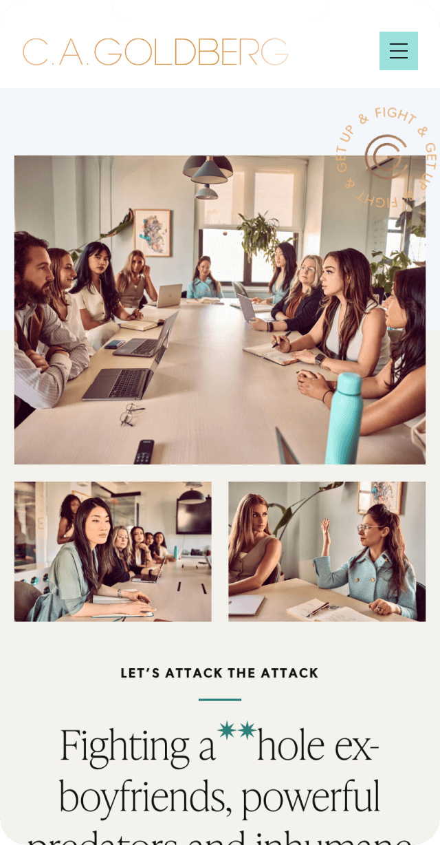
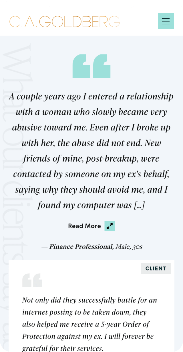
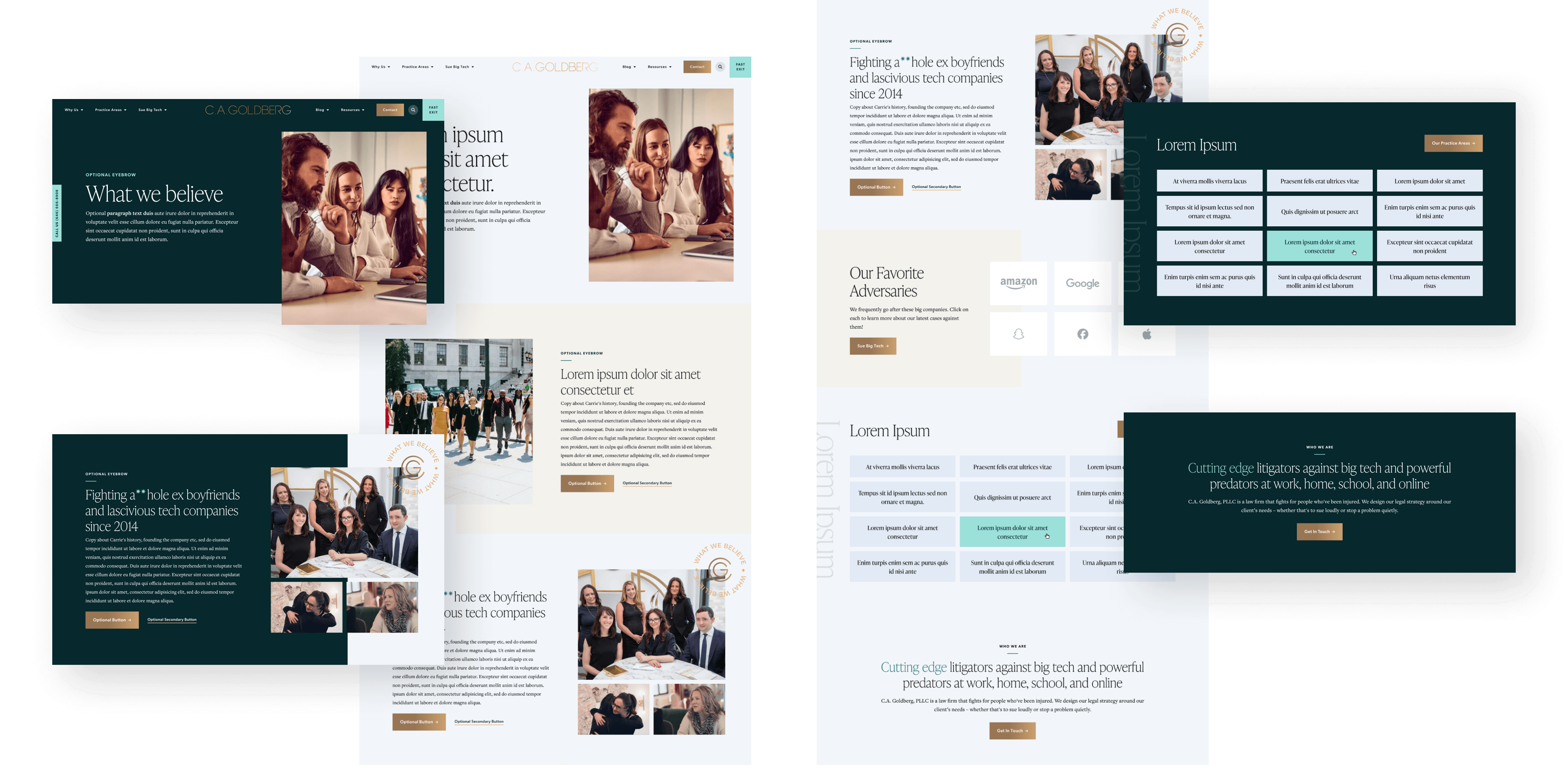
The finished C.A. Goldberg site is elegant, professional, and uncompromising. It shows off the firm’s polished new visual identity, as well as its bold personality, and ensures that victims of all kinds of abuses of power will be able to find Carrie and her team. The firm’s content shines in this new setting, and the structure of the site is thoughtful and easily accessible. We’re thrilled that we were able to help the C.A. Goldberg team to level up their look, and we are eager to see the firm thrive as they continue their important work!
