Henry Luce Foundation
A website overhaul and refreshed look for an historic New York-based cultural foundation.
A website overhaul and refreshed look for an historic New York-based cultural foundation.


When the Luce team reached out, they were unhappy with the look of their site, as well as the functionality. While the site looked professional and academic, it didn’t bring out the dynamism or modernity of the organization– or the passion that the Foundation has for the work it does. After 80+ years in operation, the team wanted to keep some of the brand equity they had, but they wanted to tweak it and expand it to better portray the organization’s contemporary personality.
The site was also using a problematic CMS that they found difficult to navigate and update. The Luce team wanted a more transparent, customized solution – which we were more than happy to create in WordPress.

We started by diving into the past of the Henry Luce Foundation. While the organization has a long history, stemming from founder Henry Luce’s focus on Asian and American cross-cultural dialogue, its interests have expanded and diversified over the last almost-century. Focuses on Asian culture, public dialogue, and theology and ethics have not left the organization, but since Henry Luce’s death in 1967, the Foundation has expanded beyond the founder’s particular interests to include work in Indigenous knowledge, women in STEM, democracy, American art, and the addition of the Luce Scholars program, placing young Americans abroad in Asia for cultural immersion opportunities.
With all we learned during our discovery process, we created a new site map detailing the structure of how the new site would tell the story of the Foundation. We made sure to maintain a particular emphasis on the actual grantmaking programs that make the backbone of the Foundation, which adding in a more ideas-centric angle by including new landing pages about the Foundations overarching priorities.
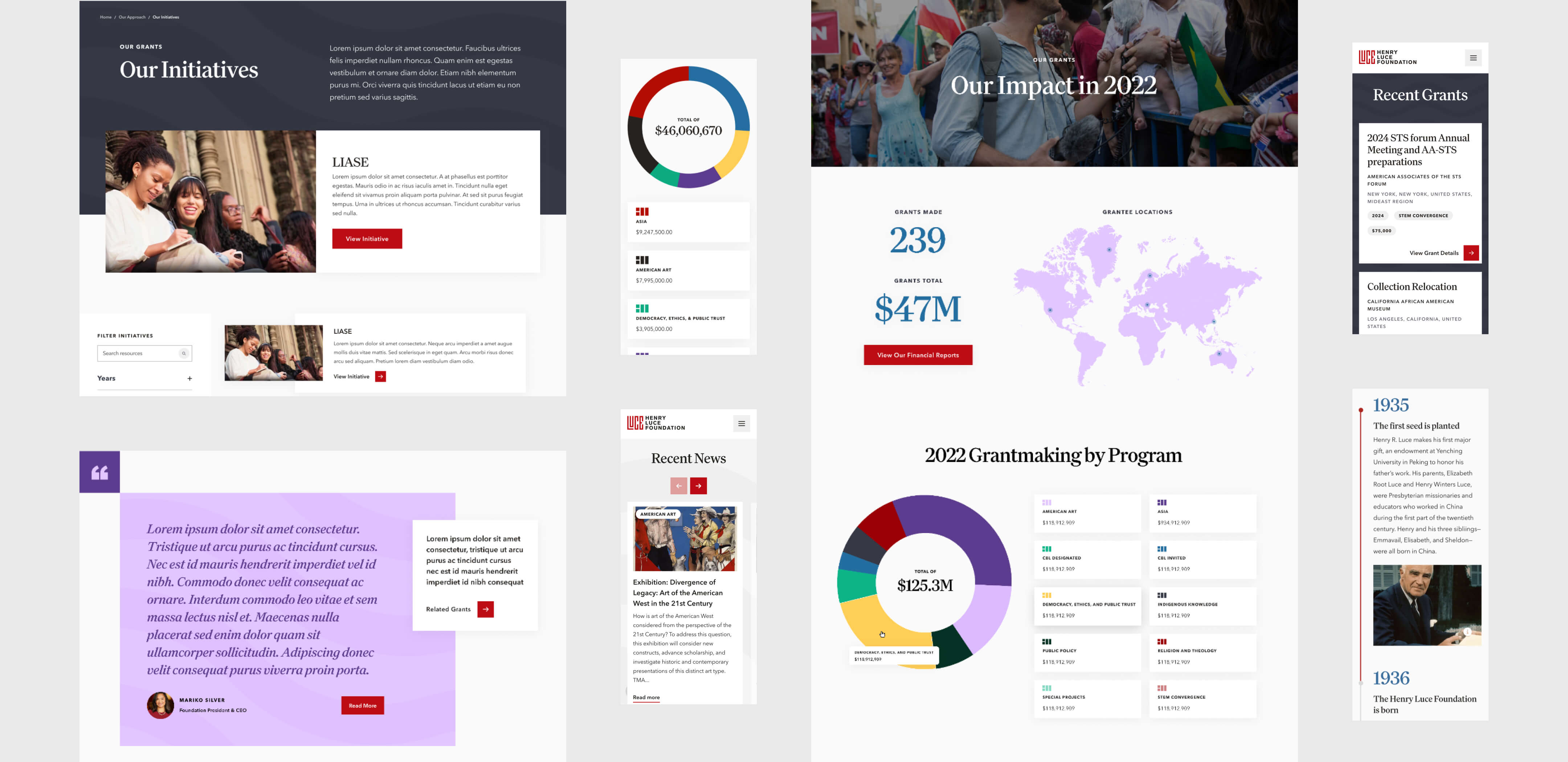
During the UX phase of the project, we began to think deeply about how to bring the “ideas” focus to the site as a whole, introducing new taxonomy archive pages for Topics, so that the organization could tag their content with new and relevant Topics as their focus ranged even beyond their defined practice areas. We also created dynamic new wireframes for Grant Year pages, so that any articles across the site tagged with a particular year would be pulled into a new, engaging format.
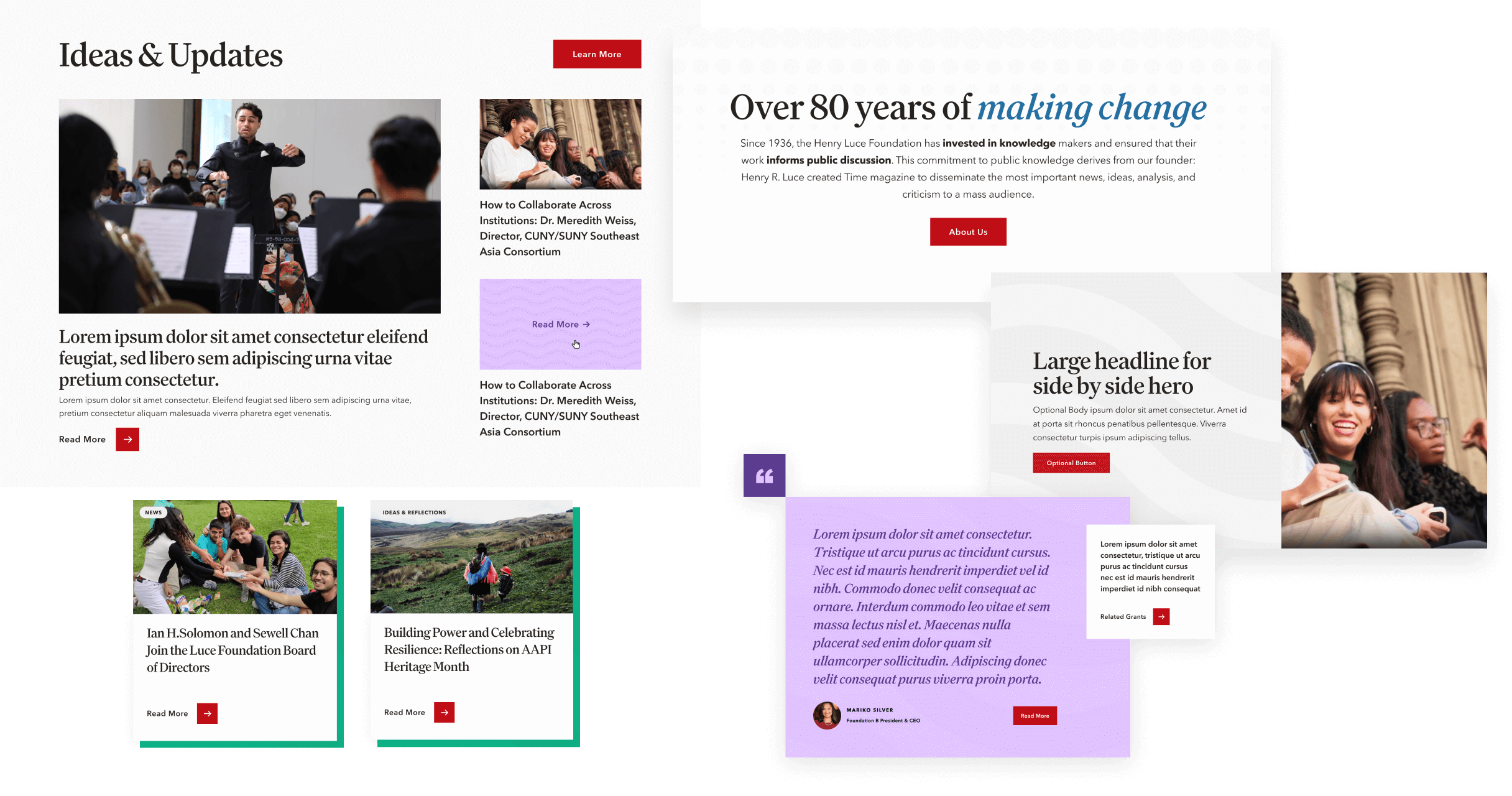
The majority of the site is modular, meaning that the pages are created using a central page builder library of modules that the Luce team can pick and choose from. This ensures that the team can easily work up new pages as the Foundation grows and changes over time.
Once the bones of the site were finalized with a new set of wireframes, it was time to begin our visual design process. We started by talking with the Luce team about what was working and what was not working about their current look. The team emphasized that they wanted to bring out the diversity and modernity of the brand, and step away from looking too academic or stuffy. The organization is welcoming and friendly, and they wanted the new look of the brand to reflect that.
What that meant concretely was that they wanted new brand fonts, an expanded color palette, and new, dynamic background graphics that would mesh well with their existing designs. Using all this information, as well as photographs of the Foundation’s office decorations, our design team synthesized a new look for the Foundation.
For the new headline font, we chose to use Family, a classic but friendly-feeling serif font with some weight to it. Per the designer of Family, who based it off of Clearface (designed at the turn of the last century), “Serifs are typically the domain of the serious; their ancestors have bookish typography in their DNA. It’s hard to make a multipurpose serif feel charming instead of goofy. [Clearface designer Linn Boyd] Benton’s genius was to pull a stuffy genre into the present, dusting it off to create a modern, affable serif.”
For subheadings and body copy, the new brand uses Avenir Next – also a classic, geometric sans serif that is familiar and super easy to read. Between these two fonts, the new Luce look feels well-respected while being open and approachable.

To bring a sense of movement into the brand, we created two new background patterns. The first, a wave pattern, is based off of the former Luce brand, which utilized a delicate, textured wave pattern that brought to mind older Asian art. To bring this motif into the present, we created two new versions with parallel wavy lines, one thick and one thin. The consistency of the pattern (as opposed to being offset like the old version) feels modern, with no hint of stuffiness.
The second pattern is a dot pattern where the circles minimize from large to small. Used as a background or an overlay, this pattern suggests change, movement, and adds dynamism to layouts across the Luce brand.
Once the elements of the brand were finalized, we designed out the website from top to bottom, carefully laying out the pages and modules to ensure a unified, engaging look across the entire site.

The look of the brand was half the battle, but the final step was to build out the new CMS and responsive front end. A custom-built, super-easy back end of the CMS now greets the Luce team, a welcome change from their previous CMS tool, which was impossible to navigate and circuitous to use. The front end features animations of the graphics we created, adding yet another layer of visual interest and contemporary design savvy to the Foundation’s new look – ensuring no one will consider them stuffy ever again!


To complete the new look and give the brand consistency, we created new collateral for the Foundation, including digital and print. The digital collateral we created includes slide decks and social media. The Foundation uses Powerpoint, which does not allow custom fonts; to keep the deck feeling consistent, we found fallback fonts that the Foundation can use whenever they might need them. For social media, we set up a complete brand center and a suite of templates on Canva so that the communications team has easy access to all their new brand elements and can create posts quickly.
New business cards were needed once we finished our work, so we collaborated closely with the Foundation’s print shop of choice to set up the cards and make sure the colors printed correctly.
Finally, we provided a full Brand Guide that gives Luce staff the rundown of the new branding and how to use it, from tip to tail.


The new Henry Luce Foundation site is approachable, ideas-centric, easy to navigate, and simple to edit. It makes the jobs of the Luce team much more streamlined, allowing them to get in and out of the site to make edits with no trouble. And from a user’s perspective, it makes the Luce story more accessible and digestible, and gives potential future grantees a clear overview of what the Luce Foundation is and how they can get involved. We couldn’t be happier with how this project turned out, and we are delighted to be able to say we helped such an accomplished and wonderful organization define their brand.

