Girl Be Heard
A brand refresh and complete website redesign to match for a well established gender justice performing arts organization
A brand refresh and complete website redesign to match for a well established gender justice performing arts organization
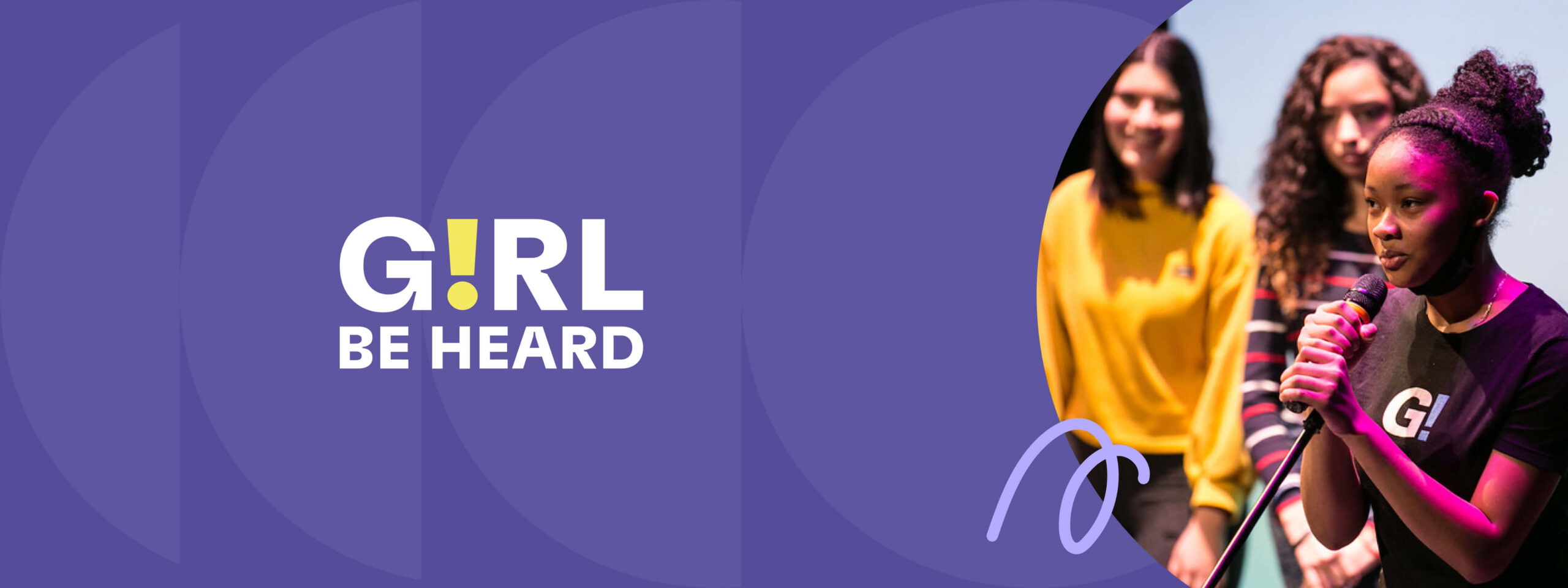
When we first met the team at Girl Be Heard, the brand had not been refreshed for 10 years, and the website was almost as out of date. The organization emerged from COVID with new ideas about their programming, and they wanted to take the time to consider how they visually present themselves considering their new direction.
As an organization that is at the forefront of the gender justice movement and performing arts, the Girl Be Heard team wanted the website to tell their story in a compelling and appealing way so that partners and donors appreciate their work to the fullest extent. We got right to work crafting a new identity for them, giving them a totally new look and applying it to a flexible modular build that is rich in special features.
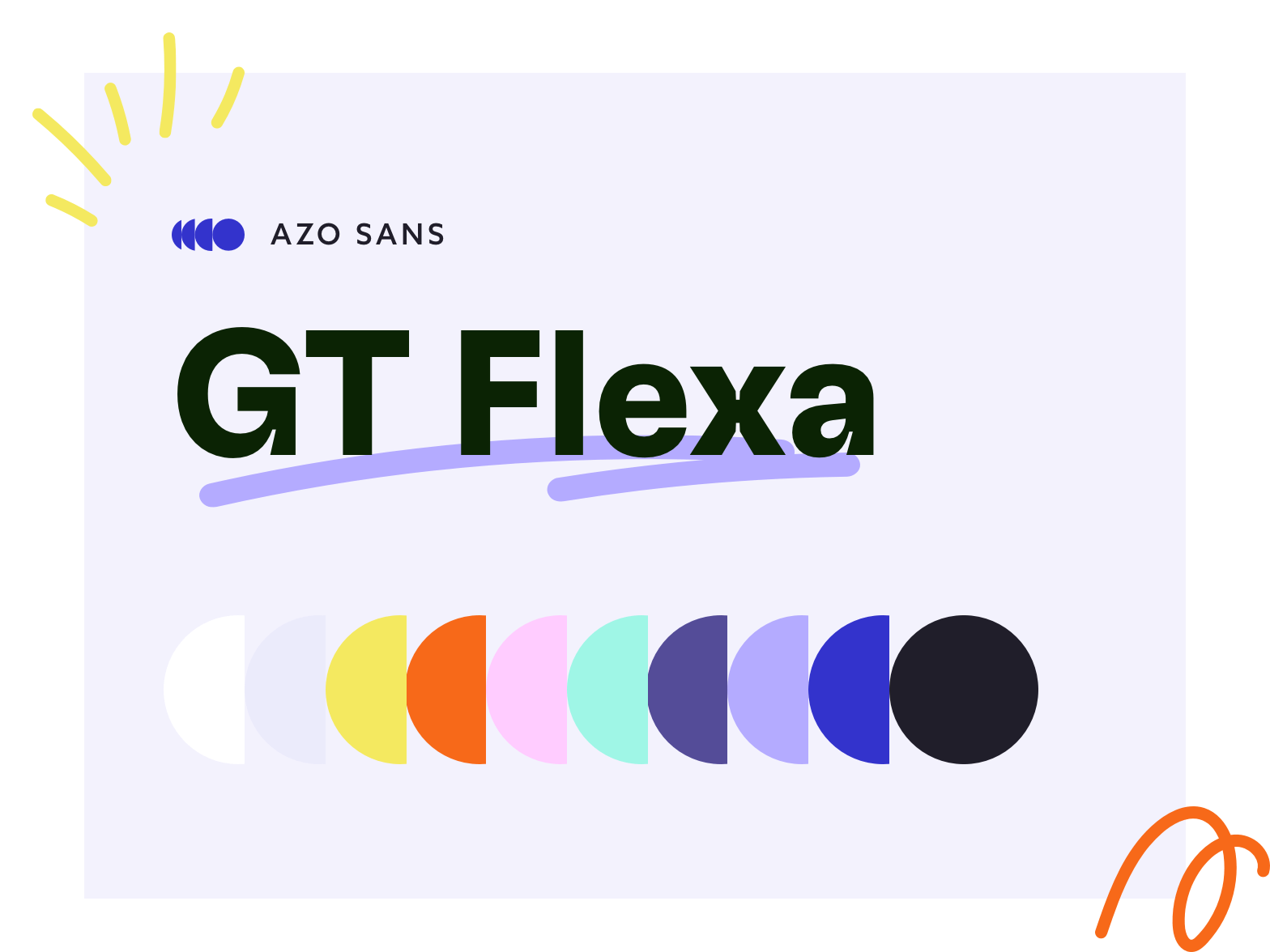
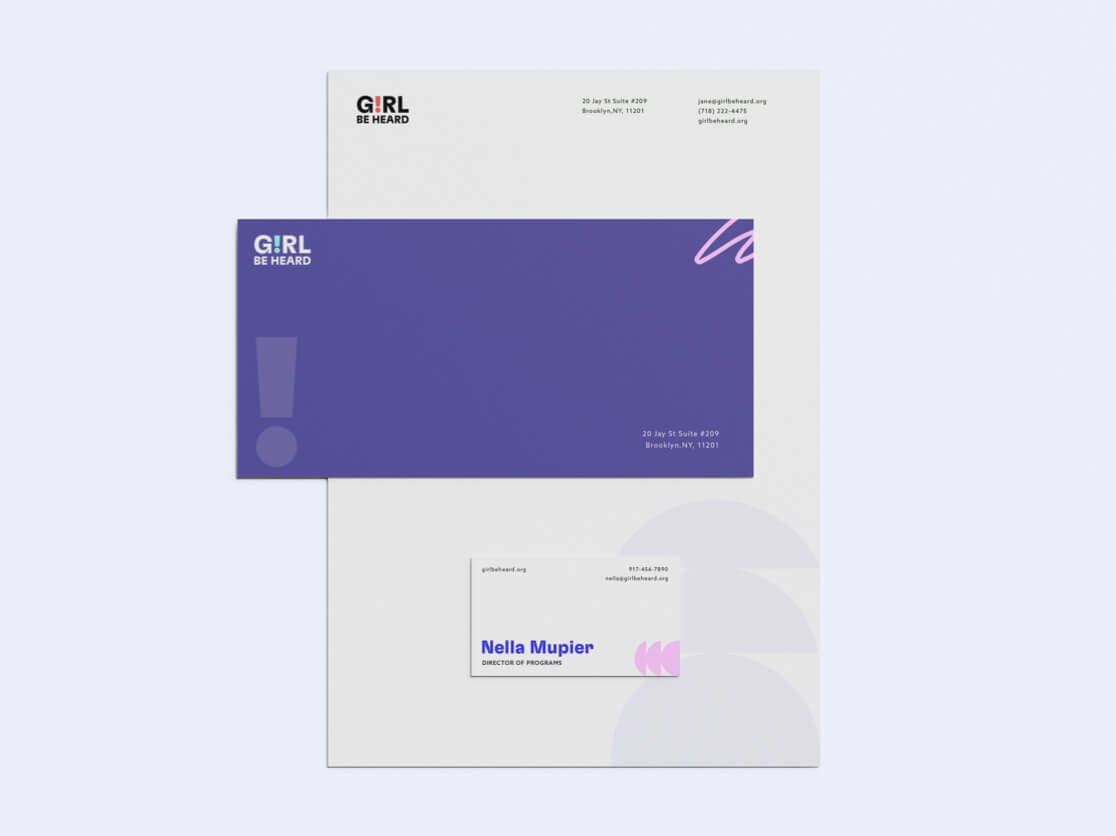
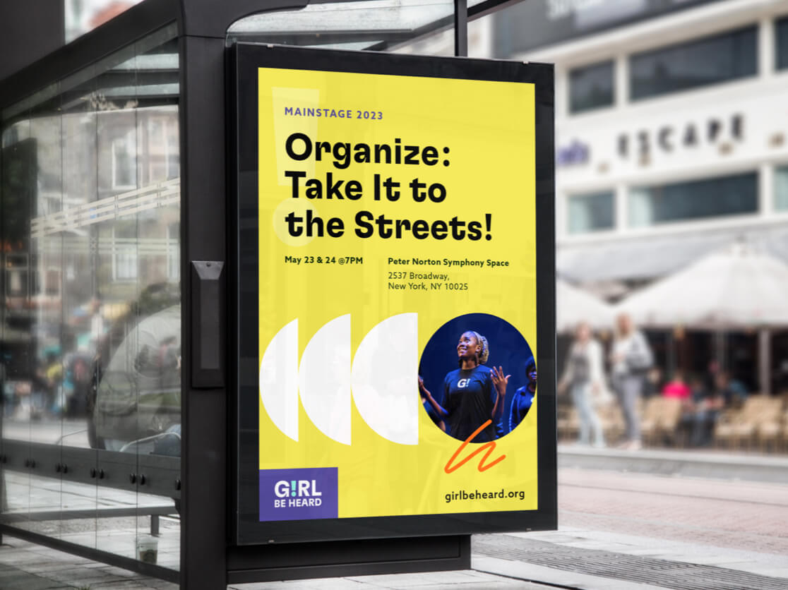
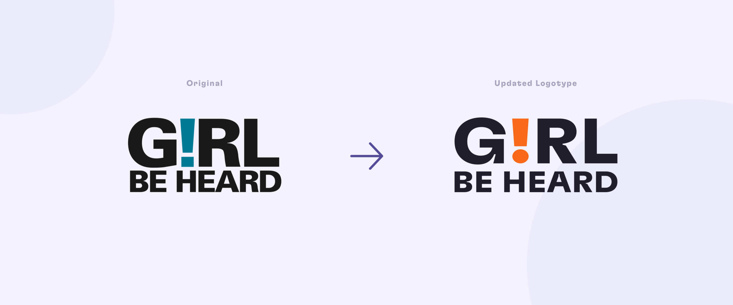
The building blocks of Girl Be Heard’s new identity started with a bold typeface: GT Flexa. This expressive font does some serious heavy lifting in making the brand feel contemporary and quirky, while maintaining the integrity of the organization. GT Flexa knows how to make a statement, and it also brings in details like the notched R, which shows up in the refreshed logotype. It’s a font that is well-suited to a modern, confident, and youthful organization.
The brand’s colors also got a bright facelift, with a daring rainbow spectrum that can stand up against the strong type – and that makes it clear that the girls and gender-expressive youth of Girl Be Heard are loud and proud in who they are.
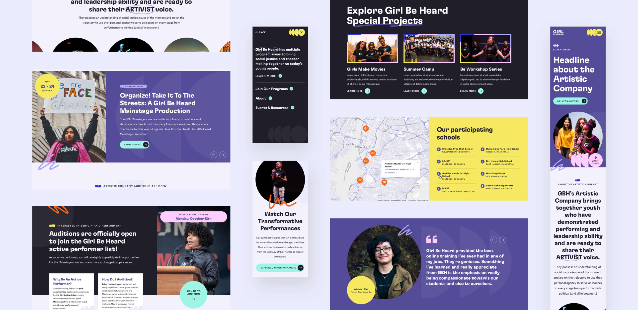
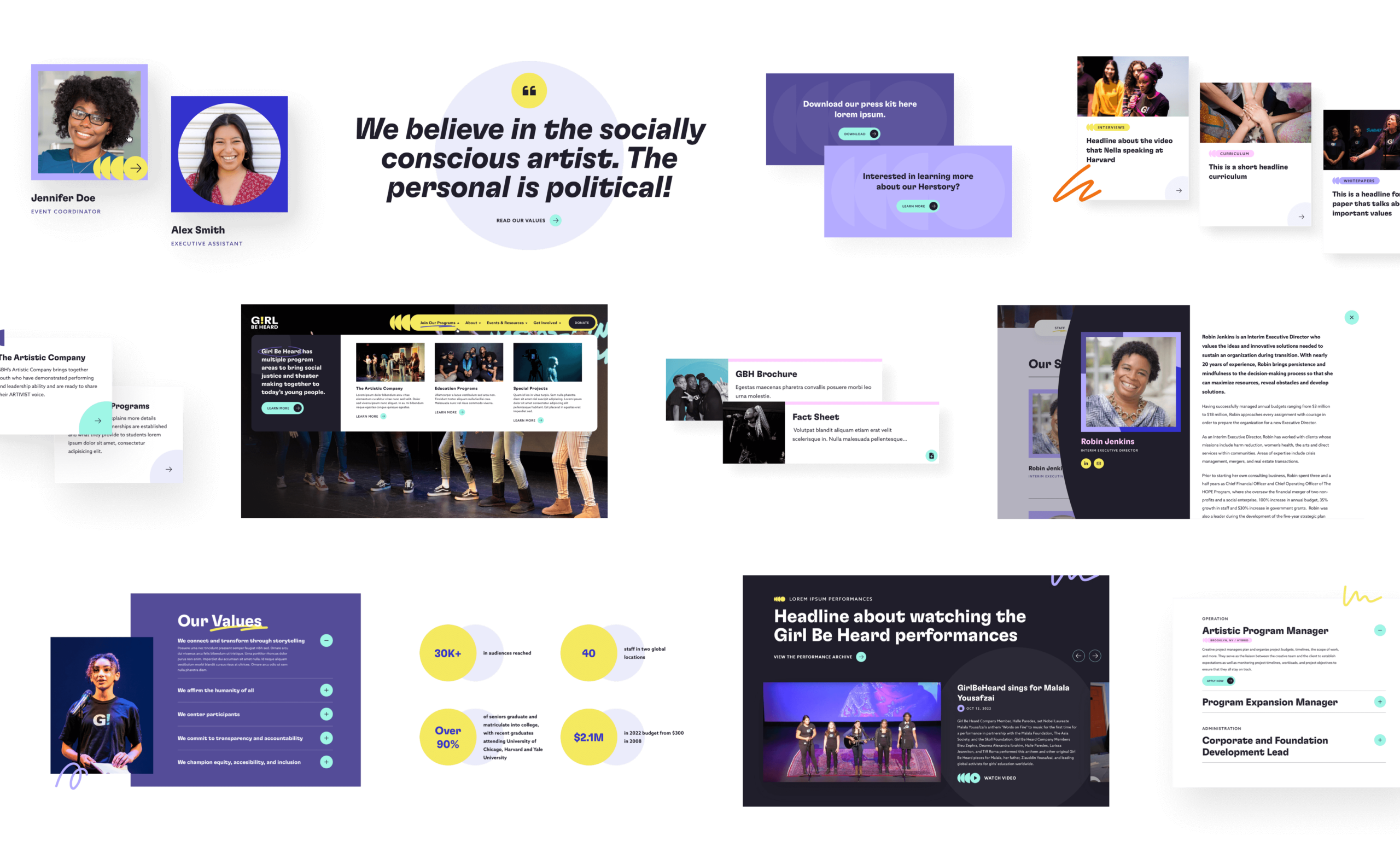
The performing arts are all about expression and movement, so we decided to bring in some pizazz by using animated hand-drawn graphic elements and unexpected moments like the creative hover states on the team’s headshots. We peppered these moments throughout the new site, emphasizing the artistic side of Girl Be Heard’s “artivist” mission.
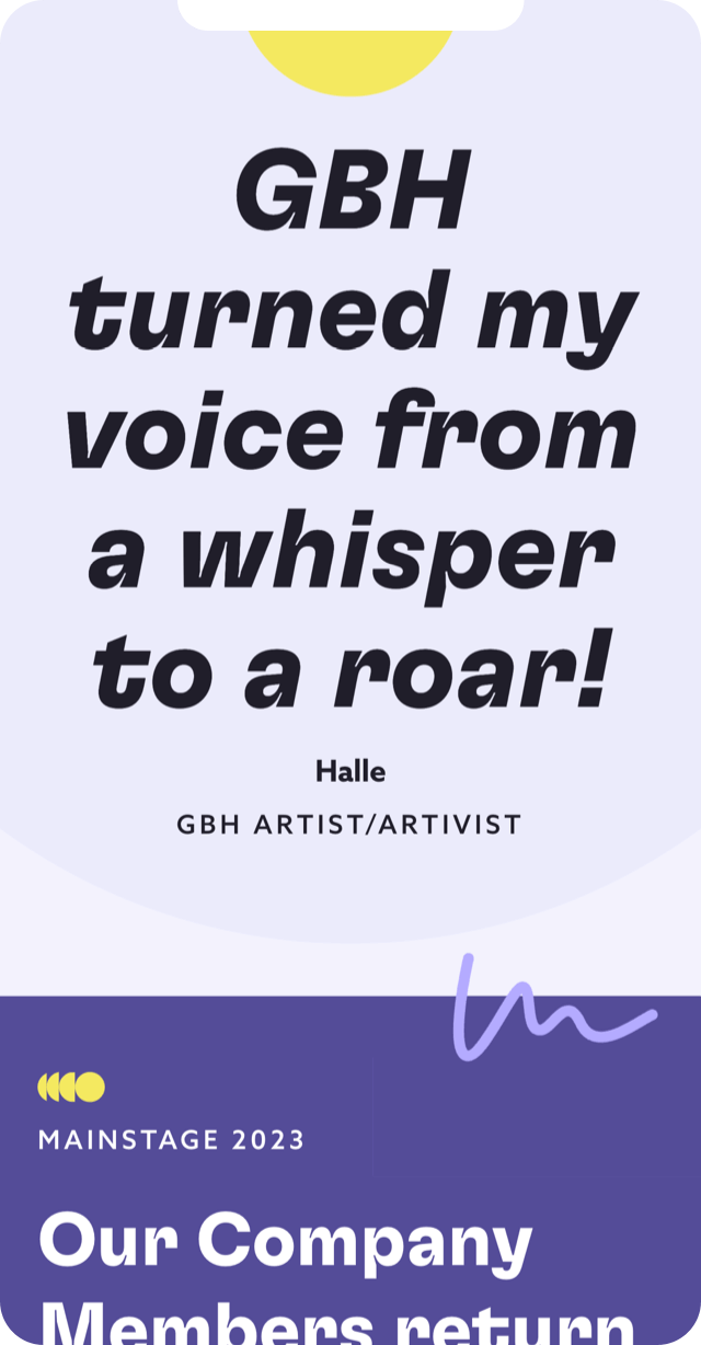
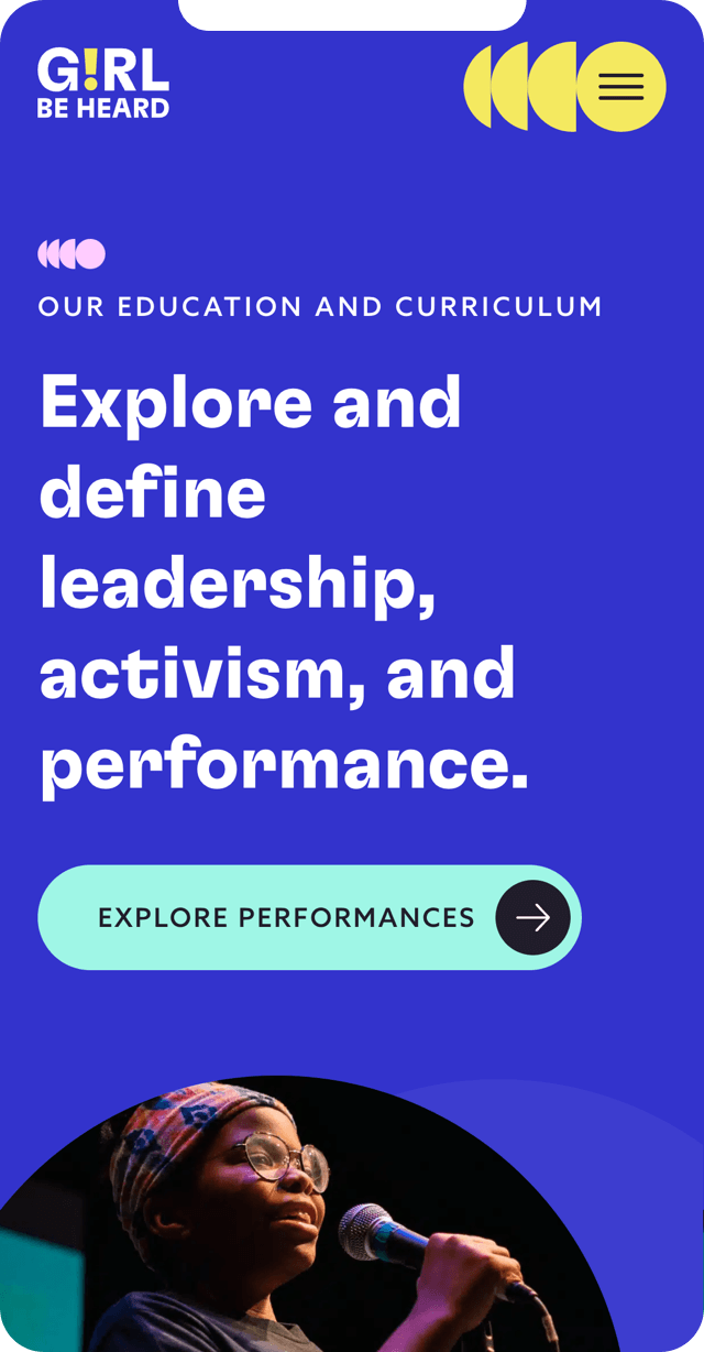
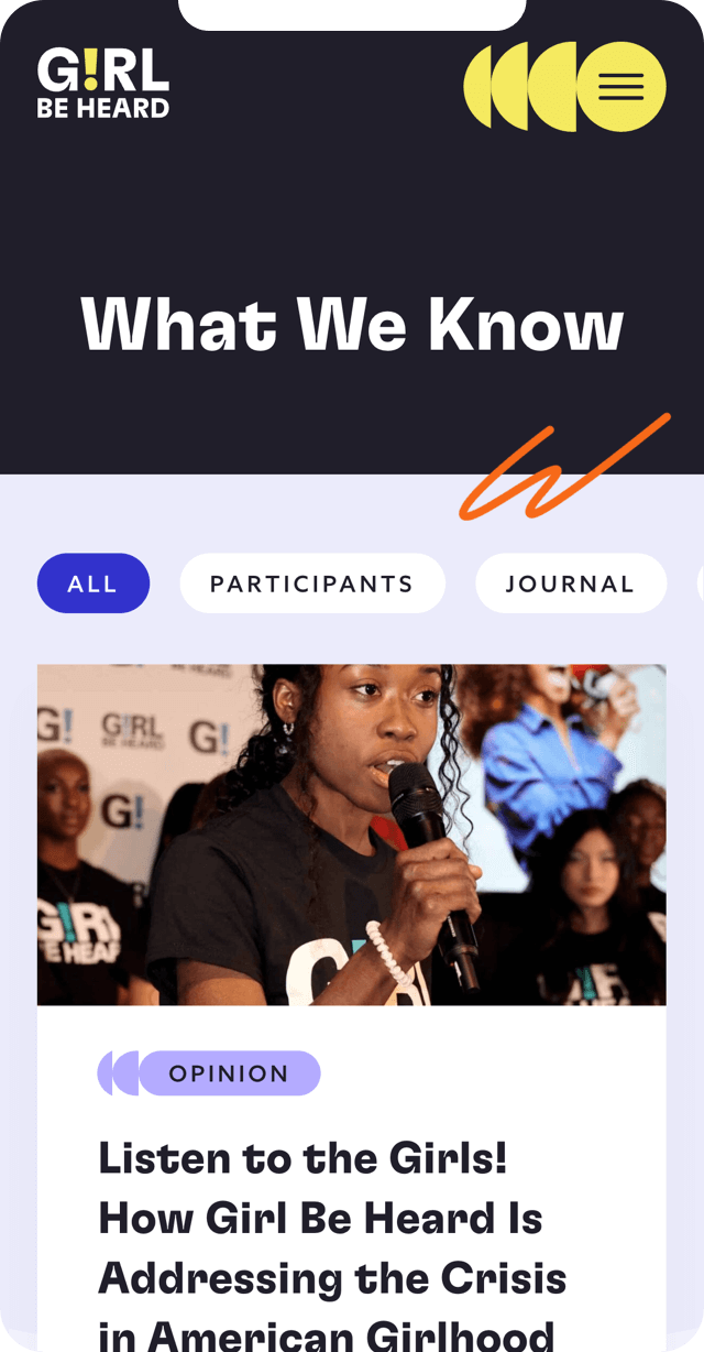
It wouldn’t be an up-to-date site without being responsive! The Girl Be Heard community consists of a lot of young, mobile-first users so we knew creating mobile designs that sing was going to be necessary. So we ensured that the new site looks and functions seamlessly across devices and screen sizes.
The new site is also completely modular, with reusable blocks that can be moved and interchanged in order to create new pages as the organization grows and changes. The back end is custom-built, with super clear instructions on how to use the CMS, and endless possibilities to combine modules. Using their new system, Girl Be Heard’s team can adapt their site to whatever comes down the line.
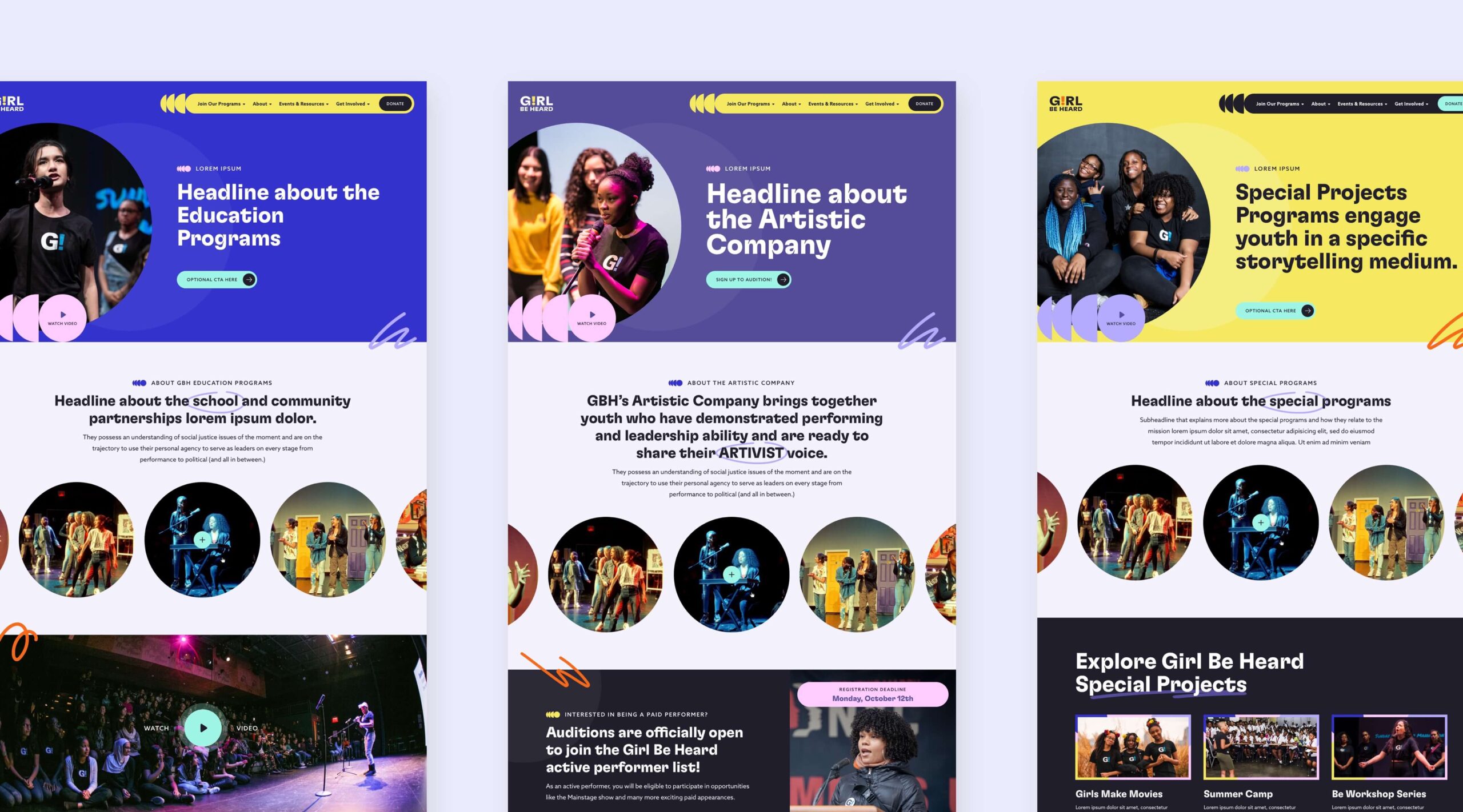
Girl Be Heard’s expansive new identity allowed us to get creative with some of the program pages, using subtly different color schemes to differentiate the Artistic Company, Education Programs, and Special Projects pages. This sub-branding using color occurs throughout the site in different ways, giving users a slightly different experience on each page, which keeps the brand from feeling stagnant across the website. Just like the responsiveness and modularity of the site, the identity itself allows for flexibility that will keep Girl Be Heard nimble in the future.