GRID Alternatives
A website redesign and rebuild for the national nonprofit making clean energy and clean energy careers accessible to every community
A website redesign and rebuild for the national nonprofit making clean energy and clean energy careers accessible to every community
GRID Alternatives was founded on a simple idea: the people who stand to benefit most from clean energy are too often the last to get it. Since then, GRID has installed solar for tens of thousands of income-qualified families, trained a new generation of workers for careers in the clean energy economy, expanded into clean mobility and EV access, and built lasting partnerships with Tribal nations through its Tribal Energy Alternatives affiliate. The work happens out of regional offices across California, Colorado, and Washington, D.C.
The website hadn’t kept up. It was built on Drupal more than a decade ago and had grown to more than 800 pages, with regional microsites, hundreds of regional pages, and years of news and press scattered across overlapping sections. Donors, partners, trainees, volunteers, and community members were all arriving at the same front door and having to dig for the path meant for them. GRID had just refreshed its brand, and it wanted a website that finally looked and felt like the organization: bold, visual, story-driven, and easy for its own team to run.
GRID is one organization made up of many teams, and each of them sees the website differently. HQ Communications needed a platform for storytelling and fundraising. Regional staff needed their local work to stay visible. Workforce development needed a clear path for prospective trainees. Program teams needed space to explain solar, multifamily, clean mobility, and Tribal partnerships without burying one under another. We ran an in-depth, highly collaborative discovery process with a wide range of stakeholders from across the organization, so that every group could tell us what they do, who they serve, and where the old site was getting in their way.
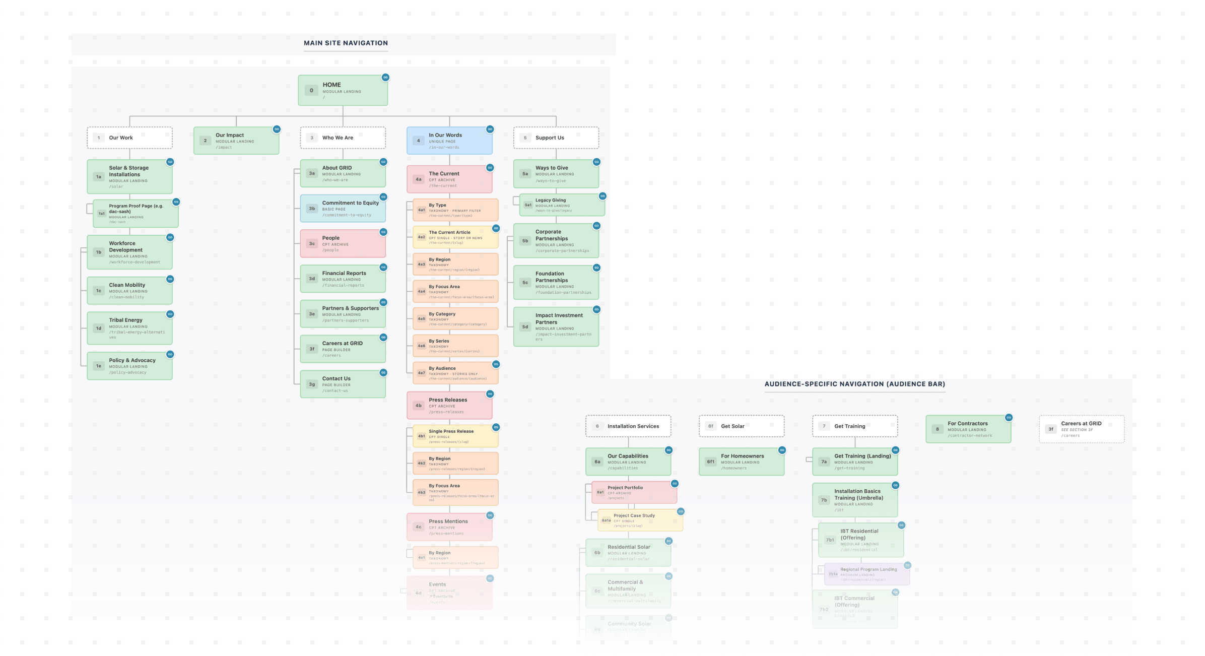
From there, we audited the existing site page by page and built a new information architecture around GRID’s core audiences and the actions that matter most to them: donate, get involved, apply, learn, and partner. We streamlined GRID’s overlapping regions, folded the regional microsites into a single shared structure, and mapped out user journeys before wireframing the key templates for desktop and mobile. Each round went back to the teams who would be living with the site, and the structure got sharper with every pass.
GRID came to us with a freshly refreshed identity and a set of brand guidelines. But a brand guide is a snapshot, and by the time we started designing, GRID’s in-house team had already been living with the new identity, stretching it across social media, reports, events, and program materials. Rather than designing from the guidelines alone, we worked closely with GRID’s team to understand how their visual language had actually evolved in practice: which elements had become signatures, which colors were doing the heavy lifting, and how their own designers were pairing photography with graphics.
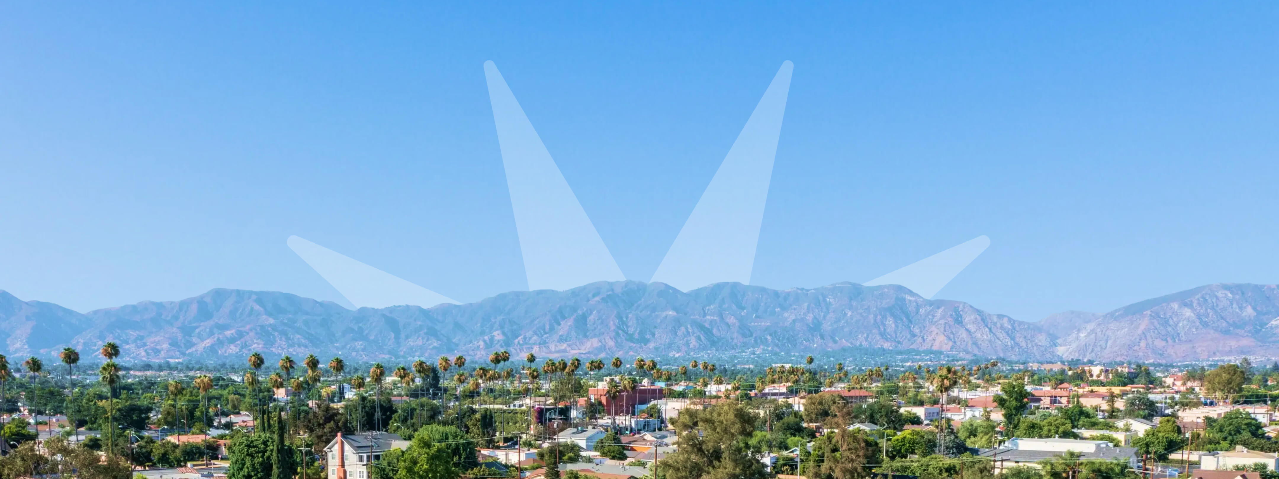
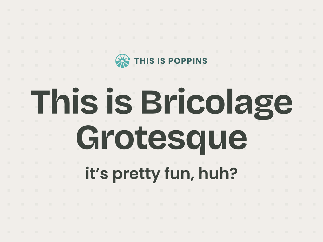
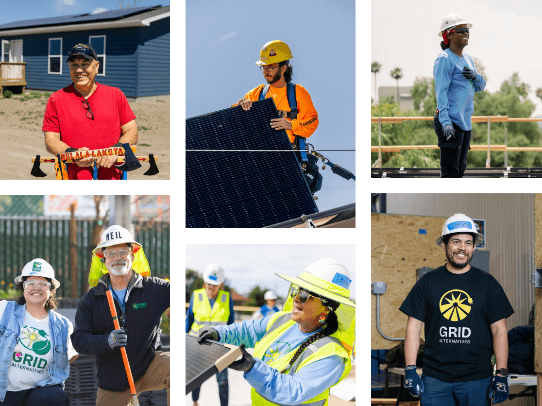
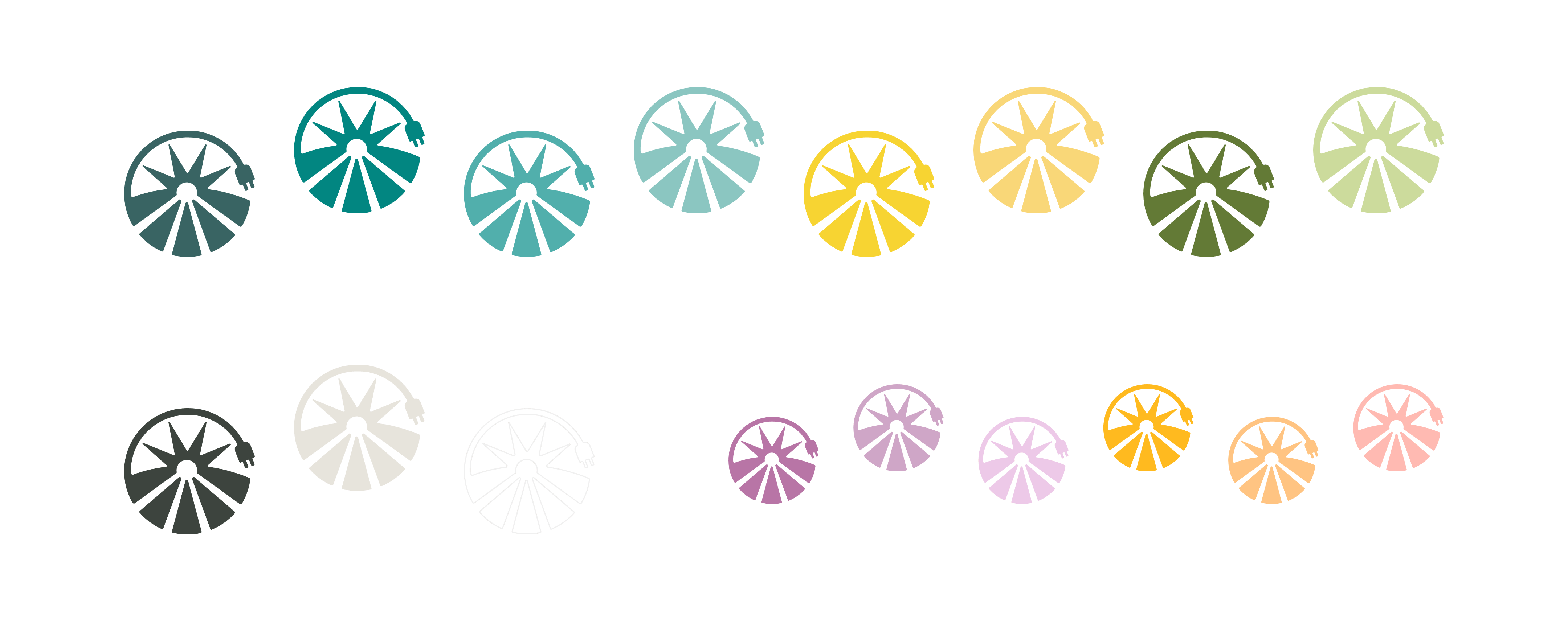
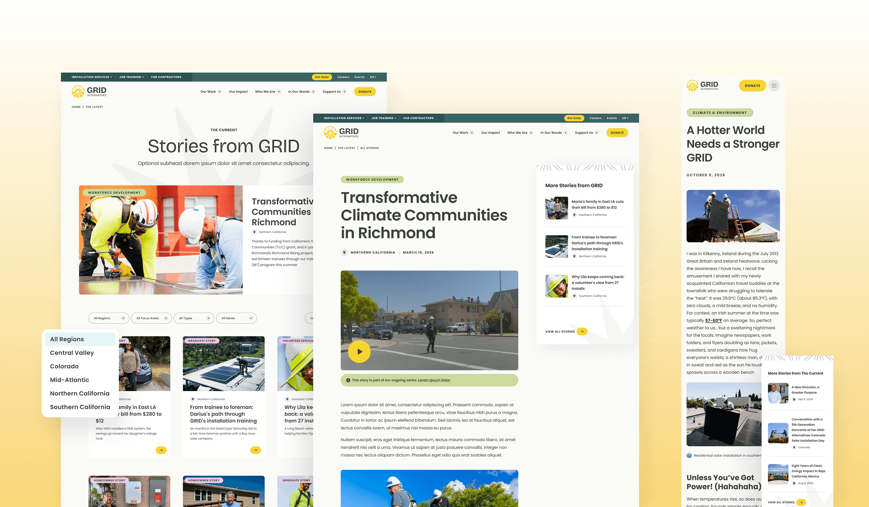
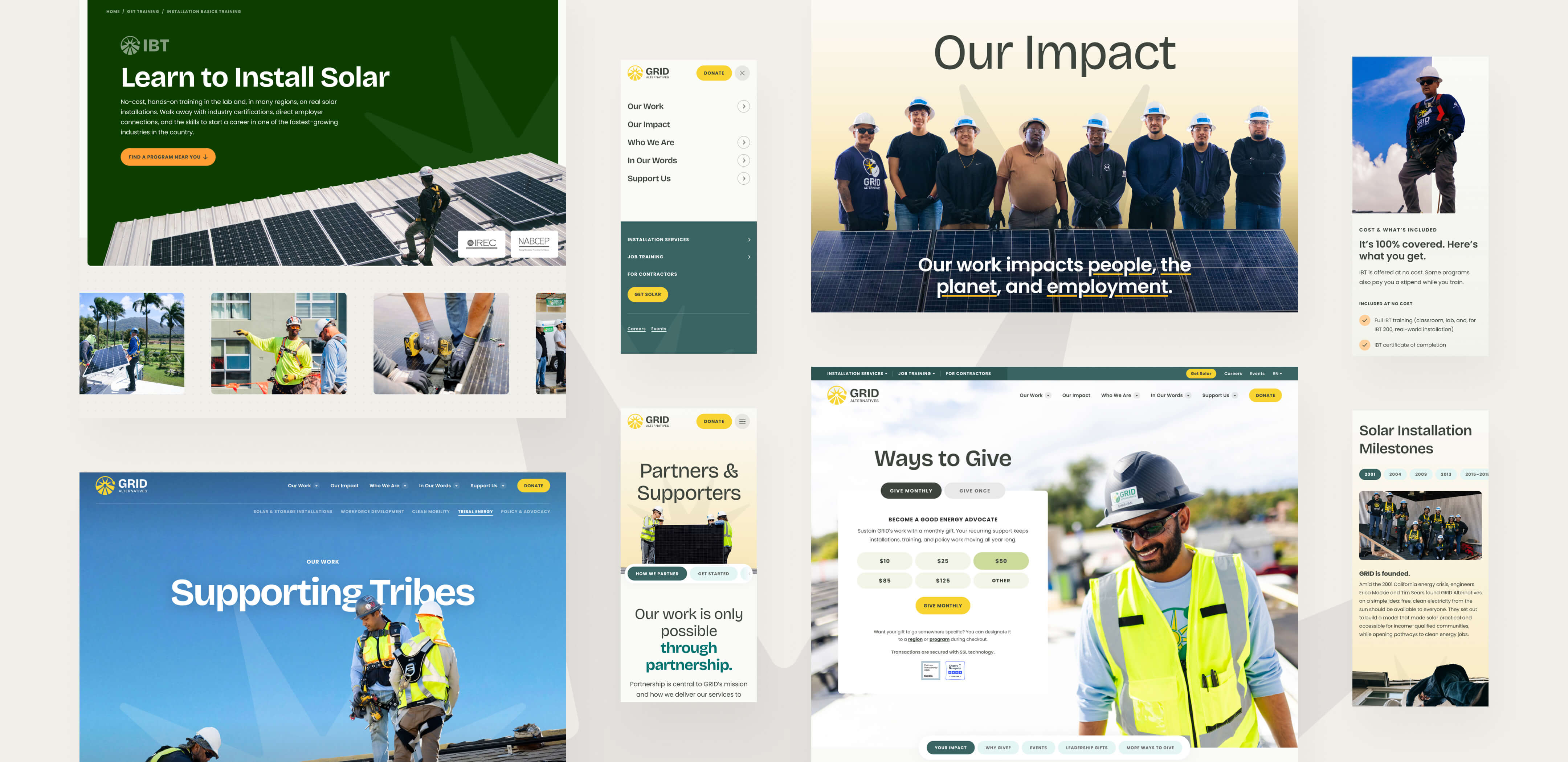
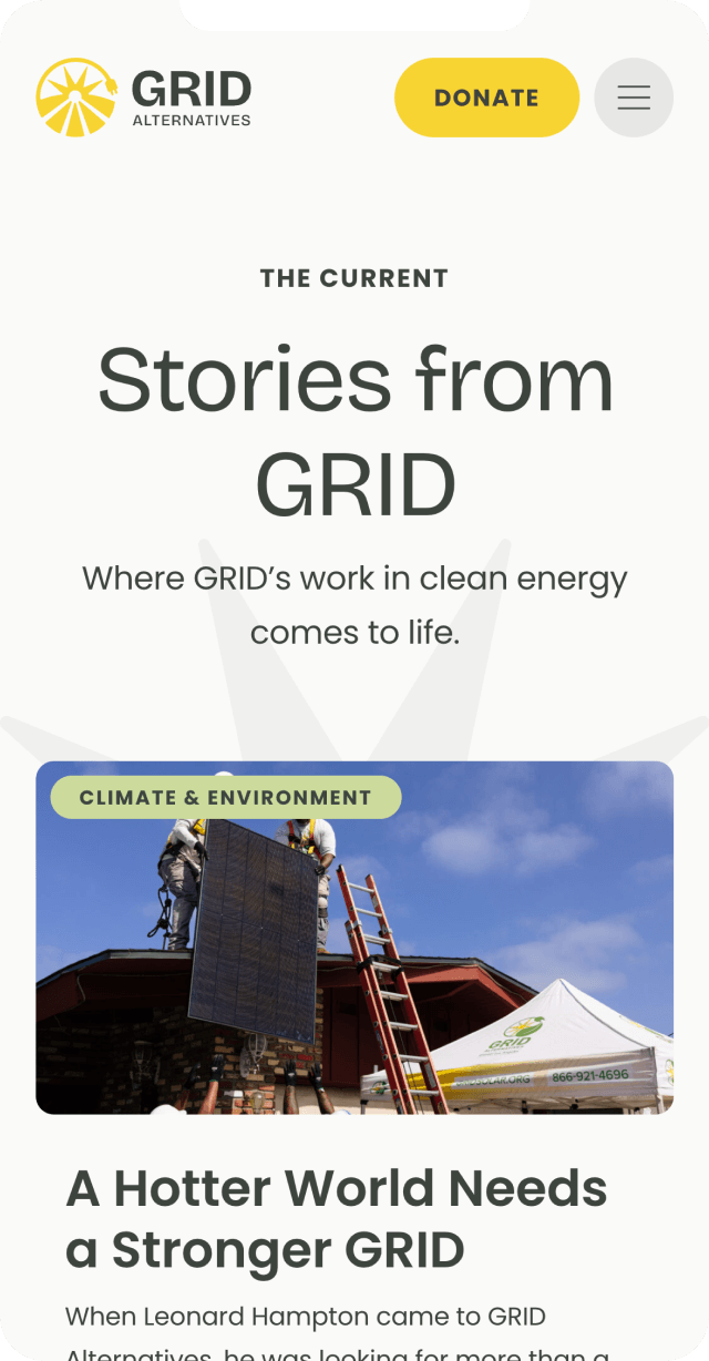
We then carried that living version of the brand onto the web. The GRID sunburst became a recurring graphic device, layered behind cut-out photography in heroes, glowing through cards on hover, and anchoring full-screen scenes. Sun rays, dot grids, and pattern bars add rhythm between sections. The palette pairs GRID’s teals and sunny yellow with fern green, warm linen, and a set of brighter accents, and headlines are set in Bricolage Grotesque with Poppins for body copy. Above all, the design puts GRID’s people front and center: installers on rooftops, trainees in the field, and families standing in front of their homes.
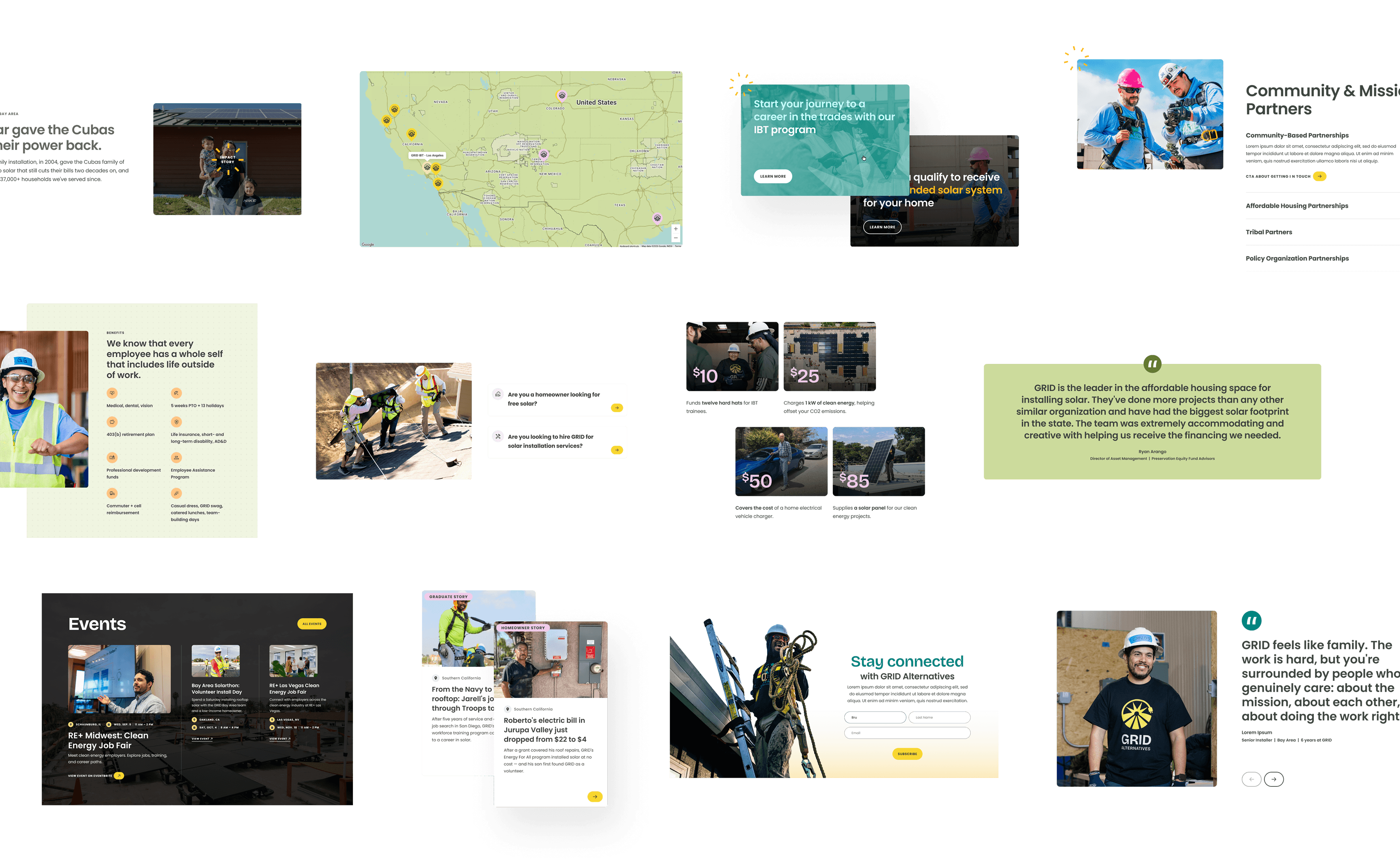
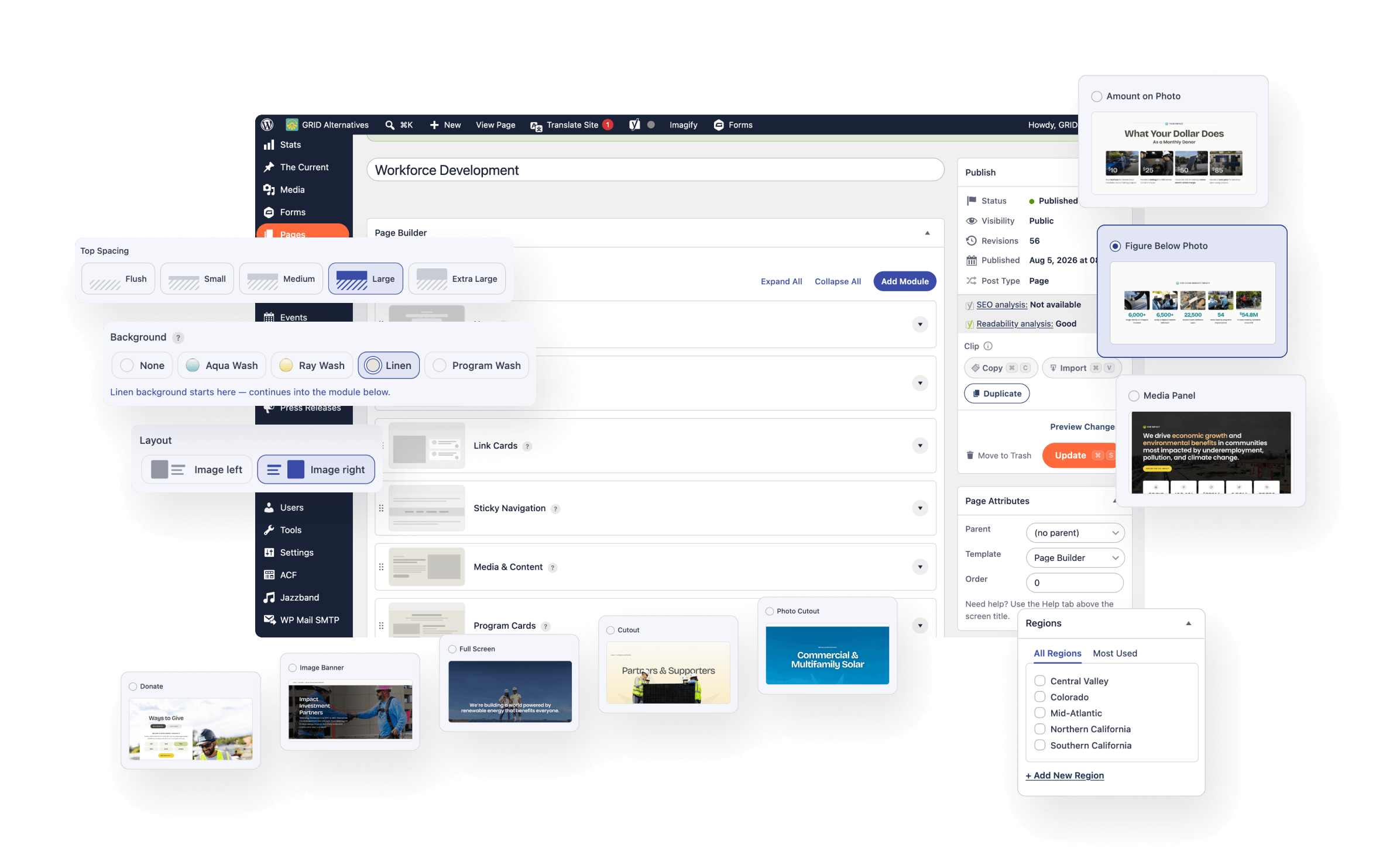
With the brand defined for digital, we designed a modular system that lets GRID tell big stories without starting from scratch every time. The page builder includes more than 30 custom modules, from nine hero variations and full-screen scrolling scenes to pinned mission statements, image marquees, video testimonials, step-by-step timelines, impact figures, partner logo gardens, and maps. Each one was designed for desktop and mobile and comes in multiple styles, so the same building blocks can feel celebratory on the homepage and practical on a training program page.
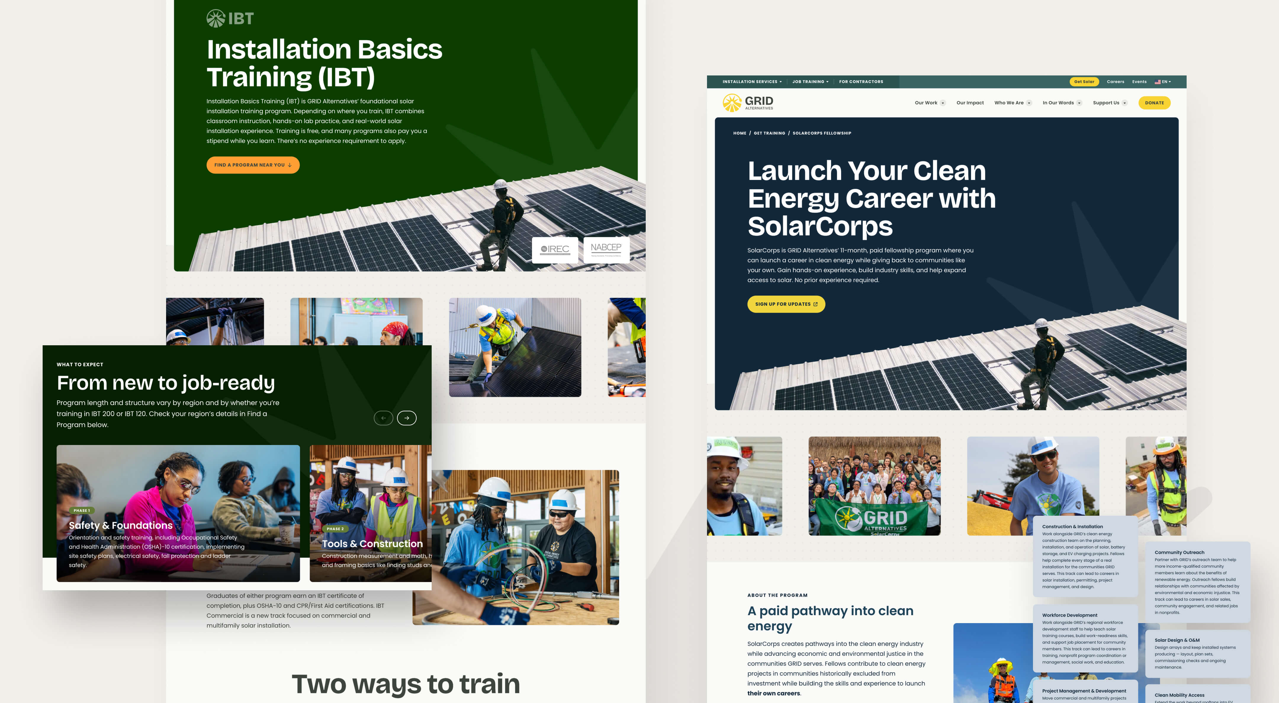
GRID’s workforce programs, like SolarCorps, carry their own sub-brands. Instead of designing separate sites, we built program palettes directly into the system: when a page belongs to a program, every module on it re-skins itself in that program’s colors automatically, while still reading unmistakably as GRID.
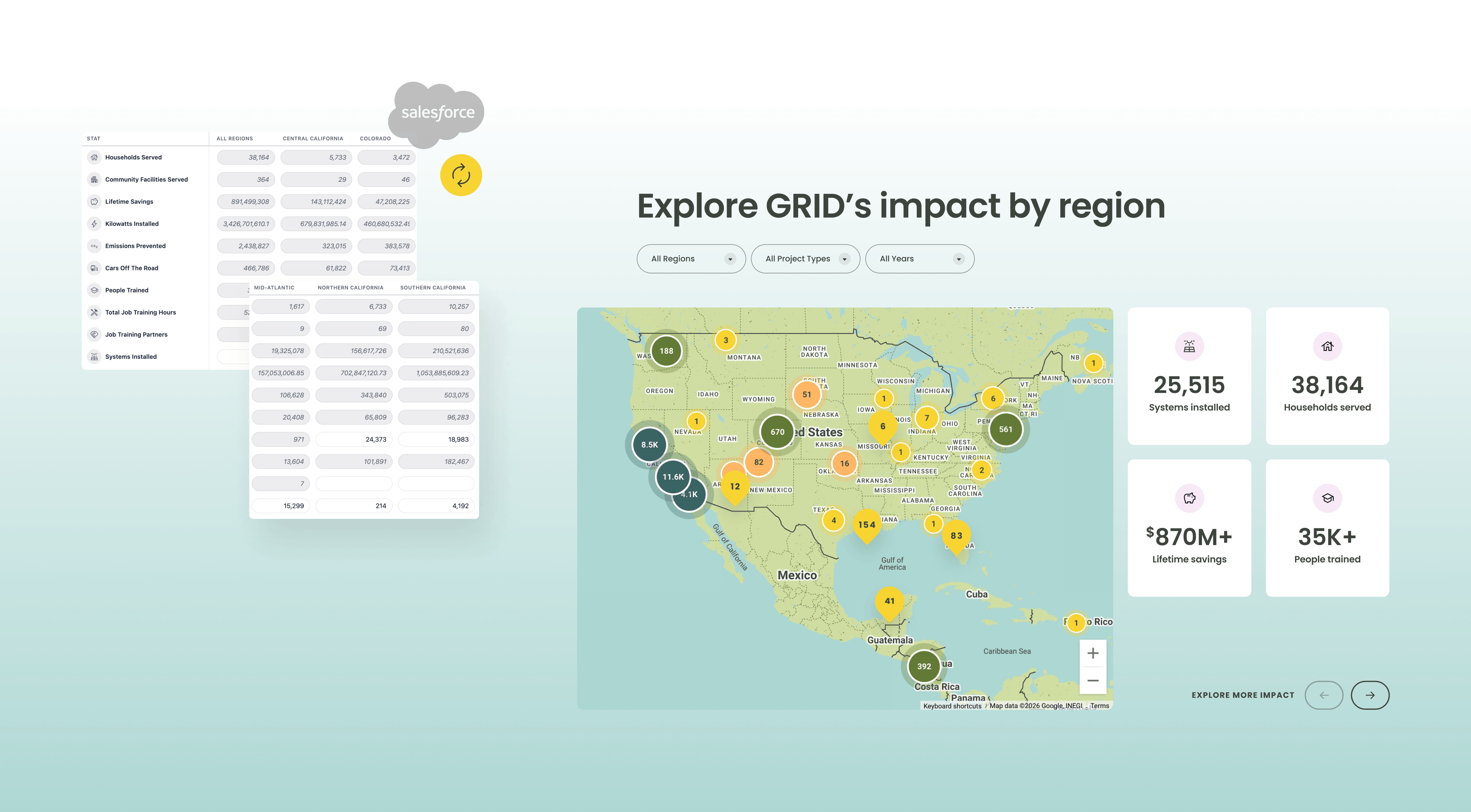
GRID’s impact is measured in numbers, and those numbers change constantly. Previously, they were typed by hand into pages across the site and quickly went stale. We built a live integration with GRID’s Salesforce instance that syncs impact metrics into the website on a schedule, organized by metric, region, year, and project type. A figure is defined once and can be quoted anywhere on the site, so when a new install is recorded, every page that references that number updates with it.
Those same figures power an interactive impact map that can be filtered by region, alongside a map of GRID’s completed projects drawn from tens of thousands of installations. Because every one of those projects is a family’s home, privacy was built in from the start: exact locations never leave the server, and projects are grouped into map areas so that no pin can ever point to a specific house.
Donor experience was a top priority. We integrated GRID’s Bloomerang donation forms directly into the site with a dedicated donate experience and a donation modal that can open from anywhere, without sending visitors away from the story that inspired them. Suggested giving amounts are read straight from GRID’s Bloomerang forms, so the site and the development team’s settings never drift apart. For donors interested in giving stock, cryptocurrency, donor-advised funds, or qualified charitable distributions, we built in FreeWill’s planned giving tools. Every third-party script loads only when someone actually needs it, which keeps the site fast for everyone else.
GRID’s regional offices are central to how the organization works, but the old regional microsites had splintered its story. In the new site, region is a shared thread that runs through stories, events, projects, and press. Visitors can filter the stories archive, events calendar, and projects portfolio by region, and regional impact figures come from the same central data as everything else. Each office keeps its local presence, and the organization finally speaks with one voice.
Getting from 800+ pages to a focused, streamlined site meant making smart decisions about what to rebuild, what to carry forward, and what to retire. We built custom migration tooling that pulled more than 5,000 pieces of content out of Drupal, including news, stories, press releases, press mentions, staff and board bios, and media, then cleaned it up, collapsed hundreds of duplicates, rewrote internal links, and mapped everything to its new home. Old URLs redirect to the right new pages so GRID keeps the search equity it built over two decades, while the site’s core pages were rebuilt from the ground up in the new page builder.
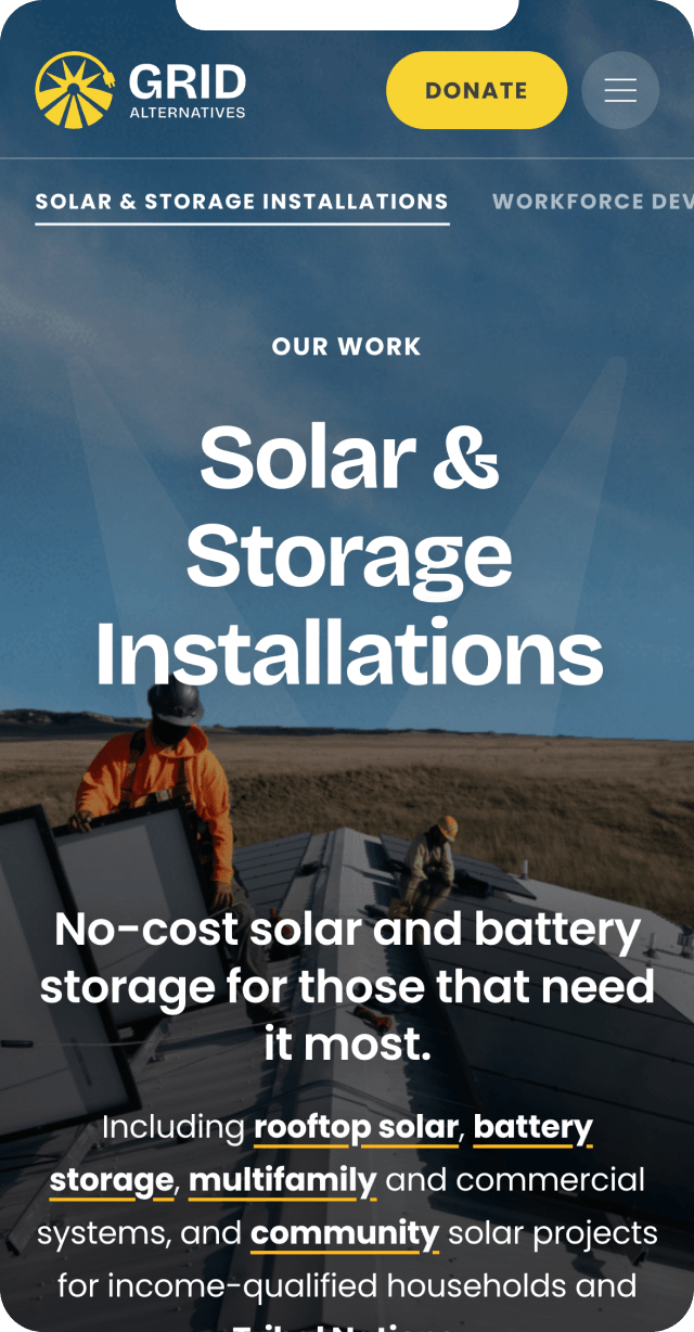
Studio Simpatico designed and built a fully custom WordPress theme, with accessibility treated as a requirement rather than a final check. The site is built to WCAG 2.1 AA standards, with pause controls on every background video, reduced-motion alternatives for animation, color contrast tuned for legibility, full keyboard support, and layouts that hold up at 400% zoom. GRID serves many Spanish-speaking communities, so the site is fully bilingual, with Spanish translations managed through TranslatePress and an English and Spanish switcher on every page.
The results show up in the numbers. In Google Lighthouse, the new homepage scores a perfect 100 for Accessibility, Best Practices, and SEO, and 95 for Performance, with first content appearing in 0.3 seconds and almost no layout shift as the page loads. It also passes both of Lighthouse’s new Agentic Browsing checks, so AI agents can read and navigate the site as easily as people can. That’s a rare result for a site this rich in video, imagery, and animation.
Behind the scenes, GRID’s team has a CMS designed around how they actually work. A visual module library shows every building block before it’s placed, reusable synced modules keep repeated content consistent, editors can draft changes to a live page and publish them when they’re ready, and AI-assisted alt text helps keep thousands of images accessible. Staff across HQ and the regions can build new pages, publish stories, and update programs without touching a line of code.
The new gridalternatives.org finally reflects the scale, diversity, and energy of GRID’s work. It tells the story of the people and communities at the heart of the organization, makes it simple for every audience to find their way in, and gives GRID’s team a platform that will grow with them for years to come. We’re proud to have partnered with GRID Alternatives to make clean energy, and the justice behind it, visible and inspiring to everyone who visits.