Greenroom
A name, visual identity, illustrations, and brand guide for a theater industry payroll startup
A name, visual identity, illustrations, and brand guide for a theater industry payroll startup
We started by learning all about Track C, a group of Broadway producers that came together out of frustration with the existing payroll infrastructure of the Broadway theater world. We dove deep into the why of their new company. They want to bring the Broadway payroll systems into the 21st century by allowing productions to automate payroll, and making it easy to incorporate the union information and tax considerations that are unique to this community.
Because the Track C group knows intimately how much of a headache the current, more analogue payroll methods are, they were able to cut right to the chase when creating the functionality of their new product – it’s purpose built by the people who need it most. They approached us needing a name and a look for this new brand – something that would feel approachable to the existing theater community, while bringing in a tech-forward look that telegraphs modernity and ease of use.
Our naming process involved getting cerebral: webs and lists of terms, making connections, following associations from word to word, and trial and error. The Track C team wanted to pay homage to their theatrical roots, but without the name being too on the nose, keeping it playful but without being too specific. We narrowed down our list to our favorites that aligned with the group’s preferences, and then came together with the group to discuss what they liked and didn’t like.
We incorporated the group’s feedback and came back with some more options, but in the end they preferred a name we presented in the first round: Greenroom! We love this name because it’s a great “if you know, you know” theater reference: a greenroom is the small room near the stage where performers wait and hang out before they make their stage entrance.
What makes it extra great is that it’s common across performance industries: it’s something that probably historically began with the theater, but that also applies to comedy, concerts, and live television. This is perfect because the team intends to expand Greenroom into other sectors once they gain their footing in theater, incorporating other entertainment payroll as well. It’s a nod to history and insider knowledge, making it clear that this team knows what they’re doing, while being approachable and making an easy nod to the financial aspect – money, green… you get it!
While we worked on the name, we were also working on concepting for the look of the brand. We listened to what the Track C team wanted – an approachable brand with theater references but also bringing in a mature, techy feel – and presented them with three options, complete with moodboards. One option leaned more into the history of Broadway, bringing in a little glamor and some vintage references. One leaned into the “startup look”: pops of color, friendly illustrations. And the last leaned into a mature, airy tech look, with more neutral colors.
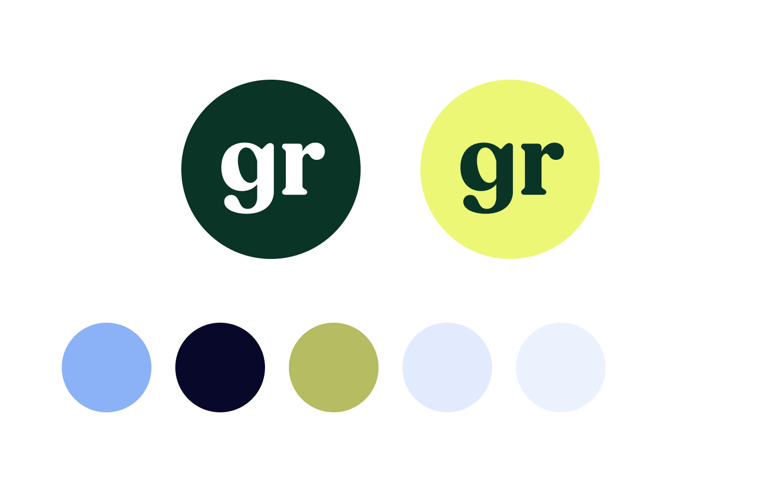
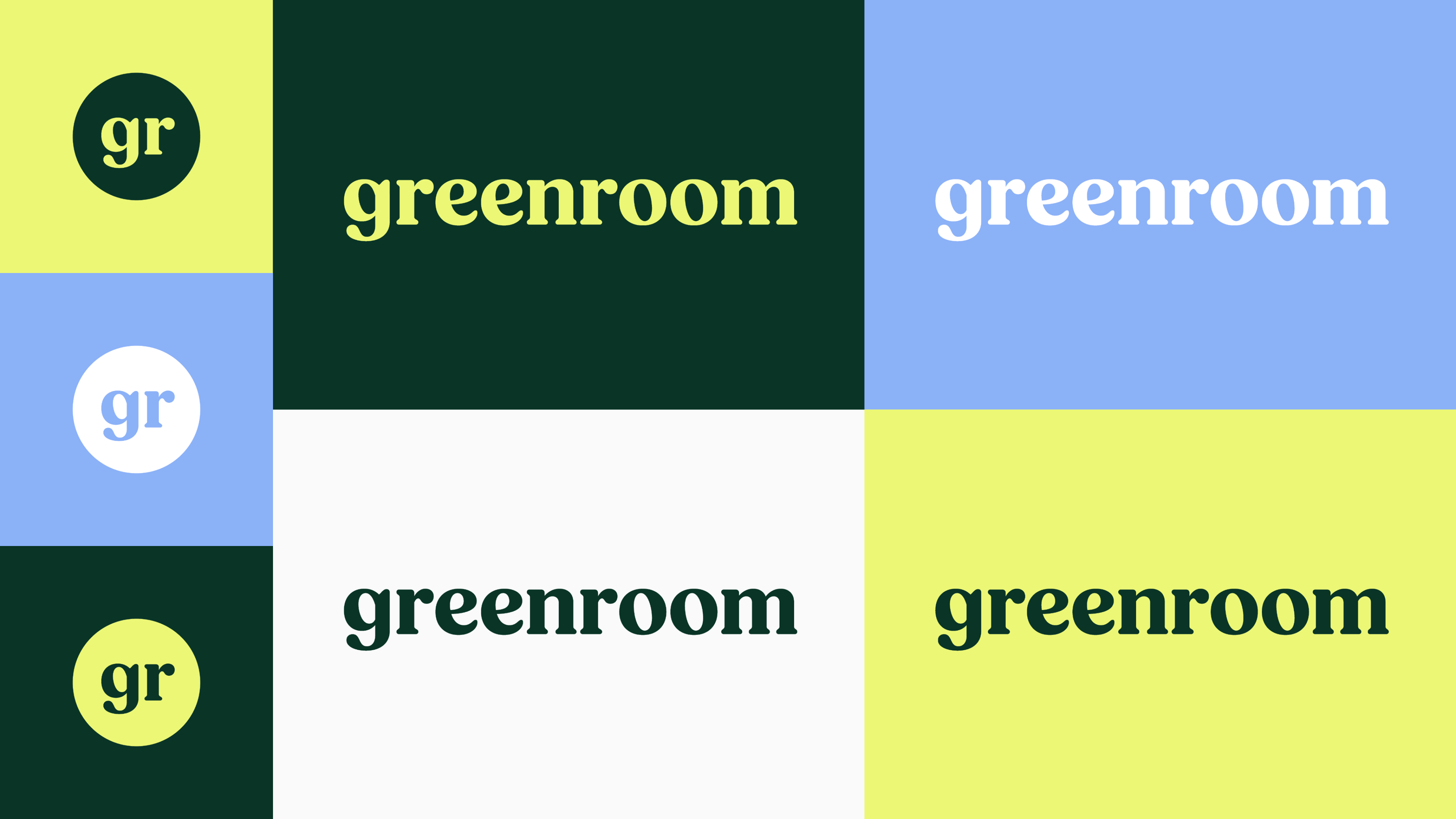
After considering the options, the team decided on a combination of the mature tech look and the startup look, with the addition of friendly illustrations to keep the brand approachable. We set to work on creating the assets, starting with the logo. For each logo iteration we showed, we brought in aspects of theater, tech, and friendliness in different ways, from references to opening curtains to the diversity of the theater paraphernalia of the past.
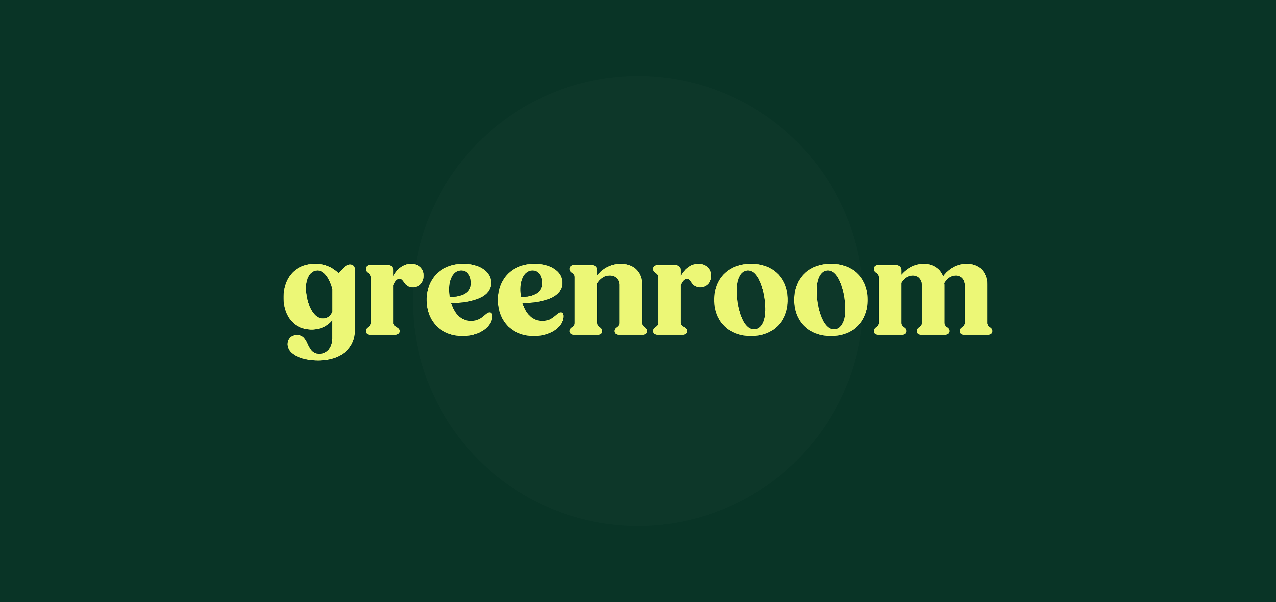
In the end, we landed on Fields, a rounded serif typeface, set in all lowercase. Fields, in the words of the typeface’s designer Adam Ladd, has “details like rounded serifs, teardrop terminals, and subtle tails [that] make this typeface friendly and approachable.” It feels slightly retro and reminiscent of the 1970s, but not stuck in the past, and lends a slightly hand-made feeling to the logo that speaks to the quality of craft that is associated with the theater.
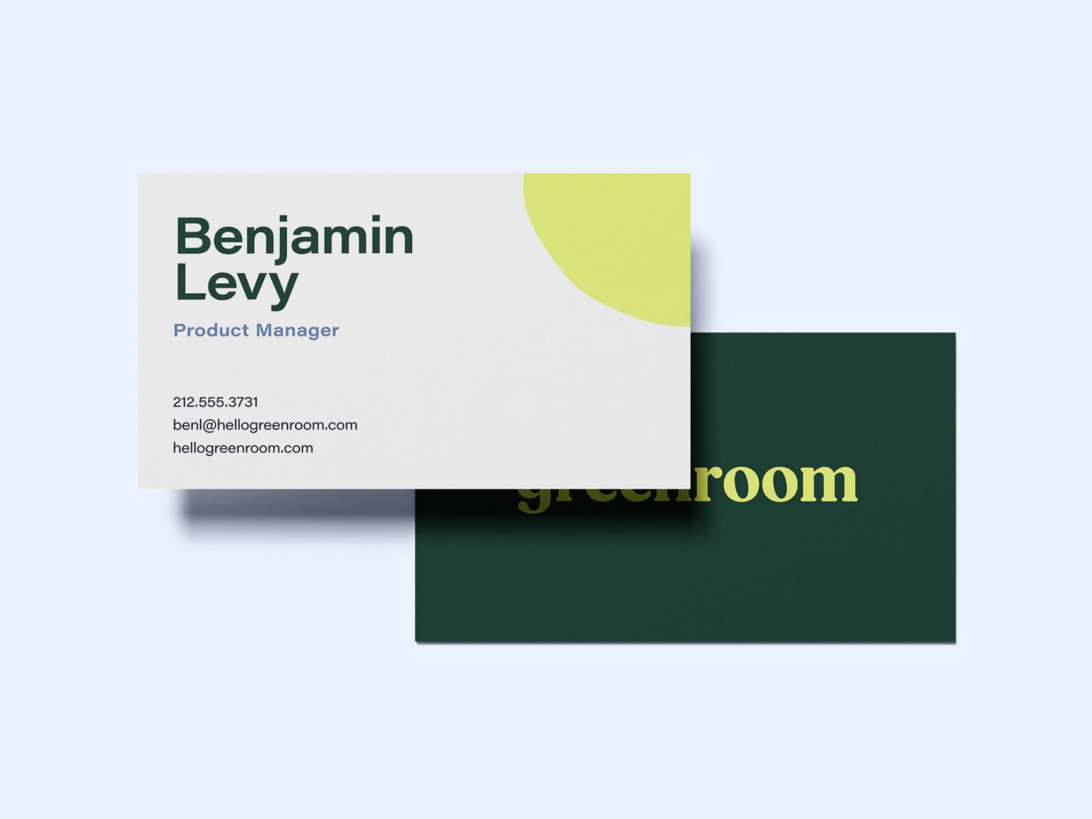
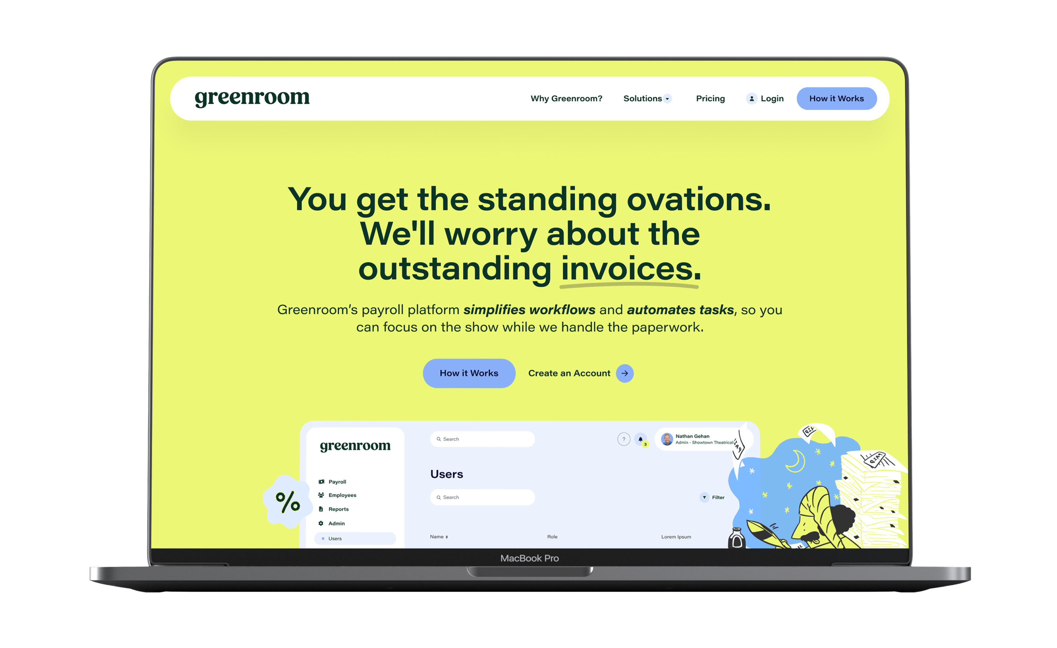
As we iterated on the logo design, we also worked out the brand’s color palette and typography. While we wanted to make sure the palette was pared back for a monochromatic feeling, we also knew it had to have a bright pop to bring in the “startup” aspect – and to add a little bit of drama! We landed on a cool-toned mix of bright acid yellow, dark forest green, and calming periwinkle. Olive and light lavender round out the palette, making sure that the brand has a fully fleshed out range of dark, medium, and light tones. By keeping the palette on the cool side of the color wheel, we avoid it feeling like a rainbow, but we were still able to create enough variety and contrast that it feels balanced. The neon greeny-yellow tells the story of the brand’s modern playfulness, while the periwinkle and dark green ground it in approachability.
For typography, we landed on Acumin Wide, a super legible neogrotesque sans serif, for both the headline and body fonts. We chose to use the Wide version of the font to keep the look of the brand contemporary – the wide font look is of the moment – while not being so extended to become dated as the brand ages. Acumin also pairs well with the rounded, friendly, warm logotype to give the brand an interesting tension between the past and the future – much like the ancient history of theater as the craft enters the modern age.
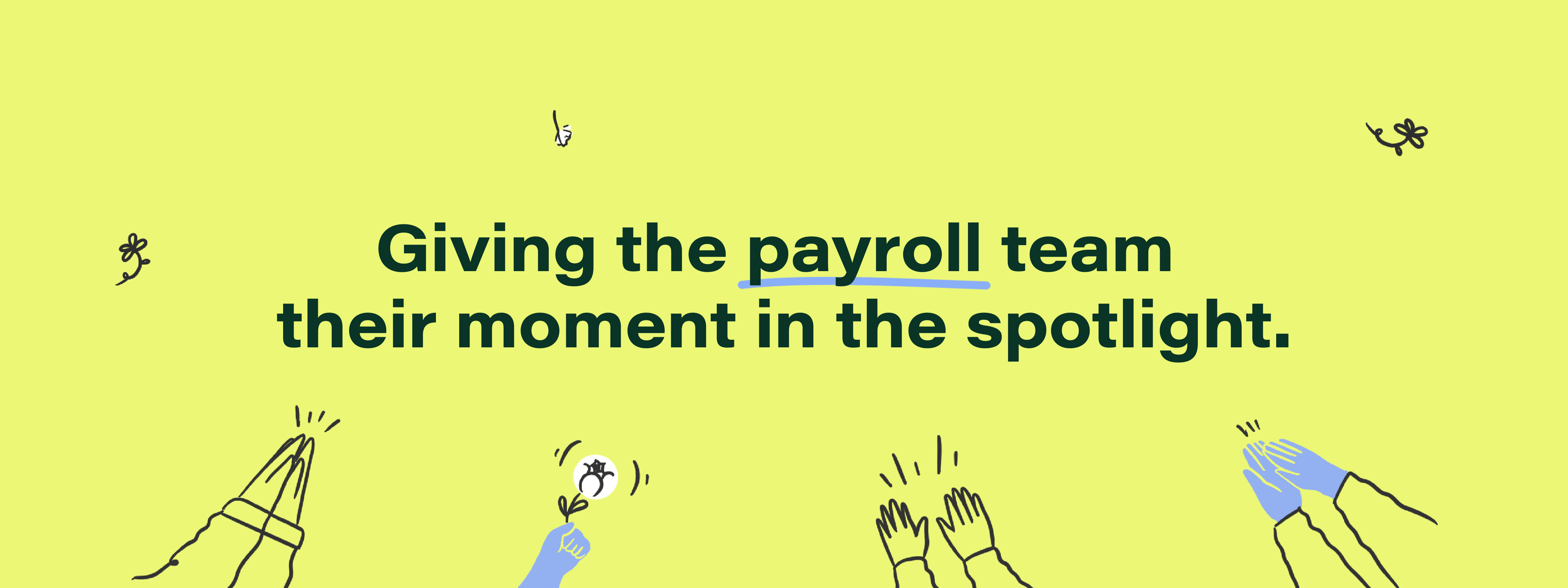
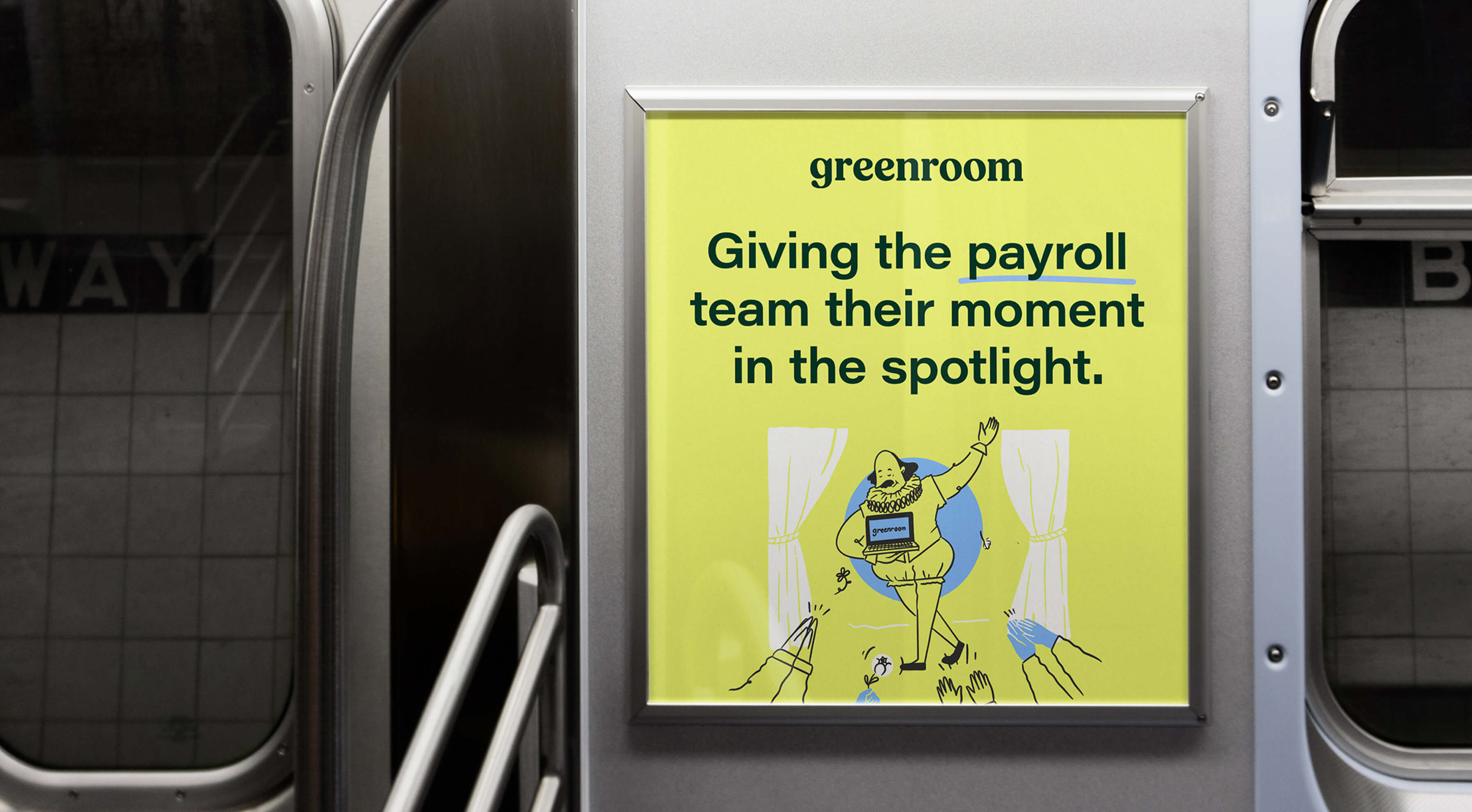
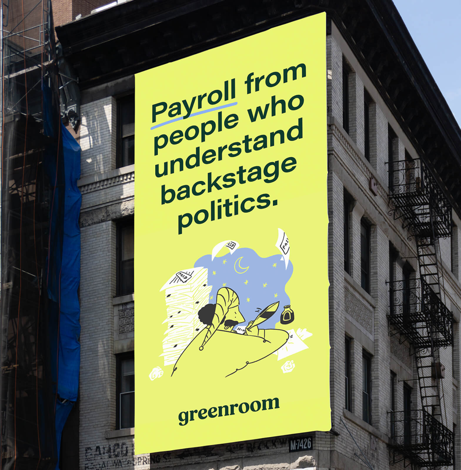
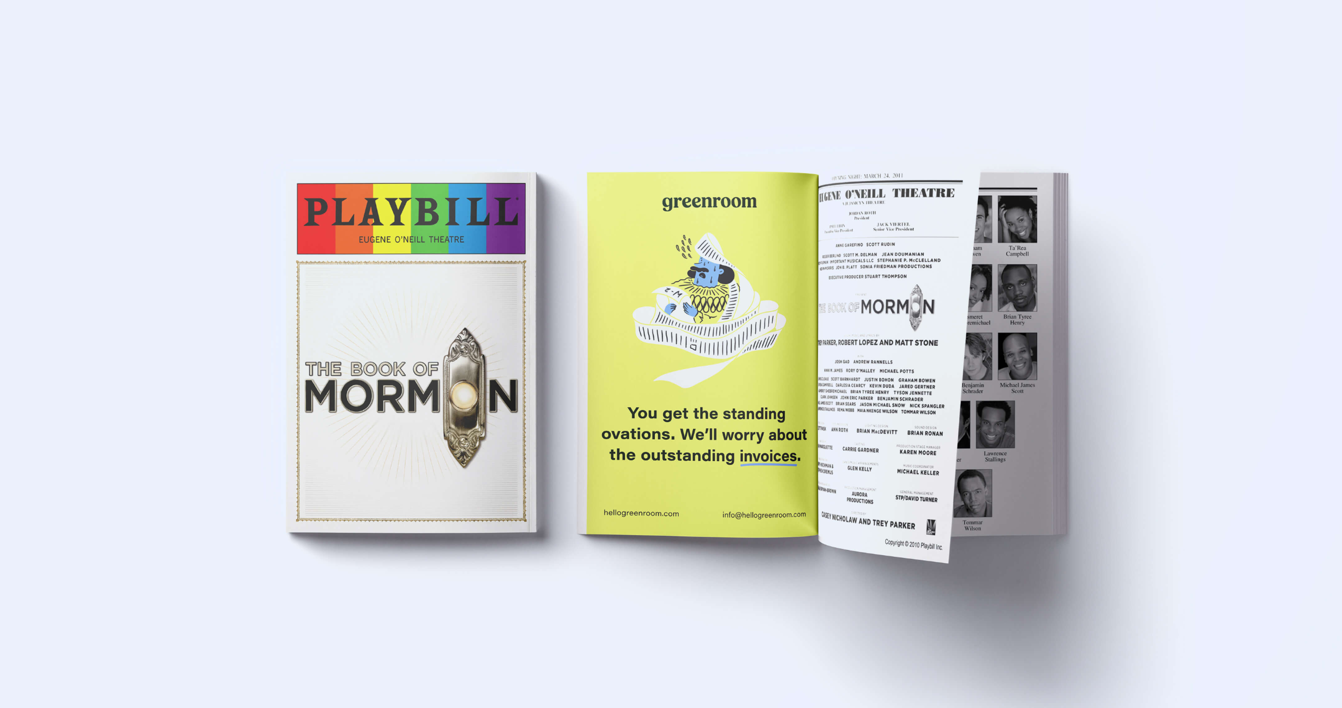
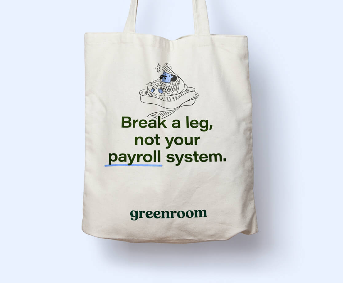
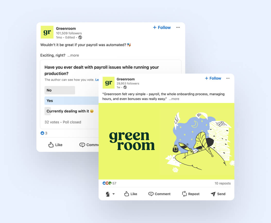
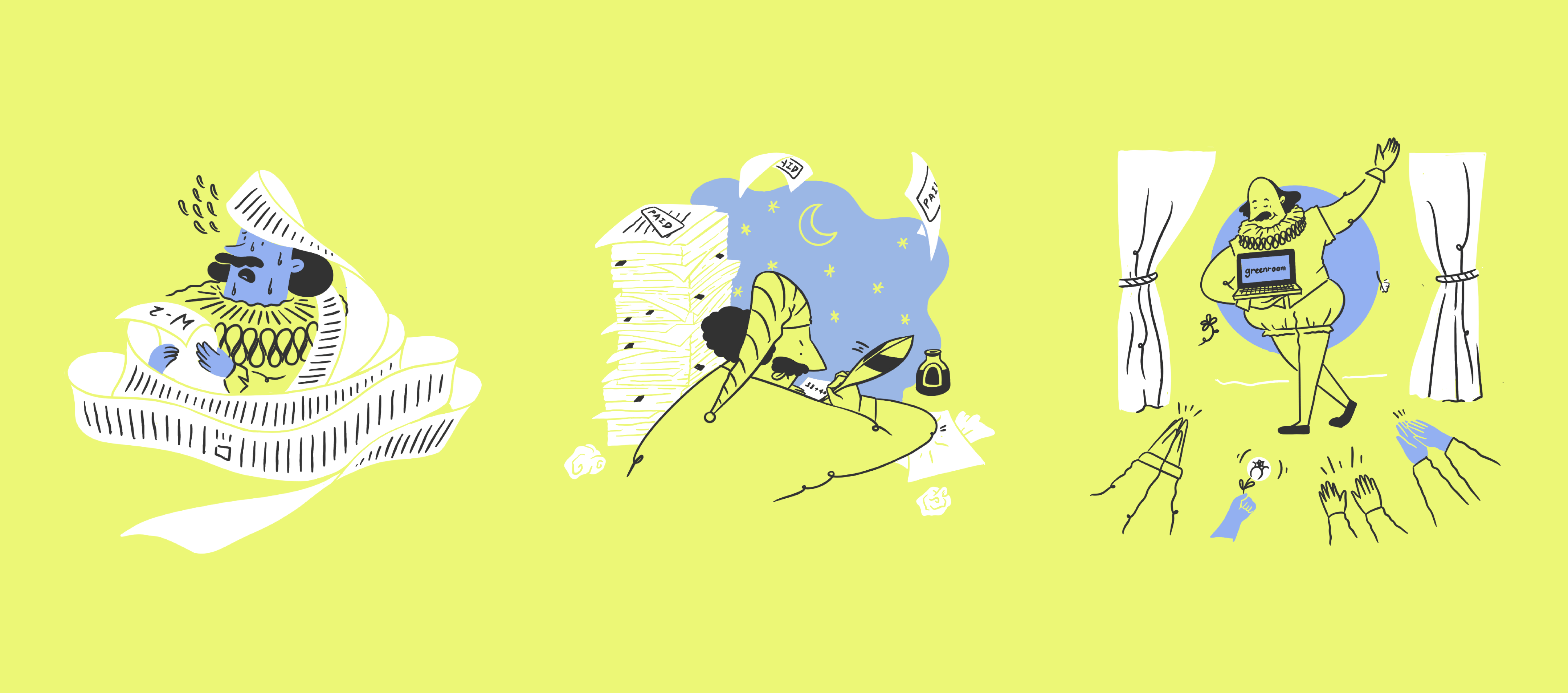
The final piece of the visual identity was the illustrations. Together with the Greenroom team, we came up with the idea of using a Shakespeare-inspired character and placing him in modern scenarios that emphasize the utility of the Greenroom product. Shakespeare, worried and frantic, trying to work on his staff’s W2s. Shakespeare up late working on what looks like a play, but instead he’s working on payroll using his quill. Shakespeare on stage getting a standing ovation, and his achievement is all thanks to Greenroom.
Our talented senior designer and in-house illustrator Angela got to work bringing these scenarios to life, keeping the color palette limited to the new brand colors. The results are tongue-in-cheek references to the most well-known personage in the theater world, which means that those who know anything about theater – in other words, the target audience – are guaranteed to be tickled by the illustrations.
The beauty of this illustration concept is also that, as the company expands into other sectors like comedy, concerts, or sports, the brand can expand to include other characters that are recognizable within those sectors. This cast of characters will give the brand the look of knowing their stuff, and will connect them directly to the audiences to whom they want to speak.
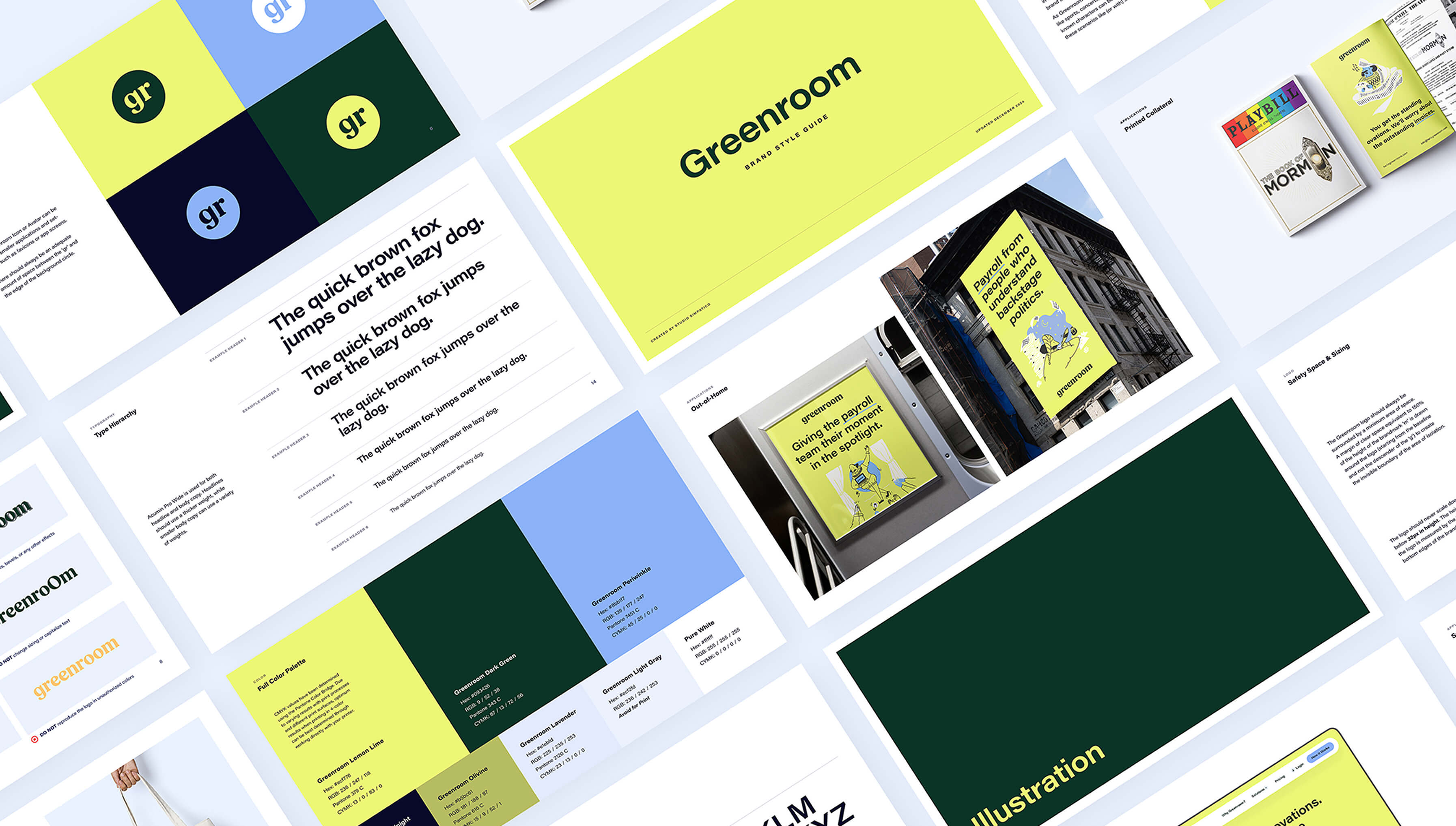
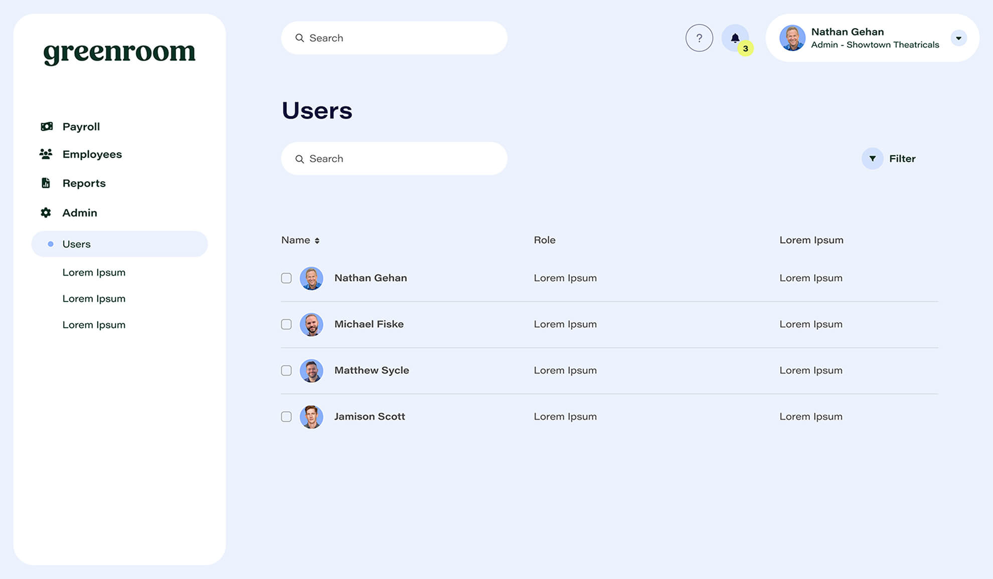
Once we nailed down the name, look, and feeling of the new brand, our final deliverable was a detailed brand guide that the Greenroom team could use to expand the brand in the future. As they go about building the product and doing their initial marketing, this guide will serve as a way to keep the look streamlined and on track. To show what that marketing could look like, we created collateral examples that are relevant to the company, such as an ad layout in a Playbill booklet, and subway and billboard ads around New York City, as well as a mockup screen of what the product dashboard might look like on desktop.
When companies get started, sometimes it can be hard to find the time or budget to put into naming or branding. We can say from experience that it makes a huge difference to have something to rally around, and a real name to reference as you go through your initial rounds of funding, building the project, and marketing it. Showing investors something tangible can sometimes make all the difference. We’re so glad that the Greenroom team agrees with this philosophy, because it led them to us! We had the best time working with them, and we can’t wait to see where this company goes from here. Encore!!